Stephen Wallis
writer / editor / storyteller
Jean Royère - Elle Decor
Bears on Parade: How the Ours Polaires Became the Ultimate Status Sofa
If there is one piece of furniture that has captured the attention of our era more than any other, it’s this one.
By Stephen Wallis
Winter 2026
https://www.elledecor.com/design-decorate/a69610842/jean-royere-polar-bear-furniture
The Ours Polaires. The Polar Bears. To some insiders, simply the Polars. Sensually curvaceous and decadently cocooning, these minimalist yet ultra-cushy sofas and chairs designed by Jean Royère in the 1940s represent the ultimate in cozy-chic sophistication—particularly for the elite tastemakers who can afford them.
High-profile owners include prominent collector Maja Hoffmann, shoe designer Christian Louboutin, and art dealer Larry Gagosian, who outfitted his New York City living room with a cherry-red Polar Bear sofa next to a swirling Cy Twombly painting, also in reds. Collector-dealers Adam Lindemann and Amalia Dayan had two chairs and a sofa in their Upper East Side townhouse, perched beneath an Alexander Calder mobile, before they sold the set—still in its original celery-green mohair—at Christie’s a few years ago for a record $3.42 million, more than twice the estimate.
“Royère is the iconic decorator. His colors, design, and lines are timeless,” says Flavien Gaillard, Christie’s head of design in Europe. For some time now it has been de rigueur among discerning collectors to pair their blue chip artworks with vintage furnishings by a select group of 20th-century French designers that includes Jean Prouvé, Charlotte Perriand, Pierre Jeanneret, Diego Giacometti, and the Lalannes, as well as Royère. “The Polar Bear set has often felt like that first box to check,” says Richard Wright, head of the Chicago-based auction house Wright. “It’s fantastically chic furniture that fits into a lot of interiors. It doesn’t look at all dated and stuck in its time.”
The appeal of Royère’s elegantly rotund Polar Bears has filtered down to the broader market, of course, part of what interiors trendwatchers have pointed to in recent years as a desire—amplified by pandemic-era isolation—for soft, inviting furnishings with cosseting shapes. Look no further than Gwyneth Paltrow’s latest Goop collection for CB2 or Sarah Sherman Samuel’s Billow sofa for Lulu and Georgia, designs that clearly channel Royère vibes.
Not surprisingly, Royère knockoffs are plentiful, but that may be changing thanks to Vladimir Markovic, who began overseeing the Royère estate in 2018. A descendant of Micha Djordjevic, Royère’s companion for the last 25 years of his life, Markovic won an important recent California court decision against a company called Edition Modern, which had been selling replicas of more than 50 Royère designs. The estate successfully argued that they were protected by copyright.
“This guy was doing cheap reproductions of Jean’s pieces, using his name and, from my point of view, really dishonoring his work,” Markovic says. “Now we are controlling, let’s say, the universe of Jean Royère.”
As well as focusing on issues around copyright, authenticity, and provenance, Markovic also founded “a heritage furniture company” that crafts authorized reissues of Royère designs. Launched several years ago, the company has showrooms in Paris and New York that offer a gradually expanding range of furniture and lighting.
These include many of Royère’s best-known creations, such as the Polar Bear chair and sofa, the Oeuf (Egg) chair, and the indoor-outdoor Croisillon seating and tables, which feature distinctive woven metal frames and are available in all six original color-ways. Also on offer are multiple iterations of Royère’s Liane (Vine) and Persan (Persian) lights, chairs from his Undulation and Yo-Yo series, and his biomorphic Flaque (Puddle) tables, including a version with a straw marquetry top inlaid with star motifs—the same distinctive veneer used on a cabinet that sold at Sotheby’s in 2018 for a then-record $1.76 million.
All the pieces are made to order in France, with artisan collaborators such as fabric specialists Jouffre and woodworking experts Souchet, based on prototypes developed at Royère’s atelier in Lyon. It took the team nearly two and a half years to get the Polar Bear right, a process that was less about replicating Royère’s fabrication details than combining and refining various techniques he used, to best “represent the spirit of Royère,” as the company’s creative director, Jonathan Wray, puts it.
Despite the Polar Bear’s deceptively minimalist form, which gives the impression of having been sculpted rather than constructed, the wooden skeleton and multiple interior layers are complex. Wray notes that only wooden joinery is used, and the alpaca upholstery is entirely hand-stitched to achieve the distinctive seamless fluidity. If the fabric is pulled too tight, it feels like a drum; too loose, and it sags.
“Right now people feel a need for comfort, not unlike the postwar moment when the Polar was designed,” Wray says. “People were traumatized. You have this piece that is enveloping, that is warm, that is rounded, that is fluffy, that is monolithic and feels grounded.”
Royère, who died in 1981, is estimated to have produced between 100 and 150 Polar Bear sets (a sofa with two chairs), as well as a similar number each of individual sofas and pairs of chairs. Until Markovic came along, there were no authorized reissues of any Royère designs. While not inexpensive—a new Polar Bear sofa costs upward of a quarter-million dollars—these offer an option for buyers beyond rare vintage pieces and knockoffs.
All the new, made-to-order Royère furnishings are marked, numbered, and certified. Lead times for upholstered pieces are typically six to 12 months. Around 80 percent of purchases are made by interior designers, including Joseph Dirand, Peter Mikic, Clive Lonstein, Monique Gibson, and the duo Ariel Ashe and Reinaldo Leandro.
“To source authentic Royère is a study in patience and precision, often involving questions of provenance and authenticity,” says Ashe, who this past fall had her eye on a pair of Royère Rouleaux sofas (a precursor to the Polar Bear) at Sotheby’s that turned out to be copies and were withdrawn from sale. She and Leandro recently commissioned a Rouleaux sofa in white shearling for a Manhattan living room, where they surrounded it with vintage pieces by Ruhlmann and Leleu. “It’s monumental yet soft, refined yet deeply inviting,” Ashe says.
For Patrick Seguin, a leading dealer of vintage Royère, Markovic’s entry into the market is a positive, “particularly thanks to vigilance regarding authenticity,” he says. He notes, however, that the reissues lack the rarity and historical value of the originals. This past fall, at the Design Miami Paris fair, Seguin’s all-Royère stand nearly sold out, led by a rare freeform table and a trio of Trèfle (Clover) lounge chairs whose backs and frames are a study in exquisite tapers and curves.
That particular Clover chair is not yet being produced as a reissue. “Each year we’re going to be adding,” says Markovic, who says the company is not looking to expand quickly. “We want to do it the right way. It’s not, after all, a mass-market business.”
Alicja Kwade - Galerie
Artist Alicja Kwade Opens the Door of Her Berlin Studio
Her sculptural boulders, which have graced the rooftop of the Met and the Venice Biennale, question ideas of time, uncertainty, and reality
By Stephen Wallis
Photography by Roman März
October 3, 2025
https://galeriemagazine.com/alicja-kwade-opens-the-door-of-her-berlin-studio/
Truth is relative. Time is fluid. Reality is subjective. These ideas are fundamental to the work of Berlin-based, Polish artist Alicja Kwade. Far from nihilistic conclusions, they serve as open-minded jumping-off points for her formally rigorous, poetically conceptual sculptures and installations, which address human perception and how we understand our place in an ultimately unknowable universe.
It’s an artistic worldview that began forming in childhood for Kwade, who spent her early years behind the Iron Curtain, in Communist and Catholic Poland, before her family escaped to West Germany when she was eight. For her, the most captivating questions have always been the big ones about existence, about knowledge, about the underpinnings of the social, political, and economic structures that define our reality. “Our lives are a little bit like being in a tunnel of awareness, where you’re thrown in on one side when you’re born, and you go through it limited to just experiencing what is around you,” she says. “You reflect on yourself, and the rest is kind of cut out.”
Kwade gave literal form to that idea in her recent high-profile exhibition at Pace Gallery in New York. The centerpiece was an installation for which she suspended three tunnel-like, stainless-steel cylinders from the ceiling, each one embedded with clocks surrounded by their own distorted reflections as their ticking provided a rhythmic reminder of passing time.
Adding to the surreal effect, Kwade combined the mirrored tubes with amorphous open structures fashioned with twisting bronze tree branches that emerged from rectilinear steel beams. The discordant elements of nature and industry, along with the shifting reflections and visual dissolution of time—all recurring motifs in her work—merged to form a sense of systems in flux. Kwade, who resists specific readings of her art, says the Pace show was “meant to be a bit mystical, strange, unexplained.”
Everything that the prolific artist conjures begins with drawings at her studio in Berlin, where she moved for art school in the late ’90s and still lives today, with her partner, artist Gregor Hildebrandt, and their son. The studio is located in a historic industrial complex in the eastern neighborhood of Oberschöneweide, now a hub for artists and other creatives.
Kwade acquired the multibuilding compound in 2017 from musician Bryan Adams, who bought the facility and refurbished it as a development for artists. Here, in workspaces marked by original brick walls, expansive windows, and soaring ceilings with exposed steel trusses, Kwade has a team of a dozen full-time employees, supported by a cast of up to 30 freelancers. Stone masons, welders, and other artisans help realize smaller works on-site, while four staff architects collaborate with her on designs for her many larger-scale installations.
The artist is intensely interested in materials, none more so than stone, which she has made extensive use of throughout her career. These projects include many of her best-known creations, notably her 2019 sculptures commissioned for the rooftop of New York’s Metropolitan Museum of Art, featuring variously sized orbs of marble or granite poised within gridded steel frames, conjuring both earthly and celestial references.
Other series consist of balls of rock arrayed across open spaces, as with her contribution at the Arsenale for the 2017 Venice Biennale as well as a commission, set to be unveiled in December, conceived for the new Dib Bangkok contemporary art museum, where a composition of 11 stone spheres extends across the vast entry court. Crucial for Kwade, who sources materials from around the world, is the span of history embedded within them. “Millions of years in the making, they are products of the most powerful geologic forces on this planet,” she says. “They are witnesses.”
On the one hand, the massive orbs are abstract and open-ended in their associations, perhaps evoking planets or, more humbly, marbles. But they are also the most literal of objects, undeniably beautiful and exuding a monumental presence. “You can feel their gravity and the tension between them,” the artist notes.
For an upcoming solo exhibition at the M Leuven museum in Belgium, opening on October 10, one of Kwade’s new works will be a room-size intervention with a large lapis lazuli boulder at the center, surrounded by walls covered in a “sexy, beautiful, bluish-grayish pigment,” as she puts it, constructed using fragments of the metamorphic rock. As with so much of what she makes, it has a profound minimalism.
The exhibition also includes one of Kwade’s film-and-sound pieces, examples of her mobiles, and a previously unrealized performance in which an actor pushes around a pallet trolley, the kind used in warehouses. Only, this trolley’s forks are curved, forcing it to go around in endless circles.
Whether one sees purposeful, beautiful repetition or absurd futility is up to them. Either way, the clock is ticking.
Wellness gardens - New York Times
How to Cultivate a Feel-Good Garden
Horticulturalists and herbalists share tips for nurturing plants with health benefits.
By Stephen Wallis
Photographs by Tony Cenicola
Aug. 25, 2025
https://www.nytimes.com/2025/08/25/garden/medicinal-plant-garden-tips.html
Gardening, as numerous studies have found, is good for us. The shoveling and weed-pulling, the exposure to fresh air and sunshine, the sensory engagement with nature — all of that is believed to lower rates of hypertension and heart disease and improve mental well-being. Digging in the soil with our hands may even have a positive impact on our microbiome.
But gardens can also promote health directly through their bounty, as a source of herbal remedies and medicines. It’s an opportunity many gardeners overlook.
“People are often surprised by how many plants have medicinal and therapeutic value,” said Devon Young, who blogs at NittyGrittyLife.com and whose most recent book is “The Homegrown Herbal Apothecary.”
While harnessing the curative power of plants has become more of a niche activity in the age of lab-derived pharmaceuticals and off-the-shelf supplements, a simple internet search reveals that many common backyard flowers and shrubs, such as roses, hibiscus blooms and Douglas fir needles, have health benefits.
Of course, some plants are toxic to humans and pets, including parts of species that are used for wellness, so care is required. But there are online resources to consult, such as the Lady Bird Johnson Wildflower Center and the Plants for a Future databases.
If you aim to create a beautiful and ecologically mindful garden that supports physical well-being, Bridghe McCracken, the founder of Helia Land Design in West Stockbridge, Mass., recommends prioritizing plants native to your region. Even if you never harvest the plants to make teas, tinctures or salves, natives are appealing because they tend to be low maintenance, requiring less watering and fertilizer, and they are good, collaborative citizens in the garden.
“When you’re working with native plants, you’re going to have a garden that is amazing for bees, for hummingbirds, for pollinating butterflies, for a whole spectrum of insects,” Ms. McCracken said.
She pointed out that many of the flowers and shrubs that are healthiest ecologically are also beneficial for human wellness. Her favorites include purple angelica, with its radiating, umbrella-like blooms; spiky Veronicastrum and Agastache; coneflowers such as Echinacea and Rudbeckia; and various types of Monarda, also known as bee balm.
“Monardas are really beautiful to design with,” she said, noting that bee balm can be used as an antiseptic, a mouthwash and a cold remedy. “Monarda punctata, in particular, is just gorgeous, with its colored bracts, and it stays in bloom for six, eight weeks.”
Selecting the right mix of flowers, herbs and shrubs involves “listening to the land and what plants grow well there,” she said. In her own garden, she puts most of her “tea plants” used for herbal brews and remedies in secondary zones, away from the house, and keeps plants with unharvested blooms closer so she can enjoy their beauty.
Ethan Dropkin, a designer and horticulture specialist at Larry Weaner Landscape Associates, a firm based in Glenside, Pa., often takes a similar approach to residential projects. He and his fellow designers plan “aesthetically structured, human-centric areas” close to the house, he said, while “the farther out you get, we usually go more naturalistic.”
The firm is known for meadow landscapes, where summertime expanses of undulating grasses might be flecked with purple Echinacea, pink Joe-Pye weed, yellow Rudbeckia and goldenrod, orange butterfly weed and the white thistlelike flower heads of rattlesnake master — all natives that have uses in herbal medicine.
Among other attractive, ecological plants that have therapeutic value, Mr. Dropkin pointed to native mints, including the Monardas and mountain mint, which has small white flowers and blooms most of the summer, though he cautioned that it can spread quite vigorously.
He also highlighted yarrow, though not all varieties are native to the United States. “They have antibacterial properties, so you can pick the leaves and put them on a cut, or you crush them up into a poultice, or you can throw them in hot water and you make tea,” he said. “The leaves are evergreen and ferny-looking, so they’re very beautiful even when not in flower. They’re also good for pollinators and act as a host plant for moths.”
When it comes to preparing herbal remedies, Ms. Young noted that a variety of preservation methods can be used, and that they are typically dictated by the plant type. “Anything with a fairly thin leaf or delicate flower can hang dry,” she said. For fleshier, more succulent plants, she uses a dehydrator, while resinous plants go in the oven, on a low setting. “With some things I’ll create a tincture using them fresh,” she said.
Among her favorite natives are the coneflowers Echinacea and Rudbeckia. “As an herbalist, I like to use the whole plant — the roots, the stem, the leaves, and the flowers,” she said. “You can either tincture fresh or prepare a tea, along with other, better tasting herbs such as mint, and it works as a powerful immune stimulant.”
Interest in wellness gardens can take many forms, according to Dara Saville, the New Mexican author of “The Ecology of Herbal Medicine” and the founder of Albuquerque Herbalism, a community program that trains people to work with plants for healing purposes. Some of her students are interested in ecology, while others want to connect with Indigenous healing traditions, she said. Many are people who have chronic health problems and are not receiving effective treatment through mainstream health care paradigms, “so they’re taking matters into their own hands.”
Ms. Saville described her own gardening style as feral: “I let plants migrate around and show me where they want to be and who they want to be next to,” she said.
Topping her list of favorites is yerba mansa, a desert wetlands native long used medicinally in the region. Its therapeutic benefits include “energizing your urinary system, your digestive system, your respiratory system,” she said.
“It’s antimicrobial and anti-inflammatory,” she added. “It just does all of these things simultaneously, invigorating your whole body to be healthier and more vital.”
Plus, “it has gorgeous white flowers and is a really beautiful addition to the garden.”
Showcasing the visual allure of native wellness plants has been a personal mission for Mihalis Petrou, a landscape and floral designer in New York City. After a friend entrusted him with an abandoned lot in Astoria, Queens, close to a decade ago, he set about installing planters and beds teeming with flowering natives.
“At one point, I had over 400 species there,” Mr. Petrou said. He began using them in fashion photo shoots for Oscar de la Renta and magazines like Numéro and Out, as well as in installations for events. “Instead of going to the flower market, I would head to my garden in Queens and harvest fresh native plants that look spectacular,” he said.
Bee balm, Echinacea, goldenrod, Joe-Pye weed and red columbine are all part of his repertoire. Some he also uses for herbal teas — yarrow, Agastache and mountain mint among them. “They’re so tasty and aromatic,” he said. “I just boil them fresh without drying them. It’s a little more bitter when they’re fresh, but I actually like that.”
Mr. Petrou said he sees parallels between the worlds of gardening and fashion, specifically the correlation between looking good and feeling good, and how that creates positive energy and inspiration.
Ms. Young echoed that sentiment. “Art is therapy and landscaping is art,” she said. “Having a wellness garden that is beautiful, that’s medicine in itself.”
Art-filled Dallas apartment by Bodron/Fruit - Galerie
Artful Adaptation
For a couple transitioning into life as empty nesters, the firm Bodron/Fruit updates a Dallas apartment where comfort and sophisticated collections take center stage
By Stephen Wallis
Photography by Douglas Friedman
Winter 2025/26
Interior designer Mil Bodron and architect Svend Fruit have well-earned reputations for balancing impactful, expansively scaled spaces with nuance and exquisite detail. The founders of the Dallas firm Bodron/Fruit are as adept at masterminding airy, elegantly modern residences from scratch as they are at executing refined updates to historic homes by Philip Johnson and Frank Lloyd Wright.
Among the duo’s latest renovation projects is a 9,600-square-foot apartment occupying an entire floor of a luxury high-rise in the Turtle Creek neighborhood of Dallas. The art-collecting clients, transitioning from a longtime 1930s home where they had raised two children, wanted a place that felt “elegant and classic, somewhat formal, but that read as definitely modern,” says Bodron. He adds that a top priority was having a variety of spaces that could be tailored for intimate entertaining as well as for hosting larger gatherings for organizations they support, including the Dallas Museum of Art.
Bodron and Fruit spent ten months devising an end-to-end overhaul of the apartment. “While room locations stayed more or less the same, most of the walls were taken out and everything was reconfigured,” explains Fruit. The most significant alterations to the layout included replacing the closed-off kitchen used by staff with a welcoming eat-in space that opens directly onto a cozy new family room. The primary suite, meanwhile, now features generous his and her baths and dressing areas. And just off the elevator vestibule, the designers created an art-lined, minimally appointed foyer that serves as a reception gallery with a walk-in bar.
Throughout the residence, Bodron and Fruit married formal rigor with material refinement. Ceilings feature crisp rectilinear coves. Walls are finished in subtle hand-troweled plaster, clad in soft upholstery, or paneled in bleached walnut. That same honey-tone wood was used for the clean-lined door and window casings and baseboards, adding warmth and textural detail. Dark bronze doors are inset with reeded glass. In the baths, walnut millwork is paired with marble. “There is a lot of craftsmanship in this place,” says Bodron. “It was a huge amount of delicate, detailed work.”
Taking advantage of the building’s raised floors, the designers were able to sink the living room by a couple of steps, extending the ceiling height to 13 feet. To break up the voluminous space, Bodron composed two separate seating areas, both mixing sculptural contemporary furnishings with choice vintage designs. Among the highlights are chairs by Ico Parisi and Carl Malmsten, a Philip and Kelvin LaVerne cocktail table, and a sensually curved Jules Leleu sofa that anchors a circular grouping near the windows with “money shot” views, as Bodron puts it, of the Dallas skyline.
Arrayed around the living room are large abstract paintings by Adolph Gottlieb, Antoni Tàpies, and Mary Weatherford, the latter featuring an eye-catching strip of neon tubing that “adds a little jolt of electricity,” Bodron notes. Lauren Ryan, a partner at the Anthony Meier gallery in Mill Valley, California, advised the couple on their acquisitions, nudging them away from checking boxes with trendy or obvious market darlings.
“Lauren said, ‘Hey, you don’t want to just run out and buy blue-chip names from the auction houses,’ ” recounts the husband. “She urged us to consider emerging artists as well as mid- and late-career artists who maybe have been a little overlooked.” The homeowners have also prioritized getting to know artists they collect, visiting with Larry Bell and Joel Shapiro in their studios, even playing pickleball with Mary Weatherford in Aspen.
Among their favorite acquisitions is a group of clear-glass sculptures created by Ritsue Mishima as a special commission for the dining room, which also displays incandescent abstract paintings such as a Mary Corse canvas embedded with glass microspheres. Perched atop the room’s bespoke William Haines Designs table and the Stéphane Parmentier travertine console alongside it, Mishima’s radiant sculptures are made of blown glass in Murano, creating a subtle echo with the luminous, midcentury Dahlia chandelier by Max Ingrand for FontanaArte that Bodron installed above.
On occasions when the owners are entertaining just a few guests, they often gravitate toward the library, where the designers swapped out the traditional oak paneling for sleek, richly grained panes of rosewood with bronze details. “You’re drawn in there,” says Fruit. “The proportion of this space is really nice and calming—it feels intimate.”
Bodron outfitted the library with an array of upholstered, largely vintage furnishings, not least a second, graceful Leleu sofa complemented by a Frits Henningsen wing chair. There’s also a built-in bar, a TV, and a Jean-Michel Frank–style game table, where the wife likes to play mahjong with friends. “We felt it was important to have spaces where people feel like they can relax,” she says.
The designers concur. “In a home with a lot of heavy-hitter furniture and art,” Fruit says, “having moments that just feel comfortable, places to sit and maybe put your feet up on the table, is key.” And just in case, Bodron notes, “we made foot pillows for them to use.”
Coastal Maine family retreat by Meyer Davis - 1stDibs
In Maine, Meyer Davis Created a Home That Exudes Vacation Vibes
The multigenerational family compound designed for a brother and sister by Will Meyer and Gray Davis evokes the past even as it looks to the future.
By Stephen Wallis
Photos by Andrew Ingalls
June 15, 2025
https://www.1stdibs.com/introspective-magazine/meyer-davis-maine
Initial meetings between clients and the designers they’ve commissioned to create new homes often take place in an office, or maybe on a video call. For one multifamily vacation retreat in Cape Elizabeth, Maine, things kicked off with a clambake.
A brother and sister who had been spending summers on the Maine coast since childhood reached out to their friends Will Meyer and Gray Davis, cofounders of the firm Meyer Davis, about designing a waterfront compound for their two families to use together. The siblings had acquired a several-acre property, stretching along a picturesque rocky cove and fringed with wooded groves, knowing that they would need to replace the modest 1920s cottage on the site with something more suitable for gathering with their several young adult children and friends.
So, they invited the Meyer Davis team to visit and organized a classic Maine cookout on their beach, with lobsters and shellfish, to let the designers experience the place and get inspired. “All their friends came over,” recounts Meyer. “We were just in the early stages of trying to think of what this property might become, so it was great to be in that setting and see how everybody likes to live there.”
One important early decision was to situate the house not at the center of the grassy meadow that sweeps down through the middle of the property but off to one side, partially nestled in the trees. “This way not only you get the views, but you have a little bit of foreground,” says Meyer, adding that the choice resulted in a more compelling overall site plan and equally commanding vistas for the pool and pool house, which sit at the top of the slope along with two pickleball courts.
The designers took inspiration for the home’s architecture in part from historic residences in the region, including its cedar plank siding and rambling roofline punctuated by stone chimneys and idiosyncratic dormers.
Inside, the interiors needed to work for the two families as well as for guests, meaning the house needed to function a bit like a mini-resort or inn, something Meyer Davis has extensive experience with, having designed numerous projects for Four Seasons, W and Mandarin Oriental, among other hospitality groups. Both the homes and the hotels the firm creates feature spaces that are dynamic and functionally flexible while also radiating refinement, warmth and comfort.
Although the Cape Elizabeth residence has 11 bedrooms — nine in the main house, two in the pool house — and totals nearly 17,000 square feet, the interiors have a graceful, rhythmic flow, with thoughtfully calibrated shifts in scale and mood. “The owners entertain a lot, so it’s a house that is made to flex depending upon who’s there,” says Davis. “The way the house is broken down, some of the rooms feel quite large and accommodating, but there are other areas to tuck into that are more intimate and coddling.”
The designers’ goal was to create a home that felt both of the moment and connected to the past. Key to achieving that was integrating into the decor select vintage furnishings, including pieces sourced from 1stDibs. “It helps to create a sense of things having been collected and put together over years,” says Meyer. “There’s a fresh, new feel to certain parts of the house but then also a sense of it being deeply rooted in history.”
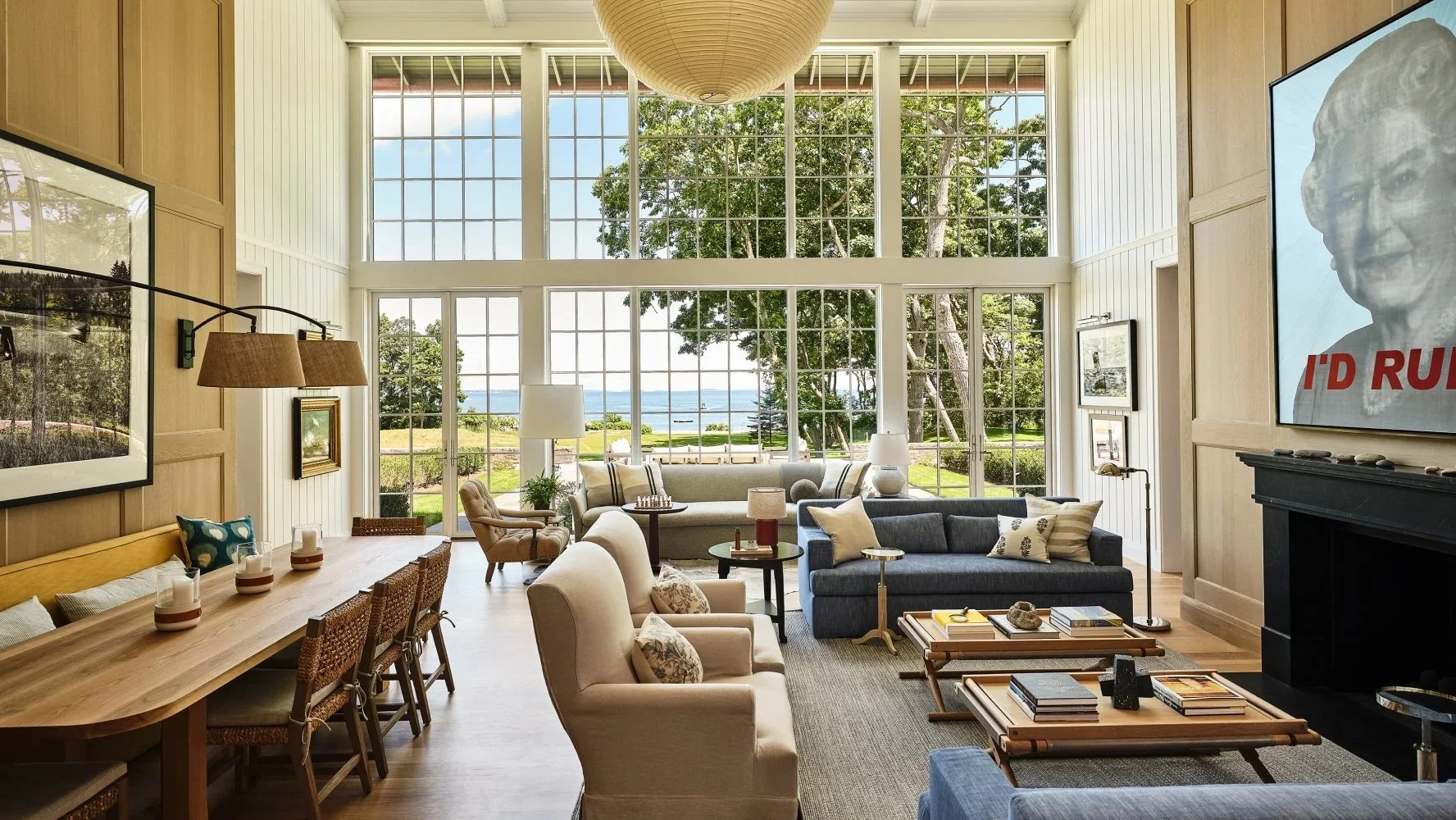
The home’s entry area immediately establishes a traditional-meets-modern tone, mixing white-painted shiplap paneling and antique maritime paintings with a blackened-steel and glass cubic pendant light suspended above a contemporary circular walnut center table. In one corner, a giant James Buchanan gilded apple sculpture gleams with surreal whimsy.
But as the space opens onto the double-height living and dining area just beyond, it’s the spectacular view of the sea through a two-story rear wall of windows that steals the show. Here, the seating includes a pair of Michael Dawkins sofas and two linen-covered lounge chairs from Horsch & Huebscher via 1stDibs, which mingle with an assortment of tables on which to place drinks. A long custom dining table, bordered by a comfy banquette and woven chairs, serves as a spot not just for meals but also for hanging out, playing games or working on a laptop.
“The goal was for all of the seating groups to be multifunctional,” says Katie McPherson, a Meyer Davis associate principal who helped oversee the interiors. “Whether you’re gathering and having a lively conversation during a party or cozying up and reading a book by yourself, everything can be used in different ways, in different seasons.”
Over the dark Vermont granite mantelpiece, a cheeky painting by Alison Van Peltdepicts the late Queen Elizabeth II, with the words “I’D RULE” stenciled along the bottom. It’s one of the many works acquired for the residence’s wide-ranging collection, which Meyer characterizes as “smart and fun without being too precious.”
The designers used a variety of wood tones throughout the house: matte-polished oak planks for most floors and either white shiplap or honey-tone bleached oak for the ceilings and walls. “We try to limit the amount of sheetrock, because we want to create something tactile,” McPherson explains. “The paneling is really important for that sense of warmth.”
That’s certainly true in the bar lounge, which is clad entirely in oak, including the cabinets and the bookshelves that frame a sprawling built-in window seat. The room is outfitted with a bespoke bar table and stools designed by Meyer Davis for Stellar Works. Next to the fireplace, a linen-clad daybed is paired with mohair-upholstered chairs by Lawson-Fenning, which also made the cocktail table with detachable rounded end tables that can be moved around as additional perches for drinks or snacks.
Equally inviting spots for gathering or a quiet retreat can be found in the casual, sun-splashed family room and the adjacent screened porch, where the designers installed a bountifully cushioned banquette that arcs around the curved perimeter, offering some of the best views on the property. Thanks to heaters in the ceiling and in the local-bluestone floor, as well as the large fireplace surrounded with rustic Maine granite, the open-air space can be used even when the families are here in colder months. “The porch is really the essence of the property,” says Meyer.
The sibling homeowners each have a primary bedroom suite. The sister took the one downstairs, which is anchored by a Meyer Davis–designed bed flanked by John Saladino lamps atop Skylar Morgan nightstands, with a Nickey Kehoe sofa at the foot and a saucer fixture from rewire overhead. Next to the floor-to-ceiling windows, an antique-inspired Holland MacRae desk with elegantly turned legs and topped by a lamp from Thomas O’Brien’s Aero Studios joins a klismos chair from Pescetta acquired through 1stDibs.
Throughout the bedrooms, vintage and vintage-style pieces play a prominent role. A mid-century Spanish bamboo ceiling pendant, sourced on 1stDibs, hangs over a richly textured space with twin beds. A Harvey Probber rosewood chest of drawers and a G23 Hoop chair by Piero Palange and Werther Toffoloni grace a room with a four-poster bed. Highlights in the brother’s suite include a Josef Frank biomorphic cocktail table for Svenskt Tenn and an antique Georgian pedestal table, another 1stDibs find. “These pieces help give soul to the project,” says Meyer.
From the expansive stone-paved rear terrace to the lively pool house to the subterranean screening room and decadently stocked wine cave, everyone has a favorite spot — or two — here. As Davis notes, “This house is where everybody in the neighborhood likes to gather.”
And when it’s time to clean up, even doing the dishes can feel like a pleasure, given the incredible views from the kitchen sink. “Someone tells me, ‘You’re on dishes,’” says Meyer, “and I’m like, ‘Okay, fine with me!’ ”
Contemporary mirror masters - New York Times
Mirrors That Are Designed to Dazzle
Sometimes, the art of making mirrors has little to do with reflection.
By Stephen Wallis
March 6, 2025
https://www.nytimes.com/2025/03/06/arts/design/mirrors-abstract-art.html
Part of human nature, it seems, is a Narcissus-like desire to gaze at shimmering surfaces that return our reflection and perhaps, as some cultures have believed, offer a glimpse of our true inner selves or even of spiritual realms beyond.
Satisfying that impulse began thousands of years ago, from China to Anatolia to Mesoamerica, with hand-held mirrors made of polished bronze, copper or shiny stones such as obsidian and hematite. The Romans figured out how to make mirrors with glass, but it was not until early 16th-century artisans on the Venetian island of Murano refined a process of coating clear glass with mercury and tin that mirrors as we know them were born.
In the 1800s, highly toxic mercury was largely replaced with silver solutions; in the 20th century, aluminum emerged as a less-expensive alternative. More recently, so-called perfect mirrors have been engineered for a clarity that Louis XIV could never have dreamed of as he checked his powdered wig in the magnificent Hall of Mirrors at Versailles.
But as new technologies have given us ever more flawless mirrors, some artisans are embracing old-world craftsmanship to push mirror making in strikingly creative directions. Though this work is more about artistry than function, the mirrors do what mirrors do — brighten and expand the apparent size of rooms while adding visual panache.
The Alchemist
Some three decades ago, Kiko López began his first experiments with making mirrors, spraying silver nitrate solutions mixed with sugar and acid on sheets of glass. That may sound straightforward but, Mr. López noted, “there’s so much that can go wrong” — factors like temperature, barometric pressure, the shelf life of ingredients and the quality of the water. “I’m talking about one part per million of something that’s not pure,” he said in a recent in a video call.
Mr. López, 63, who was born in Puerto Rico and grew up in Miami, trained in architecture and industrial design. Long based in the village of Bonnieux in the South of France, he lives and works in the 19th-century buildings of a former silkworm farm, where he turns out his shimmering creations.
Many of his compositions are inspired by abstract painters such as Ellsworth Kelly and Yun Hyong-keun. Sean Scully’s influence can be seen in mosaics of rectilinear mirrored tiles, while Mr. López’s Oracle mirrors are like wonky Anish Kapoor wall sculptures, their bumpy, off-kilter oval forms casting captivatingly distorted reflections.
Each work is unique and most reveal exquisite shifts in coloration, patina and reflectivity. These effects require multiple rounds of adding and often partly removing layers of silver, which can be sprayed or applied in foil sheets in the manner of traditional reverse-gilded glass. Mr. López prefers to use a slightly wavy glass from a German company that makes windows for historical restoration projects because, he says, it creates subtle distortions and a sense of movement.
He sometimes introduces coffee grounds, a patina-producing compound known as liver of sulfur and even ground-up mercury shaved off antique mirrors. The mercury is “completely toxic,” he acknowledged, but it produces intricate crystalline patterns when it interacts with silver.
“There’s a magic about it,” Mr. López said of his process. “When it all works out, the result, with its own imperfections, can be spectacularly beautiful.”
The Formalists
Ben and Aja Blanc did not set out to be mirror makers when they opened their studio in 2015. Based in Providence, R.I., where they met as undergraduates at Rhode Island School of Design, the married partners produce a variety of furnishings and lighting, but mirrors have always been a creative sweet spot.
For some of their earliest pieces, they cut plain reflective glass into crisp geometric shapes embellished with mane-like fringes of horsehair and other fibers. That contrast of materials, Mr. Blanc, 46, said in a video interview, was about, “How do you have a modern minimalist formal language but add a level of warmth and livability?”
Other works break up mirrored planes with areas of clear glass. At first, the couple achieved this by removing the reflective material from the surface, but it was difficult, exacting work. Eventually, they applied their own silvering to the areas where they wanted reflections and left the rest of the glass transparent.
That technique sent the Blancs in a whole new direction. Over the past six years, they have created poured mirrors using ever more complex layers of metallics and pigments with diverse painterly effects, including hand-applied, latticelike grids. They have learned to embrace unpredictability. “It’s the push between what we can control and what we can’t,” Ms. Blanc, 44, said.
Among their many designs are mirrors that incorporate Yves Klein blue and others that mimic the luminous floating fields of color painted by Mark Rothko, the Abstract Expressionist.
“When you stand in front of our mirrors, you’re aware of the art and yourself all at one time in a really interesting way,” Mr. Blanc said. “That has been the goal for us all along.”
The Deconstructivist
Growing up in London, Sam Orlando Miller spent a lot of time in his father’s silver workshop. “The thing I took away was the emphasis on skill and the value of that and how there was no cheating,” he recounted in a video interview. “Also, just not being intimidated by expensive materials. It gave me a fearlessness, really.”
As a young artist, Mr. Miller, 58, mostly made metal sculptures — “I was very inspired by David Smith and Anthony Caro,” he said. To help pay the bills, he also undertook custom pieces, “fitting out restaurants and all sorts of nonsense,” as he put it. Before long, that work became all consuming.
About 25 years ago, he and his wife, Helen Miller, a photographer, moved to the Marche region in Italy. When a design magazine commissioned photos from Ms. Miller for an article about the old farmhouse where they lived, the images looked dark and gloomy, Mr. Miller said. He decided to “knock something out to lighten the tone a bit.”
The result was the first of his many mirrors featuring facet-like pieces of colored glass set into a handcrafted metal framework. Probably best known are his Stella Nuova works, which feature kaleidoscopic starbursts of angled and colored shards. Most of his mirrors protrude from the wall in relief, though he also relies on the material’s illusionistic qualities to create a deceptive sense of dimension.
Using handblown mirrored glass, Mr. Miller applies chemicals to the surface to create various effects. He cuts the glass himself, following detailed drawings he makes for each design. His recent Rosa Luna mirrors are composed of three stacked ovals, slightly askew, each a different color and richly patinated to create mottled, distorted reflections.
“The whole thing with the geometry in my pieces is about trying to break up the surface,” he said. “I want to make mirrors that you can get lost in.”
The Fantasist
In her former life as a dancer with the Paris Opera Ballet, Nathalie Ziegler, 54, came home from performances with her eyes exhausted by the intense stage lights. She got in the habit of lighting her home with nothing but candles, which she placed inside photophores, enclosures that she assembled herself with mosaic-like bits of colored glass.
“All my friends were crazy for them,” Ms. Ziegler said in a video call. “That was the beginning of my love of working with glass.”
After retiring from dancing in the late ’90s, she began making jewel-like fixtures, mirrors, vessels and candelabra in baroque profusions of glass pieces, eventually concentrating on mirrored glass. Her nature-inspired designs, which begin with hand sketches that can be found all around her Paris studio, include birds, snakes and radiant suns, as well as more abstract crystalline and foliate forms.
All her work is rooted in traditional French craftsmanship. She often uses blown glass made by Verrerie de Saint-Just, a company created in 1826. “I can’t use a normal glass now,” Ms. Ziegler said. “Because of the light, because of the texture in the blown glass. If I use the rose, it’s like a sunset. You have everything in it.”
At her studio, she hand cuts mirrored glass into “thousands and thousands of pieces,” she said. Each fragment is placed into a brass framework, secured with silicone. It is a laborious process that can lead to workdays lasting 14 or 16 hours.
Ms. Ziegler estimated that she spent a month on a large snake mirror featured in her 2023 show at Twenty First Gallery in New York. The design involves a serpent skimming across ripples of water toward a cluster of coral and octopus legs, and what she described as “carnivorous flowers.”
Each of her mirrors is really an imaginary window or door, she said. “It’s not to see yourself; it’s to see out of yourself.”
David Kleinberg renovation on London's Eaton Square - Galerie
Classic Reboot
On London’s historic Eaton Square, designer David Kleinberg infuses a series of reunited 19th-century rooms with gracious modern verve
By Stephen Wallis
Photographs by Luke White
Spring 2025
https://galeriemagazine.com/david-kleinberg-eaton-square/
One morning, while sitting in his Manhattan office, designer David Kleinberg got a call from a potential client wanting to discuss a project in London, where he was combining two apartments on historic Eaton Square. “I told him that sounded interesting, and I looked forward to discussing it,” recounts Kleinberg. “He replied, ‘Great, how about two o’clock? I’m in the Rizzoli Bookstore across town, flipping through your book.’ “It was so disarming and charming,” continues the designer, who invited the caller, a financial investor who splits his time between the Middle East, Switzerland, and London, to pop over for a meeting. That was nearly ten years ago, and a detail of an antique mantelpiece in the home they completed together now graces the cover of Kleinberg’s second book, out now from The Monacelli Press.
The renovations took years to finish, thanks in part to the approvals required for changes to the National Heritage–listed neoclassical townhouses that line Eaton Square. Built in the 19th century, the residences were commonly broken up into apartments after World War II, and Kleinberg’s client was able to join side-by-side units. “It’s not vast at all but has beautifully proportioned rooms,” says Kleinberg, noting that the apartment contains the original entertaining spaces with 12-foot ceilings, exquisite plaster cornices, and soaring windows that overlook the square.
Donald Insall Associates, a firm with extensive experience updating historic properties, oversaw the architectural work, including tweaks to the layout to ensure a gracious flow. In the living room—the heart and jewel of the apartment, with its ceiling of swirling leafy plasterwork—stately symmetrical doorways were added at both ends, creating an enfilade with the dining area and kitchen on one side and an inviting library opposite. Towering mahogany doors can be closed to create separation as desired.
“The idea was to make a comfortable but elegant apartment for a bachelor, maybe eventually not a bachelor,” says Kleinberg. “He wanted to be able to entertain, and it needed to function for work from home.”
The only things the client brought with him were a mixed-media abstraction by Sterling Ruby and a yellow-and-white-striped canvas by Tadaaki Kuwayama, both of which now hang at one end of the living room. Contemporary artwork combined with an elevated, old-meets-new mix of furnishings is typically part of Kleinberg’s well-honed approach to enlivening traditional spaces. “In the living room, we put in one or two things to reference the time period,” says the designer. But most of the decor has more of a modern vibe, including the branching brass light fixture that, he notes, “holds its own against the Baroque garlanded ceiling.”
Anchoring the sitting area below are a custom-tailored sofa with matching armchairs and a Tommi Parzinger–inspired daybed. Also arrayed around the space are sculptural accent pieces in distinctive materials, from a pair of rose-hued, crystal-resin drum tables by Atta to an Erwan Boulloud bronze cabinet covered in ziggurat-like protrusions, a design Kleinberg calls “very textural and masculine but sensual at the same time.”
It’s a description that applies to the decor throughout, not least in the library, where Kleinberg clad the walls in pale linen and installed mahogany bookcases with gently curving tops on either side of the 19th-century neoclassical mantelpiece that appears on the cover of his new monograph. Here, too, the furnishings exude modern refinement, including a pair of 1930s Maxime Old chairs with shapely armrests, an Aldo Tura–style tiered parchment cocktail table stained chocolate brown, and a sofa upholstered in tufted russet suede. The bespoke ebonized-wood desk by Tom Vaughan of Object Studio is “a tour de force of woodworking,” as Kleinberg puts it, “forming this incredible spiraling scroll at one end, and it splits into separate ribbons at the other.”
On the opposite side of the living room, the dining area is outfitted with a pair of square pedestal tables inspired by Carlo de Carli that can be separated when the owner is alone or combined when hosting a group. In the adjacent kitchen, the cabinets are finished in pearl-gray lacquer with graphic brass inlays, while the eye-catching backsplash is reverse-painted glass in gold and amber tones.
The client had some specific ideas, notably, that his bedroom be a Zenlike cocoon of calm. He also offered up a clever way of thinking about the three main spaces. “He saw the living room as having a spring-summer feel, with some yellows and baby lettuce greens; the library as being autumnal; and the kitchen feeling icy and wintry,” says Kleinberg. It’s an imaginative description for this home, which blends eras, styles, and moods, all with consummate aplomb.
Joseph Walsh Osaka Expo sculpture - New York Times
In One Totem, a Marriage of Materials and Cultures
Joseph Walsh, an Irish designer, tries something new for the World Expo in Japan.
By Stephen Wallis
Photograph by Norman Wilcox-Geissen
March 6, 2025
https://www.nytimes.com/2025/03/06/arts/design/ireland-world-expo.html
One of the first things visitors will encounter as they enter the east gate of the World Expo in Osaka, Japan, opening on April 13, is a 20-foot-high balletic, ring-shape sculpture poised outside the Ireland pavilion.
“It’s quite a complex piece in some ways, but I was trying to create one simple gesture that would have this sense of harmony,” said its creator, Joseph Walsh, a 45-year-old Irish designer known for wood furnishings and sculptures with dynamic, serpentine shapes. At a 150-acre farm near Kinsale, on Ireland’s southern coast, he oversees a multinational team of two dozen people at his Joseph Walsh Studio.
“Magnus Rinn,” as the sculpture is titled, is his first work to use bronze and his first designed for the outdoors. It was also the product of several years of research. Mr. Walsh engaged in extensive studies with the engineering firm Arup, as well as materials testing with university labs in Dublin and in Stuttgart, Germany. The challenge, he said, was creating a form with his signature lightness and movement that could withstand the weather and seismic conditions in Osaka.
“Japan was actually the most extreme environment we identified on the planet,” he said, noting the threat of earthquakes.
The result was a hybrid form in which a bronze lower portion serves as an anchor and laminated oak torques with a single twist above it. To make the wood more durable, Mr. Walsh and his team used a high-pressure autoclave chamber, a strategy inspired by a visit to the Italian studio of the automobile designer Horacio Pagani, who has used a similar technology for his carbon fiber hypercars. Increasing the atmospheric pressure 600 percent bonded the wood laminates, making them stronger and more weather resistant and producing a “hyper-performing wood,” Mr. Walsh said.
The bronze components, which were cast at a foundry in Italy, are embellished with details that Mr. Walsh hand molded in wax, working intuitively. “I ended up staying at the foundry for a few weeks, undoing and doing and just getting lost in the process,” he said. “Each imprint is time passing with a different thought, conscious or subconscious, each a slightly different shape.”
To observers, the pattern suggests leaf forms, tree bark and even dragon scales.
Mr. Walsh said the idea of gilding the sculpture arose during a visit to Chatsworth House, the home in Derbyshire, England, of the Duke and Duchess of Devonshire, who are regular clients.
“The team at Chatsworth were talking about the fact that the gilded oak windows were the originals from 1700 and that they only regild them every 90 years,” Mr. Walsh said. “I decided to put gilding through the advanced aging test. It doesn’t rust, it doesn’t patinate.”
Outside the Irish pavilion, the shimmering sculpture will stand amid rocks and plantings by Hiroyuki Tsujii, a Japanese landscape designer.
The theme of cultural connectivity, which is central to the pavilion, will continue in a show of contemporary Irish and Japanese craft that Mr. Walsh helped organize for the new Irish Embassy and cultural center in Tokyo, scheduled to open a few days after the expo.
It is also a spirit Mr. Walsh sought to capture with the title of “Magnus Rinn.” The word “rinn,” he said, has meanings in both Gaelic and Japanese that relate to place, circularity and the flow of ideas across cultures.
Studio DB founders' Upstate New York getaway - 1stDibs
Britt and Damian Zunino’s Upstate Home Is Both a Retreat and a Design Lab
The married founders of Studio DB have spent more than a decade refining their family’s weekend getaway.
By Stephen Wallis
Photographs by Matthew Williams
April 27, 2025
https://www.1stdibs.com/introspective-magazine/studio-db-upstate/
For Damian and Britt Zunino, the husband-and-wife team behind the New York City architecture and interiors firm Studio DB, creating their cherished weekend home upstate has been a journey — one that’s lasted well over a decade and counting. “There are always projects we’re doing there, or we’re thinking about what we can do next,” says Damian, a Yale University–trained architect who designed the house as a year-round retreat to share with his wife and their four kids, now between the ages of 10 and 19, as well as extended family and friends. “We just keep creating and filling things in, whether with the furniture or the landscaping. It’s always kind of evolving.”
Britt and Damian bought their bucolic 12.5-acre property in Amenia, New York, in 2011, having outgrown the small guest cottage at his parents’ home in nearby Kent, Connecticut, that had been their getaway. But with a practice and family that were both expanding, it took Damian nearly four years to come up with a concept that felt right. “Britt and I didn’t necessarily agree,” he says. “Plus, we kept having kids, so the parameters kept changing.”
The final design was for a 4,100-square-foot, five-bedroom residence built into a sloped clearing surrounded by woodlands. Conceived to maximize light and views, the two-story main volume has a classic rectangular gable-roof silhouette, but in the back, the top level is cut away, the sides enclosing a void. Another unexpected element of this “deconstructed” design, as Damian describes it, is the open-air courtyard he inserted into the center of the house.
There’s also a concrete lower level, partially embedded into the hillside, that contains the garage, a guest room and casual family spaces that open onto a minimalist swimming pool edged with reclaimed gray granite. The house’s overall vibe is distinctly contemporary, amplified by the dusky charcoal-hued siding and asymmetrical windows framed in warm, copper-toned wood veneer. The same material lines the plant-filled interior courtyard, which the Zuninos sometimes use for sleeping out under the stars.
“It’s nice to feel like we’re always very much connected to our surroundings,” says Damian, who notes that the expansive glass doors are left open when the weather is warm, both for ventilation (the house is designed for passive cooling and does not have air-conditioning) and to enable a free-flowing indoor-outdoor lifestyle.
“In the summer, the kids and friends are constantly going between the house and the pool,” says Britt, who studied interior design at the Fashion Institute of Technology, in New York. “From a practicality standpoint, we wanted everything to be really comfortable and easy. Most of the floors are concrete, so we wouldn’t have to worry about them, and the furnishings are cozy and soft and easy to clean.”
The home is featured in Studio DB’s first monograph, Drawn Together, recently published by Rizzoli, which highlights 13 residential projects by the Zuninos. Since launching their firm, in 2007, the couple have developed a reputation for creating lively and livable spaces shot through with personality and distinctive details. Their work often employs rich material textures, sumptuous color and eye-catching pattern; this home is actually a bit quieter and more pared down than is typical for them.
That was partly due to their wanting a low-key escape with interiors that didn’t compete with the views. “There’s such a major impact of color from all the greenery, and in the fall, everything’s just golden and red and really dramatic,” says Britt. She points out too that when they moved in, 10 years ago, their investment in the property and the construction left them with somewhat limited resources for the interiors.
They got creative, bartering with colleagues and clients, as well as buying at sample sales, auctions and local antiques markets. And they sourced a number of pieces on 1stDibs. “For years, 1stDibs has been a go-to resource, whether buying for ourselves or for client projects — not just antique and vintage but also contemporary furnishings,” says Britt, noting that she also shops for vintage jewelry and fashion on the site.
Over the past few years, they’ve refined the initial “hodgepodge,” she says, upgrading and reupholstering furniture and “layering cozier things.” As in all their projects, the duo has turned to trusted makers and vendors, many of them longtime acquaintances from the city or upstate. “The house is filled with stuff from friends and neighbors, and I love that personal connection,” says Britt. “We’re always trying to tell a story or buy pieces that have a story.”
That story starts in the entry, where the Zuninos hung a chic Italian-modern-inspired glass pendant light from Blue Green Works, the design studio cofounded by their friend Peter Staples. There’s also a geometric-pattern rug in watery blues designed for Temple Studio by another pal, Joanna Williams, of Kneeland Co., and a circular hanging mirror that is one of several pieces in the home by BDDW, a firm they’ve worked with for many years.
In the kitchen, the couple initially left the hood above the La Cornue range (bought refurbished) as a plain white box. But when the opportunity arose, they bought a selection of BDDW hand-decorated tiles they had used in a project for a client and applied them to the hood. The tiles’ painterly blue trees, flowers and mountains echo the landscape outside, while adding some artful whimsy to the crisp, modern space.
In the adjacent dining area, a family heirloom table, typically covered with spirited Dutch wax fabrics from Britt’s collection, is surrounded with a quartet of walnut chairs by Michael Robbins, an upstate furniture designer, plus a couple of vintage Gian Franco Legler rattan chairs, one acquired years ago on 1stDibs. An Isamu NoguchiAkari floor lamp stands in the corner, while a globe-cluster light by Apparatus — another studio owned by friends — floats above.
Throughout the entertaining spaces, the couple used furnishings with warm wood tones, along with soft textures to contrast with the concrete floors. A plush Nordic Knots carpet with a raised geometric pattern sprawls across the living room, where everyone has a favorite perch. That includes the Zuninos’ golden Labrador retriever, Marlowe, who is partial to the lavender-upholstered daybed next to the glass doors, an ideal position for keeping an eye on the backyard.
Britt, for her part, can often be found curled up in a vintage Martin Eisler and Carlo Hauner sofa sporting a slatted-wood frame with elegantly curved ends. Her father, when he visits, prefers the Milo Baughman metal-frame chairs the couple sourced from 1stDibs. Britt recently recovered them in an embroidered denim-like Guatemalan fabric used for traditional women’s skirts, which she found in Dallas while working on fashion designer Lela Rose’s flagship boutique.
At the living room’s far end, a sculptural molded-wood chair by Peter Karpf that Britt bought in the late ’90s stands next to a low BDDW cabinet hosting one of the home’s multiple ceramic lamps by Dumais Made, the studio of their friend Charlie Dumais, in nearby Litchfield, Connecticut. Hanging on the wall above the cabinet is a large, dizzyingly patterned collage by the artist collective Ghost of a Dream, one of many pieces the couple own by artists with a connection to the Wassaic Project, a local organization that organizes artist residencies, exhibitions and educational programs. Damian’s sister, Bowie Zunino, and her husband, Jeff Barnett-Winsby, are codirectors.
When it came to decorating the bedrooms, it’s not surprising that the teenage kids of designer parents would have some opinions. Their son, the eldest, pushed to recast his room in a darker color scheme; the result is a palette of deep, plummy purples and claret reds, with accent pieces like an old Alfa Romeo Poster and a Carl Auböck leather Butterfly chair. Their oldest daughter got a recent update with a Fornasetti cloud wallpaper in an ombré that shifts from dusty pinks to silvery blues, as well as a distressed Moroccan-style rug from Marc Phillips. “She wanted to do wallpaper, and we were trying to figure out what she could age into,” Britt says. “But it was still sweet. We love the idea of the clouds.”
Britt and Damian’s bedroom suite occupies the entire top floor, comprising a sitting room, a sleeping area and a large bath that manages to enjoy both complete privacy and wide-open vistas. Taking advantage of this, they placed a freestanding tub along the windows where they can indulge in scenic soaks. “We wanted the tub to just float in front of the view and have this really serene moment,” says Damian.
Slowly adding and revising, the couple have introduced rugs bought in Morocco that offer sumptuousness around their bed and in front of their bathroom vanity. Next to their bed, a prototype BDDW lacquered cabinet with porthole-like openings — “a weird one-off” acquired at one of the studio’s auctions, says Britt — adds unique character beneath a photograph taken aboard a boat by Damian’s brother-in-law, Barnett-Winsby.
“Everything now has layers,” says Damian, “whether things we have collected or gotten from a friend or an artist we know, or something we’ve reupholstered in a fabric that we found. It all feels like it reflects us and how we live.”
But, being designers, the Zuninos can point to any number of things they’d like to change, such as the aging cabinets in the kitchen and the artificial-turf-covered terraces off the couple’s bedroom that Damian envisions redoing with a profusion of plants. Oh, and pretty much everything on the lower level, which they both agree needs a major overhaul.
“It’s a nice place to be able to experiment,” says Damian. “This house, for us, is a fun creative outlet.”
Max Gunawan's refuge in the Place des Vosges - New York Times
A Driven Introvert Creates His Dream Home in Paris
Max Gunawan, a product designer, lost his heart to the Place des Vosges. Now he lives in the fabled square.
By Stephen Wallis
Photographs by Joann Pai
Aug. 29, 2024
https://www.nytimes.com/2024/08/29/style/paris-home-design.html
Timeless with a bit of magic. That is how the company Lumio describes its small line of lamps and speakers that are designed with smart functionality but also a distinct sense of delight. Max Gunawan started Lumio in 2013 with a portable light shaped like a book that turns on when opened and — voilà! — its accordionlike pages form a sculptural fixture that can be used in various tabletop configurations or hung from a strap.
Relying on Kickstarter campaigns for initial funding, Mr. Gunawan, 43, took an unconventional path in building his venture. Trained as an architect, he founded Lumio with no experience in industrial design or business leadership, driven by a unique and uncompromising idea of the product he wanted. (He persuaded all the panelists in season six of the ABC show “Shark Tank” to make investment offers, though none ultimately panned out.) Lumio’s collection has expanded to include an illuminated Bluetooth speaker that refers to the Japanese art of kintsugi and, most recently, a seesaw-arm desk lamp inspired, in part, by the stabile sculptures of Alexander Calder.
The San Francisco–based company’s products are now sold through some 200 retail outlets in 30 countries.
Mr. Gunawan’s creations are available on Lumio’s site, in select design and gift boutiques, and at a number of museum shops, including MoMA Design Store, the first retailer to offer the Lumio book light.
“You don’t need to be a design expert to appreciate it,” said Emmanuel Plat, MoMA’s director of retail merchandising, who described the book light as having a poetic quality. “It’s just so universal in a way that anybody really can react to it. It’s hard not to have a reaction to it, an emotional reaction.”
He added: “What really sets Max apart is, he has that left-right brain, where he has a design mind and the creativity to create this object but also the know-how, the business mind to finance and produce all of this.”
Mr. Gunawan travels extensively, frequently to Hong Kong, where Lumio has an office, and to Paris, which has become his European base. Increasingly, Paris is also the place he goes to relax and recharge creatively, especially since he completed renovations on a small apartment on the elegant Place des Vosges, the storied 17th-century square in the Marais district that is lined with stately brick-and-limestone townhouses and street-level arcades populated with antiques shops, galleries and cafes. It’s a landmark that has captivated the Indonesian-born Mr. Gunawan since his college days, when he spent a semester in Paris as part of his undergraduate architecture studies at Wesleyan University in the early 2000s.
“I traveled the city and really soaked up the architecture,” he recalled. “I told my friends, ‘Gosh, one day, if I were ever to have a place in Paris, I would want to live in Place des Vosges.’ But it was purely a dream.”
After spending a decade and a half in the Bay Area, working in retail design and then starting Lumio, Mr. Gunawan said, the “slow burn” lure of Paris grew with repeated visits, prompting casual inquiries to a real estate broker. “I told her, ‘You know, if you could find me a semi-fixer upper, because I really want to put a stamp on it,” he said. “It just needs two things: good light and good volume, and that’s it, then I can work out the rest.’”
One day in late 2019, the broker called with a lead on an off-market apartment in the Place des Vosges, a ground-floor one-bedroom overlooking a quiet cobbled courtyard with a parterre garden, but he would have to act quickly. Traveling at the time, Mr. Gunawan informed her he wouldn’t be in Paris for a few months. “She said, Forget about it. That will be gone. You need to go tomorrow,” he recounted. “So I asked a friend to do a videotape walk-through of the place. And guess what? Sometimes I make decisions by impulse, and that’s what happened. I made the offer two days later.”
Totaling a modest 700 square feet, the apartment had generous 13-foot ceilings but was broken up into a series of small rooms. For Mr. Gunawan, certain changes were obvious, such as removing one of the central walls to create an open, continuous space for the living and dining areas and kitchen. But before embarking on renovations he opted to live in the apartment for 18 months, he said, “to get a feel of how I would use it day-to-day, how I want to enjoy my coffee, how the morning light comes in.”
Working with contractors, he designed everything himself, down to the smallest details. Much like the products he has created for Lumio, the results are a marriage of thoughtful simplicity and artful whimsy. The overall feeling is a refined minimalism, exemplified by the subtly shifting palette of grays. In the living areas, Mr. Gunawan used a deep battleship hue for the chevron floors and a lighter dove tone for the fluted paneling that clads the kitchen cabinets and dining table base, while a pale fog-like shade colors the walls.
“I like quiet space that is simple and clean,” Mr. Gunawan said. “It goes back to my school days, how I fell in love with architecture through the work of Tadao Ando. There are still always elements of that simplicity and the gray tones that speak to me.”
The apartment has plenty of moments of playfulness and surprise, starting in the entrance vestibule, where a couple of Japanese lucky cat figurines perch atop the door frame, while a gentle tug along the edge of an arched mirror by Bower Studios reveals a hidden hallway containing a powder room, laundry and coat closet.
Aside from the entry doors, the apartment features almost no handles or pulls (the inconspicuous few that Mr. Gunawan did include resemble small stones made in collaboration with Léa Van Impe, a ceramic artist). Instead, doors and cabinets slide or open with a touch — or, in the case of the dishwasher, with a double knock.
The kitchen was especially important to Mr. Gunawan, an enthusiastic cook who loves the daily ritual of buying food from neighborhood vendors and coming home to make dinner for himself or, occasionally, for a small group of friends. “I never do big parties, but I like to feed people,” he said, describing himself as an introvert at heart. “Four to six guests is my happy place.”
Every inch of the kitchen was meticulously designed. Appliances and storage are concealed behind floor-to-ceiling fluted paneling, while the range and sink are integrated into a niche of charcoal-hued Ceppo di Gré marble speckled with terrazzo-esque flecks of stone. Contrasting Arabescato marble with painterly gray veining was used for an open storage shelf and for the dining table’s top, which doubles as an island work space.
Mr. Gunawan suspended a minimalist Michael Anastassiades mobile-style chandelier above and encircled the table with seven of his favorite chairs, all in black, by designers including Jean Prouvé, Hans Wegner, Faye Toogood and Oki Sato of Nendo. “Chairs are one of the things that I love,” said Mr. Gunawan, who has been designing his own chair for Lumio, to be unveiled this fall. “I was, like, why not make it a variety of them. You think it’s easy to find all those black versions? In some cases, I actually had to beg.”
The living area is anchored by a classic Arflex sofa paired with a two-tone textured-wood cocktail table Mr. Gunawan commissioned from Ferréol Babin, a French designer, plus an Eames plywood chair in fire engine red and a few felted-wool poufs for extra seating. Nearby, Ceppo di Gré shelves, illuminated by recessed lighting, display books, small artworks, design objects and other curios, including a whale sculpture by the illustrator Jean Jullien, a glass candelabra by the artist José Lévy and a donkey’s head made from raffia palm fibers that he picked up at a roadside market in Morocco.
Access to Mr. Gunawan’s bedroom and office is through a door disguised within the kitchen paneling, leading to a low-ceilinged corridor that provides a sensory as well as spatial transition from the public living areas to the private. Here, he tucked the toilet, polished concrete shower and sink — a sculptural monolith of Ceppo di Gré — beneath a loft sleeping area reached by narrow stairs. The rest of the space opens to full height, with views of the garden just outside.
Every inch of storage is utilized, which means floor-to-ceiling closets with tilting clothes racks. Sparely furnished, the room is outfitted with a Bruno Moinard Editions desk and a Frama Triangolo chair (usually softened by a felt Pendleton blanket), where Mr. Gunawan often retreats to think, draw or have his morning coffee. Sometimes he starts his days at the foot of his bed, feet dangling over the side of the loft, where he designed a narrow lap table, deep enough for a notebook or sketch pad.
“It’s where I detach myself,” he said. “This is my niche, my cocoon.”
Miami Beach revamp by William T. Georgis - Galerie
Double Time
Tasked by longtime clients with a speedy redo of a Miami Beach residence, designer William T. Georgis delivers elevated, artful rooms infused with a spirited vibe
By Stephen Wallis
Photography by Richard Powers
Fall 2024
https://galeriemagazine.com/william-t-georgis-miami-beach/
It takes a nimble design imagination to pull off a family-home makeover that melds the Latin verve of Miami, mambo, and the lush gardens of Roberto Burle Marx with impeccable craftsmanship and ultrarefined materials, not to mention a selection of wryly subversive art. For architect and designer William T. Georgis, a virtuoso at integrating the offbeat and the elevated into unforgettable interiors, bringing all of those elements together “in a heady soup,” as he puts it, was right in his wheelhouse.
During the height of the COVID pandemic, longtime New York–based clients of his joined the rush to Florida and bought a house in Miami Beach overlooking Biscayne Bay. The tropical modern–style residence had plenty of bedrooms and ample living spaces for the couple and their kids to spread out and, if they desired, entertain guests. Eager to move in quickly, they opted to leave the upstairs bedrooms as they were and have Georgis & Mirgorodsky, the firm Georgis heads with his partner, Ilya Mirgorodsky, focus on upgrading the ground floor.
Over the past two decades, Georgis has completed several projects for the clients and most have been intensive, some requiring years to finish. That deep engagement and the familiarity that comes with it was a major asset in this case. “There’s a shorthand when you’ve been working together for so long,” says Georgis, explaining that his directive was, essentially, “You know what to do—just do it.”
Georgis definitely knows how to make an impression, and he didn’t waste any time here. Just beyond the front door, a shallow entryway opens into a sprawling living room that is arrayed with a rhythmic composition of distinctive vintage and custom furnishings that seem to float across an expanse of carpet in radiant blues. “It’s kind of a nod to David Hockney’s paintings of swimming pools,” says Georgis, who worked in tandem with Mirgorodsky and Carly Frey, one of the firm’s interior designers, on the project.
Curvy, organic shapes and plush fabrics abound, from Pierre Paulin foam club chairs covered in daffodil-yellow alpaca to Giovanni Travasa rattan seats from the 1960s upholstered in furry, off-white shearling. Elegant brass, wood, and leather details enliven a variety of tables, highlighted by Jean Arriau nesting tables topped with lapis stone and one of Marcin Rusak’s poetic tables inset with flowers encased in milky resin.
But the living room’s indisputable star and visual anchor is the Double Double Yentl (My Elvis) by Deborah Kass. In this ingenious send-up of Andy Warhol’s Pop Art classic, the artist replaces Elvis with Barbra Streisand posing as a young male Talmudic scholar in the 1983 movie Yentl. “I just love Deb Kass’s chutzpah,” says Georgis of the work, which presides over one end of the space. “The idea of Barbra Streisand and Yentl in Miami with a kind of tropical Latin backbeat makes me very happy.”
The clients have a notable collection of feminist art, and Kass’s work, which often lampoons the white-male-dominated version of art history, plays a defining role throughout the house. In the dining room, one of her text paintings features a quote by artist Louise Bourgeois—“A woman has no place as an artist unless she proves over and over again she won’t be eliminated”—in a spiral of multihued lettering. The work adds a playful spikiness to the space, where Georgis designed the table with an exquisite top of woven handmade paper between layers of glass, surrounding it with classic modern Warren Platner wire chairs and installing a twisting John Procario Freeform light sculpture above.
Georgis did his most significant architectural work in the reconfigured kitchen, installing bespoke cabinets, some with laminated woven-fabric fronts, and Lapitec counters in pure white. He also created a chic breakfast area, where a leafy midcentury Barovier & Toso chandelier cascades down over a groovy Emmanuel Babled table and Eero Saarinen Tulip chairs.
The home’s main hangout spaces include a family room outfitted with a comfy, TV-watching sofa by Todd Merrill Studio and generously scaled, alpaca-clad loungers that swivel. An organically shaped Hugo França cocktail table sculpted from the trunk of a Brazilian pequi tree and a rug with a tropical-green coffee bean pattern help the room feel “very Caracas, Havana, Miami,” says Georgis.
There’s also an exuberantly stylish game room, highlighted by a custom carpet whose swirling fantasia of colorful biomorphic patterns was inspired by the gardens of the late Brazilian landscape architect Roberto Burle Marx. As it was intended as a space for the whole family, Georgis designed kid-friendly elements such as a pair of panda lounge chairs in cushy shearling of dark brown and taupe. For the grown-ups, he created a glamorous corner drinks area, all trimmed in bronze and lined with crackled bronze-colored mirror, while a 1950s Stilnovo Sputnik chandelier radiates above a freestanding bamboo-wrapped bar. “The style is brassy and brash, very Miami,” says Georgis. “It seems real, like it belongs there.”
Deborah Kass makes an appearance here, too, with a text painting that spells out “enough already” in candy-colored script. You might say the canvas also resonates with the project’s relatively modest scope. Georgis had only the ground floor to work with, but in terms of making a rollicking yet refined design statement, it was, well, more than enough.
Philip Johnson's Brick House - Galerie
Both Sides Now
Meticulously restored and reopened, Philip Johnson's Brick House tells a story about the evolution of his architectural genius
By Stephen Wallis
Photographs by Tim Lenz
Fall 2024
https://galeriemagazine.com/philip-johnson-brick-house/
In his later years, the architect Philip Johnson didn’t mince words on the subject of visitors spending the night at his Glass House retreat in New Canaan, Connecticut. As he put it in the 1997 documentary Philip Johnson: Diary of an Eccentric Architect, “my guests can damn well take the late train back to New York.”
But some did stay, notably Andy Warhol, who enlisted photographer David McCabe to document the occasion. Some of McCabe’s most famous shots captured Warhol in bed—not in the Glass House but in the nearby Brick House, where the artist is seen lounging under the covers beneath an elegant arched canopy, with a large abstract sculpture dominating the wall behind. Patterned fabric softens the other walls, while velour-upholstered poufs rest atop the room’s plush carpeting.
The cozy, cloistered space is not what anyone associates with Johnson’s Glass House, the radically transparent, minimalist box of glass and steel that stands as the ultimate domestic-scale distillation of the International Style championed by Johnson in his early career. But the Brick House, completed a few months before the Glass House in 1949, was an integral, if inevitably overshadowed, component of Johnson’s design.
In addition to housing the electrical and heating equipment for both buildings, the Brick House is an architectural foil, its masonry façade serving to deflect one’s gaze toward its glazed counterpart, according to Johnson. Punctuated by a plain black door on the front and a trio of circular windows on the back, the Brick House projects an attitude as modest as the Glass House is conspicuously self-assured.
Despite its modest mien, the Brick House tells an important story about Johnson’s evolution as an architect. And now, as the two buildings turn 75, that story is being more fully revealed, with the Brick House accessible to the public for the first time in nearly two decades following a comprehensive, $1.8 million refurbishment project.
Over the years, Johnson tinkered with the home’s interior. Totaling 860 square feet, it originally contained three identically sized rooms with porthole-style windows, plus a bath and a shallow entry hall linking everything. His most significant alteration came in 1953, when he combined two of the spaces into a larger bedroom while the third was kept as a library and sitting area.
“The Brick House was a domestic retreat for Johnson and David Whitney,” says Kirsten Reoch, executive director of the Glass House, referencing the architect’s longtime companion. “In a time when living as an out gay couple was still rare, this was a beautiful nest where they weren’t on view and could be themselves.”
The most distinctive feature Johnson devised for the bedroom is its vaulted white plaster canopy sprouting from slender columns, a neoclassical flourish indebted to John Soane that also softens illumination from the ceiling lights, which the architect put on a dimmer to facilitate shifting moods. Johnson preferred a simple, almost plinth-like bed without a headboard, nightstands, or even pillows. His other big gesture was commissioning Ibram Lassaw to create the openwork geometric sculpture in welded bronze and steel that hangs on the wall behind the bed, where it serves as a kind of abstract baldachin, as Johnson saw it.
The remaining walls are lined in a luxurious Fortuny cotton, the Persian-inspired Piumette design distinguished by gold feather forms and pale-blue scrolls handprinted on a dusty pink ground. For the renovations, Fortuny provided new fabric, which also clads sliding panels that can be used to cover the door and windows, enhancing the sense of enveloping softness.
“It’s supposed to be a room that invites you to romance,” Johnson says in the documentary, describing the decor as “a great breakthrough for me, to thumb my nose at my mentor, Mies van der Rohe, and to say things should be warmer and toastier and sexier than they are in modernist, square-beamed architecture.”
Architecture writer Paul Goldberger, chair of the Glass House’s advisory council, says that the Brick House interior marked “the first time Johnson began to seriously explore non-Miesian precedents. He was interested in something that was more sensual, and he was being more openly theatrical.”
While the bedroom prefigures Johnson’s eventual shift toward historicist design, the bath was redone in the mid-’80s, at the height of his postmodern phase. Expanses of richly veined white and black marble are crowned by decorative cornices featuring a classically inspired triglyphic pattern. Towel bars and fixtures are in burnished gold tones.
In the adjacent library, where one wall hosts a gridded floor-to-ceiling bookcase, Johnson introduced some idiosyncratic flair with a yellow window curtain, a pair of multicolor 1980s Gaetano Pesce Feltri chairs, and purple carpeting by Edward Fields (re-created by the company for the National Trust for Historic Preservation, which took over stewardship of the 49-acre estate after Johnson and Whitney died just several months apart in 2005). Johnson regularly repainted the walls in different shades, including the lively mint green from the ’80s, which was chosen by the restoration team. Paint guru Donald Kaufman, a frequent collaborator with Johnson, was brought in to help match the color precisely.
The art, meanwhile, is a selection of works from the couple’s collection that were not sold at auction after Whitney’s death. Black-and-white prints by Brice Marden that once graced the entry hall have been reinstalled there as well as in the library, where they are joined by works by David Salle and Vija Celmins along with a small Pablo Picasso sculpture.
Reoch imagines visitors will enjoy perusing the 950 books from Johnson’s personal collection, a fascinating window into his interests and thinking. The opening of the Brick House, Reoch notes, “gives a visual voice to how complex he was.”
Turf wars - New York Times
Lawns Draw Scorn, but Some See Room for Compromise
Conventional turf lawns have come under attack. Landscape designers are using water-wise and native plants to balance green with “green.”
By Stephen Wallis
May 9, 2024
https://www.nytimes.com/2024/05/09/style/landscaping-lawn-green-alternatives.html
The lawn is dead. Long live the lawn. Lately this entrenched symbol of American domestic life — verdant, weed-free and crisply mowed — has come under wider scrutiny as a profligate relic, out of sync with an ecologically conscious era.
For many years, environmentalists have deplored conventional turf grass lawns as biodiversity dead zones that require billions of gallons of water every week in the United States, with outdoor irrigation accounting for a third of household water consumption on average nationwide, according to the Environmental Protection Agency. To say nothing of the polluting fertilizers and toxic pesticides and all the mowers belching greenhouse gases to keep those lawns lush and manicured.
“Lawns seem to draw as much irrational hate as they do love these days,” said Paul Robbins, dean of the Nelson Institute for Environmental Studies at the University of Wisconsin-Madison and the author of “Lawn People: How Grasses, Weeds, and Chemicals Make Us Who We Are.”
He added, “Green lawns, as much as brown ones, are now seen as a moral failing.”
But there is room for compromise. Even the most ardent proponents of sustainable, ecologically mindful landscaping argue that a simplistic “lawns are evil” narrative is unhelpful.
Edwina von Gal, a landscape designer in East Hampton, N.Y., who founded the Perfect Earth Project a decade ago to promote toxin-free, biodiverse gardens, emphasizes that lawns are not inherently negative.
“There’s nothing else like lawn for playing with your kids or your dog or a Frisbee,” she said. “But I always ask people to think about how much lawn they need. How far can you throw a Frisbee?”
Her philosophy: “Think of a lawn as more of a function than a fashion, because the fashion is changing.”
A growing number of Americans are scaling back their grass lawns or doing away with them entirely, especially in drought-affected parts of the West, where some states and municipalities have implemented restrictions on new lawns and on irrigation as well as offering financial incentives to replace existing lawns with low-water landscapes.
“Really you have to look at lawns as reservoirs, given the amount of water it takes to care for them,” said Charlie Ray, founder of the Green Room, a landscape architecture firm in Phoenix. “We are trying to reframe the conversation of what is beauty and what is lush-feeling. When you see these huge, incredibly water-intensive lawns, is that really what high-end looks like?”
Even in the desert, it is possible to create seasonal landscapes that feel lush, using native, “water wise” plant material, he said. And a bit of functional lawn can absolutely be a part of that.
Just how much lawn depends on factors that include local climate and ecology. A general rule of thumb suggested by Ms. von Gal is two-thirds for the birds. “The science shows that if you have roughly 70 percent natives, you’re going to be able to support a healthy bird population, and they’re the key indicator species for environmental health,” she said.
Recently, Steve Ells, the founder of the Chipotle Mexican Grill chain, hired Ms. von Gal to replace most of the lawn at his home in the Hamptons, on Long Island. “Over time, we are planting native ground covers and low grasses, punctuated with flowering plants,” she said. “It will be magical.”
Edmund Hollander, a landscape architect with offices in New York City, Chicago and the Hamptons, said aesthetics were a powerful argument for seeking alternatives to large stretches of mowed lawn.
“Most people realize at this point that rolling around in a perfect green sward of pesticide-covered turf is probably not the best thing for anybody, but I’m not going to rely on people’s ecological awareness,” he said. “I can appeal to their sense of beauty and the other sensory advantages to doing something that’s not just ordinary grass.”
Because turf lawns can be monotonous. “It’s the same thing all the time,” Mr. Hollander said, whereas meadows not only change seasonally but attract the spectacle of pollinators and “all sorts of wonderful wildlife.”
For one recent project on Long Island, he converted expanses of conventional turf on a large property into various types of meadow, some with native grasses, others with clover or no-mow fescue, while preserving parcels of standard lawn around the pool and outdoor dining area.
As interest in ecological landscapes continues to grow, demand is outstripping the number of designers, gardeners and groundskeepers adept at these approaches.
“It’s a whole different set of protocols,” said Larry Weaner, a horticulturist and garden designer near Philadelphia with a particular expertise in meadow landscapes.
“What’s the right thing to do as a gardener?” he asked. “Fertilize and irrigate? Well, that’s actually helping the weeds more than the meadow, and it’s counterproductive. There are a lot of things you do in traditional garden design, and particularly in turf culture, that in this realm is counterproductive.” (Overwatering is a prime example.)
By necessity, landscaping approaches tend to shift as one gets into the drier regions. Still, the mention of native, low-water landscaping, or xeriscaping, conjures images of dusty plots with a few cactuses and scraggly shrubs interspersed with rocks.
According to Christine Ten Eyck, a landscape architect in Austin, Texas, too many people in the Southwest haven’t “learned to live with a landscape that is brown sometimes.”
“They want everything green all the time,” she continued, “and they just aren’t used to the native aesthetic.”
For a recent project in San Antonio, Ms. Ten Eyck reimagined a six-acre property that had been covered with a lawn of invasive Bermuda grass. In its place she layered native low-water grasses and wildflowers along the perimeter of the grounds. Near the house, mounds of wispy sedge, white mistflower, yucca and agave mix with native grasses and perennials, while plantings of switchgrass, buttonbush and Louisiana iris mingle beneath bald cypress trees in the areas around a rehabilitated pond.
There is also a lawn area, “for the grandkids,” Ms. Ten Eyck said.
It takes time and money to replace a lawn, but municipalities in a number of mostly Western states, including California, now offer rebates to help offset those costs.
When Clementine Jang and Jessie Booth, founders of the firm Soft Studio in Oakland, Calif., converted a lawn into a sustainable garden for a client in nearby Orinda, the project qualified for a rebate from the East Bay Municipal Utility District. Using drought-resistant plants and some native grasses, the designers created an intimate, pollinator-friendly garden with a serpentine path of repurposed flagstone running through it.
The financial incentives for replacing water-hogging lawn with something less thirsty — whether through municipal rebates or slashed water bills — can override and possibly transform conventional tastes. In the 1980s, as many as 90 percent of Phoenix residences had grass lawns. Today, that number is about 10 percent, according to the Arizona Municipal Water Users Association.
“It used to be that basically about three-quarters of the water that was consumed per household here was outdoor use,” said Matt Thomas, the director of studio operations at the Green Room. “There is definitely an attitude and value shift, with people much more into native plant material, looking at the ecological benefits but especially the low water-use aspect.”
When clients want to include some lawn as part of a landscape, the firm won’t consider artificial turf, said Mr. Ray, the Green Room founder. Instead, it may set lawn areas lower than their surroundings to capture water runoff, as with a project completed a few years ago at a 1960s Modernist residence in Paradise Valley, Ariz.
There, Mr. Ray and his team used a drought-tolerant blend of grasses for limited lawn areas, while the rest of the property was arrayed with native and desert-adapted plants, including ironwood trees and statuesque saguaros.
“The Sonoran desert is one of the most diverse as far as plant material in any zone,” Mr. Ray said. “And when you expose people to how rich this type of landscape environment can be, and the wildlife it attracts, they get excited.”
Ultimately, the goal of many designers of residential landscapes is to create a connection with nature and wildlife. “It’s reassuring to see the cycles of life and the inhabitants of the garden,” Ms. Ten Eyck said. “They say that if you appeal to two or three or more of the senses at one time, it is truly a healing space, that it lowers your heart rate and does all these good things to you physically, not to mention mentally.”
She added, “It’s certainly healthier than listening to the news.”
Tiffany Fifth Avenue flagship revamp - WSJ magazine
Tiffany’s Art of Commerce
When the redone Tiffany & Co. flagship store opens on the corner of Fifth Avenue, there won’t just be showstopping diamonds on display. Gallery-worthy art by Jean-Michel Basquiat, Jenny Holzer, Richard Prince, Sarah Sze, Julian Schnabel and others will also be exhibited, many now in Tiffany’s permanent collection.
BY STEPHEN WALLIS
PHOTOGRAPHY BY NAGI SAKAI
April 2023
When Tiffany & Co. reopens its New York City flagship on the corner of Fifth Avenue and 57th Street this spring, following three years of work, visitors will hardly recognize the street-level sales floor famously featured in Breakfast at Tiffany’s. Or any other floor, for that matter. Where dark-green marble and teak columns once surrounded a bank of art deco elevators, a showstopping painting by Jean-Michel Basquiat now hangs. It’s the same one, Equals Pi, that featured prominently in Tiffany’s 2021 ad campaign starring married musicians Jay-Z and Beyoncé, who crooned “MoonRiver,” the theme song of the 1961 movie. The canvas was chosen especially for the robin’s-egg-blue background that nearly matches Tiffany’s own trademarked blue. It’s an intentionally placed lure—inviting in those tourists who come to re-create Audrey Hepburn’s dreamy window-shopping scene.
In the new-look Tiffany, splashy art abounds: A concave, faceted stainless-steel Anish Kapoor wall sculpture in the third-floor wedding and engagement area seems tailor-made for celebratory ring-shopping selfies. Step off the elevators on the sixth floor, which is devoted to home and accessories, and there is one of Julian Schnabel’s signature broken-crockery paintings, from his Victory series; it depicts flowering rosebushes inspired by those that grow on his property in Montauk, New York. Schnabel has also created a limited-edition series of plates, which make their debut as part of an installation he conceived using a seven-foot-long tiled table surrounded by hand- painted bronze chairs with velvet cushions, all made by him, displayed next to one of his famed Blind Girl paintings, which is on loan to Tiffany.
The project is a rare commercial collaboration for Schnabel, who says his connection with the company, as with so many people, goes back to Audrey Hepburn and Breakfast at Tiffany’s. But the biggest factor in his decision to participate was the man who reached out, Peter Marino, the New York–based architect and art collector.
For decades, Marino has been a go-to architect for LVMH Moët Hennessy Louis Vuitton, masterminding sumptuous, often art-filled boutiques for LVMH’s brands, such as Louis Vuitton, Dior, Bulgari, Hublot and Fendi, including several near Tiffany on 57th Street. (And in Paris, the new Dior flagship, which includes a gallery and a restaurant.) Soon after finalizing its $15.8 billion acquisition of Tiffany in January 2021, LVMH brought in Marino to take over renovations of the Fifth Avenue flagship, which had been planned under Tiffany’s previous management team and were already underway. He set out to reimagine virtually every aspect of the flagship’s interior.
LVMH’s goal for the 186-year-old American jewelry and luxury goods company is to marry Tiffany’s legacy of venerable design with cool, contemporary style. Nowhere are those efforts more important than inside the iconic Fifth Avenue store, now dubbed the Landmark (despite it not holding landmark status). Not only the crown jewel of Tiffany’s 337 boutiques worldwide, it is also central to the firm’s history and identity.“
We see the building as a cultural hub,” says the company’s president and CEO, Anthony Ledru. “Without it, Tiffany is not the same brand.” While declining to cite specific numbers, Ledru says the renovation represents “by a lot” the largest investment LVMH has made on a single store, overall and specifically for art.
That investment speaks to LVMH’s business ambitions for the brand, which has been something of a star performer since joining the group’s portfolio. “We doubled the business on high jewelry the first year, and we doubled again the second year, which is quite exceptional,” says Ledru. The next step, he says, is updating existing Tiffany stores or creating new ones. “This year, there’s really a big acceleration at the global level—in Tokyo, in Seoul, in Paris, in Milan, in London,” he says. “The Landmark is the first big one.”
The granite, marble and limestone art deco facade of Cross & Cross’s seven-story 1940 building has been preserved, and its familiar bronze Atlas clock—refurbished and reinstalled—still flexes its muscles above the Fifth Avenue marquee. On top, a new, eye-catching three-story glass extension, designed by architect Shohei Shigematsu of the firm OMA, glows like a beacon.
Inside, “it’s a total new building,” says Marino, who recounts getting a call about the project from Bernard Arnault, chairman and CEO of LVMH Moët Hennessy Louis Vuitton, the morning after the deal closed. The aim, Marino says, was to create a fresh look and identity for Tiffany, which, as he puts it, “had drifted towards a very middle ground of taste, totally nondescript.”
A major component of the strategy is art, both specially commissioned works and existing ones acquired for the project. Many areas of the building now display works by blue-chip names like Richard Prince, Jenny Holzer, Damien Hirst, James Turrell, Rashid Johnson and Sarah Sze, in addition to Schnabel, Kapoor, Basquiat and others. While art is a standard component in the LVMH-Marino luxury retail playbook, here it was taken to another level.
“What you’ll see in the store is quite unique in terms of the number of artworks and the pedigree of the artists,” says Alexandre Arnault, executive vice president for product and communication at Tiffany and Bernard Arnault’s second-oldest son. Arnault fils consulted closely with Marino and his father—one of the world’s leading art collectors—on acquisitions and commissions.
Even before the renovations, few stores could match the Tiffany flagship’s draw as a nexus of culture and commerce, occupying a prominent position on one of the world’s most famous shopping corridors. Still, visitors today expect visually stimulating and shareable displays or in-store amenities that go beyond shopping.
The sixth-floor cafe, originally introduced in 2017, has been redesigned, featuring jewelry-themed ceramic wall sculptures by Molly Hatch, and will be called the Blue Box Café by Daniel Boulud. Galleries on the eighth and ninth floors will host long-term rotating exhibitions. “We really wanted to give the feeling of this being more than just a store and a full experience,” says Alexandre Arnault.
Many of the artworks in the store have a connection with Tiffany, whether visually, in their use of Tiffany-like blues, or with their content. And several of the works that will be on display, including pieces by Jenny Holzer, Richard Prince, Sarah Sze and Schnabel, are part of Tiffany’s permanent collection. Basquiat’s Equals Pi is on loan from the LVMH collection, and there will be a group of works on loan from Marino.
On the ground floor, a commission by Not Vital that is encircled by the central jewelry counter features 15 abstract portraits—geometric totems, essentially—of famous women who have worn Tiffany, from Shirley Temple to Babe Paley to Jackie Kennedy. Modeled in silver, the figures reflect the spectacular skylight overhead devised by Paris architect Hugh Dutton with “new technology, glass beams,” Marino says, “and it literally resembles a cut diamond, with thousands of facets.”
On the third floor, Marino enlisted artist Rashid Johnson to create a commission for the Rose Salon, so called for its blush-pink fabric walls. The more than 12-foot-tall piece is part of his Falling Man series, featuring upside-down figures, typically composed of mirrored or ceramic tiles, their blocky bodies evoking the pixelated characters of early video games. For this iteration, Johnson painted the figure using wax over tiles custom-colored in Tiffany Blue.
“These works are meant to be kind of existential investigations, meaning the idea of man falling through space, finding himself,” explains Johnson. Working with Tiffany Blue fit into his ongoing experimentations with expanding his color palette. “Using that color within this context really speaks to the place,” he says.
Asked if any artists took issue with the idea of incorporating Tiffany Blue into their commissions, Marino retorts, “You mean, did Michelangelo mind painting Jesus Christ when he was commissioned for the Sistine Chapel? I don’t think so.”
Schnabel, who calls Tiffany Blue “endearing,” used it as the base color for his stoneware plates, which have 22-karat-gold edges and feature the names of artists, filmmakers, writers and musicians, selected and handwritten by Schnabel. “I thought, OK, who would I like to have dinner with? Who do I care about?” he explains. “These are all names that touch a chord somehow in me.”
It’s a highly personal cast of creatives, some dead, some living, from 17th-century painter Artemisia Gentileschi to 20th-century poet W.H. Auden to contemporary artists Luigi Ontani and Laurie Anderson, both friends of Schnabel’s. Others include musician Benjamin Clementine and movie director heroes such as Luis Buñuel and Héctor Babenco.
A total of 12 names are spread across two sets of six sets of plates, each consisting of a dinner plate, a bread plate and a dessert plate (only five editions of the two sets will be available, priced at $7,000). Schnabel likes to imagine dinner-party guests trading plates to mix and match. “Why not have Lou Reed, W.H. Auden and Luigi Ontani together? It’s a way of rewriting history.”
Tiffany has a history of working with artists, dating to 1902, when Louis Comfort Tiffany, son of founder Charles Lewis Tiffany, was tabbed to be the company’s first art director. Decades later, in the 1950s, Robert Rauschenberg and Jasper Johns teamed up on window displays for the firm and Andy Warhol created a line of Tiffany greeting cards. (Some collaborations can be risky and have mixed results for long-established brands like Tiffany, as with its recent team-up with Nike on Tiffany Blue “swoosh” sneakers, which were widely criticized by coolhunters online, even as they quickly sold out.)
The new leadership clearly sees value in partnerships with artists and plans to introduce more in the coming year. “It’s an opportunity for us to speak about our products in a different way,” says Alexandre Arnault, “and a way for us also to gather creative minds that can bring a completely outside view.”
Arnault was integral to the company’s collaborations with artist Daniel Arsham, whose limited-edition travel cases for LVMH-owned luggage brand Rimowa were conceived when Arnault was CEO there, and since has produced editioned objects and jewelry designs for Tiffany. Arsham’s 12-foot-tall sculpture Bronze Eroded Venus of Arles is positioned on the store’s third floor, encircled by the graceful staircase Marino designed with Elsa Peretti–inspired curves and transparent balustrades ornamented with rock crystal, as it spirals up to the eighth floor.
“I really turned the gas up on every single floor,” says Marino. “Each is its own planet with its own palette and its own product.”
The architect replaced dull wall-to-wall carpeting with floors of pale oak parquet and custom-woven area rugs. Dark paneling was swapped out for walls of white marble and shimmering mirror, fabric and expanses of artisanal lacquer. Sculptural display cases were tailored for each area, including dedicated spaces for the brand’s special collections by Tiffany’s legendary designers Jean Schlumberger, Peretti and Paloma Picasso. The furniture includes custom Marino designs, custom artisan designs and significant vintage pieces, reminders by association of Tiffany’s heritage as an exemplar of American design.
On the third floor, Marino created wavy, pearlescent walls and covered the ceiling in platinum leaf, a refined nod to the silver foil that famously lined the Factory studio of Andy Warhol, his first client. Bordering the floor’s main display areas are private selling rooms, each featuring the work of a different artist. Vik Muniz lined one space in a wallpaper of trompe l’oeil pink peonies he created with collaged bits of painted paper and then photo- graphed. Damien Hirst clad another room with a wallpaper based on his exuberant pointillist-style Cherry Blossom paintings, an installation Marino says is “going to be a heart-stopper.”
Many of the artists who created works for the Fifth Avenue building have long relationships with Marino, few longer than Nancy Lorenz, who has been doing collaborations with him for nearly three decades. Lorenz conceived expansive installations for multiple spaces, including two series of handmade wall panels, her largest-ever commission.
For the sixth floor—where home is a renewed focus for Tiffany with the appointment of its own artistic director, Lauren Santo Domingo—Lorenz composed elegant panels of blue-gray lacquer inlaid with mother-of-pearl. On the seventh floor, which will feature what Tiffany claims will be the most impressive collection of its high jewelry anywhere in the world, she created atmospheric wraparound panels in lacquer, mother-of-pearl and water-gilt white-gold leaf—contemporary riffs on traditional Japanese cloud screens.
Marino has even conceived of a sort of shrine to Breakfast at Tiffany’s: the so-called Audrey Room on the fifth floor. Declining to reveal details, the architect describes it as a space where “anybody can take a selfie and be part of ‘Moon River.’ ”
Bio architecture - New York Times
A Growth Spurt in Green Architecture
Buildings made shaggy with vegetation or fragrant with wood are no longer novelties.
By Stephen Wallis
March 6, 2024
https://www.nytimes.com/2024/03/06/realestate/architecture-natural-materials.html
In the lineup of climate villains, architecture towers above many. The building and construction industries account for some 37 percent of worldwide carbon dioxide emissions, according to the United Nations Environment Program. Three of the most commonly used building materials — concrete, steel and aluminum — generate nearly a quarter of all carbon output.
But there is progress. The use of renewable organic materials like wood, hemp and bamboo is expanding. Carbon-absorbing plants and trees are more widely integrated into architectural design. And even concrete is losing its stigma with the development of low-carbon varieties.
Sustainability-minded architects are adopting these materials in buildings that not only are more environmentally sensitive but also look and feel different from modernism’s concrete and steel boxes.
No one, however, has done more to promote this type of structure than the Milanese architect Stefano Boeri, who calls his creations Vertical Forests.
The original Vertical Forest — a pair of residential towers with facades incorporating about 800 trees, 5,000 shrubs and 15,000 plants — opened in Milan in 2014. Mr. Boeri has since completed about a dozen more examples, most recently in Huanggang, China, and the Dutch city of Eindhoven.
“What we have done is to use plants, not as ornament,” but as “a kind of biological skin,” Mr. Boeri said. The greenery shades and cools, regulates humidity and absorbs carbon dioxide and pollution. It also serves as a habitat for birds and insects and creates a direct, immediate connection between residents and nature.
Some critics have dismissed the Vertical Forest concept as green washing or eco-bling, arguing that the environmental benefits are negated by the carbon-intensive concrete and steel required to sustain the weight of the trees and plants. Mr. Boeri said studies by the engineering firm Arup found only a 1 percent increase in carbon dioxide emissions related to the construction of the Vertical Forest buildings. He added that his firm now typically used prefabricated concrete panels and that it was looking at building with wood, where appropriate, to reduce the carbon footprint.
Mr. Boeri acknowledges the limited environmental impact of single buildings but emphasized the importance of linking “biodiversity hot spots with a network of other green systems.” He imagines that in the future there could be forest cities “for sure.”
One metropolis taking steps in that direction is Singapore. Policies aimed at bringing nature into Singapore’s urban center have produced a cityscape punctuated by buildings that incorporate extensive greenery, including several by the local firm WOHA.
Among WOHA’s best-known designs are the recently completed Pan Pacific Orchard hotel, with its expansive garden terraces overflowing with plantings, and the Oasia Hotel Downtown, a 30-story tower enveloped by a red-mesh lattice interwoven with nearly two dozen species of creeping vines.
“The permeable living facade is part of the passive strategies we implemented to cool the building, lower energy consumption and create a relaxing biocentric space,” said Wong Mun Summ, a co-founder of WOHA. Studies have shown the exterior to be up to 68 degrees Fahrenheit cooler than nearby glass-walled structures, he said. Scaled up sufficiently, infusions of greenery could help repair the so-called urban heat islands created by expanses of asphalt, concrete, glass and steel.
The heat-island effect is a common problem in Asia’s megacities, where rapid development has obliterated many traces of nature. In Chengdu, China, which is now adding park spaces and encouraging urban greenery, Winy Maas, a founding partner of MVRDV in Rotterdam, is working on a 500-foot-high office tower with terraced gardens that cascade from a forested rooftop all the way to the ground.
“This is one of the first tall towers that has outside, walkable and interconnected space,” he said of the design, which includes a sculptural enclosure of metal mesh around the plantings to soften potentially damaging rains and winds. “At 150 meters high, the wind can dry out or kill them.”
Carlo Ratti, an Italian architect and the director of the Senseable City Lab at Massachusetts Institute of Technology, who has been picked to curate the Venice Architecture Biennale in 2025, is taking the greenery-clad high-rise in another direction. A couple of years ago, he unveiled a proposal for what he described as the world’s first “farmscraper,” in Shenzhen, China.
Dubbed the Jian Mu Tower, the 51-story building will be wrapped in a vertical hydroponic farm. Mr. Ratti has estimated his plan could yield enough produce annually to feed 40,000 people. His studio in Turin is working on prototype modules for the facade.
“At this critical moment, what we architects do matters more than ever,” Mr. Ratti said. “Every kilowatt-hour of solar power, every unit of zero-carbon housing and every calorie of sustainably sourced vegetables will be multiplied across history.”
Another tool for achieving zero-carbon buildings is one of the oldest and most common construction materials: wood. Valued for sequestering carbon dioxide and keeping it out of the atmosphere for decades, if not centuries, wood is now widely engineered into components of so-called mass timber, made with compressed, fire-resistant layers.
Among the timber buildings completed by the New York-based Bjarke Ingels Group, also known as BIG, is a new production facility for the Norwegian furniture company Vestre — “the most environmentally friendly factory in the world,” as Mr. Ingels, who is Danish, described it — in a forest near Magnor, Norway.
The star-shape building is topped with a green roof and solar panels that enhance its energy efficiency. “It’s a pretty striking factory to work in because of the warmth and texture of all the timber,” the architect said. He noted that the locally sourced wood even had an appealing smell.
Jeanne Gang is another architect with an affinity for wood. Her Chicago-based firm, Studio Gang, just completed an academic building and student housing for Kresge College in Santa Cruz, Calif. The gently curling timber-frame residential structures tuck into the densely forested site, their textured wood exteriors echoing the surrounding redwood trees. Ms. Gang described the material choices as “an ecological and poetic response to Kresge’s stunning environment.”
An equally evocative effect, in a very different context, is achieved in the new terminal for Kempegowda International Airport, in Bangalore, India, designed by Skidmore, Owings & Merrill, or SOM, based in Chicago. Conceived as “a model for sustainable development but also as a new experience around connecting to nature,” said the SOM principal Peter Lefkovits, the terminal is notable for its use of engineered bamboo, which clads the columns and is layered in latticed expanses across the ceiling. The design also incorporates hanging plants, lush walls of greenery and water features.
“The idea was to create a building that felt almost like a garden pavilion, with the openness and the qualities of filtered light,” Mr. Lefkovits said. This was the first time his 88-year-old company had used bamboo, a highly sustainable and renewable material because of its fast growth.
Architects are also turning to other natural, carbon-sequestering materials, like hemp, flax and seaweed. Henning Larsen, an international firm based in Copenhagen, recently used reeds to create its first-ever thatched facade, for a new primary school in southern Denmark.
The choice of thatching, which gives the building’s exterior a slightly shaggy, organic texture, was inspired by the local tradition of using wheat as facade cladding, said Jakob Stromann-Andersen, who leads Henning Larsen’s sustainability and innovation team. Everything about the horseshoe-shape building’s design, he added, was intended to “reinforce connections between the classroom and nature,” including a walkable green roof that slopes down and merges with the landscape at either end.
Organic fibers are also being incorporated into composites like hempcrete or mixed into bioresin panels that are durable enough for building facades. These types of materials are seen as essential in the race toward more sustainable buildings, as are recycled-content bricks and low-carbon concrete, both of which are coming into wider use. Researchers are also experimenting with adding carbon-absorbing algae to concrete to achieve mixtures with net-zero or even negative emissions.
“We cannot simply rely on natural materials, because there just isn’t enough timber and bamboo to build the whole stock of buildings we need,” said Yasemin Kologlu, who leads SOM’s Climate Action Group. “We can’t continue to build the way we are, but there’s not one silver bullet. It needs to be a culmination of maybe more than 30 different strategies for us to get there.”
Radio Host Tom Joyner's Miami digs - Elle Decor
Mic Drop
For former talk radio star Tom Joyner, Studio Roda creates an oceanfront pleasure pad with out-of-sight views and disco-era glamour.
By Stephen Wallis
Photographs by Douglas Friedman
November 2024
https://www.elledecor.com/design-decorate/house-interiors/a62544864/studio-roda-miami-florida
Oh, yeah. Oh, yeah.” Those are the words Tom Joyner, the retired longtime syndicated radio show host, repeated over and over during his first walk-through with the designer of his revamped seaside apartment in Sunny Isles Beach, part of the Miami metropolitan area.
When Joyner bought the 5,000-square-foot, three-bedroom residence, located on a midlevel floor of the 60-story Porsche Design Tower, a few years ago, he was attracted by the panoramic views, the large balcony, and the car elevator that enables him to park his Rolls-Royce Cullinan in an attached garage. Not to mention the fact that the building has room service. “You can order an espresso martini in the morning or the evening,” he says. “What’s not to like?”
But the apartment’s decor, conservatively styled in wall-to-wall neutrals, was too bland for Joyner’s tastes. Architect Wesley Kean, who had worked on Joyner’s previous home, recommended Rodrigo Albir, whose Miami firm, Studio Roda, is a regular collaborator. So Joyner invited Albir for a meeting at the apartment, where Joyner greeted him wearing sunglasses and a Versace kimono, with a Swarovski crystal–encrusted cane—his preferred chilling-at-home look. “Tom gave me a tour and said, ‘I need color. I want the apartment to be fun, to have a wow factor,’” recounts Albir. “He used the phrase ‘beige came here and died.’”
Joyner had just a few specific requests, such as more space in his bedroom for storing and displaying his extensive collections of kimonos and shoes, including several pairs of Christian Louboutin studded loafers. The follow-up meeting to discuss Studio Roda’s concepts was a breeze. “Tom approved everything on the spot,” Albir says. “He was like, ‘Just go with it. Shoot for the moon.’”
A native of Tuskegee, Alabama, and a friend of Lionel Richie’s since childhood, Joyner was briefly a member of the Commodores in the late ’60s. But he left the group before it became famous and started his own storied career as a radio DJ that lasted for nearly half a century. Albir sought to channel elements of disco-era glamour in his design, incorporating lots of mirror and shimmering metallics, along with pops of retro color. Walls and ceilings were refinished in sumptuous Venetian plaster throughout.
While the designer left the apartment’s layout unaltered, he introduced some separation between the entry and the living area by installing a chrome-and-glass folding screen that refracts natural light during the day and casts an elegant glow at night, thanks to uplights along its base. The sleek partition complements the elevated groovy-chic vibe that permeates the living room, where Albir added a bronze-mirror fireplace surround and anchored the seating area with a pair of de Sede suede sofas, designed in the early ’70s by Ubald Klug, with a sculptural form Joyner describes as “extremely comfortable.” Albir rounded out the furnishings with an organic tiered cocktail table, side tables in smoky glass and lustrous lacquer, and a silk rug with lava lamp–like swirls of maroon, burnt orange, and ocher.
Amping up the panache, the adjacent dining room features a spectacular chandelier composed of textured panels of amber, smoke, and clear glass suspended above a lime-green resin table and svelte Jorge Zalszupin chairs. The surrounding walls, finished in an eye-catching mottled green plaster, host a Picasso tapestry, a glittery panda painting by Rob Pruitt, and a mirrored stainless steel disc sculpture by Anish Kapoor that casts animating reflections.
The art in the apartment was selected from Joyner’s collection, highlighted by a canvas of a radio DJ he commissioned in the ’80s from Ernie Barnes that hangs in the entry. “I told him I wanted a piece about what I do, and he said, ‘All right, tell me some stories,’” recalls Joyner. “I talked about DJs I looked up to when I was young, including this old guy at a radio station in Montgomery, Alabama. It’s all in this painting, called Father Rock.”
Before setting off for Las Vegas, where he lived during the six-month renovation, Joyner threw the Studio Roda team one “curveball,” as Albir puts it, insisting that the apartment’s study be converted into a lounge. “And it needs to have a dance pole,” Joyner told the designer.
Albir outfitted the space with serpentine banquettes in cognac velvet, added expanses of mirror, and finished the walls and ceiling in a plaster flecked with gold dust. A bespoke bar cabinet, surfaced in disco ball–inspired bronze mirror, has an interior in cherry red, Joyner’s favorite color, while the brass dance pole ascends to a custom lighting element lined in gold leaf. Asked if the dance pole gets used, Joyner merely replies, “Mm-hmm.”
Albir admits to feeling nervous the night Joyner arrived for the big reveal. “He hadn’t seen anything. He just took this leap of faith,” says the designer, whose fears were allayed as soon as Joyner uttered his first “Oh, yeah.” Stepping into his bedroom, Joyner announced, “‘I’m finally home,’” recounts Albir, adding, “when we got to the club room, he said, ‘We’re ready to party.’”
New York City home of Amuneal's Adam Kamens - 1stDibs
The NYC Home of Amuneal’s CEO Is Full of Bespoke Details
Adam Kamens's apartment isn't just for family living — it's also for testing new products and highlighting eclectic finds.
By Stephen Wallis
Photographs by Ty Cole
October 27, 2024
https://www.1stdibs.com/introspective-magazine/amuneal-adam-kamens
Walking into Amuneal CEO Adam Kamens’s New York City apartment, the first thing you encounter in the entry is a wall of burnished bronze panels, strikingly textured with irregular pocks and pits, suggesting a kind of gritty, abstract minimalist version of a Japanese gilded screen. The pattern, Kamens explains, meticulously replicates the surface of a concrete wall in the garden outside Amuneal’s offices and fabrication facility in Philadelphia.
“We photographed it, digitized it and machined it into these plates, which were then polished and patinated,” he says, noting that it was the first time the company had created panels of this type, on this scale. “Almost everything in this apartment,” he adds, “is a first.”
For Kamens, his family home isn’t just a home. It’s a testing ground for the latest sleek, haute-industrial furnishings, shelving systems, kitchens and other custom interior design components developed by Amuneal, a 1stDibs seller of long standing. That home-as-laboratory approach started with the primary residence in Philadelphia that Kamens and his wife, Kim, share with their college-age daughter. And it continued when the couple, who have long kept a pied-à-terre in New York, decided several years ago to upgrade to a 2,700-square-foot, three-bedroom apartment in the Prism Tower, designed by Christian de Portzamparc. The building, located in the city’s NoMad neighborhood, is a short walk from the 200 Lex Design Center, where Amuneal opened a showroom in 2019.
Before jumping into a major renovation, the Kamenses lived in the apartment for about a year, leaving it mostly as-is while getting to understand its strengths and shortcomings. The dynamic crystalline shape of the 40-story glass tower amplifies natural light and views, but it also results in some challenging configurations in the interior spaces, with conspicuous canted columns that conflict with Amuneal’s predominantly crisp, gridded aesthetic.
“These columns always threw me off,” says Kamens, who worked on the revamp with two longtime collaborators — Yoshi Araki, a former Amuneal staffer who now heads his own New York design firm; and RJ Thornburg, a Philadelphia interior designer Kamens calls “a fairy godfather of design who makes everything better.” One inventive solution the team came up with was to play off the angularity with a new asymmetrical coffered ceiling above the living-dining area, off the open kitchen. The existing ceiling was the painted-over concrete slab of the floor above, so adding the beams not only created visual interest but made it possible to install wiring for music and for a constellation of small DMF ceiling lights with gear-like bronze bezels custom machined by Amuneal.
The affinity for mechanical elements and industrial-inspired materials that defines Amuneal’s ethos comes out of its history, having been founded by Kamens’s parents in 1965 as a manufacturer of magnetic shielding components for electronics, medical and scientific equipment and other specialized uses. Shielding still accounts for half the company’s business, but when Kamens took over, in 1993, not long after finishing college, he saw a need to diversify and soon began charting a strategy for Amuneal to produce furniture and custom design elements.
Eventually, attention-getting commissions started flowing in from such major retail and hospitality clients as Coach, Calvin Klein, Barneys New York, Saks Fifth Avenue and W Hotels. In 2014, Amuneal opened its first showroom, on American Street in Philadelphia. Kim Kamens served as director there until a few years ago, when they made the decision to close that showroom and shift their focus to the one in New York and, increasingly, to Amuneal’s fast-growing portfolio of high-end residential projects.
In addition to its fully bespoke work, Amuneal has a catalogue of products — a selection of which are offered on 1stDibs — that are made to order, many with customizable options for size, configuration, materials and finish. “Clients come to us because they value the craft, but they also value the individualization of it,” says Kamens. “In almost every project we do, there’s something that’s nonstandard — a finish, a detail.”
That is certainly the case with Amuneal’s kitchens, characterized by distinctive metalwork with hand-applied finishes. For his own kitchen, Kamens used a combination of bronze and charred-oak cabinet fronts. The bronze panels that clad the refrigerator on one side and conceal an HVAC unit on the other are patterned with intricate perforations that lend “a bit more of a noble presence,” he says.
The upper cabinets over the cooktop are finished in an ombré patina that is repeated on the kitchen island, where a pair of stools tuck under a robustly veined Calacatta Viola marble countertop. Above the island, the Amuneal team devised a special hanging version of the Collectors shelving unit, probably the company’s best-known design, using thicker glass shelves and fewer support elements with integrated LED lighting.
“If you want a dynamic wood kitchen, there are a million beautiful workshops that can do it,” says Kamens. “But as soon as you integrate metal into that, the market becomes much narrower, because of the specialized fabrication.”
The same palette of materials was used for the adjacent walk-in pantry and coffee bar — formerly a hall closet — that is enclosed behind a screen of fluted glass framed in brass. Here, Amuneal engineered a trimmer-than-usual mullion between the glass panels, a detail that subtly elevates the refinement.
Also new were the bronze pocket doors added between the entry and the family room. Finished in a warm, rich patina, they are trimmed with bands of solid bronze, with integrated sculptural pulls that exude an industrial Art Deco, Streamline Moderne vibe. A similar effect is achieved by the multiple arched bronze-and-glass doors added elsewhere.
Offsetting the profusion of industrial metals are several large panels of slatted walnut that are used to artfully conceal HVAC vents and controls but also serve to warm up the spaces. That includes the primary bedroom, where floor-to-ceiling walnut slats flank the bed, framing the headboard and wall behind, which are covered in the same emerald upholstery. The green is a rare splash of color in an apartment dominated by neutrals and metallics, another exception being the deep bluish-gray shade used on selected walls throughout, “anchoring” the spaces, as Kamens puts it.
Furnishings, some of which Kamens says are “still in process,” are a mix of Amuneal designs and other contemporary pieces, plus a smattering of vintage. The family room is outfitted with a version of Amuneal’s Loft shelving system and a sprawling, low-slung custom sofa — designed with a cutout that allows it to wrap snugly around a column — plus soft Beni Ourain rugs acquired on a trip to Morocco. The casual seating area next to the Roche Bobois dining table and Branca Lisboa chairs is anchored by an Edra Sherazade sofa that Kamens describes as an inviting spot “just to kick out” or settle into for after-dinner conversation.
The apartment’s art ranges from works by Philadelphia artists, like the arresting portrait of a woman by Shawn Theodore that presides over the entry area, to Mark Seliger’s iconic photograph of Barack Obama from behind, which hangs in the bedroom hallway, to an eye-catching ceramic sculpture of an infant by Peruvian-American artist Kukuli Velarde, displayed on a specially made wall mount in the family room. More works are to come. “We always leave room for art as we find it and fall in love with it,” says Kamens.
He also collects rare and unusual flea-market finds — from apothecary and scientific items to tools and natural specimens. While most of his curiosities are kept at Amuneal’s headquarters, a few idiosyncratic pieces pepper the New York apartment, including the playful submarine-whale desk light by artist Evan Chambers in his office, off the couple’s bedroom.
Kamens admits to the occasional battle with his wife over his treasures. “Even if she loves it and I love it,” he says, “sometimes she just wants it to stay in my space.”
Mount Lebanon retreat by Peter Marino - Galerie
Higher Planes
With its bold facade and refined materials, a retreat in Lebanon created by architect Peter Marino takes mountain living to an exquisite edge
By Stephen Wallis
Photography by Manolo Yllera
Summer 2024
https://galeriemagazine.com/peter-marino-lebanon/
Up in the Lebanon Mountains, little more than an hour’s drive from downtown Beirut, it’s possible to see the sparkling Mediterranean Sea while gliding down ski slopes on clear winter days. Those spectacular views have helped to make the high-altitude enclave of Faqra, which is home to important Roman ruins, a popular year-round destination for affluent Lebanese.
Here, Peter Marino masterminded a striking family retreat for a Swiss banker and his Lebanese wife, one of a handful of projects around the world that the New York–based architect completed for the couple. The house is perched atop “an unbelievably dramatic volcanic site,” as Marino puts it, surrounded by jagged formations of “thrusting igneous rocks and limestone.”
The setting clearly called for something bold, says Marino, who has a well-known penchant for high-impact gestures, not least in the boutiques he creates for luxury brands such as Dior, Chanel, Fendi, and Tiffany & Co. About a decade ago, he composed the two-story main structure containing the primary living spaces and bedrooms in a slanted L form, with canted exterior walls (“almost like a fortress,” he says), using a textured, honey-toned limestone. The façade features few right angles and the roof juts out with deep, pointed overhangs, infusing the architecture with a contemporary dynamism while linking it to the craggy, ancient landscape from which it emerges.
Part of the house is, in fact, buried into the slope. Marino created a subterranean level outfitted with expansive entertaining spaces that extend to a spa on one side and a covered open-air dining pavilion on the other. A minimalist swimming pool stretches out in between, across the center of the rear courtyard-like sanctuary. Just beyond, the world falls away. “It’s like an eagle’s nest up there,” says Marino. “You really feel you’re at 4,500 feet, in these amazing mountains that drop right into the sea. It’s quite a place.”
The residence, which is included in Marino’s new book, Ten Modern Houses(Phaidon), is entered via a brawny front door with Middle Eastern–inspired riveted bronze strapping. Stepping into the double-height space, where a soaring window offers immediate views out to the rear terraces and beyond, the mood shifts, balancing bravura with subtle refinement and eye-catching art. A pair of François-Xavier Lalanne’s iconic sheep sculptures stand poised to greet visitors. Walls of creamy limestone host abstract paintings by Pierre Soulages. A swirling stainless-steel sculpture by Tony Cragg perches atop a cast-bronze cabinet by Marino, part of his ongoing series of boxes with intricately modeled surface details. A handwoven Mongolian rug adds softness underfoot.
In the inviting living areas, stone gives way to warm walnut, which clads the ceilings, floors, and most walls. For the knockout dining room, Marino covered the walls in sumptuous crimson leather hand-dyed in Marrakech. “Each square of leather comes out a slightly different color,” he says. “It’s so refined.”
Marino furnished that space with a custom table and chairs upholstered in a fabric with jaunty geometric appliqués—“a kind of Cubist gesture to keep them modern,” he says. A spectacular 14-foot-long midcentury sideboard by Jacques Quinet lines one side of the room, while an Andy Warhol diamond dust painting of women’s shoes adds a playful punch to another.
As in all Peter Marino interiors, the staircase was another opportunity to play with materials, sculptural form, and a sense of movement. Connecting the home’s three levels, the spiraling walnut stairs are animated by a patinated-bronze balustrade whose bladelike spindles have a contoured inner edge that changes shape as you ascend and descend, producing a mesmerizing undulating effect. Hanging on the surrounding limestone walls are vintage flat-weave Moroccan rugs, some close to 150 years old. “They are more modern than any modern painting,” says Marino, adding that the decision to display them in the staircase was to protect them from sunlight.
Downstairs, Marino created a wood-paneled sanctum with a TV room, a bar, a dining area, and a seductive lounge space furnished with sheepskin-covered chairs, a custom sofa accented with hand-embroidered lamb-leather pillows, and silvered straw-bale sculptures by artist Anselm Reyle that are encased in acrylic boxes, enabling them to double as cocktail tables. The art, as throughout the house, is a mix of works already owned by the clients and acquired by Marino, and includes standout pieces by Kimiko Yoshida and Alireza Mohebi that pop against the expanses of richly grained chestnut.
The top floor, meanwhile, is reserved for the bedrooms, where everything is tailored for luxurious comfort, from cocooning walnut paneling to custom-woven curtains and bedspreads. Echoing Marino, the homeowner calls it her nest, a description that is especially apt for her cozy bedroom, which has a private balcony for enjoying the breathtaking, precipitous views. “If you have vertigo,” Marino jokes, “you probably don’t go to the edge.”
Benjamin Vandiver interiors - 1stDibs
In a Pair of New York Homes, Benjamin Vandiver Shows He’s a Fearless Master of Mixing Antique and Modern Elements
An artwork-and-vintage-filled downtown Manhattan loft and a minimalist Hamptons beach house reveal the extent of the designer's range.
By Stephen Wallis
Photographs by Joshua McHugh and Sean Davidson
June 30, 2024
https://www.1stdibs.com/introspective-magazine/benjamin-vandiver-new-york
Benjamin Vandiver has always been something of a design chameleon. Since founding his interiors firm a dozen years ago, he has shown himself to be uncommonly adaptable, creating inviting, eye-catching rooms in diverse settings and styles, from traditional and sumptuously appointed to modern, clean-lined and spare.
For a time, Vandiver worried that his work lacked a signature. “I would think, ‘Oh, my God, I have no point of view,’ ” says the designer, who started out in Nashville but has been based in New York City since 2016 and leads his studio, Benjamin Vandiver Interiors + Lifestyle, from there. “I do projects from this end of the spectrum to that end. People are not going to know who I am.”
Eventually, he embraced that versatility as a strength. And for all their differences, his interiors share important through lines. Chief among these are their distinctive characters and affable vibes.
“One thing that hopefully has always remained the same is a sense of warmth, some might say coziness or a feeling of home,” says Vandiver, whose standout room at the most recent Kips Bay Decorator Show House in New York evoked a collector’s welcoming, well lived-in Paris aerie, an effect the designer achieved using his own cherished furniture, objects and art, which he amassed over many years.
Vandiver also has a knack for, as he puts it, doing “deep dives” into clients’ tastes and desires. Perhaps no project better illustrates that dynamic than the downtown Manhattan loft he renovated a couple of years ago for a then-single man in his 30s who was moving from San Francisco to New York with few possessions and little sense of how he wanted to live.
A revelatory get-together over “probably one too many drinks,” Vandiver says, was followed by a shopping trip to Paris, where he took the client on a tour of his regular stops at the flea market as well as of his favorite Left Bank furniture galleries.
“It was really interesting to watch someone who professed he cared nothing about design, cared nothing about art. I watched his eyes light up as he asked, ‘What do you think about that? What about this?’ ” recounts the designer. “We probably furnished eighty percent of his apartment that weekend.”
Among their vintage finds from that trip were a Michel Ducaroy sofa and loveseat covered in irresistibly soft caramel-hued leather, which now anchor the loft’s main sitting area, as well as the adjacent Willy Rizzo cocktail table and an Arne Jacobsen leather Egg chair, which offers a delightful spot for repose near the windows.
Vandiver rounded out the mix in the free-flowing entertaining spaces with distinctive pieces like an exquisite lacquered-goatskin Karl Springer dining table from Lobel Modern, for the dining area, and an L-shaped Alberto Rosselli Confidential sofa, which, along with an elegantly undulating circa 1940 Paolo Buffa bar cabinet, tucks into a cozy nook-like space tailor-made for intimate conversation and cocktails.
The designer’s usual complement of quirkier touches are present too. Take the recumbent cow sculpture surfaced with timeworn gilt that perches by the fireplace, which Vandiver surrounded with Breccia Viola marble. Or the framed 17th-century Tuscan wall tiles that preside over the hangout nook. Or the antique limestone column pedestals that wound up in the dining area but belong to the category of curios Vandiver acquired without knowing exactly how he would ultimately use them.
“In this type of project, I am looking for things because I love them and they reflect the client in some way,” says the designer. “Where does it go? I’m not sure until the last moment. But they’re beautiful things, so let’s see how they live together.”
Part of the goal throughout, says Vandiver, was to tone down the apartment’s formality and imbue it with a greater sense of livability, while inserting unexpected elements to keep things interesting. To this end, he lightened the pitch-black floors and refinished the walls in creamy, subtly textured plaster.
In the kitchen, he upholstered a corner banquette in Kuba cloth, its striking geometric patterns providing a lively counterpoint to the space’s existing glossy black paneling trimmed in metal with Art Moderne curves. “It was about, How can I make the apartment feel authentic to him and also to me, with the warmth factor?” Vandiver says.
Art also plays an important role. The designer and client built a collection from scratch, starting with the large, vibrantly hued, surreal portrait of cult leader Jim Jones by Sol Summers that hangs in the living area. “One of the very first things that went to the apartment, it ignited this passion inside of him, and he became a collector,” says Vandiver. “I connected him with a few art consultants, and he went for it.”
Vandiver estimates he was involved in acquiring around half of the artworks, including a poetic 1920s portrait of a woman by Louis Latapie that melds modern and classical elements. The client picked it out in Paris, much to Vandiver’s surprise. “He told me recently it’s his favorite piece in his apartment,” the designer says. “I never would have thought that. But that’s the beauty of being there together and not having an agenda.”
The portrait is installed in the bedroom in a shallow niche that Vandiver lined with circa 1900 gray and white reclaimed Spanish tiles in a checkerboard pattern. Beneath these, a chic vintage French scroll-arm sofa nestles with a West African Senufo table and refined mid-century Danish armchair.
“I’ve been at the apartment many times when there are fifteen or twenty people, and there is always a group sitting in this area,” says Vandiver, now a close friend of the client’s. “There’s usually a Polaroid camera there, and hundreds of photos have been taken against that tiled wall.”
The Louis XVI–style bed, with its sculpted foliate details, was a less-than-obvious choice for a bachelor (who has since married and become a father), but Vandiver selected it precisely for that unexpected quality. He had bought it years earlier in Paris without a particular client in mind, but “just because I thought it was great,” he explains. If no one else wanted it, he figured he’d keep it.
Vandiver, who is self-taught, says he developed his aesthetic sensibilities and passion for objects while growing up in Western Kentucky, thanks in part to his late grandmother.
“She collected every shelter magazine, which I would pore over as a kid, and she was very crafty, tactile, often redecorating her home,” he recalls. “She also sparked my love for gardens and flowers. Now, my ritual on Saturday mornings is to go to the Flower District and buy fresh flowers for the week.”
Vandiver didn’t find his design career path until what he describes as a “quarter-life crisis” prompted him to move from the West Coast, where he attended art school, to Nashville, which was closer to home. He took a job at a local design firm. Within months, he got an unexpected break when the singer Jessie Baylin and her husband, Nathan Followill, the drummer for the band Kings of Leon, hired him to renovate their Nashville home.
Jumping in feetfirst, he launched his own studio. Other projects soon followed, including ones for such prominent clients as actors Hayden Panettiere and Connie Britton. “It was a very rapid career development, to say the least,” Vandiver says.
Since relocating to New York, his practice has continued to thrive, with numerous projects for repeat clients. These days, Vandiver is working on residences from San Francisco to Dallas to Long Island’s East End, where two years ago he completed a gut renovation of a 1990s beach house in Sagaponack for a couple with children.
The brief was to create something light, airy and minimal — “calm and clean,” says Vandiver, who started by ripping out and replacing all the interior surfaces. The floors are now wide planks of warm natural oak, while most of the walls and ceilings are clad in crisp white tongue-and-groove paneling, except in the kitchen, where Vandiver used pearly gray tiles on the walls.
Throughout he inserted hits of eye-catching color, such as the kitchen’s candy-apple red Mathieu Matégot perforated-metal table, which is positioned beneath a vintage emerald pendant light and paired with French chairs attributed to Adrien Audoux and Frida Minet with woven rope seats and backs. “It’s not what you would expect in a classic kitchen,” says Vandiver. “That’s a thing I like to do, just to throw things off a bit and give the room life.”
In the living room, which is lined entirely in white shiplap paneling and has an octagonal vaulted ceiling, a pair of sofas with tubular wooden frames face a mid-century enameled-copper table by Swedish designer Algot Törneman.
Vintage Italian armchairs upholstered in a daffodil yellow fabric contribute a chromatic flourish, while a crumpled aluminum wall sculpture by Paul Morehouse serves as an edgy alternative to a conventional mirror above the fireplace. Between the windows on one side, Vandiver installed a striking dark bronze abstract floor sculpture composed of stacked irregular forms.
“Without the art, the room could have fallen flat,” says Vandiver, who found the unattributed bronze sculpture in the Hamptons. “It’s probably six hundred pounds. It adds a bit of idiosyncracy and extra interest.”
The dining room is similarly outfitted with charismatic vintage pieces. A Karl Springer table and a suite of Joe Colombo chairs are posed atop a Tuareg mat; a Charles Dudouyt credenza with carved geometric details provides storage and visual appeal. “It’s important, even in a more minimal space, to give some history, give some patina,” says Vandiver. “It’s not your typical beach-house dining room, though the chairs are covered in an outdoor Pierre Frey fabric so you can actually sit on them in your swimsuit.”
While far from a traditionalist, Vandiver has always had a strong affinity for fine craftsmanship, sophisticated materials and exquisite details, and he enjoys layering rooms with furnishings and objects. Working organically, intuitively, he relishes “getting into that headspace of truly creating,” he says, “thinking about proportion and balance in an idiosyncratic way. When I have freedom to do that, that’s when people walk into a space and go, I love it here.” Put another way, it just feels warm.
Nicolas Party - Galerie
Party Time
Artist Nicolas Party is having a moment, as his expressive, jewel-tone works tapping into an array of art-historical references strike a chord with museumgoers and collectors
By Stephen Wallis
Photography by Kyle Dorosz
Late Fall 2023
https://galeriemagazine.com/nicolas-party-studio-visit/
Throughout his roughly 15-year career, Nicolas Party has approached art making like a spirited time traveler, gallivanting across eras, plucking inspiration from diverse styles and movements, adopting mediums long faded from fashion. The Swiss-born, New York City–based Party is the rare 21st-century artist to have made his name painting with pastels, using flat, reductive forms in vivid hues to create idiosyncratic still lifes, portraits, and landscapes that range from playful to poetic to disquieting. Drawing on everything from Renaissance art, rococo, and 19th-century Romanticism to modernist abstraction and Surrealism, Party is a master of art historical sampling, producing eye-catching works in a language that is distinctly his own—and perfectly attuned to our post-Internet, Instagram-addicted age.
It’s all “very organic and intuitive,” says Party, who also makes boldly painted figurative sculptures. He is the first to arrive each morning at his Brooklyn studio, where he divides his time between a clean space for drawing, watercolor, and oil painting and an area for the messier pastels. “I’m mostly by myself, working all day on my painting, which is the part I love most, listening to a book or music, and I’m in my zone.”
Over the past few years, Party has been turning out an impressive volume of work for a relentless schedule of gallery and museum shows, which typically involve immersive environments with strikingly painted backdrops and often include specially built walls that create transporting spaces within spaces. Plain white walls are rare in Party’s exhibitions, the latest of which is an installation at the Frick Madison in New York, running through early March 2024. It pairs two of Party’s portraits with one by 18th-century painter Rosalba Carriera, who is among his most cherished art heroes, owing to her pioneering use of pastels. Adding another layer, Party mounted the portraits atop pastel murals he devised featuring trompe l’oeil draperies of fabrics based on works by pastelists Jean-Étienne Liotard and Maurice-Quentin de La Tour.
Additionally, Party has a solo show on view at Hauser & Wirth’s flagship New York gallery, through October 21, highlighted by two large murals with haunting images of swamps and forest fires. Both series speak to nature’s majestic beauty, while also evoking climate change and ecological devastation. “Humans are anxious about the world right now and the future,” he says. “I think it’s interesting how some images click straight away to our unconscious.”
The Hauser & Wirth show also showcases serene, mystical landscapes inspired by Ferdinand Hodler, the Swiss modern painter known for his luminous mountain scenes, as well as portraits that borrow from 19th-century French artist Rosa Bonheur, who specialized in depicting animals. For the past few years, Party has been making hybridized portraits, superimposing shells, insects, or other natural elements onto the torsos of his subjects. In this case, those elements are a ram, an eagle, a dog, and a donkey, taken from paintings by Bonheur. Party likes the frisson that comes from an unexpected pairing, a strategy used by Surrealists such as René Magritte, another prime influence, but also has roots in ancient Egyptian and Greek art. “It’s a very classic idea, mixing human and animal elements to create this chimera kind of character,” says Party. “They become like spirits.”
Recently Party has taken up painting in oil on copper, a practice that had its heyday in the 1600s and allows, unlike pastels, “incredible transparency and detail,” he notes. Several works on small arched copper forms, echoing Renaissance ecclesiastical art, are in the Hauser & Wirth show, including triptychs with hinged panels that can be closed like portable altarpieces. One, a rendering of a cherubic sleeping baby, is based on Party’s infant daughter, Swan, now a year old, with his wife, writer Sarah Blakley-Cartwright.
Party confesses to feeling a bit stressed about his upcoming exhibition at the Museum Frieder Burda in Baden-Baden, Germany, opening in November. His labor-intensive concept is to paint several site-specific murals, including his largest burning forest to date. The murals will constitute nearly the entirety of the show, accompanied by a few small paintings on copper that will provide a dramatic contrast in scale—something Party likes to play with.
In deference to the museum’s pristine all-white architecture by Richard Meier, the artist has no plans for temporary walls or his usual bold background colors. “It will be one of my first shows in a long time on a white wall,” says Party. “You see, I’m not completely against it.”
Aspen ski house by Ghislaine Viñas and S2 Architects - Interior Design
Ghislaine Viñas and S2 Architects Revive an Aspen Ski Home
By Stephen Wallis
March 2, 2024
https://interiordesign.net/designwire/ghislaine-vinas-and-s2-architects-design-aspen-home
There’s no mistaking the Aspen, Colorado, home of art collector Paige West and tech executive Christopher Cooper—especially when the garage door is open. Inside, the paneled walls and ski lockers are painted stop-sign red, while carpeting and benches are a complementary crimson shade. “I really like the connection to the Swiss flag and ski patrol,” West says of the arresting color, which is a recurring theme throughout the interiors masterminded by her longtime friend and collaborator, designer Ghislaine Viñas. “I’m not sure anybody’s ever seen a red garage,” West adds. “I think it’s perfect.”
Growing up in Philadelphia, West developed a love of skiing in the nearby Poconos. When she was a teenager, the family started taking ski trips to Colorado, and in the mid-’80’s her parents decided to buy a place in Aspen. A decade later they acquired the house next door, adding more space for friends and relatives, including West, who put her three boys (now teenagers themselves) on the slopes at an early age. Her family, based in New York, has spent nearly every Christmas in Aspen. So, when West’s parents considered selling both residences a few years ago, she and Cooper (everyone calls him “Coop”) looked at buying or building a new place of their own. But West says she got “a little sentimental” and convinced her parents she should purchase the second house from them—and give it a major overhaul.
West enlisted Joseph Spears, principal of Aspen firm S2 Architects, to reimagine the three-level, nearly 6,000-square-foot structure. Out went the mushroom-brown horizontal siding, replaced with bolder charcoal-hued vertical planks. The low-pitched hipped roof was swapped for a strikingly contemporary gabled one that extends out from the living room, creating deep eaves over a cantilevered balcony with glass balustrade. The entire southern facade, which previously had few windows, is now dominated by expanses of glass. “Paige and Coop like living in bright, engaging spaces,” Spears says. “So we opened everything up to make it a lighter chalet sort of idea.”
Spears worked with Viñas on the interior finishes, opting for a limited palette. Throughout, pale white oak was used for floors, millwork, and many ceilings. “Paige wanted the place to feel very Scandinavian and simple,” says Viñas, who cites inspirations ranging from Aspen’s early Swedish settlers and traditional Alpine architecture to vintage ski bum culture. “We just riffed on things we admired. Then Paige installed her art, adding that amazing contemporary twist.”
West has the luxury of drawing from some 3,800 artworks she has assembled with her father, Alfred West Jr., executive chairman of the financial services firm SEI. She serves as the West Collection’s curator and is overseeing construction of a future home for its display in Philadelphia. West also operated the New York gallery Mixed Greens for nearly two decades and maintains relationships with many of the artists she showed. That includes Mark Mulroney, whom she commissioned to create a mural for the entry stairwell, a cartoonlike mashup of references to Aspen’s wintry landscape and log cabins. “There’s humor and life—it’s bright and happy and very much how we want you to feel here,” West describes.
Nicknamed the All Inn, the house has been tailored for entertaining. The main social hub is an airy top-level great room with an open kitchen plus a dining area that accommodates 14 seated on traditional Tyrolean–style chairs painted with Swedish folk motifs. Viñas furnished the living area with a sprawling leather-and- wool sectional as well as vintage art deco chairs cushioned with sheepskin throws. In warmer weather, the glass doors can be opened completely to the terrace—outfitted with more red furniture—while on chillier days, there’s usually a fire roaring. Aspen regulations prohibit new woodburning fireplaces, so the ability to keep this one was a prime reason to renovate rather than rebuild. Spears gave the hearth more presence by fashioning a monumental blackened-steel surround with niches for logs and a TV, which cleverly disappears behind a Minako Abe landscape painting that slides on rails.
Each of the home’s eight bedrooms has its own bath and distinctive art and design elements. In a kid’s bedroom, for example, Viñas hung a 1960’s Slim Aarons photograph of skiers lounging on a Swiss mountainside atop a mural of the same image. She enlivened one guest room’s orange four-poster with carvings of birds common to Aspen, and outfitted the undulating headboard of another’s glossy banana-yellow bed with artwork by Mulroney.
The idiosyncratic details extend to the bathrooms. “When we started, every one was going to be identical,” Viñas notes. “In the end, they could not have been more different. There is a ridiculous amount of detailing, from tile inlays to cabinetry.”
Storage was a major consideration, particularly with all the gear required for winter sports. In addition to the garage ski storage, there’s a lodge-style basement locker room with bright-red benches for pulling on boots and outerwear closets hand-painted with lively folk patterns by Viñas’s artist daughter, Saskia Luna Viñas (who executed a similar treatment in the mudroom). Jenna Pino, the firm’s design director, created bespoke wallpaper panels filled with references to the family. “It has lots of little private stories and all sorts of characters,” Viñas says. “Friends are in there, their kids, their dogs.”
The project took three years start to finish, which speaks to the level of meticulous detail involved. “It was a lengthy process, but that’s why we got so much personality into this,” Viñas summarizes. “The house has a lot of personality.”
Hank Willis Thomas - WSJ magazine
A Portrait of the Artist as an Optimist
Hank Willis Thomas’s art confronts today’s divisive issues—violence, racism, polarization—in hopes of inspiring mutual understanding and positive action.
By Stephen Wallis
Photography by Andre D. Wagner
Fall Men’s Style/September 7, 2022
https://www.wsj.com/articles/hank-willis-thomas-artist-new-show-confront-divisive-issues-11662495935
Throughout the summer, drivers on Long Island’s Route 27 between Southampton and Water Mill have been passing the words “Remember Me” emblazoned in large neon script across the side of the Parrish Art Museum. A yearlong installation by the artist Hank Willis Thomas, those two words radiate with a sense of profound, if uncertain, meaning. Are they a plea? A provocation? An exhortation?
Maybe the answer is all of those things and more, suggests the Brooklyn-based Thomas, 46, who spends a lot of time thinking about the potency and relative truth of words, symbols, gestures and images. The source material for the Parrish piece was an old postcard with a picture of a young rifle-carrying Black man in a hat worn by the 19th-century U.S. cavalry regiments known as the Buffalo Soldiers. “Remember me” was scrawled on the back. The fact that the phrase was handwritten “personifies it, activates it,” says Thomas. “We all want to be acknowledged and remembered.”Remembering, in many ways, is the core of Thomas’s art. Trained as a photographer, he has spent much of his career mining advertising, sports and pop culture images as well as documentary photos of protest, especially from the Civil Rights era. By incorporating these images into his work, Thomas reframes often overlooked historical narratives and highlights their intersections with contemporary issues of race, freedom and justice.
“In these extremely fractured times, Hank Willis Thomas is an invaluable convener of people and ideas, with a genuine desire to connect and foster dialogue, always with an eye to a path forward,” says Parrish curator Corinne Erni, who oversaw Thomas’s facade commission. She also worked with him to organize “Another Justice: US Is Them,” on view at the museum through early November. The exhibition features works by Thomas and 11 of his collaborators in the For Freedoms initiative, which he co-founded in 2016. A forum for artists to participate in public discourse, For Freedoms continues to expand its outreach and mission, which has extra resonance in this midterm season.
In addition to the Parrish exhibition, Thomas’s New York gallerist, Jack Shainman, has turned over both of his Chelsea spaces to a just-opened show of recent work, and the artist is finishing multiple public art projects, including a memorial on Boston Common to Martin Luther King Jr. and Coretta Scott King.
“What I love about his work is, on the one hand, it punches you in the gut, and on the other hand, it’s very forward-thinking,” says Shainman, who has worked with Thomas for nearly 20 years. “Hank is an optimist, I do believe.”
That optimism is reflected in the artist’s sculpture for the King memorial, The Embrace, a 20-foot-high circular bronze that depicts the Kings’ arms intertwined, based on a detail from a photograph of the couple embracing after he was awarded the Nobel Peace Prize in 1964. The monument is slated to be officially unveiled in January 2023, on Martin Luther King Jr. Day.
Created with MASS Design Group, Thomas’s frequent collaborators, the memorial is literal and specific in its references—honoring the Kings’ commitment to their social justice work and to each other—but at the same time, the gesture is abstract and universal. “Not everyone can hug, but I’m pretty sure everyone has been hugged,” says Thomas. The design encourages visitors to walk into the center of the memorial, where an oculus opens to the sky above, “and they will be in the heart of the embrace,” the artist says. He likes to imagine the work as “the largest monument to love in the United States of America.”
Composed of some 600 pieces that were first 3-D printed before being cast in bronze, The Embrace is being fabricated at the Walla Walla Foundry in Washington state, where it will be welded into five segments and shipped across the country. The granite plaza beneath it will take the form of a labyrinth, or peace walk, designed with elements of African-American quilt patterns as well as plaques inscribed with the names of 65 local Civil Rights activists, all of whom participated in the Kings’ 20,000-strong march from Roxbury to Boston Common in 1965.
“Our proposal was to say, hey, what if we make this plaza its own memorial...to the ’65 march and elevate some of the unsung heroes of that period, the foot sol- diers, the people locally who fought for economic and social justice,” says MASS Design founder and executive director Michael Murphy. “This could be a catalyst for something bigger and not just something frozen in time, not just one story, but the beginning of hundreds of stories that we have yet to fully find out.” Murphy, who also worked with Thomas on the Gun Violence Memorial Project currently at the National Building Museum in Washington, D.C., adds that “one of Hank’s strengths is not just understanding how to tell stories but also demanding that we ask of those stories some- thing greater than ourselves.”
A five-foot-high version of The Embrace is included in the Shainman show, which is on view through the end of October, alongside several other sculptures and some of Thomas’s largest so-called retroreflectives to date. Printed on retroreflective vinyl, these works feature photographs—mostly historical—overlaid with washes of color, graphic patterns or painterly marks that partially obscure the primary image. Thomas plays with the fact that retroreflective surfaces appear most clearly in bright light. (Think car headlights on a stop sign.) What observers can see shifts as they move around the work, with the latent image only fully revealed by using a phone’s camera flash or flashlight held near one’s chin.
“Part of what I’m fascinated by with this work is that the viewer is constantly aware of their positioning and their orientation towards what they’re looking at,” says Thomas. “There’s a lot of passive viewing in photography, but in this case, the viewer becomes a photographer in a sense, using flash photography to actually make the picture.”
Some of the new retroreflectives combine Civil Rights protest images with references to celebrated artists of the era. In one, portraits of Freedom Riders emerge from the squares of an Ellsworth Kelly–style color grid. Another features a photo of Malcolm X beneath a re-creation of Roy Lichtenstein’s Mirror #2 (Six Panels), a work that was itself playing with visual representation and illusion. “I’m thinking a lot about these masters of art who figured out visual language graphically but have often left content wanting to be implemented,” says Thomas. “I’ve tried in my own way to take content that I was interested in and mixing that into these.”
Thomas also explores more recent politically charged imagery, superimposing a TV color bar pattern on a photo of the January 6 riots at the Capitol. He notes that without context, isolated images from that day can be hard to distinguish from other historical protests. “I’ve been fascinated with this concept of what gets peo- ple out of their houses to come together for something that they believe,” he says, “carrying symbols and signs to let the world know that they want to be seen.”
Most of Thomas’s new sculptures in bronze and stainless steel continue his exploration of gesture, depicting arms and hands variously clasping, grasping, reaching or, in one case, giving a peace sign. That work, titled Duality, is something of a corollary to his well- known sculpture Unity, a 22-foot bronze arm with the index finger pointing skyward that was permanently installed at the foot of the Brooklyn Bridge in 2019.
The show at Shainman also includes a small-scale version of a commission Thomas created in collaboration with artist Coby Kennedy for Chicago O’Hare International Airport. The 49.5-foot-long work, Reach, features a pair of arms extending toward each other, their hands about to touch. It will be installed in the airport’s parking and car rental center. “The desire to connect with another is definitely a running theme,” Thomas says.
Perhaps no body of work is more personal to the artist than his series “Falling Stars,” which was inspired by the death of his cousin Songha Willis, a close friend and mentor who was killed in a shooting in 2000. Oversize flags embroidered with thousands of stars— one for every person murdered by guns in the U.S. in a particular year—are hung from a wall, cascading onto the floor below. The three in the current show represent 2018 (14,916 deaths), 2019 (15,433) and 2021 (20,923).
“We have computer chips that can connect us with everyone across the world, but we can’t stop killing each other. That’s probably a crisis of imagination, and that’s where I think art plays a role,” says Thomas. “Say what you want about the power or impact of art at a gallery, but it is part of my attempt to bear witness, to call into loving action, and also to look sternly at who we are and ask the question of what do we truly represent?”
Ask Thomas for his take on the grim mood in the U.S., with polls indicating that a majority of Americans, regardless of political affiliation, believe things are heading in the wrong direction, and he doesn’t hesitate. “The polls don’t ask the important follow-up question, which is, What are you going to do about it?” he says. “Are you going to keep demonizing people who you disagree with? Are you going to just huddle and try to protect your little version of your safe community, or are you going to actually try to become an active participant in enhancing the things that you care about?”
Passive House Brooklyn brownstone by Baxt Ingui - New York Times
An Aggressive Passive Push for a Brooklyn Brownstone
Updating a Victorian brownstone in Carroll Gardens according to Passive House principles didn’t mean sacrificing the charm.
By Stephen Wallis
May 2, 2023
https://www.nytimes.com/2023/05/02/style/passive-house-brownstone-carroll-gardens.html
When Hope Reeves and Martin Walker bought an 1899 brownstone in Carroll Gardens, Brooklyn, five years ago, they knew it was going to require a lot of work to meet their ambitions for a smartly functional and stylish home to share with their three sons.
For decades the building had been owned by the same extended family, whose members created separate apartments on its four floors of living space. “Every floor had its own kitchen and bathroom and velvet wallpaper and stuff that had been here for 60 years,” said Mr. Walker, 57, a former information systems specialist and founder of the online brain fitness company MindSparke, who records and performs rock music under the name Art Schop.
Likewise, badly deteriorated plumbing and electrical systems needed wholesale replacing.
On the bright side, it was a generous size at 25 feet wide and had garden areas in the front and back. It was also, atypically, attached on one side only, meaning there were three exposures for maximizing light.
Though much of the interior architectural details had been stripped away, intricate crown moldings in the parlor remained, as well as elegant wainscot along the staircase, and wide-plank pine floors that in many rooms had been covered up with carpeting or linoleum.
The couple, who paid $4.75 million for the property, according to public records, enlisted Baxt Ingui Architects for the renovations, with the goal of preserving as much historical charm as possible while implementing energy-responsible upgrades.
Known for designing with Passive House principles, which are aimed at making residences better insulated, airtight and more energy-efficient, Baxt Ingui embraced the historical and environmental considerations with equal vigor.
On the exterior, the architects added a period-style cornice to the street-facing facade and used archival photos as reference to restore lost Italianate details around the windows and front door. Behind the house, a free-standing two-car garage that occupied much of the back garden was reduced to about half of its size and converted to a games pavilion, with room for an outdoor seating area beside it.
Inside, the renovation strategy essentially began at the top, with the attic. At the time, said Ms. Reeves, 51, a freelance writer (who has contributed to The New York Times), the attic was a “dark, musty little space with tiny windows” reached by “a rickety, old iron ladder.”
That inhospitable domain is now a sun-splashed home office with expanses of nearly floor-to-ceiling glass offering panoramic views of Lower Manhattan.
According to Michael Ingui, a partner in the firm, the transformation required a loss of habitable space elsewhere because the residence, roughly 5,000 square feet, not including the attic and basement, was at the maximum allowed by zoning regulations. The architects’ solution was to remove a large section of the parlor level at the back of the house and create a double-height kitchen and dining area whose floor is positioned roughly midway between the parlor and garden levels.
Not only did the open, split-level configuration solve the square-footage issue but it effectively tied together all of the entertaining spaces. And by making the 15-foot-high rear wall of the kitchen and dining area almost entirely glass, while also adding two tall windows in the parlor, the architects ensured that natural light flowed freely through those areas. That included the garden-level den, a space that Mr. Walker noted had been “the darkest, dingiest room in the house” (not counting the previously unfinished cellar, which is now his airy music studio).
At the same time, exterior walls were insulated and sealed, and triple-pane windows were installed, eliminating drafts and insects and reducing noise and dust. “It’s kind of crazy,” Mr. Walker said. “You sweep the floor, you just get crumbs. There’s none of this New York black dust.”
The airtight walls are “vapor open,” Mr. Ingui said, “letting moisture out so the house can breathe.” Air is filtered and circulated through an energy recovery ventilator (E.R.V.) system, which keeps it fresh and clean, while also helping to regulate the internal temperature. The enhanced energy efficiency achieved by the Passive House strategies eliminates the need for a boiler or radiators, reduces the amount of ductwork and allows for smaller mechanical systems throughout.
It also made the decision to remove the parlor fireplace an easy one. “The reason most of our Passive House clients take the fireplace out, other than giving them more space, is simple,” Mr. Ingui said. “You’ll never use it, ever. It gets too hot.”
Mr. Walker confirmed that the family rarely turns on the heat, which like the air conditioning uses an electric-powered system of high-efficiency units known as mini-splits. The air conditioning gets more use, he said, but requires significantly less energy than a conventional central cooling system and doesn’t need to run as long.
Helping to offset some of the family’s electricity costs, a modest 5.25-kilowatt array of solar panels on the roof produces close to a quarter of the energy they consume. It could provide more, said Mr. Ingui, if city building codes are updated to allow batteries to be used with residential solar systems.
The decision to insert skylights into the attic office reduced the area available for solar panels, but the trade-off was that light now streams down through the stairwell — which the architects widened — enlivening the home’s previously dark core.
Custom plywood shelves and cabinets installed in the breakfast area and den — a contemporary contrast with the home’s Victorian-era decorative elements — were championed by Ms. Reeves, who spearheaded most of the furnishings. While not of the 1890s, her choice of vintage modern seating and lighting, mixed with select new pieces, conveyed a sense of historic layering.
Respecting the townhouse’s past was essential to the couple, who could have saved themselves time and money by doing more demolishing and replacing. The same goes, to a certain extent, for their decision to prioritize sustainable features, which Mr. Ingui estimated added four to six weeks to construction time and around five percent to the total cost.
That calculation, he noted, depended partly on the quality of the windows and the HVAC system — boiler, radiators, piping, in-floor heating, thermostats — that would have been installed instead.
Ms. Reeves said that “not doing passive, solar, low-flow water fixtures, et cetera, honestly didn’t seem like an option to us.” Regarding the added upfront costs, she said, “It just seemed like the price we would pay for the privilege of having this house.”
In a city with a lot of aging, inefficient structures, the townhouse shows how an older building can be preserved and upgraded for luxury and comfort, while also making it more environmentally responsible. “We breathed new life into it,” said Mr. Ingui. “The updates will last well over 100 years, through multiple generations.”
Shemtov residence in Southampton by Sawyer | Berson - Interior Design
Putting on a Show
A Southampton, New York, retreat by Sawyer | Berson is an artful stage for interiors by its design-forward homeowner, Dune CEO and founder Richard Shemtov
By Stephen Wallis
Photography by Joshua McHugh
May 2023
https://interiordesign.net/projects/dune-ceo-southampton-home-by-sawyer-berson/
Over the past few decades, the New York architecture firm Sawyer|Berson has designed a bevy of houses in the Hamptons. Admired for their stylistic versatility, founding partners Brian Sawyer and John Berson have masterminded everything from stately Colonial Revival residences to bold, contemporary compounds. But never before had the studio worked on a home quite like the one proposed by Richard Shemtov for a wooded single-acre property in Southampton.
Shemtov, the CEO and founder of furniture company Dune, was looking to build a weekend retreat to share with his wife, Dominique, and their three daughters, who range in age from 14 to 26. He envisioned something modestly scaled, modeled after traditional gable-roof barns but in a rigorously pared-down style. Key inspirations were Herzog & de Meuron’s Parrish Art Museum in nearby Water Mill and the Baron House in Sweden by John Pawson.
“It wasn’t our typical commission,” says Sawyer, who has known and worked with Shemtov for years. “It was an exercise in discipline, really, a fun puzzle to work out. We could fit a certain amount of program in the box.” Adds Berson, “As it turned out, that was a deceptively simple idea, to coordinate the plan and section and make the entire composition sing.”
To create a crisp silhouette, Sawyer and Berson sunk one of the structure’s two main levels entirely below-grade and devised the standing-seam roof, a weathered-gray zinc, so that it is flush with the perimeter edges and has hidden gutters. Expanses of 10-foot-high, black-painted aluminum–framed glass—most of which slide open—line much of the front and rear facades, while the rest of the exterior is clad in a distinctive recycled-glass brick.
The house’s ground floor encompasses an open living/dining area, the kitchen, and four bedrooms. The loftlike basement level—housing several entertaining areas, Shemtov’s home office, a laundry room, a gym, and a kitchenette—is completely column-free, which added significantly to the engineering complexity of the project. The house also expanded a bit as plans developed: A custom-fabricated carport was tacked on and room was carved out below the eaves to create a half level, a cozy attic den that can double as a guest bedroom. “It’s the house we wanted,” Shemtov says. “But we went way over budget and it took nearly three years to build.”
A big chunk of that time was devoted to fitting out the 8,000-square-foot interiors. It’s not uncommon for Sawyer|Berson to handle every aspect of a project—architecture, interiors, landscape—as can be seen in the duo’s forthcoming monograph, to be published by Rizzoli this fall in advance of the firm’s 25th anniversary. But in this case Shemtov oversaw the interiors himself, his first time designing a project of this scale. “Every inch of the house was considered and thought out, almost to the point where it was obsessive,” he admits.
Architectural detailing was kept to a minimum—just simple baseboard trim and crisp custom millwork in select spots. In the double-height living area, Shemtov devised a striking fireplace surround in richly grained wenge and, opposite, built-in bookshelves with a hand-glazed faux-linen finish, their back panels lined with mirror or hair-on hide to add layers of texture. On the ground level, 8-inch-wide pine floor planks were treated using a wire-brushed effect and then treated to a milky glaze. “You walk barefoot on it and it feels like a massage,” Shemtov enthuses.
All built-ins and seating and most of the tables were made by Dune, which employs some 60 full-time furniture makers at its New Jersey facility. Shemtov used a mix of Dune Collection pieces and original designs—some of which have since been added to the line, like the living area’s amoeba-shape ottoman/table, upholstered in harlequin-pattern panels of coral leather, and the dining area’s Donald Judd–inspired teal-aluminum sideboard. Downstairs, which offers billiards, ping-pong, Pac-Man, and pinball, two separate seating areas are anchored by exuberant Dune sectionals, one covered in a rusty-hued chenille and the other, a channel-tufted circular model inspired by Pierre Paulin, in a lemony suede.
The art is mostly things the homeowners have collected over years, works by friends or that have a personal resonance. One new acquisition is the Bernardo Siciliano painting of a restaurant interior that hangs in the dining area. The scene felt distinctly familiar to Shemtov, who learned after he bought it that the artist had based it on Lincoln, a restaurant in Lincoln Center where Dune created a custom banquette.
To bring light down into the lower level, Sawyer|Berson, which oversaw landscaping, created a courtyard garden with a series of amphitheater-style concrete terraces that are arrayed with a profusion of potted plants. “I originally saw it as a kind of hanging garden with things tumbling down,” says Sawyer. “Richard came up with the idea of lining it with pots, which I think is fun and punchy.”
The focal point of the rear grounds is a minimalist swimming pool, surrounded by porcelain-tile coping and a sweep of precisely graded lawn. There’s an outdoor kitchen and a poolside dining pergola, as well as a covered terrace that’s become one of the family’s favorite hangout spots. Shemtov imagines spending weekends and summers here with the girls—and, eventually, their families—for many years to come. “Labor of love is a commonly used term,” he says, “but with this house, it resonates a lot.”
Stewart residence - Architectural Digest
An Elegantly Eclectic New York Town House
A fusion of works from different eras that “talk to each other” balance the Upper East Side abode of designer Caterina Heil Stewart and her husband, Sotheby’s CEO Charles Stewart
By Stephen Wallis
Photography by William Jess Laird
December 2023
https://www.architecturaldigest.com/gallery/inside-an-elegantly-eclectic-new-york-town-house
Mounted atop the living room paneling at designer Caterina Heil Stewart’s Manhattan town house is a painting of a young skier barreling downslope amid flurries of snow or perhaps, more fantastically, across a starry cosmos.
It’s a memorable early Yoshitomo Nara work, rendered in the Japanese artist’s signature cartoonish style, the child’s expression a mix of innocence and rebellion.
That frolicsome spirit runs throughout the elegantly eclectic home that Heil Stewart has composed for her family of five. In the living room, works by Latin American artists Alberto Baraya, Ernesto Ballesteros, and Marcelo Silveira join in presiding over a dashing array of vintage Italian furnishings, among them mohair-clad Giuseppe Scapinelli seating, svelte Ico Parisi tables, and Art Deco–inflected Osvaldo Borsani armchairs that she paired with a Louis XIV games table. “I like mixing pieces from different eras that talk to each other,” says Heil Stewart, whose confident combinations favor furnishings that showcase craftsmanship and artistry.
“Caterina’s vision is not just decorative—she’s really got a collector’s eye,” says her husband, Sotheby’s CEO Charles Stewart. “She’s thinking about timeless beauty, timeless design.”
Heil Stewart grew up surrounded by design in São Paulo, where her grandfather and mother were both architects. Ultimately, she followed in her father’s footsteps and became a lawyer, but several years into her career, she sought a new path. After taking classes at Parsons School of Design and working as a fashion buyer, she began pursuing interiors projects, steadily building up her practice before founding her firm, StudioCAHS, in 2013.
At her home on the Upper East Side, just steps from Central Park, Heil Stewart has offset traditional 19th-century details with touches of playful panache. In the entry, coil-like sections of a Fabio Novembre sofa for Cappellini frame Vik Muniz’s re-creation of a Lewis Carroll photograph of Alice Liddell, composed using thousands of colorful toys. Along the adjacent wall, Heil Stewart added groovy-chic 1970s mirrors by Luciano Bertoncini. “You can hang your coat when you come in,” she says, demonstrating how when the top of the panel is pushed in, the lower part becomes a hanger.
Upstairs in the gallery-like space between the living and dining rooms, Heil Stewart paired a vintage Angelo Mangiarotti pedestal table with a 1970s Terje Ekstrøm chair, whose twisting form is not only visually striking but also, she notes, “super comfortable.” Mounted above are Cao Guimarães photographs that represent gambiarra, a Brazilian concept that refers to “adapting things according to needs,” explains Heil Stewart. “As you can see, it’s using a potato and a toothpick to stack the bills in a bar. Or a bottle holding a window open.”
The Stewarts have been collecting together for more than two decades, starting with artists from Brazil, which is where they met. The couple later branched out to include artists from elsewhere in Latin America, as well as the US and the UK, the other countries they’ve called home. In the dining room, a geometric abstraction by the late Japanese-born Brazilian-expat Tomie Ohtake hangs above the fireplace. The cozy family room, meanwhile, displays a work British artist Tracey Emin created for the 2016 Rio Olympics. “All of the things we’ve bought have significance to us,” says Charles Stewart.
“And I love the way the art talks to the design and the space.” That interplay extends to the couple’s bedroom, where the graceful curves of their vintage iron bed reverberate with the lines and spheres of the Stilnovo light fixture overhead and the simple, vividly hued forms in the Carlito Carvalhosa canvas above the fireplace. “I wanted to wake up and have that burst of energy every day,” Heil Stewart says of the painting, adding, “It just makes me happy.”
New Classical High-Rise Architecture - Veranda
Is the Future of American High-Rise Residences Rooted in Old-World Elegance?
Writer and New Yorker Stephen Wallis explores an early 20th century swing toward traditionalism, prewar detailing, and all-out romance in tomorrow’s landmarks.
Aug 18, 2022
https://www.veranda.com/luxury-lifestyle/artwork/a40726048/american-high-rise-residences/
Throughout the past decade and a half, New York City’s skyline-altering luxury building boom has produced no shortage of eye-catching, unmistakably contemporary landmarks. Some are twisting or gridded or stacked like Jenga blocks, others are sleek and supertall, and nearly all are clad in shimmering expanses of glass (see Hudson Yards). But there is another side to this story.
Amid the futuristic never-seen-that-before, stretching-into-the-clouds pyrotechnics, some of the city’s most prestigious new apartment high-rises are being designed by architects who unabashedly look to the past. While far from dyed-in-the-wool classicists, these architects are embracing and reinterpreting traditional design language, materials, and craftsmanship in pursuit of a stronger expression of character and a distinctive sense of home in urban buildings. Though it would be an overstatement to declare a full-blown movement, there’s no doubt these types of projects have momentum in New York and are beginning to gain traction, selectively, in other American cities. “Some people explicitly want to be in the newfangled thing, but a lot of others just feel more comfortable in a more traditional setting. People value character and a sense of place,” says Peter Pennoyer, one of the leading architects who has designed historically inspired, high-end residential buildings. That list also includes Steven Harris, William Sofield, Lucien Lagrange, and, most prominently, Robert A.M. Stern.
Indeed no one has been more influential or bankable in the luxury condo sphere than Stern, the former dean of Yale’s architecture school whose mantra, as he likes to say, is “Looking to the past to move forward.” Buildings by his firm, Robert A.M. Stern Architects (commonly shortened to RAMSA), have set the standard—and in real estate terms, become the model of success—for a new kind of urban classicism that draws heavily on the architectural history of his native New York, especially the apartment houses designed by J.E.R. Carpenter, Rosario Candela, and Emery Roth during the interwar period.
For a certain class of buyer, those venerable buildings, with their elegant limestone or limestone-and-brick façades informed by Italianate, Georgian, or Art Deco influences, have long been Manhattan’s ultimate prestige addresses. But while today’s buyers appreciate the generous ceiling heights and gracefully proportioned living spaces of the historic buildings’ original floor plans, they have no need for multiple servants’ rooms and expect larger baths and open, accessible kitchens where they can gather with family and casually entertain. Renovating these old apartments, even ones that have been updated over the years, can be a headache.
What Stern and others working in a similar vein bring is a level of aesthetic sophistication and luxury on par with the best classic apartment houses, only everything is new. Not to mention, there’s no co-op board to deal with. Stern has even adapted his approach to towers 60, 70, 80 stories high, affording supertall-caliber views.
The grandest of RAMSA’s New York projects, 220 Central Park South, completed a few years ago, is one of several ultraluxury residences that anchors so-called Billionaires’ Row. Composed of an 18-story, park-facing “villa” and an adjoining 950-foot-tall tower behind, 220 features façades of silvery Alabama limestone, punctuated by a rhythmic variety of windows, Juliet balconies, and setback terraces. The architecture’s understated classicism feels comfortingly familiar, almost from an earlier era, yet also fresh, modern even. And it has resonated with buyers.
Initial sales in the building approached $3 billion, including what has been reported as the most expensive home ever sold in the U.S., a 24,000-square-foot, four-floor spread acquired by hedge fund manager Ken Griffin for nearly $240 million. The address has been a magnet for high-profile figures from the worlds of entertainment and finance, as have many of Stern’s buildings since his watershed 15 Central Park West opened in 2008, establishing stylistic and material signatures RAMSA has continued to refine and expand upon.
“We cut a new direction, established a return to a new set of precedents, the 1910s to 1930s residential buildings, mostly on Manhattan Island, which were among the glories of that period of architecture in the United States,” says Stern. “The intelligence of the New York apartment house as it evolved was thrown out the window to a shocking extent after the Second World War. Now we’re bringing it back, and there is a real audience for that kind of approach.”
In the postwar decades even modern high-rises billed as luxury—whether white-brick, concrete, or glass-and-steel—too often fell into cookie-cutter monotony and plainness. Apartments tended to be standard built, one stacked on top of another with little variation, linked by long internal corridors that took up space and undermined any sense of homey intimacy. Pennoyer, whose firm has designed a couple of Upper East Side buildings and is working on a third, sees a shift. “There’s a rising expectation of what an apartment should be,” he says. “I don’t think people will any longer accept the low ceiling heights, cramped dimensions, and lack of detail that we saw in the ’70s, ’80s, and even the ’90s.”
Pennoyer is speaking, of course, about the upper echelons of the real estate market and the kind of buyers he was catering to with his 151 East 78th Street, a 17-story limestone-and-brick building rich with neoclassical details, and the just-completed Benson, an 18-story high-rise at 1045 Madison Avenue with its Art Deco–inflected façade of limestone and elegant ironwork that evokes prewar Paris and New York in equal measure. When it comes to the interiors of Pennoyer’s buildings—as with most of Stern’s—the residences are a thoughtfully calibrated balance of classic and contemporary. “You’re trying to bring various influences together and not just say, I’m going to try to replicate a prewar apartment,” Pennoyer explains. “You’re making something that’s absolutely contemporary but has those proportions and space and openness that we all prefer now.”
Some developers, no doubt aiming to give their building another selling point, opt to bring in a marquee designer to put his or her creative stamp on the interior spaces. Kelly Behun worked on the interiors of Stern’s 1228 Madison Avenue, for example, and Lauren Rottet is doing 200 East 83rd Street. At The Benson, Achille Salvagni was enlisted to amp up the lobby’s modern glamour, explains Elizabeth Graziolo, who left her position as a partner in Pennoyer’s firm in 2020 to launch her own practice, Yellow House Architects, though she continued to see The Benson through to completion.
The Haitian-born architect is in the early stages of designing her firm’s first Upper East Side residential building, while adding to her portfolio of historic renovations, including apartments in a pair of early-20th-century Financial District landmarks: The Woolworth Tower and One Wall Street. “In these iconic buildings, people feel like they are living a lifestyle of glamorous New York at its height,” says Graziolo, noting that conjuring a sense of romance and nostalgia is precisely what many new buildings aim to do.
Experience with renovations at distinguished old New York addresses is one of the reasons Harris says architects like him have been tapped by developers to design apartment buildings in a similar spirit. “Also we work for a lot of the types of clients who are their potential buyers, so we have a sense of how they actually live and use spaces,” says Harris. Presently he is finishing a 20-story high-rise at 109 East 79th Street that’s clad in fluted limestone, pale Roman brick, and panels of exquisitely patterned Pietra di Torre stone that surround the double-height entrance featuring an abstract glass mural by Mig Perkins. The design was influenced, in part, by Harris’s love for the Villa Necchi Campiglio and the “kind of stripped classicism of 1930s Milan architecture,” he says, “what you’d call somewhere between neoclassical and Art Deco.”
Harris emphasizes that, as with the great prewar apartment houses, the design was dictated by the floor plans. “There are quite a few different apartment configurations that interlock almost like a Chinese puzzle,” he says. That complexity is reflected in the building’s varied fenestration and massing, which achieves a kind of balanced asymmetry, a characteristic common to the work of Stern, Pennoyer, and others that adds character to the silhouette and an appealing sense of idiosyncrasy. It can be seen in Sofield’s latest New York residential development project as well, the 30-story Beckford Tower and 19-story Beckford House, a pair of complementary buildings that stand a block apart on Second Avenue, at 80th and 81st streets.
“One of the things I love about old apartment buildings is how people over the years have screwed them up,” says Sofield, a self-described modernist by temperament and historicist by training. “Some rich person said, ‘Damn it, I want a bigger window,’ and they put in a bigger window—creating all these what for an architect would be considered mistakes. In both buildings, I kind of built in intentional idiosyncrasies, which I think makes them feel more authentic.”
The façades of both the house and the tower mix gray brick and limestone with buff brownstone, all hand laid in subtly asymmetrical patterns with varying color and texture, while window styles and dimensions shift with an unpredictable elegance. For Sofield, who is well-known for designing boutiques for luxury brands like Tom Ford, Gucci, and Bottega Veneta, distinctiveness and craftsmanship and channeling “emotional experiences” are paramount. He believes any revival of classically informed architecture is foremost a response to “the erosion of the character of neighborhoods,” resulting, in part, from “developers who saw an opportunity to throw something up quickly and with very little thought to craft.”
Ultimately the discussion around architects looking to the past has everything to do with a renewed emphasis on quality, refinement, and thoughtfulness, as well as creating a connection to history and place. “Architecture is really emotional—we want people to react emotionally to what we do,” says Lagrange, who is based in Chicago. He recounts the story of a woman who approached him at a party to tell him she makes a point each morning of walking by his building 65 East Goethe, featuring a mansard roof and other Parisian-inspired neoclassical details. “It’s amazing,” he says. “Just walking by the building makes her feel good because of the detail, the ironwork, the doors, the finishes.”
Lagrange’s current projects include an 18-story high-rise in Dallas called One Turtle Creek and a 34-story limestone-and-granite tower in Chicago’s Gold Coast neighborhood that will recall, he says, the preeminent Art Deco–era apartment buildings on Astor Street. Having worked on plenty of glass buildings over the years, Lagrange notes that buildings with masonry walls and punched windows can provide a greater sense of domesticity. “When you go home, you want to be sheltered, in a cocoon almost,” he says. “In a glass tower, it can be a little scary or uncomfortable at the edge and you lose privacy. To me I want a wall, to contain the room and to have artwork and lighting.”
It’s a sentiment echoed by other architects, including Harris, who says he has seen among his clients “a desire that an apartment be, if not refuge, at least an escape in some way.” Peter Lyden, president of the Institute of Classical Architecture & Art, sees a COVID-19 connection. “I think the pandemic has pushed some people into wanting to live like where their grandparents did. I know that sounds kind of funny, but they want familiar surroundings, private and really cozy rooms. It’s going back to this beautiful, gracious kind of living.”
Could the pendulum of taste in the urban real estate market be swinging toward more traditionally inspired architecture, at least at the top end? It’s interesting to note the classical design elements in a number of high-profile new apartment buildings that no one is going to mistake as anything but contemporary. Take SHoP Architects’ 1,428-foot, dramatically tapering 111 West 57th Street—heralded as the world’s skinniest skyscraper—which rises out of historic Steinway Hall with two of its four sides clad in alternating bands of undulating cream-colored terra-cotta tiles and graceful bronze scrollwork, nodding to an earlier era of New York architecture.
Some 20 blocks away, in the NoMad neighborhood, CetraRuddy’s 45-story Rose Hill tower has a glass façade ornamented with chevron-patterned metal ribbons and a shaped crown that echoes Art Deco landmarks like Rockefeller Center. In the Financial District David Adjaye’s 66-story 130 William adopts as its primary motif one of classical architecture’s most fundamental forms, featuring arched windows in gridded rows across its walls of dark textured concrete. And in Boston, Höweler + Yoon designed the 20-story 212 Stuart Street with a façade of glass and fluted precast panels of varying sizes arranged in a rhythmic pattern of variation and repetition.
None of this is rote classicism, of course, though there are connecting threads in the references and design language. It’s really about the aspiration to create something of quality that is distinctive—not entirely new but worthy of standing alongside the historic precedents that serve as inspiration.
Chris Schanck - WSJ magazine
Shape-Shifter
Artist Chris Schanck’s idiosyncratic furnishings, wrapped in foil and encased in resin, go on view at New York’s Museum of Arts and Design.
By Stephen Wallis
Photography by Corine Vermeulen
Spring 2022
https://www.wsj.com/articles/artist-chris-schanck-interview-11643894890
“Terrifying” is how Chris Schanck sums up a sculptural bench nearing completion in his studio on the east side of Detroit. “I drew it and thought, Wait, how?”
Schanck, 46, whose handcrafted creations fall into a hard-to-define category where art and design collide, is producing the bench as a centerpiece of his first full-scale solo museum exhibition, opening at New York’s Museum of Arts and Design (MAD) on February 12. As with everything he makes, it was born out of his imaginative drawings, but it represents a notable shift toward figurative works that are explicitly narrative—and intensely personal.
The bench’s high-back circular seat, ornamented with cascades of serpentine swirls, is made with a welded steel frame and sculpted blocks of foam, all covered in layers of resin and shimmering foil, a process Schanck developed while studying at the nearby Cranbrook Academy of Art. Crowning the piece are two seated figures facing each other, a skull at their feet. It’s an interpretation of the classic Death and the Maiden motif, and both figures are modeled on Schanck himself. Their hands hold a head whose translucent resin face, rendered in the manner of a Renaissance grotesque mask, will emit a Gatorade-green glow, thanks to a light inside.
Schanck says the idea for the bench emerged dur- ing the Covid pandemic, when he found inspiration in the memento mori, including Death and the Maiden motifs, that proliferated in European art after the Black Death plague. “They were a reminder to live your life more fully—not to fear death but to seize the day,” says Schanck, who is also creating a mirror for the MAD exhibition with relief-carved figures inspired by Sylvia Plath’s poem “Mirror,” a meditation on aging and the end of life. While such allusions might suggest intense self-reflection, he hopes these pieces project a positive, even optimistic spirit.
It’s the sort of balancing act that characterizes all of Schanck’s work, which bridges the industrial and luxurious, the crude and refined, the kitschy and cool. His breakout pieces were his tables, chairs and cabinets made with foam carved to resemble crumbling, encrusted stone or decaying wood. Schanck added the alchemic step of embellishing their surfaces with aluminum foil, at first using ordinary kitchen foil and later shifting to colorful candy-wrapping varieties. Everything then gets sealed in layers of glossy resin.
Dubbed “Alufoil,” the series has found an enthusiastic reception, notably in the world of fashion. Designer William Sofield furnished the Tom Ford flagship on Madison Avenue with a console and chair, while architect Peter Marino commissioned Schanck to create benches for more than a dozen Dior boutiques world-wide. More recently, Bottega Veneta installed several of Schanck’s pieces at its Detroit pop-up shop.
Schanck’s creations are as appealing to luxury brands looking to distinguish themselves as they are to bespoke-minded collectors. Prices typically start around $30,000 and run to $150,000 for original pieces from Friedman Benda, his New York dealer. (He recently signed on with the David Gill Gallery in London, where he’ll have a show early next year.)
“It’s work that appeals to adventurous collectors,” says interior designer Michael Lewis, who often commissions pieces from Schanck for clients. “He has an enormously intellectual approach, and he’s always pushing the boundary to achieve something new.”
Like other artist-designers whose offbeat forms and material choices challenge orthodoxies of good taste—Misha Kahn, Katie Stout and the Haas Brothers come to mind—Schanck makes work that is far from function first. “The typologies are really vessels for [Chris’s] ideas,” says Andrew Blauvelt, director of the Cranbrook Art Museum and curator of the MAD exhibition. “His work is a mashup. A little bit fantasy, a little bit sci-fi. There are literary and classical references. And there’s often a biographical element, deep-seated touch points into his past.”
Those touch points include memories from Schanck’s childhood, first in Pittsburgh and later in Dallas, as well as the Detroit neighborhood where he has lived and worked since graduating from Cranbrook in 2011. Nicknamed Banglatown, the area is home to large numbers of immigrants from the Indian subcontinent. Two immigrant women serve as his full-time foil specialists, part of Schanck’s diverse group of studio assistants. “They’re the closest thing I have to a family here,” Schanck says of his team.
Wanting to insert more of his surroundings into his work, Schanck began incorporating discarded scraps, sticks and other detritus from the neighborhood into seemingly jerry-rigged assemblages that convey both a postapocalyptic dystopia and a sense of renewal. His Banglatown cabinet, part of the MAD show, includes a rendition of the inventive homemade scarecrows commonly found in local backyard gardens. “I wanted to tell the world about the ingenuity going on here,” says Schanck, adding that “it could have been a bad idea, but I thought it was worth the risk to try.”
Schanck is taking other chances, too. He’s making his first foray into commercial products with a series of home goods like resin place mats and coasters for Von Gern Home, the tabletop accessories company founded by his friend and client Kira Faiman. And he is partnering with his friend Wesley Taylor, a Detroit graphic designer and artist, to start a fashion and accessories line called Off-World. “As far as I know, I only have one shot at this,” says Schanck. “So why hold back?”
Andrew Trotter reinvigorates a historic home in Puglia - New York Times
Falling in Love with Puglia
In Italy’s “heel,” an unoccupied house in poor condition is restored
By Stephen Wallis
Photography by Roberto Salomone
September 1, 2023
https://www.nytimes.com/2023/09/01/realestate/puglia-italy-farmhouse-renovation.html
One might describe Andrew Trotter’s passion for Puglia, in southern Italy, as a slow burn. The British-born, Barcelona-based designer first visited the region, which forms the heel of Italy’s geographic boot, about a decade ago. His close friend Carlo Lanzini planned to create a boutique hotel that would cater to the growing number of travelers lured by Puglia’s charming medieval villages, its sun-bleached landscape dotted with ancient olive groves and its nearly 500 miles of coastline, featuring picturesque coves with limestone cliffs and lovely sand beaches.
Mr. Lanzini enlisted his help in finding and renovating a masseria, the name of the traditional whitewashed farmhouses found across the Pugliese countryside. “We went twice, both times in the winter, and I didn’t actually like it very much,” said Mr. Trotter. “It’s a place that’s grown on me rather than an immediate love.”
At that time Mr. Trotter, who is 51, had recently left a career in fashion, launched a short-lived Barcelona design shop and co-founded Openhouse, a boutique and gallery that evolved into a semiannual interiors and lifestyle magazine, with his friend Mari Luz Vidal, a photographer. Having studied interior design and spent a year at the London firm of Anouska Hempel in the early ’90s, it was a return to his roots.
When Mr. Lanzini ultimately decided to construct a new masseria-inspired building for his hotel venture, near the town of Ostuni, Mr. Trotter put himself forward to oversee its design. After some convincing, he got the gig, and the resulting six-guestroom Masseria Moroseta “very quickly became a little bit famous,” as Mr. Trotter put it, leading to other commissions designing and renovating vacation homes in Puglia, including for Mr. Lanzini as well as new clients who admired Mr. Trotter’s minimalist yet warm aesthetic.
While Studio Andrew Trotter soon had projects in locations around the world, Mr. Trotter and his domestic partner — the firm’s business manager, Marcelo Martinez, 31, who is Spanish — continued to travel to Puglia regularly. They decided to look for a residence in the region that could serve as their base and as an income-generating rental property when they weren’t using it. Their search led them to the southern Pugliese town of Soleto, in the heart of the Salento peninsula, where a centuries-old house, tucked into a cobbled alley, caught their attention. “The town is very sleepy, and it’s something I love about the real south of Puglia, which is very untouristic. In the smaller villages you feel like you’re in a movie, like ‘Cinema Paradiso,’” Mr. Trotter said, adding, “We’re the youngest people in Soleto.”
Even though an offer had already been made on the house, the couple convinced the agent to let them have a look. Behind the front wall and arched stone gate with large wooden doors, an open-air courtyard served as the entry to the two-story residence. Expanded in stages over time, the house incorporated two vaulted chapels, one estimated to be 400 years old, while parts of the upper floor were believed to have been added as recently as the 1920s.
The family that previously owned the property hadn’t used it in a long time, but many of their belongings remained, untouched. “There were clothes and furniture, artwork, photos of the family,” said Mr. Trotter. “But for about 20 years, nobody had come to the house. Nothing worked. There was no running water, no electricity. There was a hole in the back garden where the sewage went to.”
Not to mention, there was only one bathroom, the walls were wonky and decaying, and the only way to climb to the second floor was by an exterior staircase in the front courtyard. “That quirkiness is what gives charm to the house,” Mr. Martinez said. Features like a 15-foot vaulted ground-floor ceiling gave the interior a character and mood that a mere glimpse at plans and snapshots did not reveal.
Also, the house was exactly the size they wanted, and it had a garden with enough space for a small pool. When the other offer fell through, they “just went for it,” Mr. Trotter said. (He declined to divulge how much the couple paid for the property.)
Mr. Trotter and Mr. Martinez, who discussed the project over Zoom from Barcelona, set about updating the house for contemporary living, making it comfortable and simply stylish, while retaining as many elements as possible to preserve the home’s distinctiveness and historic feeling. They dubbed it Casa Soleto.
For convenience and rentability, they added three upstairs baths so that each bedroom has its own, plus a powder room on the ground floor, all of which meant putting in extensive plumbing. New electrical systems were installed, though lighting was kept minimal. Many of the antique doors and existing floors — terrazzo tile or polished concrete — were preserved, and portions of the roof and walls were repaired.
On the ground floor, where the rustic walls were built with stones and earth up to three feet thick, Mr. Trotter and Mr. Martinez had to replace expanses of cement plaster added in the last century that were trapping moisture within. Throughout the house the walls have been refinished in subtly textured lime plasters or washes, in earthy tones from dusty beige to chocolaty brown to pale green. All were made by Domingue Architectural Finishes, one of a handful of firms the couple partnered with on the project.
The Scandinavian furniture company Frama provided an assortment of clean-lined wood tables, chairs and stools that complemented the mix of antiques and simple upholstered seating clad in solid, neutral linens. The Australian carpet maker Armadillo provided the jute rugs that are found in most rooms. (In exchange for their contributions, the companies can use Casa Soleto’s images and story in their marketing.)
Mr. Trotter and Mr. Martinez, who spoke by phone and over Zoom, kept some of the furniture left by the previous owners, including large wooden gun cases they repurposed as coffee tables, a few beds with distinctive headboards and, in the largest bedroom, a glass-front cabinet filled with old books accumulated by the doctor who once owned the house.
Resisting the urge to contemporize the kitchen, they instead worked with local craftsmen to restore the wood cabinets, replicating them for additional storage, and to create fronts for a built-in refrigerator and dishwasher. They installed an ILVE range that’s “quite old school,” said Mr. Martinez. “The goal was to make everything functional and up-to-date, but without trying to do something too contemporary or out of place.”
The couple used a fair amount of the artwork that had been left hanging on the walls, a mix of unattributed landscapes, still lifes and portraits. But they also commissioned new works from Eleanor Herbosch, an Antwerp-based artist who made three abstract paintings mixing ink with soil excavated from beneath the home and from the garden.
Ms. Herbosch’s works hang prominently in the atmospheric dining room, which occupies the later of the two chapels, at the front of the house, and a cozy lounge in the older chapel at the back, where they opted for a darker, moodier palette. “We wanted it to be a bit like a cave where you go and watch a film or just hang out, read a book,” Mr. Trotter said.
The garden has been completely reimagined, with a plunge pool and plantings selected with advice from the London landscape designer Luciano Giubbilei. A terrace connected to the largest bedroom overlooks the garden, while a smaller balcony off the front bedroom offers views of the nearby Gothic bell tower commissioned by the medieval nobleman Raimondo Orsini del Balzo. “It rings at 6:30 every morning, and on Sundays it’s not just a simple bong-bong-bong,” Mr. Trotter said. “It keeps going, every 20 minutes.”
Completed in July, the renovation of Casa Soleto took two years, and there’s nothing else like it in town. “The mayor and the priest came to see the house,” Mr. Trotter said. “Italians like to make everything new and perfect, and we’ve done it in a way that it still feels old, so I think they don’t get it.” But for him and Mr. Martinez, he added, “true luxury is not about being in super-polished perfection.”
Addressing design's diversity problem - New York Times
Opening the Doors of Design
A tiny proportion of designers are Black, but a host of new initiatives, as well as evolving tastes, are working to right the imbalance.
By Stephen Wallis
Sept. 29, 2020
https://www.nytimes.com/2020/09/29/style/opening-the-doors-of-design.html
Two decades ago, when the designer Stephen Burks was beginning what would become a renowned international career, there were virtually no African-American role models for him to look to.
After breaking out with a furniture collection for Cappellini in 2000, he has gone on to design for Roche Bobois, Dedon, Missoni and Moroso, among numerous other top companies.
Recently, when it was noted that he was the first Black designer to work with most of the design houses that hired him, he interrupted. Framing it that way, he said, actually “softens the blow a bit.” For many of these companies, he pointed out, “I was the only Black designer.”
While he is no longer alone in the business, there remains a dearth of Black designers — a fact that has taken on new urgency in the wake of the death of George Floyd and the protests that have followed.
Expressions of solidarity with Black Lives Matter across the design industries have poured out on social media. Black-owned design companies and studios are being singled out for support, and larger design firms are pledging to improve diversity and equity.
“I do think the moment is significant because it has woken up a group of people that have been sleeping for a long time,” said Malene Barnett, a Brooklyn-based artist and textile designer who founded the Black Artists + Designers Guild in 2018. “Ultimately to change, the system has to be demolished and started from scratch. It’s time for everyone to figure out how to create a new foundation so we can build a society that supports people and is truly inclusive.”
For many Black designers, it is a complicated moment. While eager to seize the momentum, some see little reason to trust that talk of greater inclusiveness will translate into results, or that even well-intentioned incremental steps toward diversity will produce substantive change.
It doesn’t take a great deal of research to recognize that Black designers are poorly represented in the world of high-end furnishings, a business with estimated global sales of roughly $25 billion last year. Just visit marquee industry trade shows, or flip through leading design magazines (some of which this white reporter has worked for both as a writer and an editor). You can also go online and look at the rosters of designers promoted on the sites of major international furnishings brands.
That is exactly what Jomo Tariku, a Virginia–based Ethiopian-reared designer, did to compile a report that found that less than one percent of all furnishings produced by top international brands are by Black designers. (He first presented his findings at a seminar on Black design hosted by Princeton University last winter. They were later reported by the interiors publication Business of Home and the design website Dezeen.)
In addition to running his studio, Jomo Furniture, Mr. Tariku works as a graphic designer and data scientist for the World Bank. He initially undertook his research to put some numbers — which he concedes are scientifically imprecise — to his own experience of feeling like the only Black person at many industry events.
“I’d go to trade shows, but people don’t take you seriously as a Black designer because they don’t know — they’ve never met one,” said Mr. Tariku, whose work marries traditional African forms with digital modeling and a crisp, minimalist aesthetic. “When I’d ask for the name or the contact info of a company’s creative director, what I’d get is a blank stare or, ‘He’s not available.’ I don’t know if white designers face the same thing.”
As Mr. Tariku found, if you scan the designer pages of top furnishings companies you might see two or three Black faces out of dozens — or none at all. Herman Miller, a leading American brand based in Michigan, for example, shows just a single Black designer: Bibi Seck, a New York–based Senegalese designer who heads the firm Birsel + Seck with his wife, the Turkish-born designer Ayse Birsel.
Mary Stevens, the senior vice president of global product development and advanced innovation at Herman Miller, said the company is aiming to do better. Prompted by recent events, it is founding a Diversity in Design program, for which it hopes to build a consortium of businesses — including competitors — to tackle the issue.
“We’re looking at increased retention initiatives, equitable career development, all the things that you would expect,” Ms. Stevens said. “But this is also focused on the funnel into the design field, and that means involvement in education systems, in the communities in which we serve. There’s no question that the Black Lives Matter movement has moved us to be much more proactive than we had been in the past.”
Jerry Helling, the president and creative director of Bernhardt Design, in North Carolina, who has championed many emerging designers, also believes the problem is in the pipeline. “The lack of awareness among young people about being able to pursue a career in design is a challenge that must be addressed,” he said. “I believe supporting design education — and especially, mentoring — is crucial for companies who are committed to supporting diversity and enhancing the design industry.”
Some top design institutions are ramping up efforts to redress the imbalance.
In June, the executive board of the Design Academy Eindhoven in the Netherlands issued a statement acknowledging the school’s “lack of diversity that does not accurately reflect the society it exists within, let alone the planet more broadly,” pledging to “do more, and do it now.”
Not long after, Rosanne Somerson, the president of Rhode Island School of Design, released a letter to the RISD community, taking responsibility for allowing a culture of systemic racism to persist and outlining steps to advance social equity and inclusion. Among the changes are revisions to the Eurocentric curriculum; a cluster-hire of 10 new faculty members committed to “issues of decoloniality, race, racism, and ethnicity”; and admitting more students of color. According to the school’s enrollment figures, the percentage of Black or African-American students rose slightly from 1.9 percent in 2012 to to 3.8 percent last year.
“RISD is not a terribly diverse place, and people are realizing their complicity in these inequities,” said Christopher Specce, head of the school’s furniture department. “Student activism has been really a primary force in confronting inequities and racism. Everyone is approaching this with a sense of urgency.”
Of course, the underlying systemic issues that perpetuate the design world’s diversity problems start well before college. As for the question, Why aren’t there more Black designers? Mr. Burks, for one, has little patience. “I mean, come on. Design is a luxury to begin with for most people. A majority of African-Americans in this country are living at the poverty line,” he said. “It’s about education. It’s about opportunity. It’s about choices. You’re looking at a population in this country who 60 years ago were fighting for basic civil rights. We have to fix this country first.”
For his part, Mr. Burks collaborates with artisans in developing communities around the globe, in some cases partnering with nonprofits like Aid to Artisans and the Clinton Global Initiative. He recently conducted workshops in craftmaking at Berea College in Kentucky, which is tuition-free and was founded in 1855 as the first interracial college in the South. Mr. Burks noted that the vision behind his work, which emphasizes craft and often incorporates recycled or repurposed materials, has never been solely about being a Black designer. His goal is to cast off Eurocentric biases and embrace the idea that “anyone and everyone is capable of design,” he said. “I don’t want to just make the design world open to people that look like me but to everyone.”
He is also launching a program called Designing Diversity, whereby companies he works with would donate the proceeds from sales of his designs to a nonprofit of his choice, benefiting racial equity. “I haven’t had any takers yet,” he said. “Companies don’t necessarily want to give up their profits to try to fix the problem.”
That skepticism is shared by Ini Archibong, an American designer of Nigerian descent who lives in Neuchâtel, Switzerland. “I’m not going to pretend I’m necessarily hopeful that the structures in place will all of a sudden change their objectives to be about righteousness over the dollar,” said Mr. Archibong, who is known for exquisitely crafted furnishings that combine luxurious materials with a surreal, even mystical sensibility. “This moment does make me hopeful about the level of consciousness and awareness of humanity.”
Over the past decade, Mr. Archibong has worked with Knoll, Bernhardt Design, Lapicida, Sé, Hermès and the New York gallery Friedman Benda. Like other successful Black designers, he has often been the only person of color in the room. “You end up thinking about yourself not only as who you actually are but also as how a white person is perceiving you,” he said.
Once, when he was a student at Art Center College of Design, in Pasadena, Mr. Archibong presented a table inspired by the lowrider cars he grew up around. “The instructors were like, ‘I don’t get it. And I think that it’s over the top and garish,’” he recalled. “But I show that table to anybody who’s Black and they get it.”
These days, Mr. Archibong is busy with his most ambitious project to date, the Pavilion of the Diaspora, to be unveiled at next summer’s London Design Biennale. The design concept is based on the conch shell, referencing an organic horn for symbolically summoning Africans who have left the continent and — more generally — people who have been displaced from homelands everywhere. The pavilion will be a space for contemplation, with visual, auditory and haptic components, and it will also host community events and performances. The aim is to give voice to the diaspora, in all its rich diversity, on an international stage.
Also contributing to the biennale is Chrissa Amuah, a British-Ghanaian textiles designer who is partnering with Alice Asafu-Adjaye, an architect based in Accra, Ghana, on an installation that will address Ghana’s long colonial relationship with Britain and Denmark. Ms. Amuah, whose London studio is called AMWA Designs, incorporates traditional Ghanaian symbols known as adinkra into her textiles, including a collection she created for Bernhardt Design that will debut next year.
Ms. Amuah is equally well known as the founder of Africa By Design, a three-year-old online platform and series of roving exhibitions that showcases the work of sub-Saharan designers, both on the continent and living abroad. With a roster of nearly 40 designers from several countries, Africa By Design was born out of a recognition that there are “so many African designers whose work is incredible but they just don’t have a platform to show and promote it,” said Ms. Amuah. “They know their craft, but they wouldn’t know how to necessarily communicate with a Western market.
For Ms. Amuah, shining a spotlight on design talent across Africa can also help debunk stereotypes. “When we took Africa by Design to Dubai,” she recalled, “I remember one Emirati man walked in and said, ‘Oh, this is a great exhibition. But you know what’s missing? A lion skin.’ His instinctive perception of Africa and design was, you know, an animal skin.”
Patrizia Moroso, the creative director of the Italian furnishings house Moroso, noted that global interest in African art has taken off and believes design will follow. “When creativity starts blowing, art is the flag that you see before other things,” said Ms. Moroso, who is married to a Senegalese artist, Abdou Salam Gaye. “Design was not so important in another Africa focused on other issues. But now it is starting to be important, because there is a new consciousness around creative potential and quality of life in Africa.”
Ms. Moroso, who said that she has always sought out designers with different backgrounds and nationalities, lamented that “it’s not easy to find a lot of designers coming from Africa.” But she conceded that, as an industry, “we probably have to do more, to develop better ways of scouting new talent.”
A decade ago, Moroso launched its M’Afrique collection of exuberant outdoor furniture. The concept was to have company designers — most of them white — travel to Senegal to collaborate with local craftsmen on pieces that would “underline the beauty and soul and energy of Africa,” as Ms. Moroso put it. “We saw the possibility to create a meeting point for our designers and these fantastic craftsmen who were able to do things that we are no longer able to do in Europe, like making these beautiful woven objects.”
A few of the subsequent M’Afrique designers have been Black, including Mr. Seck and Mr. Burks, who oversaw the collection’s first exhibition in Milan. And this spring Moroso is unveiling new additions by the Ghanaian-British architect David Adjaye.
All of the designers interviewed agreed that while solutions are challenging, a reckoning over the design industry’s diversity problem was overdue. “I’m glad people are talking about it,” Mr. Tariku said. When he posted his research on diversity online, some commenters argued that design should be only about design and not skin color, to which Mr. Tariku said, “Look, I wish it was.”
This article is part of our latest Design special report, which is about taking creative leaps in challenging times.
Marcin Rusak - New York Times T Magazine
A Designer Who Finds Beauty in Decay
In a Warsaw warehouse, Marcin Rusak turns decomposing plant material into polished pieces that, as they change and degrade over time, convey the impermanence of beauty.
By Stephen Wallis
Photographs by Rafal Milach
Oct. 12, 2021
https://www.nytimes.com/2021/10/12/t-magazine/marcin-rusak-plant-decay.html
One of the designer Marcin Rusak’s lasting memories from his childhood in Poland was spending time in his family’s greenhouses. His maternal great-grandfather and grandfather were flower growers in Warsaw and, although their business shuttered just before he was born, he often played in those abandoned, overgrown glass structures. “I can still feel the warmth and smell the weeds and bacteria growing there,” he says.
It’s fitting, then, that the 34-year-old has built an international following for furnishings and objects that incorporate flowers and plants in unexpected ways. About a decade ago, while in his master’s program at London’s Royal College of Art, he began using discarded blooms from a flower market to create painterly textiles, pressing the petals’ natural pigments onto silk — a metaphorical way of extending their life, at least until the colors inevitably faded. “So much effort goes into the flower industry, which is massive and confusing,” he says. “We grow these living things that we keep for two weeks, and then they end up in a bin.”
Since establishing his studio in London five years ago, he has expanded upon these ideas, most notably with the flower-in-resin furniture for which he’s now best known. His Flora tables, cabinets and wall hangings, typically crafted with minimalist metal bases and frames, feature surfaces with dried blooms, leaves and stems, all encased in semitranslucent resin and composed by “intuition,” says Rusak, in a style that calls to mind Dutch still lifes or East Asian lacquer. Then there are his furniture-like Perma sculptures, created with thin, cross-sectioned slabs of flower-infused resin that resemble vividly flecked stone. Rusak cuts the segments, in black or milky white resin, into interlocking parts using a CNC milling machine, which leaves bits of raw plant exposed. Over time, some will decompose, crumble and fall away, leaving small voids. “In a sense, the piece is living,” he says. “And I want to keep it this way.”
In part because of Brexit, Rusak decided a couple of years ago to move his studio to Warsaw, where he rents three adjacent spaces, totaling 5,400 square feet, inside an industrial park 10 minutes from the city center. There, amid prototypes in various stages of development, bins and racks are filled with dried or drying flowers, discarded blooms and plant material that Rusak sources from various growers and sellers, including his mother and sister, who own a floral design business and shop in town called Mák 1904. As his output continues to expand — between here and a production facility in Rotterdam, the atelier now makes upward of 100 pieces a year — he has hired 15 or so employees, while also collaborating with artisans throughout Europe, including metal workers and glassmakers, who fabricate components for commissions from private clients, interior designers and galleries such as Sarah Myerscough Gallery in London, Carwan Gallery in Athens and Hauser & Wirth’s Make gallery in Somerset, England.
At Design Miami, opening in December, New York’s Twenty First Gallery will show four new Rusak pieces, all inspired by the work of the Austrian architect and designer Josef Frank. The gallery’s owner, Renaud Vuaillat, who says Rusak has “a kind of rock ’n’ roll quality,” thinks the most striking piece is a cabinet covered in bronze metalized leaves, crafted using a process in which Rusak creates hand-welded, branchlike frameworks that are overlaid with damp leaves, typically African Thaumatococcus daniellii, chosen for their pliability and strength. Their texture and veining are preserved in the metalizing process, which begins with a thin, protective coat of resin, followed by successive layers of molten zinc and bronze or brass often applied by Rusak himself, who spends countless hours inside a ventilated chamber within his Warsaw studio, outfitted like an astronaut in protective gear, dispensing liquid metal from an industrial thermal spray gun that reaches 7,000 degrees Fahrenheit. The works reference Art Nouveau’s mimicry of foliate forms — only, in this case, they’re literally composed of leaves. And while the metalizing encases and, in one sense, preserves the organic matter by giving it durable form, it also transforms it.
Such duality is at the heart of Rusak’s practice, particularly with what he calls his Perishable vessels, formed using a mixture of tree resin, shellac, beeswax, plants, flowers and cooking flour that is heated and pressed into molds. With their archaic, almost haunting beauty, these unique objects are meant to degrade, sag and collapse over time. “These works expose the fragility of nature,” says Brent Dzekciorius, the founder of the London-based design company Dzek and a mentor of Rusak’s, who owns a vase from the collection. “It still smells ... and I like that it’s aging in parallel with me.”
Rusak has been scaling up this degradable concept, starting with an outdoor sculpture commissioned to accompany an exhibition of modern Polish art and design at the William Morris Gallery in London. On view through early next year, the seven-foot-tall treelike form will be covered with a shellac mixture that will slowly erode, eventually revealing a metalized core with flower patterns inspired partly by Morris’s own Arts and Crafts designs. At the same time, Rusak continues to pursue his interests in botanical engineering and genetics, working with scientists who are studying the potential for storing data in plant DNA. He recently acquired an 18th-century neo-Classical villa outside Warsaw that he intends to transform into a design research lab and cultural center, with spaces for exhibitions, artist residencies and educational programs.
It’s this mix — of science and beauty, poetry and personal history — that defines Rusak’s work and lends it depth. In the 17th century, Dutch flower paintings not only demonstrated an artist’s virtuosic skill but reminded viewers of their own mortality. Today, Rusak’s flower furnishings impart similar lessons. “What I love about this work is that it’s never the same, and it doesn’t have a limit,” he says. “It’s an endless pool for discovery.”
Designer Brian McCarthy's NYC home - Galerie
High Style, High Voltage
Glamorous gets gutsy in designer Brian McCarthy’s New York City apartment, thanks to an ever-evolving mix of sophisticated furnishings and arresting art
By Stephen Wallis
Photography by Francecso Lagnese
Winter 2022/23
https://galeriemagazine.com/brian-mccarthy-manhattan-apartment
New York City interior designer Brian McCarthy was driving with Daniel Sager, his partner in business and in life, down to Maryland to visit family this summer when he came clean. The New York Times had just run a stellar review of multimedia artist Tiona Nekkia McClodden’s buzzy exhibition at the gallery 52 Walker, a show McCarthy says “absolutely blew my mind.” Sager, figuring McClodden’s work would now be even more in demand, teased, “Well, I guess you missed that boat!” Actually, he hadn’t.
McCarthy fessed up to acquiring not one but two pieces. And not for the first time. On more than a few occasions the designer, a self-described “drug addict when it comes to art,” has had to explain an unexpected call or invoice from a gallery to Sager. “Danny’s a great sport about it, but he’ll always ask, ‘Why can’t we just go to a museum and look at something that’s not for sale?’ ” McCarthy says.
A quick scan of the couple’s midtown Manhattan home would suggest that McCarthy’s acquisitiveness has prevailed. Located on 57th Street, in a 1922 building across from Carnegie Hall, the two-bedroom apartment has gone through three significant renovations since McCarthy moved in 23 years ago. That’s not counting the constant art and furnishings updates, or “evolutions,” as the designer likes to describe them. “It’s fun because I’m constantly collecting, and so there’s always something coming and going.”
Having started his career in the 1980s at Parish-Hadley, a firm synonymous with elegant American decorating, McCarthy is well known for interiors infused with undeniable glamour and aesthetic savoir faire. While impeccably tailored, his rooms never feel conventional, thanks to sparks of uncommon color, creative decorative details, and memorable combinations of exceptional furnishings and art.
Still, when Sager came into McCarthy’s life two decades ago, he admits he was a little unsure about some design choices in the apartment, which at that time featured lots of neoclassical furniture. “Brian had this 18th-century four-poster Italian bed,” recounts Sager. “Let’s just say it was beautiful, but it wasn’t sexy.”
Though the refinement remains, many of the 18th-century pieces are gone, replaced by a diverse mix of furnishings that skew more modern and contemporary. An important part of that are commissions specially made by some of McCarthy’s favorite artisans, not least the late Claude Lalanne, who created the dining room’s exquisite bronze chandelier. It was the last piece she produced for McCarthy. “Thank God I did it when I did,” says the designer, who also owns a prized pair of her crocodile consoles, which he insists he’ll “never let leave here.”
There are classical elements, such as the robust dentil cornice moldings McCarthy added in the living room “to make it gutsier” when he redid the entertaining spaces with architect Robert W. Anthony several years ago. He kept the 18th-century mantelpiece installed in an earlier renovation, taking its formality down a notch by mounting a salty Mel Bochner text painting above it. And he finished the walls in an oyster-hue Venetian plaster embellished with rhythmic horizontal gilded bands. It’s a great background, the designer says, for artworks such as the monumental abstract Albert Oehlen canvas that presides over one end of the room, which is crowned by a ceiling painted a shade by Benjamin Moore called Mississippi Mud.
The palette is essentially flipped in the dining room, where the couple regularly hosts intimate dinners at the glass-top table with a striking Gio Ponti wood base. “I wanted this rich, dark background that kind of throws its arms around everybody when you’re in here,” McCarthy says of the walls plastered in a deep mocha. It’s a shade that, he says, also works well as a backdrop for the room’s art, highlighted by the largest of the couple’s multiple paintings by William Pope.L, whose provocative oeuvre deals with issues around race and class.
McCarthy notes that lately he and Sager have acquired more figurative works, often by artists of color and queer artists addressing identity issues. He points to an eye-catching painting by Jonathan Lyndon Chase—whom he likens to a “gay Matisse,” owing to the artist’s Fauve-like use of expressionistic hues—that hangs in the central hallway gallery beneath a sculptural Patrice Dangel plaster and bronze light fixture, another custom commission.
The couple’s bedroom also has a new bespoke chandelier, a graceful tangle of metal strands by Hervé Van der Straeten patinated in a color that complements the room’s blushy ocher and copper tones. Its swirling form plays off the undulations of the room’s Caleb Woodard cabinet and the Stephen Antonson plaster bedside lamps encrusted with whimsical disks.
Sager and McCarthy now have separate baths, each with its own distinctive marble and fixtures, following their last big update, completed with architect Alexandre Gamelas, of AGCS Arquitectos, just before the pandemic. And McCarthy is already eyeing his next renovation project: the kitchen. He knows exactly how he would redesign it. The main thing holding him back is the thought of cutting into his art acquisition budget. “The question is,” he says, “how much do I really want it?”
Next-generation wood buildings - New York Times
The Trees and the Forest of New Towers
As engineered wood evolves as a construction material, the sky is becoming the limit for timber office and institutional buildings.
By Stephen Wallis
Nov. 20, 2019
https://www.nytimes.com/2019/11/20/style/engineered-wood-tower-construction.html
Michael Green has seen the future of the building industry, and that future is wood. Lots of wood. The Vancouver-based architect is among the most ardent proponents of what is known as mass timber, prefabricated structural wood components that can be used to construct buildings — even large-scale buildings — faster, with less waste and eventually with less money.
Most crucially, Mr. Green and others say, building with mass timber can ameliorate climate change because it produces less in greenhouse gas emissions than construction with concrete and steel. And wood has the benefit of storing the carbon dioxide trees absorb during their growth, keeping it out of the atmosphere indefinitely.
“Roughly 11 percent of the global carbon footprint is related to what buildings are made out of,” said Mr. Green, whose mass-timber projects include the T3 office building in Minneapolis (the name stands for timber, technology and transportation) and a pair of buildings for Oregon State University’s College of Forestry, including a research and development facility for the school’s TallWood Design Institute.
Over the next 40 years, he added, it is estimated that nearly 2.5 trillion square feet of new construction will be needed to support growth in the world’s increasingly dense urban areas, according to the 2017 Global Status Report issued by the United Nations Environment Program. “If we continue to build the way we are,” Mr. Green said, “we are absolutely not going to meet any kind of climate objective, and we’re going to change our children’s future forever in a pretty bad way.”
While cutting down trees to make buildings may not sound environmentally sensitive, mass timber supporters argue that wood could be harvested from sustainably managed forests.
Increasing numbers of architects, developers, governments, educational institutions and corporations are embracing wood. In Biel, Switzerland, Swatch Group just completed three buildings said to be among the largest timber construction projects in the world. Designed by Shigeru Ban, an architect admired for his innovative use of wood, the complex includes a serpentine company headquarters wrapped in a spectacular latticed timber facade.
Notably, big players in the tech world are adopting wood. Microsoft is using mass timber throughout its new Silicon Valley campus, while Sidewalk Labs, Google’s sister company, has plans for a new waterfront district in Toronto consisting of wood buildings, some as tall as 30 stories.
“We’re past the tipping point in the acceptance of wood,” said Thomas Robinson, founder of the Portland, Ore., firm Lever Architecture, which recently completed the Nature Conservancy’s local offices and community center using Forest Stewardship Council-certified wood and is working on an expanded mass-timber headquarters for Adidas. “The people who are the innovators, looking for the next thing, a richer experience for their employees or how they live, they’re turning to mass timber.”
The benefits are aesthetic and environmentally responsible, he added. “People just connect to wood in a way that is visceral.”
Mr. Green, who is consulting with Sidewalk Labs on its proposal for Toronto, said mass timber should be embraced for buildings much larger than residential and low-rise structures, which now account for most wood construction. When the seven-story T3 Minneapolis (designed with DLR Group) was completed in late 2016, it was the tallest wood building in the United States. An eight-story residential building in Portland, Ore., called Carbon 12, has since been built.
A second T3-branded property is planned for Atlanta, and other projects are in the works for Nashville; Denver; Austin, Texas; and two are planned for Toronto.
At the end of last year, the International Building Code was changed to allow wood buildings of up to 270 feet tall, or the equivalent of about 18 stories, from 85 feet. The United States code won’t adopt the revised standards until 2021, but some states will allow projects based on the new criteria to be submitted before then.
In Europe, where mass timber began gaining traction nearly 20 years ago, encouraged by aggressive climate policies, wood buildings are rising to new heights. Last spring the 18-story Mjostarnet office and residential tower by Voll Arkitekter in Brumunddal, Norway, became the world’s tallest mass-timber building at 280 feet (including an openwork wood structure on its top).
Just a few months later, the HoHo Vienna, a mixed-use building designed by Rüdiger Lainer + Partner, was nearly the same height but had six more floors.
Enthusiasm for timber, however, is not universal. Some environmental groups have raised concerns about the effects of scaling up wood construction, especially without universal commitments to sustainable forestry. Skeptics also note that there is limited data on mass timber’s long-term impact on atmospheric carbon levels — the full benefit of which is possible only if the wood components used are recycled and not allowed to decay at the end of a building’s life.
There are also deeply ingrained fears around wood and fire safety, and both the International Association of Fire Chiefs and the National Association of State Fire Marshals opposed the recent updates to the International Building Code, arguing, among other things, that additional fire testing is needed before mass timber can be safely used in tall buildings.
Those who favor timber, however, say far taller wood buildings are possible. Prominent architecture firms like Skidmore Owings & Merrill, PLP Architecture and Perkins & Will have done studies for wood-framed skyscrapers between 40 and 80 stories. The Japanese timber company Sumitomo Forestry has proposed an 1,100-foot, 90-percent wood tower for Tokyo that would be the country’s tallest building of any type.
“We’re already designing at 35 stories,” Mr. Green said, citing a tower he conceived for a development proposed for the Porte Maillot area of Paris.
To be clear, timber advocates are not pushing for a return to old ways of building, before devastating fires prompted large cities like New York and Chicago to ban most new wood construction in the 19th century. Mass timber refers to a variety of different types of engineered wood components, the most common being cross-laminated timber (known as CLT) and nail-laminated timber (or NLT), in which multiple layers of wood planks, stacked at 90 degrees, are glued or nailed together under pressure to form structural panels. So-called glulams, which are made in a similar fashion and have been around for more than a century, are typically used for long elements like beams and columns.
Mass-timber components have a resistance to burning that is relative to their thickness, as extensive tests conducted by the United States Forest Service and the American Wood Council at the Bureau of Alcohol, Tobacco, Firearms and Explosives Fire Research Laboratory and elsewhere have demonstrated. When mass timber is exposed to fire, the outer layer chars, slowing the burn and creating a protective barrier around the core. In multiple fire tests, mass timber’s performance has consistently exceeded building code requirements.
Wind becomes more of an issue as buildings get taller, one reason that most mass-timber buildings higher than several stories are hybrid structures, incorporating some concrete, steel or both to provide rigidity and weight.
For now, a lot of mass-timber projects are about recapturing the spirit of old industrial wood buildings, albeit updated with 21st-century comforts and technology. In Toronto’s Distillery District, the New York firm SHoP Architects plans to use mass timber for a sprawling five-story retail and office complex inspired by the area’s historic buildings. It will be SHoP’s first mass-timber project, after plans for a much-anticipated 10-story residential tower in Manhattan fizzled a couple of years ago when approvals stalled.
“People want to live and work in these kinds of buildings — they have a sense of connection to the material,” said Chris Sharples, one of SHoP’s founding partners. “And what we’ve seen from fabricators and builders is that there’s a 35 percent drop in construction time for mass-timber buildings, which means the carrying costs are less.”
And, he said, the work sites are quieter and cleaner, generating less waste. “When you live near a job site, it’s noisy, with all of the trucks — it’s a horrible quality of life,” Mr. Sharples said. “You see these wood buildings go up and it’s like a barn-raising in the middle of your block.”
Ultimately, economic and quality-of-life factors are driving mass timber as much as global climate considerations. “People don’t do this for the environmental reasons,” Mr. Green said. “I may, but my clients want to know it’s cheaper.” And it is getting cheaper, as the industry expands and supply chains are developed. Mr. Green’s firm was acquired by the building technology company Katerra, whose enterprises include one of the world’s largest CLT plants in Spokane, Wash.
While he imagines explosive creative possibilities for architects inspired by future technologies like 3-D-printed wood, Mr. Green said climate considerations were paramount. “We need to change the conversation around what to celebrate in architecture,” he said. “This movement is about switching out the concept of what good design is. There has to be a new framework of what we see as beautiful.”
Gallerist Sean Kelly's NYC home - Galerie
Into the Heights
After decades in a spacious SoHo loft, art dealer Sean Kelly and his wife, Mary, move to a glass tower in Hudson Yards, enlisting designer Gloria Cortina to make their apartment an intimate jewel box in the sky
By Stephen Wallis
December 3, 2021
https://galeriemagazine.com/sean-kelly-hudson-yards-apartment/
Sean Kelly is a risk-taker and something of a contrarian. It’s a combination that explains a lot about the gallerist’s life and career, not least his decision three decades ago to pick up and leave Bath, England, for New York, where he and his wife, Mary, settled in SoHo—back when the neighborhood was still the city’s art epicenter. Living in a spacious penthouse loft, they raised their two now-adult children, while Kelly ran his gallery nearby, before moving it to an off-the-beaten-path block in Chelsea and, later, to an even more unexpected but ultimately prescient location next to what would become Hudson Yards.
From the start, Kelly’s gallery had a distinctive bent, reflecting his predilection for art that is challenging, cerebral, and often steeped in narrative. His roster ranges from eminences like Marina Abramović, Antony Gormley, Rebecca Horn, and Joseph Kosuth—some of whom he’s shown since the ’90s—to mid-career and rising stars such as Jose Dávila, Julian Charrière, and Kehinde Wiley. The Kellys were known for hosting parties for 150 people at their loft, attracting a lively mix of artists, collectors, curators, and other art-world personalities.
But a few years ago, the couple felt it was time for a change. “We sort of lived through the last stage of SoHo when it was interesting,” Kelly says. “With the kids moved out and starting families of their own, we were rattling around in the space. Mary just said, ‘I want a different lifestyle.’ ” Plus, the couple had built a home and an art barn for their collection—both designed by architect Toshiko Mori—near the Hudson Valley town of Canaan, where they spend most weekends.
If the Kellys giving up their loft wasn’t entirely a surprise, their choice of a new address was: a 1,700-square-foot, two-bedroom apartment in the 88-story tower Fifteen Hudson Yards. While a five-minute walk from the gallery, it was as dramatic a move as one could make in New York. “That’s the fun part,” says Kelly, who notes that he and Mary are friendly with the building’s architects, Elizabeth Diller, Ricardo Scofidio, and Charles Renfro, as well as David Rockwell, who worked on the interiors. “In a funny way, it fit the profile of what I like to do, which is take these giant leaps and do the opposite of what might seem natural.”
Equally unexpected was the couple’s decision to bring in an interior designer, a new step for them, to tailor the apartment’s unfinished spaces (everything but the kitchen and the baths). They enlisted longtime friend Gloria Cortina, a furniture and interior designer who runs an established practice in Mexico City but had never done a project in New York.
“My husband, Santiago [Sepúlveda], and I are art lovers, and we would see Sean and Mary everywhere, and we started this amazing relationship,” explains Cortina. “At one of the fairs, Sean comes up and tells me, ‘We’re moving, we need to downsize, and we want to make kind of like a jewel box, something that is super precious and custom made. And we want you to do it.’ ”
The symbolic inspiration for the Kellys’ vision was one of Joseph Cornell’s small vitrines that they own, containing a poetic assortment of found and handmade objects, with references to the sun and cosmos. Now mounted in the couple’s bedroom, the Cornell serves as a metaphor for the entire apartment, Kelly says, as “a tiny machine, comparatively, for living that is full of wondrous things.”
The Kellys were attracted to Cortina’s flair for exquisite materials and refined details, often with a distinct Mexican character, which can be seen in the ziricote wood paneling that covers the entry and main bedroom. It’s also reflected in her use of black obsidian—a stone highly valued by the Aztec—in the furnishings she creates for her interiors and sells through New York dealer Cristina Grajales.
One piece in particular that Kelly insisted on having was Cortina’s Black Hawk console, a version of which is in the Cooper Hewitt, Smithsonian Design Museum. The table is coated in a deep-red cochineal lacquer, its minimalist form embellished with a cascade of stylized bronze feathers—another Aztec reference—inlaid with obsidian. The table is surmounted by her moody Dark Light sconce and an Édouard Manet drawing, with all three elements engaging in a lyrical dialogue.
“For Sean, everything needs to have a story, a line of thought,” says Cortina, who also created a custom piece, dubbed the Brújula (or compass) table, for the dining area. The hand-hammered walnut top rests upon legs, which represent the four cardinal lights that color the apartment, with its expansive views over the Hudson River and lower Manhattan.
Sprinkled throughout the apartment are international vintage treasures, from a marble-top Jorge Zalszupin cocktail table to leather-cushioned stools by Poul Kjærholm and multiple light fixtures by Angelo Lelii, whose designs Kelly calls a “total obsession.” As for the art, it’s a mix of gallery artists and historical works, mostly intimately scaled and all very personal.
The largest work is a quartet of specially commissioned Dávila photographs above the living room sofa that reference iconic pieces by Marcel Duchamp, another of Kelly’s obsessions. The couple owns some 60 works by the artist, one of which, displayed prominently at the end of the kitchen, is a mirror etched with Duchamp’s signature in reverse, cleverly casting each person who stands before it as his latest portrait, explains Kelly, who regards it as a masterpiece.
Another touchstone, hanging nearby, is Harry Shunk’s famous staged photograph in which Yves Klein appears to dive from a building into the street. After all, Kelly remarks, “it’s what I did 30 years ago.”
Teresita Fernández studio visit - Galerie
Fertile Ground
In a custom-built Brooklyn studio, artist Teresita Fernández mines the complex histories, mythologies, and beauty of landscapes
By Stephen Wallis
Photography by Winnie Au
Fall 2021
https://www.galeriemagazine.com/tour-teresita-fernandezs-multi-level-brooklyn-studio/
Gorgeous and fierce. Poetic and political. Seductive and confrontational. The art of Teresita Fernández is all of these things. And that is her intention. “I refuse to choose between creating something beautiful and exquisite and making art that is social-political,” says the Brooklyn-based artist, who grew up in Miami, a child of Cuban immigrants. She suggests that much of her recent work is “almost like a terrible beauty.”
Throughout her three-decade career, Fernández has been making evocative artworks and installations that reference natural forms and phenomena, from waterfalls, mountains, caves, and celestial skies to auroras, mirages, fires, and storms. Her primary interest isn’t nature itself but the sociohistorical and psychic layers that are embedded in what she calls the “stacked landscapes” of memory and imagination.
For Fernández, beauty is a tool to draw viewers in and challenge their perceptions, to push them to see more deeply. That might mean looking beyond the superficial gloss of romanticized landscapes or—as with the Caribbean-focused works she showed at her longtime New York gallery, Lehmann Maupin, last fall—acknowledging colonialism’s devastating legacies of environmental and human exploitation and economic injustice.
With all of Fernández’s work, materials are key. (Not coincidentally, her recent midcareer survey that appeared at the Pérez Art Museum Miami and the Phoenix Art Museum was titled “Elemental.”) She has delved into glass, graphite, malachite, ceramics, and, for the past several years, charcoal, which she applies to reflective metal panels by drawing or rubbing and attaching solid pieces in relief.
A group of works in progress at her studio this summer—some of which will be included in a solo show at Anthony Meier Fine Arts in San Francisco, October 14 through November 19—depict barren, rocky landscapes on gold-chrome panels, their skies filled with dusky clouds and enigmatic swirls, radiant suns or glowing moons. Partly inspired by the art of Japan, where Fernández spent time early in her career, the contrast of “lightness and darkness, the glint of the gold and earthiness of the charcoal,” as she puts it, is a recurring theme in her oeuvre.
Her use of mirrored surfaces means viewers see themselves, often indistinctly, inserted into the landscape as they move around the pieces. “There’s a sense of wayfinding and finding yourself,” Fernández says. “Of course, that’s a metaphor for understanding your place, the way you fit into a social structure.”
Since the late ’90s, Fernández has been making art in this same Brooklyn location, where the genteel brownstones of Boerum Hill give way to industrial sprawl along the Gowanus Canal. Four years ago, having outgrown her warehouse space, she decided to replace it with a multistory studio building on the same site. “This is home. My children grew up in the old studio,” she says, referring to her two kids, now ages 20 and 17.
To oversee the design, Fernández turned to Fanny Chevalier Mueller of Architect-A2, the Brooklyn firm that renovated her home. Together they created the 4,000-square-foot building with a double-height space for “dirty” art making on the ground level and a versatile “clean” second floor with tables for administrative work, research, and writing as well as for creating drawings and smaller pieces. The building also provides extensive storage, and it has a roof terrace that can serve as an outdoor work area and entertaining space.
After shutting down the studio for a few months at the start of the pandemic, Fernández spent part of the ensuing year on major public commissions, including a 29-foot-wide landscape that subtly taps into ideas about migration and immigration and is now installed at Denning House on the Stanford University campus. At the Philadelphia Museum of Art, the inaugural work displayed in a new atrium designed by Frank Gehry is an 18-by-28-foot version Fernández made of her Fire (United States of the Americas). On view through the spring, the puzzle-like map of the U.S., in which the states are rendered in solid charcoal and surrounded by smoky striations, is a smoldering vision of America, with its often-forgotten outlying territories conspicuously included.
Also making its debut this summer was an undulating trellis of mirrored stainless steel, perforated with foliage patterns, that Fernández created for a new terrace at the Brooklyn Academy of Music’s Harvey Theater. Titled Paradise Parados, the installation references climbing vines and garden walls as well as theater curtains. It is also intensely interactive with its surroundings. “The piece is like a cinematic device that’s generating images, with this very dynamic light play,” Fernández says.
In all of her art, there is a deep sense of interconnectedness—between the personal and universal, the material and ephemeral, the literal and metaphorical, even the terrestrial and the cosmic. “Our blood is literally made from the same ferrous material as a star a billion miles away,” remarks Fernández. “It’s all the same stuff.”
Namibia's Desert Lions - Centurion
Pride & Purpose
An extraordinary new safari goes deep into Namibia to track the rare Namib Desert lion—and to work with local communities to help save it.
By Stephen Wallis
Summer 2020
Dr. Philip Stander—Flip, as his friends call him—emerged from his truck barefoot and dusty. His khaki baseball cap, T-shirt, and shorts were stained, and he looked like he hadn’t bathed in some time. And, well, he probably hadn’t.
The expert on Namibia’s rare desert-adapted lions had been out searching for a particular lioness—officially Xpl-45, nicknamed Lovechild—for nearly two weeks. “I’ve been doing 12- to 18-hour days, covering more than 850 miles,” he said by way of introduction, extending a hand and forearm scribbled with numbers. “I’m not even sure what they mean anymore,” he offered with a shrug.
Stander has spent more than three decades tracking, studying, and working to protect the world’s only population of desert-dwelling lions—currently around 130—which make their home in the northern Namib Desert. His groundbreaking research, the subject of two documentary films titled Vanishing Kings and a book of the same name, has brought international attention to these lions, which in the early ’90s were presumed to be extinct, having been killed by trophy hunters or farmers protecting their livestock. But after evidence of lion activity was discovered in the area, Stander launched the Desert Lion Conservation Project, in 1998. Since then he has been tracking prides across the Namib, including along the desolate Skeleton Coast. After disappearing from its beaches 30 years ago, the lions have returned and adapted by feeding on cormorants and seals.
The oldest desert on earth, the Namib is an unforgiving yet spectacularly beautiful land of rock and sand, punctuated by tabletop mountains and vast undulating dunes. It’s little wonder the region has become popular with safari-goers looking for off-the-beaten-path experiences. While the Namib doesn’t support the abundant wildlife found in many other parts of southern Africa, it is home to an array of desert-adapted game, including cheetahs, elephants, giraffes, and the largest population of free-ranging—and critically endangered—black rhinos anywhere. Lions survive here by hunting antelope such as oryx and springbok, as well as ostriches, zebras, giraffes, and, along the coast, Cape fur seals. With little water available, the lions rarely drink, relying on the blood of their prey for hydration. They also kill domestic livestock, leading to conflicts with humans—the greatest threat to their existence.
What’s perhaps most exceptional about the Namib lions is their massive territories, which can span 10,000 square miles, compared with less than 100 square miles for savannah lions. They can easily cover 30 miles in a single night, often over extremely rough terrain. That creates serious challenges for Stander, who patrols the landscape in his customized Toyota Land Cruiser, a roving research center that wouldn’t be out of place in a Mad Max movie. The equipment inside includes tranquilizers and medicines, a large speaker used for attracting or warding off lions, and computers for processing data from the GPS tracking collars fitted to more than a quarter of the region’s lions. Newer satellite-connected collars make it easier to remotely monitor the animals’ movements, but many, including Lovechild, still wear older collars, which require a close range of a few miles to be tracked.
“It’s crazy how much effort goes into finding them,” conceded Stander, who is often on the move, virtually nonstop, for weeks at a time. When he is, his laundry isn’t the only thing that’s neglected. He sleeps sporadically, and he was vague about how often he eats. “I rely a lot on the kindness of others,” he said, adding, “Everything is driven by how the lions behave. It’s why I work the way I do.”
I had come to the Namib to shadow Stander in his research on a trip organized by Wilderness Safaris as part of the outfitter’s Travel with Purpose program of small-group itineraries, which emphasize conservation and community engagement. Our base was Wilderness Safaris’ Damaraland Camp, a collection of ten bungalows on a rocky slope overlooking the Huab River Valley, with rooms that were luxurious by desert standards (lack of five-star shower pressure notwithstanding), excellent food, and attentive service. But the greatest privilege was the chance to see Stander at work. For more than two decades, Wilderness has provided him with financial support and lodging, but this was the first time it had collaborated with him on a trip—“an experiment,” as Stander called it—that gave guests the chance to witness his efforts firsthand.
The opportunities Wilderness’s Travel with Purpose program offer don’t just satisfy a growing demand for deeper and more exclusive safari experiences—they support a greater mission to build community-based conservation. “Tourism gives value to wildlife,” Stander told our group of four over dinner the first evening. “It provides income and job opportunities and a whole range of other benefits to the communities. Without tourism, we would not be able to justify protecting lions in this area.”
Still, the dynamic between humans and lions remains complex—even more so amid Namibia’s worst drought in a century, already well into its second year when I visited. Cattle had been dying in large numbers, while the surviving animals were weakened and vulnerable, and with diminishing prey in the wild, lions were increasingly turning to alternative food sources, livestock chief among them.
Preventing human-lion conflict has become a priority for Stander, who has worked closely with the Namibian government and local conservancies to create mitigation strategies now being implemented. These include cladding livestock enclosures known as kraals with tarps or dark netting (when lions can’t see inside, they’re unlikely to attack) and installing warning-system towers in conflict hot spots. These structures—13-foot-high antennas with solar panels, batteries, speakers, and LED floodlights—detect when collared lions are nearby, triggering bright lights and alarms designed to deter the predators and alert residents.
One morning we joined Stander on a trip to the tiny village of Driefontein, where the first of these towers was erected. “In the past year, we’ve lost half of our 50 cows,” a woman who came to greet us told me, though it was unclear how many had died at the hands of lions. Another local recounted how lions had breached a kraal, killing the dogs guarding it and the goats inside. The story was the same in nearby De Riet, where a young man told me that “some weeks, we are losing five or more goats”—not only to lions but also to jackals and hyenas.
Sometimes the only answer is to relocate problem lions. Weeks before our visit, Stander had tranquilized three males who had made multiple attacks in Driefontein and moved them to a conservation area farther inland to avoid conflicts. That contrasts with the sad fate of five male lions, nicknamed the Five Musketeers, who were a focus of Stander’s research for years and were the stars of the Vanishing Kings movies he made with wildlife filmmakers Lianne and Will Steenkamp. Between July 2016 and April 2017, all five were either poisoned or shot, highlighting for the world the dangers faced by the Namib lions. Indeed, Stander’s work is relentless—and it doesn’t always end favorably. “But we have to do this,” he offered resolutely. “These lions belong to the world.”
While we had come to see the lions Stander so fiercely defends, we soon began to realize this would be no simple safari. Given the animals’ constant roving, anticipating and pinpointing their location can be difficult, and even with the benefit of tracking systems, there was no guarantee we’d find them. As we discovered, when you come to the Namib to see lions, you have to be flexible, patient, persistent.
On our first couple of days at Damaraland, Stander’s satellite reports indicated the nearest lions were hundreds of miles away, so we set out for the dry riverbeds of the Huab in search of other game. In these channels, for most of the year water can be found only beneath the surface, but it’s enough to support a variety of flora, notably the ana trees whose leaves and seedpods are a primary source of nourishment for elephants, giraffes, and kudu. You can’t have a more exhilarating up-close elephant encounter than the one we experienced there, when two of the giant animals approached our vehicle, not 15 minutes apart, each stopping a heart-racing few inches from our open Land Cruiser. The next day, we came upon another rarity: a pair of black rhinos, a mother and her five-year-old calf, feeding on clusters of Damara milkbush—one of the few splashes of green in this arid moonscape, its breadstick-like branches toxic to just about every other species.
By the fourth day, all of us were itching to find lions. Stander proposed a journey: We’d travel the six hours to the Doros Crater, where he hoped to find the Huab pride, a family of nine, only two of which had been collared. Stander was eager to fit collars to at least two of the group’s subadult males. “They will soon start wandering around on their own and may even disperse by mid-2020,” he explained. “This inevitably brings them into conflict with villages and livestock, and we need to monitor their movements.”
The collaring process typically begins with Stander enticing the lions into a clearing—usually by setting out prey, often a springbok or other game that he shoots nearby—in order to tranquilize the animal with a dart. Otherwise, he has to improvise to try to get a clear shot. Since the darting must be done in the evening, when the lions are active, it means working in darkness. Even though Stander, who has tranquilized hundreds of animals, has the process down cold, a lot still has to go right.
After an early breakfast, we headed out, trailing Stander, who left well before sunrise to get a head start on locating the pride. For hours we bounced over rugged tracks, traveling through a landscape awe-inspiring in its diversity, from vast fields of coppery stones and the all-black Burnt Mountain to expanses of loose white quartz that resemble, improbably, a dusting of snow on the desert floor. We stopped to look at rock carvings etched millennia ago and bundles of Welwitschia, a low-lying plant whose leaves can live for as long as 1,500 years.
It was midafternoon by the time we caught up with Stander, who had news. He had found the lions, but he hadn’t spotted any game that could be killed to lure them into the open. Nonetheless, with the sun beginning to dip, Stander led us into the Goantagab riverbed, a twisting gorge with sheer rock walls, until we came to a clearing where we found the Huab pride lounging beneath a mopani tree. Keenly aware of our presence, but decidedly unconcerned with it, they yawned and flicked their tails. It wasn’t the dramatic collaring mission we had anticipated, but it was a magnificent moment—and one that put the importance of Stander’s work into perspective.
“You’re lucky if you see two, three, maybe four lions together,” Stander told us once the sun had gone down, noting that he’d be returning for another attempt at collaring in the coming days. He will eventually relinquish much of this day-to-day fifeldwork—it’s too much for a single person, even Stander—and hand over the work of the Desert Lion Conservation Project to the locals he has been training. It won’t be easy for him to let go, something made all the more evident as we said our goodbyes. While we were off to a late dinner at Damaraland Camp, Stander was preparing to catch a few hours of sleep before heading back out into the desert again. A human-lion conflict had flared up—and he still needed to find the elusive Lovechild.
Wilderness Safaris’ Travel with Purpose trips (wilderness-safaris.com) to Namibia can be booked through Next Adventure (from $6,000 per person; nextadventure.com).
Drake/Anderson updates a historic Southampton estate - Elle Decor
Unexpected Color Combinations Rule the Roost in This Elegant, Art-Filled Estate
Leave it to Drake/Anderson to bring on the panache!
By Stephen Wallis
Photographs by Joshua McHugh
Published: Sep 19, 2022
One might imagine it would take an uncommon level of trust—and open-mindedness—on the part of homeowners to green-light their interior designer’s plans for a primary bedroom with a color scheme of orchid and cantaloupe. Except when it’s the rare client whose favorite pairing happens to be purple and orange and the designer is Jamie Drake, a master of unconventional, punchy palettes who never met a shade of purple he couldn’t deploy with panache.
Roughly a decade ago, Drake was enlisted by longtime clients to revitalize a historic Long Island estate anchored by a stately redbrick Georgian house that “had wonderful bones,” the designer says, “but really had never been updated since its construction in 1913.” Before getting to any chromatic flourishes—and there would be plenty, the couple’s bedroom included—extensive work was required to modernize the house for 21st-century living.
For starters, it lacked air-conditioning, and all of the plumbing and electrical systems needed redoing. A poorly conceived 1970s addition with garages, it was decided, would be demolished and replaced by a new poolhouse and entertaining wing. Plus, the owners wanted to make use of the home’s lower level for things such as a gym, a billiard room, and a wine cellar. But in planning the new geothermal HVAC system, it became clear that ceiling heights downstairs would only be around seven and a half feet. “We came up with the notion that we could actually lift the house on a web of steel and excavate down,” explains Drake.
Once the house was set on a new foundation, its chimneys rebuilt with brick matched to the original, and its century-old windows replaced, Drake turned his attention to the interiors. He worked closely with Caleb Anderson, his partner in Drake/Anderson since 2015, to retain the spirit and period details of the rooms while upgrading and infusing them with the sophisticated flair the duo is known for (and on full display in their first monograph together, Bold, coming out from Rizzoli in October).
In the entrance hall, Drake and Anderson preserved the marble checkerboard floor, each tile numbered and meticulously reinstalled. They rebuilt the staircase in marble rather than the preexisting wood, which Drake says “seemed like a total disconnect with the fabulous ironwork railing.” And while they based the room’s plasterwork moldings, overdoor decorations, and fluted pilasters on the originals, they “made them larger scale, bolder, stronger,” says Drake, noting that they also removed one of the pilasters for better rhythmic balance and to create wall space for art, a spot they used to display a graphic Roy Lichtenstein painting of sailboats.
The owners’ art, nearly all of it modern and contemporary, plays a tone-setting role throughout the house, serving as a foil for the traditional architecture. In the foyer, next to the Lichtenstein, one of Alexander Calder’s iconic mobiles floats above a sculptural metal piano by the London firm Based Upon “that looks like it got dropped in from outer space,” as Drake puts it. Neoclassical mirrors and antique ruby-glass sconces are mounted over Deco-ish consoles in parchment, bronze, and lacquer by Hervé Van der Straeten, adding to a centuries-spanning mix that Drake notes is “a statement of what’s to come in the rest of the house.”
While the entry mostly sticks to muted neutrals, visible through open doorways are spaces splashed with striking color, not least the living room, where the walls are skimmed in a plaster Drake describes as a “warm, embracing, vibrant coral-y salmon.” Centering the room is a large, robustly modern Vladimir Kagan tête-à-tête sofa, while sitting areas on either side feature the same diverse furnishings—a ’40s upholstered sofa and chair, biomorphic contemporary cocktail tables, an English open armchair—composed in “asymmetrical symmetrical groupings where everything is flipped,” says Drake. A spiraling circular painting by Blair Thurman is displayed over the florid marble mantelpiece, with Tang horses standing atop antique English consoles on either side completing the picture of spirited eclecticism.
“We were looking to strike a balance, aiming for elegance and high style with some degree of formality, but not in a way that’s leaden and certainly not grandmotherly,” says Drake. “It’s high style that looks to the past but does not ignore the present.”
In the dining room, Drake and Anderson clad the walls in traditional paneling with a carved linenfold detail along the base, but they painted it all an electric cobalt blue and installed artworks by Gerhard Richter, Anish Kapoor, and Maya Lin, creating a vibe that’s anything but stodgy. The room’s monumental Suzan Etkin light fixture with blown-glass drum shades is connected to a hydraulic system so that it can be raised to allow for larger-scale entertaining with different configurations of tables in the space.
The library was given all new mahogany paneling, classical in style but also with a twist. The bookshelves are wrapped in parchment, “a contemporary take that lightens the whole room,” says Drake, who accented the largely neutral space with hits of eye-catching crimson in the chair upholsteries and the trim on the curtains.
No convincing was required when it came to the lavender backsplash, the purple reverse-painted glass cabinets, and the violet-upholstered breakfast chairs in what he calls “a contemporary take on a 1910 kitchen.” Ditto the dressing room upstairs, done in a shade of lilac.
The clients share Drake’s fondness for purple, and they happen to love pairing it with orangish hues, hence their bedroom’s distinctive palette, which is reflected in the curtains, bedding, chair upholstery, and Persian carpet, even in the Wayne Thiebaud landscape painting that hangs over an antique English chest of drawers. A window behind the bed that had been closed up was restored in order to recapture “the most beautiful view,” says Drake, who describes the grounds around the house as “a balance between formal gardens and more bucolic, rolling countryside.”
The century-old gardens have been restored and updated by landscape architect Janice Parker, a frequent Drake/Anderson collaborator. Together they refreshed the bluestone terraces and designed a new granite-bordered pool, all outfitted with Michael Taylor outdoor furniture. In these areas, Parker emphasized plants with lush, vibrant foliage and flowers, including Agastache, lavender, and phlox in shades of purple, naturally.
There’s also a sculptural bronze firepit ringed by curved granite benches that look out to one of Tony Cragg’s spectacularly twisting totems, shaded by towering cryptomeria trees, with the trellises of the historic rose garden visible beyond. Both outdoors and inside, the residence speaks to tradition while also embracing the new. Drake, who puts it all together with harmonious pizzazz, sums up the home up this way: “It shows you how true eclecticism can really sing.”
Elmgreen & Dragset - Galerie
Creative Industry
Working in a 1920s Berlin water-pumping station, the prolific duo Elmgreen & Dragset are turning out some of the most evocative and smartly provocative art of their 25-year collaboration
By Stephen Wallis
Photographs by Roman März
June 11, 2021
https://www.galeriemagazine.com/elmgreen-dragset-berlin-studio-visit/
”You know, we’re old rats,” says Ingar Dragset, referring to himself and his longtime creative partner, Michael Elmgreen. Last year the duo marked 25 years of making art together as Elmgreen & Dragset, known for their witty, irreverent sculptures and installations that subtly subvert entrenched social codes and power structures using playfulness, beauty, even delightful absurdity.
The artists have turned gallery spaces into full-scale swimming pools, topped a plinth in London’s Trafalgar Square with a bronze monument (or, rather, anti-monument) of a boy on a rocking horse, and, perhaps most famously, installed a replica of a Prada boutique—permanently closed—on an empty stretch of Highway 90 in the west Texas desert near Marfa. “Many of our works are not only a comment on an existing reality,” says Elmgreen. “They are sort of an expanding of reality by making a magic moment, making our boring, everyday lives a little bit more mysterious.”
The pair’s latest magic moment can be found inside the recently opened Moynihan Train Hall in New York. Anchored to the ceiling of the station’s south entrance, the commissioned work consists of nearly 100 models of skyscrapers—some based on real structures, others wholly invented—illuminated by 72,000 LED lights. Evocatively titled The Hive, the cluster of buildings is a minimalist vision of a metropolis, projecting downward like stalactites, some up to nine feet long. The work speaks to the increasing homogeneity of global skylines, defined by “spectacular, expensive buildings by the same starchitects,” Elmgreen says. But, he notes, The Hive is also imbued with more optimistic ideas about urban dynamism, ingenuity, and a profoundly complex—if not always harmonious—coexistence.
Elmgreen, who is Danish, and Norwegian-born Dragset are thoroughly international artists, represented by nine galleries in the U.S., Europe, and Asia. They’ve been based in Berlin since 1997, when they settled there not just as collaborators but as a couple. Their romantic relationship ended a decade later, around the time they made one of their biggest leaps professionally, acquiring a decommissioned 1920s water-pumping station in the city’s Neukölln neighborhood to serve as their studio.
An elegant brick building, its façade striped with narrow windows that span nearly its entire height, the station contains around 10,000 square feet of interior space. Much of that is occupied by a soaring, column-free main hall overlooked by mezzanines and catwalks that are now occupied by desks and workstations used by the studio’s ten-member team.
It took the artists a year to decide how to proceed and to pull together money for renovations, which were carried out with architects Nils Wenk and Jan Wiese. “We were willing to keep it more or less as it was,” says Dragset, “leaving the historical details intact.”
The light-filled big hall, with its nearly 45-foot ceiling, serves as the primary work space, adapted for each project based on how much is being made in the studio or, as with most of the artists’ work, by outside fabricators. “Sometimes we do tests that fill the entire space,” says Elmgreen. “For the Moynihan Train Hall installation, we did paper and wooden models here, including sections at full scale.”
At the back of the building, there are three floors that contain a kitchen and dining area for communal lunches, a conference room, and private quarters for Elmgreen and Dragset, furnished in part with repurposed pieces from past exhibitions. (Both have separate apartments in the city, though Elmgreen stays at the studio more or less full-time.)
When they’re not traveling, Elmgreen and Dragset are in the building every weekday, and despite challenges they’ve maintained a busy schedule throughout the pandemic. Their installation Short Story, first presented at König Galerie in Berlin last summer, is now on view at the Copenhagen Contemporary, through October 24. It consists of a nearly life-size tennis court with two white-painted bronze figures of boys, one lying defeated and the other standing uncomfortably with a trophy. There’s also a third figure of a man seated courtside in a wheelchair, perhaps sleeping.
As with so many Elmgreen & Dragset creations, a precise reading remains elusive. “We have three characters, and it’s unclear who they really are and how they relate to each other,” says Dragset. “The whole thing could be a memory. Or a dream. It’s really up to the visitor to choose.”
Other current projects include commissions for a new indoor swimming pool in Copenhagen and Stockholm’s Royal Djurgården. There are also plans for an exhibition at the Centre Pompidou-Metz in France next year (dates to be determined) as well as multiple gallery shows. First up will be a presentation of new sculptures at Pace’s multistory Chelsea building in November—the duo’s first solo show in New York since 2016.
Just as the artists prefer not to get too specific in explaining their art, they avoid saying much about what they’re working on. “We have many ideas,” teases Dragset, who recently visited a Carrara marble quarry for an undisclosed project. After all, says Elmgreen, “we don’t want to spoil the moment of surprise.”
Ini Archibong - WSJ magazine
TOGETHER APART
Designer Ini Archibong plans for his biggest project yet, a platform for telling stories of the African diaspora.
By Stephen Wallis
Portrait by Lukas Wassmann
February 2021
https://www.wsj.com/articles/designer-ini-archibong-reveals-inspiration-behind-his-forthcoming-london-biennale-installation-11612531455
For much of the past year, the pandemic has kept Ini Archibong cloistered at home. And he’s never been busier. “I live my work anyway. I don’t have a social life at all,” says the American designer, 37, who recently moved to a lake-side flat in Neuchâtel, Switzerland, where he’s been working with Brooklyn’s UM Project to make his workspace into, he says, “an all-around cockpit.”
Archibong creates furnishings and objects that blend art deco luxury with a cosmic-futurist sensibility, drawing on myth, fantasy and his own history. Since launching his studio, Design by Ini, in 2010, he has become known for his collaborations with brands like Bernhardt Design, Hermès, Christofle and Sé. Archibong’s latest ventures include a forthcoming chair for Knoll, an expanding role as a creative consultant for the Swiss tech company Logitech and a dozen or so original pieces for his first solo gallery show, with New York’s Friedman Benda, slated for fall.
Before that, Archibong will unveil the most ambitious undertaking of his career: the Pavilion of the African Diaspora for the London Design Biennale in June. The pavilion, conceived as a trio of sculptural structures to be installed on the River Terrace at Somerset House, will serve as a platform for reflection on the past, present and future of the African diaspora.
“My intent with the pavilion was really to use the skills that I have to be of benefit to the multitude of people that represent the diaspora, a culture that has so often been marginalized, for them to express themselves,” says Archibong, who was born and raised in Pasadena, California, the son of Nigerian parents who came to the U.S. as college students. An émigré himself—Archibong has lived in Switzerland since 2014—the designer wants the pavilion to speak to the idea of being displaced from one’s homeland. “It’s just like any of my other designs,” he explains, “where I try to contextualize my own experience into kind of universals.”
The plan, as Covid-19 restrictions allow, is to kick things off with a series of events in various cities, each hosted by a member of a council of advisers and supporters. Next month, Alvin Ailey American Dance Theater artistic director Robert Battle is to preside over one in L.A. that will include a performance. Additional events are being planned for London, Washington, D.C., San Francisco and New York City. Archibong proposed the idea to the biennial’s artistic director, British artist and stage designer Es Devlin, in 2019. But without government support and with Archibong tied up with other commitments, the project stalled. Then Covid-19 forced the biennial’s postponement from last September to this summer, and international protests for racial justice brought a greater sense of urgency to the project.
Archibong had begun working with Tamara N. Houston, the founder of Icon Mann, a network of Black men who use their influence “to positively change and impact Black male narratives and perceptions,” says Houston. “Ini told me, ‘We’re going to design for the diaspora. I need you,’ ” says Houston, who agreed to come on board as managing partner.
Archibong decided to make the pavilion the first project of his new creative studio, titled L.M.N.O., enlisting fellow graduates from Pasadena’s ArtCenter Jori Brown and Maxwell Engelmann as well as another designer, Ebony Lerandy. “All the kids that got in trouble in school,” Archibong jokes.
The design consists of a trio of structures: a 25-foot-high, conch shell–inspired canopy and two open structures, what Archibong calls the wave gate and the sail. The twisting forms, created with an algorithm based on catenary architectural elements, are intended to evoke “flowing water, flowing sound, emanating waves,” says Archibong, who is working with the architecture firm Perkins&Will and structural engineering specialists DIFK.
The shell’s opening is meant to represent the trumpeting of diaspora voices, which take material form in the wave gate. As the metaphorical sound waves continue on, they activate the billowing sail, a painful reminder of the history of slavery reimagined here, says the designer, “to become a thing that propels us forward.”
The key to the pavilion’s success, Archibong says, will be the programming. He and Houston are putting together a lineup of speakers to address topics relevant to the diaspora. “I’m also reaching out to some Black technologists to try to figure out if we can bring some kind of augmented reality educational experience,” says Archibong. And he’s expecting to offer culinary programming from people such as Jon Gray of Ghetto Gastro as well as streetwear drops.
To make all of this happen requires funding—upward of $3 million, according to Houston—and a major early contribution came from Logitech. CEO and president Bracken Darrell says when he learned of the idea for the pavilion, his first thought was, “It’s so brilliant, why has it never been done? We immediately wanted to be part of it.”
And more money will be needed, if Archibong and Houston are to realize their plans to tour the pavilion after the biennial closes. The structure is being designed so that it can be disassembled and reassembled at other sites. Programming can be tailored for local audiences, be they in the U.S., Africa or the Middle East, though the core messages will remain the same. “The ideas of diaspora and of universal language are very important in Ini’s consciousness and in his work,” notes gallerist Marc Benda, of Friedman Benda. “His idea of community is sort of like an onion—it’s where you come from, where are you today and how all of that interconnects.”
Whether designing the pavilion or a chandelier, Archibong says his process is the same. “I am more or less just a vessel for something else,” he says. “There’s an intent on a spiritual level to create things that speak to higher truths for future generations.”
Kiko Lopez - Galerie
Glass Act
Kiko López’s mirrored installations and crystal forms create an otherworldly effect with light and reflection
By Stephen Wallis
Fall issue/September 22, 2022
https://galeriemagazine.com/kiko-lopez-maison-gerard/
Summer can be brutal for glass artist Kiko López. Working in an unair-conditioned studio at his home, a 19th-century former silkworm farm in Provence, France, López specializes in mirrored creations whose toxic ingredients require him to wear a mask, a rubber coat, gloves, and boots. “Some days,” he says, “I put the cold-water hose in my boots every 15 minutes, because it’s so damn hot.”
This unglamorous process, which involves manipulating applications of aqueous silver mixtures on glass, is part chemistry, part alchemy, resulting in reflective surfaces with painterly gradations of shadow and color and exquisite patina-like effects. López uses this approach to produce not only a host of decorative mirrors but also tables, lamps, screens, fireplace mantels and surrounds—even entire walls.
Sometimes compared to traditional verre églomisé, López’s mirror work has roots in old-world craft, but it also exudes a contemporary, experimental spirit. The same is true of his designs in crystal, mostly lighting and tabletops, which he produces in the Czech Republic. These days he fields commissions from all over the world, including from preeminent designers such as Axel Vervoordt, Joseph Dirand, and David Kleinberg. López also crafts pieces that can be found in top design galleries, such as Jacques Lacoste in Paris and Rossana Orlandi in Milan. In October, he has a show at the London gallery of the furnishings brand Sé and another at Maison Gerard, his first solo presentation in New York. “It’s the biggest gathering of his work ever under one roof,” says Maison Gerard owner Benoist F. Drut, who is planning an installation with “serious wow factor” that will “definitely go beyond just hanging some mirrors.”
Born in Puerto Rico and raised in Miami, López studied architecture at the University of Miami and later worked at the offices of Robert A.M. Stern before enrolling in the Rhode Island School of Design to learn industrial design. Then, 30 years ago, he moved with his wife, Ebba Langenskiöld López, to the Provençal village of Bonnieux, where they set up a business restoring old country houses. When Ebba took a job in the textiles industry, López began building an independent studio practice, creating what he colorfully calls mouton à cinq pattes. Literally translated as “sheep with five legs,” the term, as López uses it, refers to unique, site-specific pieces that simply don’t exist until he imagines them and turns them into reality.
Achieving the sense of movement and depth that López seeks in his mirror works typically requires no fewer than ten layers of silvering. Often he will rub off parts of a layer; other times he introduces substances like coffee grinds or cigarette ash, the latter a fortuitous discovery that resulted from his smoking while working.
One can see in some of López’s mirrors echoes of the abstract painters he cites as influences: Sean Scully, Mark Rothko, and Yun Hyong-keun, the Korean minimalist whom he calls “my hero at the moment.” There’s a kinship in the contrasts between light and dark, positive and negative spaces, the fuzziness between foreground and background.
At Maison Gerard, López will be showing works in this vein as well as some of his largest-to-date Oracles, mirrored concave disks whose sensual forms project an enigmatic quality with their distorted reflections. Also on view will be a mosaic screen partly inspired by Le Corbusier’s Unité d’habitation housing in Marseille and a couple of his crystal-top tables, whose intricate patterns he based on volcanic eruptions. “I’ve been able to imitate nature, but it requires a zillion steps,” says López.
The Maison Gerard show, “Kiko López: Smoke and Mirrors,” which opens on October 12 and runs through December 23, was nearly two years in the making. And knowing López, Drut says he can count on a few surprises, adding, “Always good surprises.”
Giacometti brothers - Esquire
The Other Giacometti
As a sibling, an assistant, a model, and a confidant, Diego Giacometti is inextricably bound to his older brother, sculptor Alberto Giacometti. Now that Diego’s furnishings have achieved acclaim in their own right—and commanded eye-opening prices at auction—it’s time to examine how each helped shape the other.
BY STEPHEN WALLIS
Esquire Big Black Book Fall/Winter 2018
Alberto Giacometti’s expressive, hauntingly gaunt figures are among the most iconic works of the past century. They’re also the most expensive sculptures on the planet; his Pointing Man sold for a record $141 million, in 2015, to the hedge-fund billionaire Steven Cohen. But in recent years, Alberto’s younger brother Diego has proved no slouch himself when it comes to fetching the kinds of prices that turn heads at blue-chip auction houses.
Together, the Swiss-born Giacomettis are the most celebrated brothers in all of 20th-century art. And yet Diego spent most of his adult life in Alberto’s shadow, serving his brother’s idiosyncratic genius as a loyal assistant in a cramped, disheveled, barely heated Paris atelier. It wasn’t until after Alberto’s death, in January 1966, that Diego, then 63, fully dedicated himself to his own work. A craftsman at heart, he found his métier in furnishings and decorative objects, developing an original artistic language that echoed ancient Etruscan and Greek styles while incorporating sculptural elements drawn from nature. In what became his signature style, he embellished the arms of chairs, the legs and stretcher bars of tables, the frameworks of ceiling lanterns, and the finials of bookshelves with a captivating array of tree and leaf forms, as well as creatures including birds, stags, horses, dogs, cats, and frogs. The slender forms and hand-modeled surfaces of his exquisitely crafted pieces—usually in bronze—evinced unmistakable similarities to his brother’s brooding, attenuated sculptures, but the spirit was always lighter, even whimsical.
Over the last 20 years of Diego’s life, his admirers included a coterie of Parisian tastemakers and cultural luminaries. Influential decorator Henri Samuel ordered pieces for clients such as Jean Seberg and Romain Gary. Film producer Raoul Lévy (And God Created Woman), art dealers and collectors Marguerite and Aimé Maeght, and couturier Hubert de Givenchy became devoted patrons. “If you were a wealthy person in Paris in the ’70s and ’80s, you needed to have a Diego Giacometti table in your house,” says Cécile Verdier, the former Paris-based cohead of design at Sotheby’s. “You had to—there was no question.”
That legacy continues to resonate with contemporary interior-design eminences like Jacques Grange and Juan Pablo Molyneux, who have used Diego’s pieces in their projects, while fashion designer Marc Jacobs installed a pair of Diego stools in his Manhattan townhouse. “His work can live with any category of other furniture—in a very classic or modern interior,” says Pauline De Smedt, head of design at Christie’s in Paris. “Plus, its poetry moves people. I don’t know how to say it in English—it’s like it is coming from your dreams.”
“He created something that nobody else had done, his own vocabulary, his own universe,” says Verdier, whose department last year sold a monumental Diego bookcase with bronze birds and trees, made for book publisher Marc Barbezat, for a record $6.3 million. “These sculptural elements add poetry and lightness, which for me is a key to his art.”
The bookcase sale is one in a string of escalating records at successful Diego Giacometti auctions, most notably the sensational $34.5 million sale of 30 works by Diego (and one by Alberto) from Givenchy’s Loire Valley château, staged by Christie’s, in March 2017. Most pieces had been commissioned by Givenchy over a 20-year period, and thanks to avid interest from buyers across the globe, all 21 lots sold above expectations. Best in show was an octagonal table that went for $4.4 million, five times the high estimate. It featured an oak top and a sensuously hand-molded bronze base with slender, stylized figures—typifying the masculine elegance that is Diego’s hallmark.
Of course, even needle-moving prices like those at the Givenchy sale are well below the sums commanded by Alberto’s sculptures, which hold the top three spots for the most expensive sculptures ever sold at auction—all above $100 million. A more instructive comparison is to look at prices for Alberto’s decorative works. The current record, achieved earlier this year at Sotheby’s, is $9.9 million, for a 1952 bronze chandelier that Alberto designed with small sculptural elements, including one of his famous walking men. “In the same category, the market basically recognizes them in the same region of importance,” says De Smedt.
The lives and careers of the brothers were deeply intertwined from the time of their births, just a year apart in 1901 and 1902. They were raised in a small village in the Swiss Alps, where their father, Giovanni, a well-known painter, kept his studio door open to his children, according to Catherine Grenier, director of the Giacometti Foundation and author of a recently published biography of Alberto. “It was mostly Alberto who was making drawings, paintings, sculptures in the studio with his father,” she says, explaining that in those days Diego and his younger brother, Bruno, who later became an architect, “were not so interested.”
Alberto moved to Paris in 1922 at the encouragement of his parents to pursue a career as an artist. Driven and immensely talented, he quickly found himself at the center of the city’s art world. His first biographer, James Lord, claimed that no one doubted the significance of Alberto’s talent. Except, at times, Alberto. Confident and charismatic, he was also prone to bouts of melancholy and self-doubt.
While Alberto was an intellectual, Diego was an earthier type who took delight in the rhythms of the natural world. After a scattered start to his career, he moved in with his brother for a time in Paris, helping out in the studio. He took on that role formally in 1929 when Alberto asked him to be his assistant.
The brothers’ relationship was one of mutual support and dependence that lasted nearly four decades, with the pair spending countless hours working side by side in Alberto’s impossibly cluttered 250-square-foot studio at 46 rue Hippolyte-Maindron, in Montparnasse. Among the most mythic artist studios of that era, the space has been meticulously re-created at the recently opened Giacometti Institute in Paris—complete with wall scribbles; paint-splattered tables littered with plaster models, brushes, and sculpting tools; and even Alberto’s makeshift bed in the corner. Simone de Beauvoir, a close friend of Alberto’s who also modeled for him, described the studio as “submerged in plaster.”
Diego, whose role expanded over the years, assisted Alberto with bases, supports, and molds for his sculptures; oversaw patinas for his bronzes; and coordinated with foundries, framers, and galleries. Most famously, he frequently sat as a model for his brother’s paintings and sculptures, such as the 1954 Grande Tête de Diego—an ax-like bronze portrait, accentuating Diego’s expansive forehead and sturdy jawline—which brought in $50 million at Sotheby’s five years ago.
Both men were passionately committed to the work and put in long hours, often eating little. But man, did they smoke a lot. Alberto reached 80 cigarettes a day, according to a letter written by his wife, Annette. (Diego never married but had a companion named Nelly, whom he lived with for 15 years.) Dealers and friends—including legendary names like Breton, Balthus, Picasso, Sartre, and Beckett—would drop by for visits. This was Paris’s heyday as the world’s art capital, with Montparnasse as the city’s avant-garde heart.
Treated for stomach cancer in 1963, Alberto suffered from poor health in the final years of his life. He also grappled with increasing anxiety, perhaps fueled by the pressure of his success, and he had trouble finishing works. Along with Annette, Diego kept him on track and saved him from destroying works he deemed failures. According to Grenier, “Diego would tell him, ‘The work is perfect. Now you must stop.’”
In the early ’60s, having begun to take on some of his own commissions, Diego moved into a studio around the corner from Alberto’s. Among his most important early clients were the Maeghts, the art dealers and collectors who enlisted Diego to create stair railings, lamps, tables, chandeliers, and more for multiple residences as well as for the Maeght Foundation in the south of France.
Alberto’s death hit Diego hard, but it was also a creative awakening. He soon built up a steady stream of commissions that grew into a backlog. He often worked alone—though he did share his studio with a beloved cat—and some clients waited years for pieces from the charming perfectionist, whose precise casts and patinas were nothing short of an obsession. “He was a pretty romantic person,” says Verdier. “It’s not like he was a company, making 25 tables a day. He worked when he had inspiration.”
Each piece Diego made was basically a one-off. While he would recycle elements of existing tables and chairs, he was constantly reworking his models to add a new figure. “Each time, it was a unique piece, and that’s what everybody wants now,” says Bruno Jaubert, a specialist at the French auction house Artcurial. “Plus, now we see the creations of Diego in another way—not only as furniture but as sculpture. And it has changed the market for his work.”
Diego’s highest-profile commission was also the one that’s easiest to see in person today: a 50-piece group of seating, tables, and lighting for Paris’s Musée Picasso, which opened in the Hôtel Salé in 1985, just a few months after Diego’s death from a heart attack while he was recovering from cataract surgery. The museum commission helped boost his reputation (and prices), but almost immediately questions arose about fakes and unauthorized casts. Though he often signed his work “Diego,” or stamped it with his initials—to him, Giacometti would always be his brother’s name—he kept very few records and did not number his pieces. Investigations by French and U.S. authorities in the late ’80s and early ’90s revealed the existence of numerous fakes, including quite a few sold by major auction houses. “There is no record whatsoever of what he made, and there still isn’t any recognized authority, any committee, for Diego’s work, so it’s a totally blurred area,” says De Smedt. “The provenance is absolutely key.”
Despite the concerns over fakes, demand for Diego’s pieces is soaring—and increasingly global, thanks to growing interest from Asian buyers, according to Verdier, who notes that there was a surge of interest in Diego’s work following a major exhibition dedicated to Alberto in Shanghai in 2016. Indeed, many inexperienced buyers, unfamiliar with Diego, make the mistake of conflating the two brothers. “It was quite interesting to see, at the viewing for the Givenchy sale, a lot of people were quite unclear about the link between Diego and Alberto,” says De Smedt. “Were they father and son? Who made what?”
The latest opportunity to compare their work side by side comes in November, when De Smedt and the team at Christie’s will stage a special sale in New York of pieces by Alberto and Diego. Keeping in mind their considerable difference, De Smedt notes the undeniable links between the two. “It’s obvious in the touch, in the way that everything is so thin and elegant and the way that the material is worked,” she says. “You can almost feel their fingers going through the piece.”
Billie Zangewa - New York Times
Billie Zangewa Makes Art Where the Light is Best
The artist’s tapestries capture moments of her domestic life. They begin at her kitchen table.
By Stephen Wallis
May 4, 2021
https://www.nytimes.com/2021/05/04/arts/design/billie-zangewa-tapestries.html
Rootless is how Billie Zangewa recalls much of her childhood, growing up in Malawi, Zimbabwe and Botswana in the 1970s and ’80s. Her father was an engineer who helped build electrical power systems across southern Africa, and her family moved around a lot.
“I went to, like, seven primary schools,” said the artist, now based in South Africa. “And I lived in houses where the personal touch just wasn’t there. Home didn’t really exist for me. It was more like a memory, a fantasy.”
Now, home is at the center of Ms. Zangewa’s art: tapestries of silk fabrics hand-stitched into collages that depict intimate moments from her life as a Black female artist and a single mother, sometimes — not least during Covid lockdowns — juggling the two.
“It’s my everyday experiences, challenges, personal growth, my journey,” she said of her tapestries, which have attracted a growing international following. This fall, she will have her first solo museum exhibition, at the Museum of the African Diaspora in San Francisco, as well as simultaneous shows of new work at the London and Seoul branches of the Lehmann Maupin gallery.
Even before the pandemic, Ms. Zangewa, 48, was making her tapestries at home, in the 1950s colonial house she shares with her 8-year-old son, Mika, in Johannesburg’s Parkhurst suburb. Though it has a contemporary eat-in kitchen that was added later, the residence retains original details like tin ceilings and floors laid with planks of Douglas fir.
“That was mandatory for me,” she said, “because it just brings back really beautiful memories of when I was a little girl in Zomba, where for a couple of years we had this lovely house with wooden floors, pressed ceilings and bay windows.”
Her work space is the seven-foot-long kitchen table, made in India with a reclaimed wood top and vintage turned legs, surrounded by secondhand Xavier Pauchard metal cafe chairs. (“New furniture just doesn’t excite me,” she said.) At times over the past year, when her son’s school shifted to remote classes, the two of them worked at the table side by side.
It’s a scene Ms. Zangewa memorably captured in a work titled “Heart of the Home.” Measuring four and a half feet across, it’s fairly typical in size for her tapestries, and it depicts the artist standing behind her son as he writes in a notebook, his abacus, pencils and eraser in front of him, and a tablet computer — that ubiquitous feature of distance learning — close at hand.
She points to something on the page, stepping into the role of teacher. But she is also the mother who has dinner in a pot on the stove and has taken time to brighten the countertop with flowers, while her own work at the other end of the table is left out, seemingly obscured by an irregularly shaped void. A jar of her body butter rests on the table, awaiting precious time for self-care.
“This is very much a post-Covid image of life, where domestic space has taken on so many different functions,” said Ms. Zangewa. “And it was kind of a scary situation, especially for my son, because his familiar learning space was gone. Now, suddenly, there’s Mom being my teacher and then everyone is having all of these thoughts about dying from Covid. Will we ever see people again? So it’s a very emotionally loaded piece.”
Ms. Zangewa acknowledged that the proximity was “absolute hell” at times (as most parents can relate to), with “blowups and tears.” But she loved being able to “take a break and have a quick chess match or go sit on the patio and have a little midday snack together.” The rough patches, she said, were all part of the bonding.
As much as “Heart of the Home” is a personal snapshot of a moment between a mother and son, it is also a scene played out over and over in kitchens across the globe. The very ordinariness and universality of it, meticulously captured in handmade detail, give the work a humanity that defines Ms. Zangewa’s art.
Earlier in her career, she made tapestries with nature scenes or cityscapes and episodes from her life around Johannesburg. It was really after the birth of Mika that her focus increasingly shifted to domestic subjects — not just images of family life but also quiet moments of reflection and solitary pleasures such as reading a book on a sofa, sipping a cup of tea at the end of a long day, or taking a shower to refresh and recenter psychically.
Ms. Zangewa said she likes to think of these seemingly mundane acts — along with so many underappreciated things women do in the home — as a kind of daily feminism practiced, in her case, by a single mother who may present as strong but is also “very delicate and fragile.” Embracing her identity and choices, putting her own vulnerability and pain on display, adds to the poignancy of her domestic scenes.
The tapestry “An Angel at My Bedside” shows the artist asleep, a framed photograph of her son next to her on the night stand. “It was a very, very sad moment,” she said, explaining that a dear friend, Henri Vergon, founder of the Johannesburg gallery Afronova, had recently died and she had been unable to visit him because of Covid.
“Strange things can happen when you’ve just lost somebody,” she said. “You fall asleep and dream about them and they give you a message.”
She has documented lighter moments lately, too, including her son, in his pajamas, curled up on a vividly striped pouf, “just like a little puppy” as she described it, in “Return to Innocence.” Or the artist, wearing a bikini, surrounded by flowers in her sunny garden, “dreaming of being by the sea,” she said, in “A Vivid Imagination.”
While she may be suffering from pandemic-induced wanderlust, Ms. Zangewa said, “There’s no place I’d rather be than at home.” And her hope is for her son to have a more settled childhood than her own.
“I lament the fact that I can’t go back to an old family home,” she said. “My son’s father actually lives in his mother’s house. So on the weekends, my son goes to his grandmother’s house. I want that kind of rooted narrative for my boy.”
As she and Mika have begun to return to more normal routines, Ms. Zangewa has fully reclaimed the kitchen table as her own. There is a space at the back of the house that she had envisioned using as a studio but still hasn’t gotten around to doing the renovations.
“If I’m honest, I think I haven’t dealt with it because I don’t really want to work in there,” she said. “I love my kitchen. Now it’s autumn in South Africa and the light that comes through the windows is just heavenly. I literally feel like I’ve been transported. So unless somebody can bring that to that other work space, I’m not going in there.”
Nancy Lorenz at Rome's Church of the Artists - Galerie
Divine Intervention
Nancy Lorenz animates a celebrated Rome basilica with an ethereal installation reinterpreting heaven and earth
By Stephen Wallis
Photography by Serena Eller Vainicher
Spring 2023
https://galeriemagazine.com/nancy-lorenz-church-of-the-artists-rome
Like so many memorable creative projects, this one began with an unexpected introduction. A few years ago, New York City artist Nancy Lorenz got an invitation from her friend Karen Duffy, the actress and onetime MTV VJ Duff, to come for dinner in Connecticut. She wanted Lorenz to meet Monsignor Walter Insero, who, in addition to overseeing social media for Pope Francis and the Vatican, is the rector of Rome’s Basilica di Santa Maria in Montesanto, also known as the Church of the Artists. For the better part of a century, the basilica has invited artists to create installations beneath a magnificent dome completed by the Baroque master Gian Lorenzo Bernini in the 1670s. “Duff, being Duff, said, ‘Well, Father Walter, you have the Church of the Artists. Nancy’s an artist. You need to do something with her,’ ” recounts Lorenz. “She just makes things happen that way.”
On April 17, Lorenz will become the first American and one of very few women to exhibit at the Church of the Artists when she unveils a quartet of painted and gilded jute banners that will cascade down from four balconies overlooking the basilica’s elliptical nave. Her concept is for the pieces hanging on either side of the entry to reflect an earthly theme, while the two flanking the altar evoke the heavenly and celestial. “My work is not religious, though I feel there is a spiritual element and I do think about transcendence, but transcendence through materials,” says Lorenz, who grew up Catholic and attended parochial schools, including one in Japan, where she spent her teenage years. “We went to a church that embraced all kinds of religions. We had Shintoism. I was very attracted to Taoism.”
The influence of Asian culture on Lorenz can be seen in her use of techniques and materials such as lacquer, mother-of-pearl, and gold leaf in her personal artworks and in the commissions she does for designers like William Sofield and Peter Marino. But Lorenz is also inspired by early Renaissance art, and her creations have a kinship with the drips and swirls of Jackson Pollock, the lyrical scrawls of Cy Twombly, and the artists of Italy’s postwar Arte Povera movement.
Prominent Arte Povera figures, including Jannis Kounellis, exhibited at the Church of the Artists, whose location on the Piazza del Popolo happens to be a short walk from where Lorenz spent a year while getting her MFA in the late ’80s. “Our idea is to host contemporary works that contrast with the extraordinary pieces in the Baroque temple—the tension between them is what’s interesting,” says Insero, who was attracted to Lorenz’s use of high and low materials. “Art is an open door toward infinity. It elevates us and protects us from indifference.”
Lorenz, who will exhibit works related to her Rome project in two gallery shows this spring—at Gavlak in Palm Beach and at a pop-up organized by Lucien Terras in Paris—prefers not to get too specific about meaning in the installation. “I’m creating these joyful, light-activated surfaces that will be celebratory,” she says. “What anybody else wants to bring to it, there will be opportunities for that.”
Johnny Swing - New York Times
Newly Minted Work by a Change Artist
Johnny Swing makes furniture from coins with each design requiring thousands of nickels, quarters, half-dollars or dollar coins.
By Stephen Wallis
May 31, 2020
https://www.nytimes.com/2020/05/31/arts/johnny-swing-coin-artist.html
“Did you have beef or lamb?” It was the first question a design-world veteran asked when I mentioned I’d been to visit Johnny Swing in February. For the last 25 years, the sculptor and furniture maker with the boogie-woogie name has been based just outside Newfane, a quaint southern Vermont town sometimes described as one of the most photographed in the state.
Mr. Swing’s home is an updated old farmhouse that sits on 50 hilly acres of woods and pastures he uses for grazing cows and sheep. The property includes an improvised chicken coop with several hens that provide fresh eggs, and Mr. Swing is building a new sugar shack for making maple syrup. There’s also a guesthouse to accommodate visitors, whom Mr. Swing — an affable host and enthusiastic cook — often treats to meals of lamb or beef from his own animals, roasted for hours in his vintage Boston Stove Foundry wood-burning oven. (For the record, the beef was delicious.)
Mr. Swing decamped to this bucolic spot with his then-wife and newborn (he is divorced and has two sons, now in their 20s), after spending most of the 1980s and early ’90s in New York City’s scrappy East Village art scene. For years, he worked in a former gas station on Avenue B that he converted into a jury-rigged metalworking studio with an outdoor area that was part sculpture garden and part junkyard. Over dinner and a generous amount of wine, he recounted colorful stories of ’80s nightclub escapades and creative mischief, including arriving at the opening for one of his first shows at the St. Marks Gallery, “riding, arms outstretched, on top of a 13-foot spring mounted inside the bed of my Jeep,” as he described it. “I was like a comic book character in a performance piece. In the East Village at that time, everything was a performance.”
These days Mr. Swing, 59, works a short drive down the mountain from his home in a 5,500-square-foot studio he designed himself, with high ceilings, soaring windows and dedicated spaces for carving, modeling and welding. A small team assists him in creating his sculptures of twisted steel cable and repurposed metal objects, his architectonic lighting fixtures and — the thing everyone knows Johnny Swing for — his sofas, chairs and benches made from shimmering coins.
Typically, he makes only a handful of coin pieces a year, as each design requires thousands of nickels, quarters, half-dollars or dollar coins, all meticulously joined with upward of 60,000 welds, depending on the size of the piece and the coin used. The metalworking alone can stretch to 300 hours or more, sometimes spread out over months.
Intense and playful, Mr. Swing has an expansive, restless energy. “I’m too old to have been diagnosed with A.D.D. or whatever, but I’m kind of manic and I love to bounce between two and three different things going at once,” he said. He’s been known to take breaks by bombing around the adjacent field on his snowmobile at 100 miles per hour.
Lately, Mr. Swing has been focused on his most challenging body of coin furniture yet. It’s a group of seven biomorphic designs that fit together, puzzle-like, in a configuration that suggests an undulating landscape or, more whimsically, a fried egg. There’s a circular stool or table that forms the “yolk,” while sculptural seats of varying shapes and dimensions compose the “white.” Mr. Swing also likened the swirling forms to sea creatures that, nested together, call to mind a whale.
Planned as the centerpiece of his debut solo show with the Tribeca design gallery R & Company — his first in New York City in eight years — the new designs are being produced in two versions, one made with nickels and one with dollar coins. (Because of the coronavirus outbreak, the show was moved from May tentatively to the fall.) The works will be sold as complete sets and separately, with individual pieces starting around $20,000.
“Johnny is a leader in the American studio furniture movement, a renegade D.I.Y.-type artist and craftsman who’s taken an everyday commodity and used his technical skills as a welder to turn it into a luxury material,” said Zesty Meyers, R & Company’s co-founder. “People are hungry for things that are uniquely handmade. It’s the defining taste for billionaires today.”
Mr. Swing’s choice of coins as a medium invites a variety of interpretations. Is the work a wry critique of capitalism? A wink at the investment value of art and luxury furnishings? A commentary on our obsession with money? Studies that have shown that simply touching currency can elevate people’s emotional states, and a Swing sofa or chair invites sitters to immerse themselves in cold, hard — though surprisingly comfortable — cash.
But Swing is no ideologue. He views coins as an intriguingly malleable, multivalent material and as “beautiful little sculptures in their own right.” Having always repurposed found and castoff materials, he likes that coins possess past lives, trading hands countless times and traveling unknowable distances.
Mr. Swing started designing coin furniture shortly before leaving New York for Vermont. His first piece, crafted with pennies, was based on Harry Bertoia’s iconic Diamond chair. “I liked the fact that pennies were discarded — no one even bent down to pick them up anymore,” he said. “And I felt like I was borrowing, the same way rap musicians take some old funk or jazz line.”
But it was not until Mr. Swing began developing his own forms several years later that the coin furniture started to find an audience. Early designs included the Nickel couch, featuring a gently rounded back that curves into an elegantly bulbous armrest on one end, and the barrel-back Half Dollar chair, whose gracefully spreading sides give the piece its other name, the Butterfly chair.
Over the years, the pieces expanded in scale, culminating in the 11-foot-long Murmuration, an asymmetrical curl of nickels with a low seat at one end and a flat circular bench at the other. It looks a bit like a wide-handled soup spoon with a playfully twisted bowl.
To create his free-form shapes, Mr. Swing starts by carving blocks of Styrofoam with a sanding disk. He coats the forms in fiberglass and epoxy resin, giving them a smooth, hard surface. At that point, “I sit in the work a lot and if I don’t like the way something feels, I go back in and just cut that whole section out and redo it,” he said. The final pieces are used to make concrete molds that the coins are pressed into as they are welded together.
Mr. Swing prefers not to get too literal about the influences of his curvaceous designs. “If I was going to get specific, I would say the female form, lying in bed — the hip or the waist,” he offered. “Also, Ferrari racecars from the ’50s and ’60s. You could even throw Brancusi in there or Jean Arp or Henry Moore.”
Underlying the shimmering surfaces of the designs are complex frameworks Mr. Swing engineers to support the thin layer of welded coins. “It’s like an eggshell — there’s not much strength to the welds or to the coins,” he said. “So they’ve really got to have this superstructure in addition to the legs.”
Mr. Swing’s best friend, the artist John Carter, who met him in 1986 when they were both attending the Skowhegan School of Painting and Sculpture’s summer residency program, said there was always been an element of risk-taking in Mr. Swing’s work. “When we first started making things, it was like, cut stuff out, never grind it, slap some Bondo on it, throw paint at it — sort of like Jackson Pollock in three dimensions,” he said. “Now it’s like some German engineer took control of his head and process.” Mr. Carter recounted bumping into a fellow Skowhegan graduate, Judy Pfaff, at a party about a year ago. She jokingly remarked, “Whoever thought Johnny Swing would become so refined?”
Mr. Swing’s work was already finding its way into significant private and institutional collections in 2009, when Sotheby’s sold a Nickel couch from the estate of the designer Robert Isabell for $104,500, smashing the $20,000 high estimate. (His current auction record stands at $155,000.)
James Zemaitis, who directed the sale at Sotheby’s and is now R & Company’s director of museum relations, said, “As beloved as Johnny’s coin pieces are, the reality is that his talent is as a metalsmith. You can put him in the American studio furniture pantheon as a sort of successor to Albert Paley and Paul Evans.”
According to Mr. Zemaitis, R & Company encouraged Mr. Swing to push beyond the “literal representation of money” and focus even more on “the beauty of his sculptural forms.” In making his new nesting pieces, Mr. Swing decided to take a different approach to the coins (which he obtains from banks, weeding out any that are too dirty or scratched). Now, after the coins are cleaned, he runs them through a machine that flattens, distorts and blurs them so that they are less immediately recognizable as currency.
“The material being abstracted may actually bring the work up a notch,” Mr. Swing said. “The coins are now almost more beautiful as objects. Each shape is independently dynamic, and I’m making them more my own. They’re also a bit more mysterious — there will be some really beautiful ghostlike images when they’re polished.” And that, he hopes, will give them a new bit of magic.
Helen & Brice Marden's Marrakech getaway - Galerie
Painter’s Paradise
Historic splendor mixes with spirited contemporary style in a sprawling 19th-century riad that artists Helen and Brice Marden are updating in the heart of Marrakech’s medina
By Stephen Wallis
Photographs by Jean Cazals
September 25, 2020
Three decades ago, Helen and Brice Marden were on their first trip to Morocco together when inspiration took root. It was wintertime, and the artist couple was driving up into the Atlas Mountains. “The red earth was coming through the snow,” recalls Helen, “along with blades of young green grass.” From that moment came one of Brice’s signature minimalist compositions, Helen’s Moroccan Painting, a 1980 work in which he distilled the memory of that landscape into a monochromatic rectangle of mossy green atop another in earthy burnt sienna.
Throughout Brice’s career, travel has been integral to his art, including the lyrical, looping, calligraphic abstractions he’s arguably best known for. He and Helen have had a notably peripatetic 52-year marriage—though they’ve cut back since his 2017 cancer diagnosis—and along the way they’ve acquired properties in several locations, from their base in Tivoli, New York, and their longtime Grecian getaway in Hydra to a retreat on the Caribbean island of Nevis and, most recently, two residences in Marrakech.
“We’ve been going to Morocco for years, and Brice particularly loves Marrakech because of that beautiful afternoon light with the pink—it’s just glorious,” says Helen, whose own vibrant canvases were recently exhibited at Gagosian. “Both of us work, especially Brice, wherever we are. And Brice is not Churchill. We can’t stay in La Mamounia while he paints.”
So about five years ago the couple acquired a riad—a traditional home built around a courtyard—near the edge of Marrakech’s medina, later adding part of an adjacent house to serve as Brice’s studio. Not that they were looking, but a couple of years later they learned about another, much larger riad that was for sale in the heart of the medina. Known as the Riad Madani, the 14-bedroom former palace of the El Glaoui family dates to the mid-19th century and is filled with colorful zellige tiles, exquisite painted ceilings, and walls finished in traditional tadelakt polished plaster.
The owners who were selling, one of them a former French diplomat, had over the course of decades added an array of furnishings and objects amassed on far-flung travels. “You have the incredible bones of the best of Moroccan architecture mixed with French château furniture, African portraits, painted tapestries from China, and sculptures from Melanesia,” says Meryanne Loum-Martin, the owner of the Jnane Tamsna hotel in the Palmeraie district who featured the residence in her new book, Inside Marrakesh: Enchanting Homes and Gardens (Rizzoli), a survey of the city’s most stylish interiors. “It’s totally spectacular and a brilliant example of Marrakech’s cosmopolitan fusion style.”
Helen was intrigued enough to make a weekend trip to Marrakech to see it. “When I walked into the riad, the place was so magical,” she recounts. “I quickly sent an offer, thinking the owner would counter. But he texted back, ‘Great, we’ll close in January.’ I thought, Yikes, I haven’t even told Brice yet.”
The residence came with virtually all of its contents, and the Mardens have kept things much as they were, while undertaking some modest renovations. In addition to cleaning and repairing the historic tiles and refreshing the tadelakt plaster, they updated the tired kitchen and enlisted their friend Madison Cox, the eminent landscape designer, who has a home on the legendary Majorelle estate, to work on the overgrown garden in the largest of the four courtyards.
The couple brought in some furnishings from go-to sources like Now on the Ocean, the company founded by writer and garden designer Umberto Pasti, which sells delightfully idiosyncratic tables and chairs made by Moroccan craftsmen. Another trusted source is Mustapha Blaoui, an emporium in the medina that provided much of the furniture in an entertaining space distinguished by brick columns and arches.
In the main living room, which was given a Deco-ish makeover decades ago, Andy Warhol Marilyn screen prints mix with Arabic inlaid tables, a quirky and colorful Tord Boontje hoop-back chair, eye pillows by Greek jewelry designer Elena Votsi, shaggy Beni Ourain and other Moroccan rugs, and armchairs and sofas that the Mardens reupholstered in fabric dotted with spirited red Berber pom-poms.
Mornings tend to start with breakfast in a sunny garden spot. Brice often spends part of the day drawing out there as well, when he’s not in his studio at the other riad, a 20-minute walk away. As for Helen, she usually finds time to retreat to her favorite second-floor bedroom, which has a sitting room with richly painted ceilings and a window out to the medina. “I just love being up there,” she says. “I feel harbored from the world.”
Pierre Jeanneret's Chandigarh furniture - Esquire
Why Does This Chair Cost $30,000?
Pierre Jeanneret’s Chandigarh furniture was slowly being lost to the scrap heap. Today, it’s coveted by collectors around the globe.
BY STEPHEN WALLIS
Esquire Big Black Book Spring/Summer 2018
https://classic.esquire.com/article/2018/1/1/why-does-this-chair-cost-30000
You know the chairs. You’ve seen them in trendspotting style magazines and on cool design sites. Maybe you’ve even spied them arrayed around Kourtney’s dining table on Keeping Up with the Kardashians. (Hey, no judgments.) They’re the midcentury armchairs with the tapered wood legs that form a distinctive inverted-V shape. There are a number of variations—some with caned seats and backs, others with upholstered cushions—but all are marked by an unmistakable, sublimely simple presence. Still not clicking? Well, it’s definitely clicking with design enthusiasts, who shell out thousands, even tens of thousands, for the iconic chairs that the Swiss-born architect Pierre Jeanneret created in the 1950s and early ’60s for Chandigarh, the new, built-from-scratch capital of India’s Punjab region.
Jeanneret didn’t just design chairs, of course. His cousin and collaborator was Le Corbusier, the legendary architect behind the overall plan for Chandigarh, envisioned as the crown jewel of Indian prime minister Jawaharlal Nehru’s post-independence initiative to build a series of progressive, forward-looking cities as symbols of the new modern nation. While Le Corbusier based himself in Paris, Jeanneret relocated to India for a decade and a half, during which he served as the man on the ground, overseeing all aspects of the massive Chandigarh project as well as designing a number of buildings himself. But arguably his most tangible legacy is the remarkable array of furnishings he masterminded for the complex.
“Chandigarh was such an extraordinarily poetic but also major, major project with intellectual, social, political components,” says François Laffanour, the owner of Galerie Downtown in Paris and a leading dealer of Jeanneret’s and Le Corbusier’s works. “It was something completely new in terms of urbanism. And Jeanneret’s furniture, which is a little bit rustic and simple, was exactly right for Le Corbusier’s architecture.”
A devout pragmatist, Jeanneret emphasized functionality and practical materials, using teak and Indian rosewood for their durability and moisture resistance and incorporating traditional, inexpensive rattan caning into many pieces. Adamant about involving the local community, he enlisted Chandigarh craftsmen to produce chairs, sofas, benches, stools, tables, desks, bookshelves, cabinets, and more. In today’s parlance, you might almost call it woke. “The thinking behind the furniture was totally original in the 1950s,” says Laffanour, “but it seems very current with where we are today—socially conscious, ecological, made with simple materials but also strong and comfortable. It was made in the country, by Indians, with the wood of the country, and not something imported from Europe.”
Everything Jeanneret created was conceived to complement the spirit and ideals of the architecture. “References to the facades of different buildings can be seen in desks and bookcases,” notes Patrick Seguin, another top Paris dealer, “cleverly reinforcing the harmony and the relationship between the two.” Much of the seating features legs in the signature inverted-V form that calls to mind an architect’s drawing compass.
These days, a search for Pierre Jeanneret on the high-end decorative-arts site 1stdibs turns up dozens of pieces he created for Chandigarh, from $5,000 office armchairs to $25,000 desks to $60,000 pairs of the so-called Kangaroo chairs, strikingly angled low seats designed for ergonomically stylish lounging in government officials’ private residences. The furnishings have also become staples of blue-chip design auctions. Last summer at Bonhams, a periodicals rack went for $102,500. At a Wright auction in October, a pair of upholstered lounge chairs fetched $179,000. In December, Sotheby’s sold a daybed clad in an eye-catching brown-and-white hide for $87,500.
That’s serious cash for furnishings that, 15 years ago, were often treated like little more than trash. In Chandigarh, Jeanneret’s aging pieces were routinely discarded, sold to cabinetmakers as scrap for a few rupees, or even burned as firewood. Literal heaps of the now-treasured V-leg chairs could be found on the grounds of the university and on the roof of the High Court. The turnaround can be largely credited to a group of enterprising Paris dealers who began making trips to Chandigarh in the late ’90s, buying up cast-off pieces, mostly from government-sanctioned sales, to restore, exhibit, and place with clients in Europe and America. “We acquired furniture that was in disrepair and not being used,” says Éric Touchaleaume, the first of those early pioneers, who was joined by Laffanour, Seguin, and Philippe Jousse. “The pieces were often in bad condition, but fortunately teak is very strong and easy to restore.”
While the efforts of those dealers have been portrayed by some as unsavory opportunism, there is no denying the crucial role they played in preserving an important, imperiled chapter in modern design. They staged some of the first exhibitions and published some of the first books on the furniture of Chandigarh. In the process, they made Jeanneret a star, drawing him out from the long shadow cast by Le Corbusier and into the 21st century. Previously, most collectors had known Jeanneret mainly for the suite of tubular steel furniture he created with Charlotte Perriand (who was for a time his lover) and Le Corbusier in the 1920s.
But Jeanneret’s inclination was always toward wood. And the furnishings he created for Chandigarh, with their marriage of pared-down architectural forms and rich organic materials, are particularly well suited to contemporary interiors. It’s no wonder that architect-designers like Joseph Dirand and Vincent Van Duysen, two of today’s top masters of luxurious, supremely minimalist spaces, are avid collectors of Jeanneret’s work and frequently deploy it in projects for clients. “Pierre Jeanneret’s chairs express a sense of craft through the materials and a sense of intuition through their form,” remarks Van Duysen. “The open-weave, graphic treatment of rattan he often used and the V-shaped legs are a very recognizable, strong statement of timeless design.”
Or, as Laffanour puts it, “when you look at Pierre Jeanneret’s wood furniture, you can see the patina, you can see the time on it, and there is something romantic in the way that it’s not totally perfect. In a minimal, very clean, very white environment, pieces by Jeanneret look like works of art, and they bring an element of human touch that breaks up the pristine perfection.”
Naturally, Jeanneret’s meteoric rise in the global design scene did not escape the notice of Indian officials, and thanks to local efforts to protect and preserve his Chandigarh furniture, buying opportunities in India essentially ended a decade ago. With demand high and supply limited, fakes and overly restored pieces have muddied the market. Fortunately, scholarship and standards of connoisseurship continue to improve, and the market remains strong. “Good things always sell for good prices,” says Laffanour. The only question is how much higher they can climb.
Plant-Covered Architecture - The Daily Beast
Are They Buildings or Gardens? The New ‘Green’ Architecture
Buildings are sprouting greenery, especially in Asia—not just living walls or rooftop meadows but whole façades draped with plants and terraces overflowing with vegetation.
By Stephen Wallis
05.12.18
https://www.thedailybeast.com/are-they-buildings-or-gardens-the-new-green-architecture
Spend a little time on websites devoted to what’s new and next in global architecture, and you might notice a surprising abundance of greenery on buildings. Not just a living wall here or a rooftop meadow there but entire façades draped with plants and terraces overflowing with lush vegetation.
These days, more and more architects—including such celebrated names as Thomas Heatherwick, Kengo Kuma, Pritzker Prize winner Jean Nouvel, and the firm MVRDV—are designing structures that would put the mythic Hanging Gardens of Babylon to shame.
High-rise towers are being reimagined as vertical forests, while some visionaries are contemplating future cities where virtually all buildings would be arrayed with plants, trees, and other flora.
It’s all an extension of the decades-old movement promoting environmentally sensitive, sustainable, and socially conscious architecture—a movement made more urgent by climate change and explosive population growth.
Increasingly, architects and developers are embracing the benefits of using extensive vegetation on buildings, ranging from energy-saving thermal insulation and solar shading to mitigating air pollution, increasing urban biodiversity, and enhancing quality of life by bringing nature into places that are often proverbial concrete jungles.
“Trees and green spaces have been disappearing from our cities for decades, and this has taken a big environmental toll, from worsening air quality to extreme urban heat islands with no plants to help absorb that heat and cool the air,” Mun Summ Wong, co-founding director of the Singapore-based firm WOHA, told The Daily Beast. “We’re also losing community spaces. So much can be gained from re-greening cities—not just on an environmental level but on a social one.”
Among WOHA’s best-known projects is the five-year-old Parkroyal on Pickering, a hotel and office complex in Singapore that’s raised up on stilts with lush gardens all around its base.
The most distinctive feature, however, is the series of huge, curvaceous, and seriously eye-catching garden terraces that are dramatically cantilevered between the blocks of hotel guest rooms.
The firm took a quite different approach to the nearby Oasia Hotel Downtown, a 30-story mixed-use tower wrapped in a striking red-mesh lattice that hosts 21 different species of tropical vines, creating, as WOHA has put it, a “perforated, permeable, furry, verdant tower of green.”
The building features open-air gardens on multiple levels that serve as communal spaces, permit cross-ventilation, and enhance light and views.
All of these things contribute to a “biophilic effect, which is the positive impact that green environments have on our psyche and general well-being,” WOHA’s other co-founder, Richard Hassell, told The Daily Beast.
Hassell added that the benefits of such factors are harder to measure than things like a building’s reduced energy and water consumption or its effects on biodiversity (both the Parkroyal and Oasia properties have seen an increase in species of birds, butterflies, and other small animals like lizards).
It’s no wonder that so many of the new vegetation-clad buildings are popping up in places with warm, often tropical climates (better for growing a wide variety of plants), especially in Asia, where runaway development in exploding megacities has often obliterated most traces of nature.
Vietnamese architect Vo Trong Nghia, known for his innovative and arresting use of traditional bamboo, typically incorporates extensive vegetation into his designs.
His most spectacularly lush projects include the Atlas Hotel in Hoi An and the nearby Naman the Babylon resort, as well as the under-construction FPT University in Ho Chi Minh City, where he is based.
The new campus was conceived as gently undulating, densely forested hills wrapped around a central garden courtyard, with trees and plants providing an almost seamless canopy that extends across the structure’s rooftops and many balconies.
In Shanghai, British designer Thomas Heatherwick drew on similarly topographic allusions for his 1000 Trees development, now being built on a riverfront site next to the city’s M50 arts district.
The sprawling, 75-acre complex of residences, shops, offices, and schools takes the form of two tree-covered mountains. The sloping concrete structures are supported by several hundred columns that extend to the surface and hold large planters filled with trees and shrubs.
Slated for completion later this year, Heatherwick’s verdant peaks rising among Shanghai skyscrapers are already a social media sensation.
Indeed, environmental and social benefits aside, vegetation can lend architecture major visual impact, making it a hit with the cool-hunting crowd. The most compelling projects not only gain a sense of organic vitality but can also take on a fantastical, almost surreal quality.
That is certainly true of most proposals conjured up by Belgian architect Vincent Callebaut, a self-proclaimed “archibiotect” whose boldly futuristic designs include a proposal for a 132-story, dragonfly-shaped urban farm for New York City.
In Taipei, Callebaut is behind the soon-to-be-completed Tao Zhu Yin Yuan residential complex, inspired by the double-helix structure of DNA. A pair of wings, containing 42 apartments, twist vigorously around a central cylinder, enhancing light and views and creating open balconies, from which the foliage of trees, shrubs, and plants—some 20,000 in total—will cascade.
“This is a prototype of a carbon-absorbing green building that can fight against global warming,” Callebaut told The Daily Beast, “while the balconies include gardens for vegetables and medicinal plants for the inhabitants.”
For Jean Nouvel, trees and plants are, among other things, a way to break down—dematerialize—the conventionally stark forms of modern architecture, and many of his latest buildings incorporate elaborate vegetation.
The French architect has worked frequently over the years with pioneering botanist Patrick Blanc, and their recent collaborations include the much-lauded One Central Park residences in Sydney and the Le Nouvel KLCC towers in Kuala Lumpur, a pair of condo buildings covered with spectacular top-to-bottom vertical gardens composed of nearly 250 different plants.
“Sometimes we use special systems for vegetal walls, for the integration of vegetation into the buildings themselves, but for me the vegetation is an architectural material,” Nouvel said. “I never think that landscape is on one side and the building on the other—it’s part of the same concept.”
Among Nouvel’s forthcoming projects is the 22-story Rosewood residential and hotel tower slated to open next year as part of a redevelopment project called Cidade Matarazzo in the heart of São Paulo.
The building, envisioned as a new icon for the city, features a distinctive asymmetrical façade of layered lattice panels through which a profusion of trees and plants will protrude, almost as if the adjacent gardens and park had invaded the building.
That’s the effect envisioned by Nouvel, who has described the project as “inventing the hanging gardens of São Paulo, with luxuriant greenery and outrageously stunning views.”
The idea of creating a lush urban oasis also defines projects such as the Dutch firm MVRDV’s showstopping Valley development now under construction in Amsterdam.
The mixed-use complex is composed of three jagged peaks of varying heights, with unassuming glass walls at the street-facing base giving way to almost chaotically stacked stone volumes, planted terraces, and gardens (masterminded by renowned garden designer Piet Oudolf) on the interior and upper levels.
Promising to be equally spectacular is the proposed 1 Hotel conceived by Japanese architect Kengo Kuma for a site on Paris’ Left Bank. On the exterior, overlapping wooden and metal panels will create a pixelating effect, with vegetation spilling out between them.
An interior courtyard garden will sit at the rear of the U-shaped building, overlooked by private balconies arrayed with more plants and trees. Kuma’s firm has colorfully described the project as “a green lung for the city.”
If Italian architect Stefano Boeri had his way, cities themselves would serve as green lungs for the planet.
A vocal advocate for principles spelled out in his manifesto Vertical Foresting (you can check out his TED talk here), Boeri first realized his vision with a pair of influential high-rises in Milan, completed in 2014. Covered in a combined 700 trees and 20,000 plants, the towers serve as a model that Boeri is adapting for projects in a number of other cities.
He has even devised a masterplan for a new 30,000-resident sustainable—and, yes, vegetation-covered—community, dubbed Liuzhou Forest City, in southern China.
According to Boeri’s firm, the city will be home to some 40,000 trees and almost one million plants, whose impact will include absorbing almost 10,000 tons of CO2 and 57 tons of pollutants per year, while producing approximately 900 tons of oxygen.
Whether or not Boeri’s Liuzhou project will become a model for sustainable cities of the future remains to be seen. In the meantime, it must be said: The renderings are pretty cool.
Julie Mehretu - Galerie
Depth of Focus
With a major midcareer survey exhibition traveling the country, Julie Mehretu is painting with more urgency than ever, her complexly layered abstractions projecting a new, disquieting intensity
By Stephen Wallis
Photographs by Heather Sten
March 3, 2020
https://www.galeriemagazine.com/julie-mehretu/
When artist Julie Mehretu broke out in a big way in the early 2000s, curators and collectors avidly embraced her dynamic, occasionally immense paintings in which maps and architectural drawings were overlaid with explosions of squiggles, graphic shapes, and arcing ribbons of color in mesmerizing visual thickets. In these bravura works, Mehretu seemed to capture the speed, the anxiety, the never-ending barrage of media, and the simultaneous interconnectedness and fragmentation that characterize life in the 21st century. Born in Ethiopia and raised from age 7 in the U.S., the artist was hailed as a kind of Jackson Pollock for the global digital age—and one of the most significant painters of her generation.
Turns out, it was only a first act.
Over the years, Mehretu has continually pushed her (mostly) abstract language in new directions, the full sweep of which is on display in a midcareer survey that opened at the Los Angeles County Museum of Art in the fall and moves to the Whitney Museum of American Art in June. “When something starts to feel like it loses its potency, I don’t want to keep working with that,” she says.
Arrayed around Mehretu’s New York studio are nearly a dozen paintings in various stages of progress that reflect the latest turn in her process. These works—many of which will be part of a fall show at the Marian Goodman Gallery in Manhattan—show some of the hallmarks of her earlier paintings but conjure a palpably different mood. The bewitching layers have grown darker and denser, the application of paint more expressive and graffiti-like, while the maelstrom of intense colors speaks not to exuberance but to disquiet, outrage, defiance. “The paintings are informed by really terrible things,” Mehretu explains. “Wildfires, the neo-Nazi march in Charlottesville, people trying to cross a border or being pulled away from a protest.”
Working with a small team of trusted assistants, Mehretu begins by painting or printing digitally manipulated and blurred photographs onto canvas. Selected from her archive of news photos of conflicts, protests, and environmental disasters, these images—distorted and obscured beyond recognition—serve as a first layer that the artist repeatedly builds upon using an airbrush, ink, screen-printing, and hand-painting.
Mehretu’s foundational imagery, whether it’s maps and buildings or photos of current events, has always referenced complex and sometimes ugly histories. Her celebrated 23-by-80-foot Mural (2009), created for the lobby of the Goldman Sachs building in Lower Manhattan, is a tour de force history of not only capitalism and finance but also, implicitly, its excesses. Her 2017 commission for the lobby of the expanded San Francisco Museum of Modern Art—a pair of 27-by-32-foot paintings titled Howl, Eon (I, II) (2017)—combines 19th-century Hudson River School landscapes with images of crowds protesting police brutality in Baltimore and Ferguson, Missouri. But her recent works are her most overtly political and humanist. “Where these paintings are coming from, they’re difficult content-wise,” says Mehretu. “But they have, I think, aspects of open possibility.”
In her studio earlier this winter, one of the most vibrant and arresting works was a large painting with only its first layer, a hauntingly blurred image of deep blue and black forms placed against a background of searing orange hues. It derived from a photo of fires set in Myanmar to drive Rohingya Muslims from their homes. But the resonance for Mehretu extends to the devastating recent wildfires in California and Australia. The image is one she’d been contemplating for a while, and she was taking her time before starting work on the subsequent layers. “I’ve shied away from getting drawn into this one,” Mehretu confesses. “I have spent a lot of time just looking at it. I really don’t know what it’s going to look like, but all of that time definitely informs my intuitive ways of working. It’ll happen when I get there. The process gets really dirty at times, really messy. You can always erase, you can always sand out, and you can always build up. And it’s trusting that process.”
Looking ahead, Mehretu says her focus is on remaining immersed in “making, reading, thinking, being engaged in the world.” While certainly not taking for granted the significance of a big survey exhibition, she says, “having done the show, I feel like, Oh, there’s all this work I’ve made, and then I realize, like, so? Frank Stella did this how many times? To think about that is really humbling.”
Catskills retreat by Lang Architecture - Architectural Digest
Back to Nature
In a quiet corner of the Catskills, a creative couple tailors a sustainable getaway to their extended families
By Stephen Wallis
Photography by Matthew Williams
June 30, 2021
https://www.architecturaldigest.com/story/inside-a-creative-couples-sustainable-catskills-getaway
The first thing you notice at Bill Caleo and Megan Noetzel LeFauve’s Catskills home is the abundance—and the aroma—of wood. “It’s part of why I love walking into the house,” Noetzel LeFauve says of the white oak used for ceilings, floors, and millwork, all of it unsealed and rubbed with natural oils. “It smells so cozy.”
And cozy was the goal. Caleo, cofounder of the Brooklyn Home Company, a boutique real estate–development firm, and Noetzel LeFauve, an interior designer, envisioned the home as a year-round compound for themselves, their children, and their extended families. In addition to the three-bedroom house, the property includes a garage with a bunk room, a guest cottage, a playhouse, a pool, and a pool pavilion. There’s even a pond full of sunfish, shiners, and bass.
Part rustic great camp and part modernist barn, the retreat belongs to a 130-acre sustainable community known as Hudson Woods, masterminded by the Manhattan-based architect Drew Lang. Caleo hadn’t been considering the Catskills as a place for a weekend home. But he fell in love with Lang’s designs and the promise of getting back to nature. “I knew I needed more of that in my life, and I wanted that to be a part of our children’s lives. I totally drank the Kool-Aid.”
A major draw was Lang’s commitment to passive-house principles, which Caleo honors in his own projects. Outfitted with solar panels, the house is also, Lang explains, “oriented to maximize solar gain and enable cross-ventilation, so you don’t have to actively heat and cool it.” Windows are triple-glazed and walls heavily insulated, at times naturally so by the terrain. “The property can operate net-zero.”
Many materials were regionally sourced, including that FSC–white oak (farmed at a Pennsylvania mill) and the bluestone used for pavers (quarried from a deposit on-site that then became the pond). A similar ethos informed the furnishings, overseen by Caleo’s sister and business partner, Lyndsay Caleo Karol. For the kitchen, she worked with fabricators to create a marble-top table with swing-arm seats for 12. Her husband, Fitzhugh Karol, a multitalented maker who handcrafts pieces for all Brooklyn Home Company projects, contributed the entry console, composed of charred timber beams, and the pavilion’s dining table.
Come summertime, the latter plays host to lunches (in wet swimsuits) and dinners cooked on the indoor grill, with vegetables fresh from the garden. Caleo tabs the pavilion as his favorite room, one that they use in three seasons. “When it’s chilly,” Noetzel LeFauve says, “we’ll light a fire, open some wine, and just hang out.” And they never know when they might see a hawk swoop down or wild turkeys emerge from the trees. Caleo jokes that Lang’s seductive pitch “tricked” him into thinking he’d like it here. Now he’s grateful. “To be in the pool, just be surrounded by woods,” he says, “it’s an awesome feeling.”
Jeffrey Deitch's Hollywood Sequel - WSJ magazine
Hollywood Sequel
After stepping down as the director of the city’s Museum of Contemporary Art, Jeffrey Deitch returns five years later at the helm of his own 15,000-square-foot gallery
By Stephen Wallis
Sept. 10, 2018
https://www.wsj.com/articles/a-new-frank-gehry-designed-gallery-space-opens-in-l-a-1536588352
It’s not quite the next installment of Star Wars, but Jeffrey Deitch’s return to Los Angeles is, in art-world terms, a blockbuster event. Five years ago, Deitch stepped down as director of the city’s Museum of Contemporary Art (MOCA), amid a swirl of negative press and board resignations, and returned to New York to revive his career as an art dealer. Now he’s back, this time at the helm of the new 15,000-square- foot Jeffrey Deitch Gallery in Hollywood. Renovated by architect Frank Gehry, the space offcially opens on September 29 with an exhibition of works by Ai Weiwei—highlighted by a sprawling installation of 6,000 traditional Chinese wooden stools.
“It was important to me to start with a great international artist, someone with whom I have a personal connection,” says Deitch, who notes that, along with concurrent exhibitions at the Marciano Art Foundation and the UTA Artist Space, this show marks the first major presentation of Ai’s work in L.A. “And I wanted to stage something truly spectacular that would just knock people out.” It’s a characteristically high-impact gesture for Deitch, 66, who’s had a remarkably varied career—from curator and writer to co-founder of Citibank’s art advisory (he has an M.B.A. from Harvard) to private dealer and gallerist to direc- tor of MOCA and, finally, back to being a gallerist.
At Deitch Projects, the New York gallery he ran from 1996 to 2010, the program mixed together up-and-coming talents, neglected establishment figures, graffiti artists, fashion designers, experimental filmmakers and all manner of performance acts. In his pinstripe suits and round-frame buffalo-horn glasses, Deitch himself was easy to spot at show openings.
“I always saw Jeffrey as sort of a pied piper, an impresario who brought people to contemporary art,” says Maria Bell, a writer, producer and lifetime MOCA board member. Bell has long supported Deitch, even after he ran afoul of more conservative sensibilities with populist shows of street art and Dennis Hopper photographs. She argues that Deitch’s tenure at MOCA—which recently named MoMA curator and PS1 director Klaus Biesenbach its latest director—was actually “a superdynamic time that people in L.A. look back on a bit wistfully.”
Deitch, who plans for now to keep his New York galleries, insists his return to L.A. is not about redemption. Nor is it, he says, even a return. He still has his art-packed Los Feliz home, once owned by Cary Grant and Randolph Scott. His relationships with L.A. artists, collectors and museums go back to the ’70s and ’80s. He even considered opening a Melrose Avenue gallery a decade ago, but the space just wasn’t right.
This time around, Deitch says, he found “the exact right kind of building in the exact right location,” a former lighting-rental warehouse on North Orange Drive. Not far from the Los Angeles County Museum of Art and the Marciano, it’s also close to galleries such as Regen Projects, Kohn, Gavlak and the recently opened outpost of Tanya Bonakdar, the latest New York gallery to get in on L.A.’s humming contemporary art scene.
Then he landed his ideal architect, Gehry, whom he calls “arguably the most significant person in visual culture in Los Angeles of the past 50 years.” Deitch recounts how, 20 years earlier, Gehry turned down his request to do his Wooster Street gallery in New York.
“I volunteered this time,” says the architect. “I knew that given the right kind of space, Jeffrey was going to soar with it. And I really wanted to do that, because I like him. I like his spirit. He goes to street art and places other dealers don’t.”
The most significant architectural work involved removing a mezzanine level, inserting additional skylights and putting in a level concrete floor. “We created a wide-open space where you can build partitions quickly,” says Gehry. “Nothing is precious, so if you have to knock a hole in a wall, you can.”
The program will be geared toward museum-quality exhibitions and solo presentations of major artists who don’t often show in L.A. “While sometimes his infatuation with the new gets the better of him, Jeffrey understands the laying on of hands, of art as a continuity,” says artist David Salle, who has known Deitch since the ’70s. “Few people make such interesting connections between works of art, past and present.”
For Deitch, the new gallery marks a return to the spotlight in a city he loves. “I’ve always wanted to provide platforms where you can have a discourse between artists, intellectuals, writers,” he says. “That’s what we hope to do here in Los Angeles.”
Retro Montauk tennis pavilion - New York Times
A Tennis Pavilion With a Throwback Vibe
A family gets an athletic retreat on Long Island that is just this side of camp.
By Stephen Wallis
May 4, 2021
https://www.nytimes.com/2021/05/04/realestate/design-tennis-architecture.html
Is it yellow? Or green? Wherever you come down in the great tennis ball color debate (for the record, the International Tennis Federation goes with “optic yellow”), the sulfurous shade is one that, according to Ghislaine Viñas, “only about three people in the world absolutely love.” You can count her as one.
“Nothing could be more thrilling for me than to actually have a perfect excuse to use that color,” said the Dutch-born, New York City–based interior designer, and intrepid colorist. Her “excuse” was a fanciful tennis pavilion she masterminded for a family’s summer home overlooking Lake Montauk, on the tip of Long Island.
The pavilion is the latest project Ms. Viñas has completed over the past two decades for Paige West and Christopher Cooper. Ms. West, founder of the now-closed Chelsea art gallery Mixed Greens, is the curator of the West Collection, which she has assembled with her father, Alfred West Jr., the chairman and chief executive of the financial services firm SEI. Mr. Cooper, her husband, is a founder of FanHero, a technology company that helps celebrities monetize their social media content.
The couple have three teenage sons, and they have tailored their Montauk home — working with Ms. Viñas and the architecture firm Arcologica — to be a stylishly low-key refuge for play and relaxation with plenty of guests. They even gave the house, which sleeps up to 24 people, a droll portmanteau name: the Floritauk Motel — a mash-up, coined by Ms. Viñas, of the home’s two primary aesthetic influences, Montauk and Florida. The latter looms large in Ms. West’s childhood memories, thanks to the many vacations she spent there with her family.
The idea behind Floritauk, she said, was to capture the carefree, toes-in-the-sand feeling the family associates with Montauk, while also channeling a vintage Florida vibe with tropical, beachy hues set against clean white backdrops. “It was all very fun and tongue-in-cheek,” the designer said.
After buying an adjacent empty lot a few years ago, Ms. West and Mr. Cooper decided to extend the narrative by using the land to build a tennis court and pavilion that they named — why not? — the Floritauk Tennis Club.
Local ordinances stipulated that, in order to put a tennis court on the property, they had to build a structure on it as well. So they commissioned Arcologica and Ms. Viñas to create a 1,650-square-foot pavilion: a low white-brick building tucked against the slope and topped by a roof with a bocce court and sedum plantings to blend in with the surrounding vegetation.
That restraint, however, ends at the pavilion’s minimalist glass-and-steel French doors. Inside, Ms. Viñas took a very different approach to the spaces, which consist of a kitchen and bar, a lounge area with a television and Ping-Pong table, and a locker room. “We definitely went with the whole kitsch-retro vibe,” said the designer, who amped up the pattern and exuberant color, including, yes, that distinctive tennis ball hue.
In fact, Ms. Viñas gave it a starring role, upholstering the lounge’s 12-foot-long banquette and a pair of rattan-framed poufs in an S. Harris fabric the company calls light green. Complementary shades abound, from the viridian tile bar with brass details and its tufted teal leather stools to a glossy Granny Smith-green credenza. A tropical trellis fabric by Christian Lacroix clads the two daybed-like sofas, which have a modern Saarinen table between them.
A clubby canvas awning, in bold black-and-white stripes with a shapely scallop edge, adds graphic flair above the banquette and wall where the Floritauk Tennis Club logo is playfully stenciled. Providing similar visual punch in the kitchen and bar area is a classic Florence Broadhurst bamboo lattice wallpaper that Ms. Viñas had “morphed up like it’s on steroids, 20 times bigger than it is usually,” she said.
“Those bright colors and the brass and the stripes and the bamboo trellis wallpaper — all of that was my childhood growing up,” said Ms. West. “It’s a very ’70s, ’80s color scheme that I remember from my grandmother’s beach house, and we just kind of ran with it.”
For the locker room, Ms. Viñas chose a chipper gold-and-white scheme, covering the walls in a canary yellow Bamboo and Birds paper by Bob Collins & Sons. She had custom tassels made for the lockers, whose nonconsecutive numbers correspond to family birthdays and other special dates.
In another winking nod to old-school country club culture, just outside the locker room Ms. Viñas installed a mock trophy case, with the artist Jonas Wood’s hand-painted tennis ball wallpaper as a whimsical backdrop. The glass cabinet is filled with vintage engraved chalices and platters, most acquired on eBay by Ms. West, who sought out only runner-up awards. “There’s not a winner in the bunch,” she said. “But there are some really great mixed-couples trophies and third-place cups.”
To round out the Floritauk story, Ms. Viñas’s husband, Jaime Viñas, a graphic designer, has created a collection of Floritauk-branded hats, T-shirts, sweatbands and bags, as well as stationery, postcards, trays and cocktail napkins. There’s even a bar menu, which lists special house cocktails like the Floritaukito, the Route 27 Sour, and the Esther, named after Esther Williams, a hero of Ms. West’s grandmother.
“When you go down to the tennis pavilion, you’re just kind of delighted and transported to another world,” Ms. Viñas said. “It’s all very theatrical.”
And for this active family, the pavilion was a major blessing during last year’s Covid-restricted summer. “It was the first year we really got full use of it, and with three teenage boys, we found that they were down there more than they were up at the house,” said Ms. West.
So what’s new for this summer? Ms. West said a bocce drinks menu is in the works, as are — at the request of one of the boys — Floritauk bucket hats to give away to what they hope will be more guests than a year ago.
As a repeat Floritauk visitor, Ms. Viñas said, “the swag is unbelievable. It’s all part of the fun.”
Miles Redd renovates a 1920s Greenwich home - Veranda
Magical Forest
Designer Miles Redd blends bold color and pattern with the gracefulness of a 1920s Georgian-style house, and the result is nothing short of a theatrical journey.
By Stephen Wallis
Photographs by Douglas Friedman
Oct 22, 2020
https://www.veranda.com/decorating-ideas/house-tours/a34244489/miles-redd-greenwich-house-tour/
There's a graceful 1920s Georgian-style brick house in Greenwich, Connecticut, where the trees are always bursting with summery foliage. Indoors. To walk through the home’s limestone-trimmed front door is to step into a woodland fantasia, punctuated by romantic garden statuary and neoclassical follies. The idyllic panorama spans the walls of the entrance hall and envelops the serpentine main staircase, the verdant canopy soaring up to the second-floor landing and giving new meaning to the phrase “lush life.”
The profusion of greenery, courtesy of a custom-printed wallpaper by Iksel, was installed by designer Miles Redd, never one to shy away from a theatrical flourish. Riffing on a rotating cast of decorating legends, Redd is a master of his own brand of cheeky traditionalism, leavening formality with whimsy to keep things fresh. It’s a big part of why Sam Milner, a former magazine editor, and her husband, financial executive David Flowerdew, hired Redd to oversee the interiors of their family home. “I just fell in love with Miles’s use of pattern and color. He incorporates a lot of traditional elements in his rooms, but they’re also very bold and unexpected,” says Milner, who came up with the idea of pairing the Iksel wallpaper with gray leopard-print carpeting, a gutsy combo that would have made C.Z. Guest proud. “When visitors walk in, they’re wowed. It’s so out of the box and different.”
Milner and Flowerdew initially acquired the seven- bedroom, 8,600-square-foot house as a weekend retreat from New York City. “My sister lives about two blocks away, and my mom moved to Greenwich from L.A. a year ago,” says Milner. “Then with everything that’s happened with COVID, we decided to make the jump and moved here permanently.”
Though the house was in good condition, Milner and Flowerdew brought in Charles Hilton, a Greenwich-based architect well versed in the art of rejuvenating classic homes, to “make it more functional for a couple with two young boys,” Hilton says. In addition to enlarging the family room and creating a new breakfast area off the kitchen, Hilton reconfigured many of the bedrooms (including adding and updating baths) and carved out a playroom for Digby, who is now three, and his year-old brother Oscar, born a few months after the project was completed.
Redd was involved from the get-go, working in close collaboration with Milner on finishes and furnishings. “Comfort, practicality, and glamour were the main priorities,” says the designer, citing three qualities that aren’t always compatible but mesh stylishly in the home’s mix of 19th-century antiques, custom upholstered pieces, vintage carpets, chinoiserie wallpapers, botanical prints, and exuberant chintzes.
Both Redd and Milner agree that the living room was the space they wrestled with the most, ultimately settling on a scheme with emerald silk walls, lapis-blue taffeta curtains, and a riot of florals on the seating and Persian carpet. There are pops of ruby red on pillows, lampshades, and the original threadbare velvet upholstery on French armchairs once owned by Consuelo Vanderbilt Balsan. “I love it, because it kind of gives the room a bit of patina,” says Redd.
Pushing the pattern and color adds a playfulness that cuts against the room’s formality, as does, arguably, the thick bullion fringe on the sofas and slipper chair, carefully matched to the ball gown curtains, which are dramatically swagged and edged with an accordion-pleated ruffle. “Who makes curtains like that anymore?” Redd asks rhetorically, describing them as a nod to one of his decorating heroes, John Fowler. The room’s towering bookcases were previously sold by interiors legend Geoffrey Bennison to prominent art collector Eugene Thaw, while the frilly George II mirrors and skirted table are “totally Mario Buatta,” says Redd, adding, “Sam has a real love of ’80s design, as do I.”
Looking ahead to post-pandemic days, Milner says the living room’s jewel tones, “rich and glittering at night,” make it an inviting spot for drinks with friends as well as spending time with family during the holidays. There’s a bar in the adjacent conservatory where Redd made liberal use of pink and green floral chintz and embellished the curved ceiling with trompe l’oeil tent decoration, one of his signatures. “I find when you have an arched ceiling, to stripe it just makes everybody happy,” he says.
The space that probably gets the most use of all is the family room, which adds to the home’s array of far-flung aesthetic reference points with its Iksel wallpaper featuring Islamic arches, foliate patterns, and two large paintings commissioned from artist Tim Kent. “It’s a big hangout spot,” Redd says, where the family can pile onto the cushy sofa, put their feet up, and watch movies.
No doubt it’ll get plenty of use at Christmas, when Milner’s mom and her sister’s family of five come over for a dinner of turkey and ham and Milner’s annual “attempt at a pecan pie,” as she puts it. In the past, the couple has often traveled during the holidays. “This year I’m sure we’ll be hunkered down here,” says Milner. “It’s the best thing about this house—being near my family.”
Chikwenya safari camp - Departures
A Classic Returns
Wilderness Safaris comes back to one of Zimbabwe’s most stunning sties with the reopening of Chikwenya.
By Stephen Wallis
July/August 2019
https://www.departures.com/travel/wilderness-safaris-zimbabwe-chikwenya
Our arrival at Chikwenya couldn’t have been more perfectly choreographed. The camp, located in a secluded area of Zimbabwe’s Mana Pools National Park, nestles into a densely forested embankment overlooking the majestic Zambezi River. As our Land Rover pulled up to the clearing at the center of camp, the sinking sun was casting a spectacular salmon glow across the vast floodplain, while the mountains of the Rift Valley escarpment formed shadowy silhouettes in the distance. A herd of water buffalo grazed along the riverbank below, and the absolute serenity was broken only by the intermittent bassoon-like groans of hippos submerged near the shore. It was a moment, as one of our guides, Luke Terblanche, later said to me, “when there are just no words to express the peace, the beauty, the magnificence.” This place, he added, “exposes you to the soul of Africa.”
I was among the fortunate first visitors to the new Chikwenya, which briefly reopened after a two-year total rebuild last fall before closing during the November-to-March rainy season, when the soft ground makes the area difficult to navigate. The camp is a collaboration between local Zimbabwean owners and Wilderness Safaris, which operates more than 40 camps across southern and eastern Africa. It’s part of a significant investment Wilderness is making in Zimbabwe as the country begins to emerge from years of corruption, violence, and economic devastation under Robert Mugabe, the liberation hero turned dictator whose close-to-four-decade rule came to an end in 2017. His ZANUPF party remains in power under president Emmerson Mnangagwa and the economic situation is still tenuous—as evidenced by ongoing fuel and food shortages, currency instability, and sky-high unemployment—but there is real hope, something long missing, that Zimbabwe can finally turn a corner.
And that is good news for the tourism industry, which suffered badly in the final years of Mugabe’s regime. “Those were really dark, tough times,” said Wilderness Safaris CEO Keith Vincent, a native Zimbabwean. He explained that the company was forced to scale back its operations in the country as bookings, particularly from Americans, dried up. In 2006, Wilderness pulled out of Chikwenya, where it had operated a camp since 1998. The 6,200-acre private concession was taken over by Capmount Lodges, an operator that focused mostly on river and fishing expeditions for a predominantly regional clientele. “As a company, we had a choice,” said Vincent. “We could pack up our bags and leave Zimbabwe completely or we could try to keep a few people employed, look after these areas with spectacular wildlife, and hope to live long enough to see us come out of that era.”
A few years ago, as signs of positive change were afoot, including the opening of a new airport in Victoria Falls, on the northwestern border, Capmount and its investors began a dramatic overhaul of Chikwenya. In addition to converting to solar power and installing a water purification system, they updated the design and built an airstrip less than ten minutes away. They also asked Wilderness Safaris to come back to run the camp.
For Wilderness that meant returning a jewel to its stable of Zimbabwean properties—three in Mana Pools and three in Hwange National Park—all new or recently refurbished. “Reopening Chikwenya secures the long-term future of one of Zimbabwe’s premier wildlife areas,” said Vincent.
Early one morning, as our gregarious and endlessly knowledgeable driver Foster Siyawareva—one of Zimbabwe’s first certified black African guides—was telling us about the sausage tree and its distinctive elongated fruit, I was the only one to notice a couple of female lions relaxing in a clearing perhaps a hundred yards away. (It was a proud moment, spotting those lionesses before our eagle-eyed guides.) Soon, several lumbering elephants emerged from the trees, accompanied by a few skittish baboons. Next, a group of impalas cautiously approached, while the lionesses—one pregnant and both apparently satiated—barely took notice.
As we made our way through the forest, past centuries-old termite mounds rising several feet, there was wildlife at every turn. In addition to elephants and impalas, we encountered groups of water buffalo and eland—the shy, ox-like antelope with faint white stripes and thick, twisting horns—as well as gracefully antlered waterbuck, whose shaggy manes provide buoyancy when swimming. We spotted plenty of smaller creatures too, such as vervet monkeys, mongooses, and an array of birds, including iridescent-blue long-tailed starlings and brilliantly colored little bee-eaters. Down along the river we saw one of the crocodiles that make the Zambezi treacherous, and we watched a massive hippo graze briefly before disappearing into the water until dusk.
What we didn’t come across at Chikwenya was other people. Unlike in some places, we never found ourselves sharing our once-in-a-lifetime animal encounters with a dozen jeeps. It was just me, another couple (an American actress and her filmmaker husband) and our guides. And boats are rarely seen on this stretch of the Zambezi. The most visible sign we saw of other people was the distant smoke of fires across the river in Zambia. When I asked my guide, Tendai Mdluli—who has worked at multiple camps and is now part of Wilderness’s corporate team—what makes Chikwenya special, he didn’t hesitate. “The location,” he said. “And the remoteness—we’re way out in the middle of nowhere.”
Chikwenya is a great place for touring on foot, as I did with Mdluli. On the ground, your relationship to the surroundings shifts—perspective, scale, awareness, vulnerability (even with a rifle-toting guide). It was humbling and thrilling to watch a couple of elephants, less than a hundred feet away, bathing themselves with mud, first splashing their chests and under their ears, then slinging the muck over their backs. This area is known for some of the best up-close wild elephant sightings in the world.
The only one of the Big Five safari animals absent from Chikwenya is the rhino, which roamed the Zambezi Valley until the 1980s, when poaching nearly wiped them out. With fellow operator andBeyond, Wilderness is participating in an ongoing project to replenish both white and black rhinos in Botswana. I asked Arnold Tshipa, environmental officer, about the possibility of bringing rhinos back to Mana Pools and Hwange. “Not anytime soon,” he replied, without hesitation. “You have to guard them 24-7, and it’s very expensive.”
That harsh reality is a reminder of how fragile the search for human-wildlife balance is. And it’s a big reason why Chikwenya’s owners wanted a camp that sits lighter on this land that animals pass through daily as they move between forest and river. (On the night of my arrival, the armed guard who accompanied me to my tent casually mentioned that a lion pride was “hanging out” under my terrace.)
The seven cabin-like tents (two are multi-tent family units) stand on low wooden decks and are accessed by elevated timber walkways. The interiors, by South African designer Tanja Beyers, are outfitted in luxe-safari style with large, cozy beds, soaking tubs, and desks crafted from reclaimed wood slabs. Lighting is embellished with beadwork and ceramic disks, which were made by regional artisans, as are the hand-batiked robes.
In keeping with the Disconnect to Reconnect motto espoused by Wilderness, there’s no Wi-Fi, so you can blessedly forget about email, the markets, and the latest headlines. But there are plenty of spots for reading and relaxing. All of the tents have outdoor seating areas—a couple have their own plunge pools—from which you can take in the wildlife along the riverbank. One afternoon, as I enjoyed an outdoor shower beneath a towering muhute tree, the only sounds came from birds in the canopy overhead, while baboons frolicked and groomed each other in the shade of a feverberry tree and the sun glinted off the river beyond.
The lure of the water is irresistible, and a boat excursion, especially in the late afternoon, is an essential part of the Chikwenya experience. You can go angling for tiger fish (the closest I came to a catch, alas, was when a yellow-billed kite swooped down and tried to steal my bait), or you can just sit back, drink in hand, gliding past groups of submerged hippos and solitary elephants feeding on the reed grasses of small, marshy islands. Out on the river, time slows and primordial rhythms seem to take over. As the sunlight began to fade and the colors deepened, I felt the ineffable sense of inner peace and connection that Terblanche had described wash over me.
Back at camp, evenings began with cocktails and canapés in the palapa-style lounge or around the fire pit. Dinner was served at a communal table in a large open-air pavilion or at tables out on the lawn, and the quality and diversity of the food—especially for a far-flung campsite—was impressive. While we dined on plates of perfectly grilled rib eye and roasted potatoes beneath the stars, just a stone’s throw down the slope a two-ton hippo was having its own moonlit feast of riverbank grasses.
Over meals, the members of Chikwenya’s small team shared safari stories, talked of their families, and offered thoughts on Zimbabwe’s future. For them, the stakes are, of course, personal. “I hope by the time people leave this place they have a better understanding of Zimbabwe,” said Mduli, “and a positive view of our country.”
At one point during my visit, the discussion turned to the topic of evolution. I found myself caught off guard when a couple of the guides told me they rejected the theories of Darwin. Perhaps I shouldn’t have been surprised. Whatever your spiritual beliefs, it’s not hard to embrace the idea that this magnificent natural setting was molded by a divine hand. Suites from $1,288 per person.
3D-printed houses - Architectural Digest
Welcome to the Robot Age
Cutting costs, saving time, and eliminating waste, the 3-D-printed house has officially arrived
Posted September 26, 2018
Text by Stephen Wallis
https://www.architecturaldigest.com/story/3-d-printed-houses-are-here-and-in-high-demand
For the past several years, talk of 3-D printing revolutionizing the way we build has been mostly just that—talk. But the promise of printing a habitable house, on demand, in virtually any location, is becoming a reality. Around the globe, teams of architects, engineers, and entrepreneurs have developed robotic arms capable of producing walls for a small home in as little as 24 hours, with essentially zero waste and for a fraction of traditional construction costs. Competing to develop the top technology, industry players are now engaged in a space race of sorts—literally so, in some cases, with NASA funding research for printing habitats beyond our planet.
Of more immediate, earthly interest was the recent unveiling of two of the first-ever homes to be printed on-site. At Austin’s South by Southwest festival this past March, the San Francisco–based nonprofit New Story presented a 350-square-foot prototype of the low-cost homes it hopes to build across the developing world. Just a month later, during Milan’s Design Week, architect Massimiliano Locatelli debuted a 1,100-square-foot residence of a decidedly more luxurious sort, with elegantly plastered interior walls, brass details, and stylish furnishings. These two projects—using similar technologies in which robotic arms extrude layers of a concrete mixture that harden into solid walls—represent opposing ends of the spectrum for this industry’s potential.
“There are over a billion people without adequate shelter,” says New Story cofounder Brett Hagler. “It’s a massive deficit, and traditional construction methods are not enough to make a dent. But 3-D printing promises significant decreases in cost and build time.” To date, New Story has completed close to 1,000 conventional houses in Bolivia, El Salvador, Mexico, and Haiti—where it is currently building a community with support from AD—with each home requiring around $7,000 and two weeks to finish. Using a 3-D printer developed with the company Icon, Hagler expects to reduce those numbers to $4,000 and just a couple of days. The charity’s first large-scale printed project will be 100 homes in El Salvador, slated for completion next year.
“We will be able to put a lot of creativity into the design based on a family’s current situation and their future dreams,” Hagler notes of the homes’ flexible layouts, which are determined by customizable CAD files. “We’re trying to have better aesthetics—something that’s too often ignored when it comes to the world’s poorest families.”
It’s precisely the aesthetics and creative potential that inspired Locatelli, cofounder of the firm CLS Architetti, to erect his 3-D-printed house in Piazza Cesare Beccaria. As he explains, the project was all about embracing the textures of 3-D-printed forms and “exploring the beauty of the new language.”
Realized in collaboration with concrete specialists Italcementi, the engineering firm Arup, and the Dutch mobile 3-D-printer maker CyBe Construction, the house took about a week to create, with production lasting roughly 48 hours. Consisting of four rounded volumes (living area, bedroom, kitchen, bath), all topped by a roof garden, “the shape was completely free compared to traditional architecture,” says Locatelli. “Go ahead, try to make a curved house with bricks or stone—it’s so complicated. With this you really can create new shapes.”
Locatelli says he has received numerous inquiries, including commissions for 100 homes near Washington, D.C., and a 10,000-square-foot house on Sardinia. And the owner of a Lake Como villa who had hired him to build a guesthouse switched gears after seeing the project in Milan. “He said, ‘I’m not going to build in stone anymore. I want the 3-D-printed house,’” recounts the architect, who is working with Arup on how to print multilevel structures—something that has never been done. “The relationship between architect and client is going to change so much,” says Locatelli. “Probably the architect is going to become a shrink, more or less, helping give shape to the client’s dreams.”
Rudin family retreat by Alex Papachristidis - Veranda
Gold Rush
Alex Papachristidis gives summerhouse style a gilded makeover in his sister’s Hamptons home, where a parade of fine art and finishes dazzles in the brilliant ocean light.
By Stephen Wallis
Photographs by William Abranowicz
April 28, 2020
https://www.veranda.com/home-decorators/a32166032/alex-papachristidis-hamptons-ny-house-tour/
The first thing you notice when you enter Ophelia and Bill Rudin’s oceanfront home on the East End of Long Island is the gold and silver tones. Everywhere. Not just the walls and furnishings but “every sheet, every napkin, every dish, everything,” says Alex Papachristidis, the esteemed decorator and Ophelia’s brother, who has been designing residences for the Rudins for more than 30 years. “When we started, I asked Ophelia, ‘What colors would you like?’ She said gold, silver, and white. And that’s the whole house.”
The result is a kind of unrelenting—and ultrarefined—radiance, an eternal sunshine conjured by two very compatible minds. As both siblings will tell you, they are extremely close. Nine years older, Ophelia calls Alex her baby brother, whom she helped raise. “Alex was born with an innate aesthetic sense, and from the time he was a little guy, he’s been our Beau Brummell,” she says, referencing the Regency- era English tastemaker. “He has helped each member of our family develop their own sense of style.”
In Ophelia’s case, that’s a mix of comfort and unabashed glamour. “What Alex gets about me is that I love things that are aesthetically glamorous,” she says. “Perhaps because I’m a romantic.”
The home’s neutral palette and glimmering surfaces complement the light and views of this extraordinary setting, with dunes and ocean on one side and Mecox Bay on the other. Located near the village of Bridgehampton, the parcel was acquired by the Rudins in the late 1970s. At the time, it was occupied by a modest dwelling that had been owned by Richard Bach, the author of Jonathan Livingston Seagull, and had survived the infamous 1938 hurricane. But the family house the Rudins built to replace it was less fortunate when a devastating 1998 nor’easter hit, causing irreparable damage.
For a decade and a half, the property sat empty. Then several years ago, Ophelia and Bill decided to build anew by the ocean, to create the home where they would eventually retire.
In early discussions with Alex and architect Kathrine (Kitty) McCoy, Ophelia made clear that she did not want a typical shingled Hamptons home. As inspiration, she offered up photos of a stucco- and-limestone home in the Caribbean.
Three years later, the house was complete, featuring a white stucco facade with Jerusalem limestone trim and floors throughout in a variety of patterns and all radiant heated. The roof is cedar shingles, “to bring it down a notch,” Papachristidis says, “and make sure it doesn’t feel out of place in the Hamptons.”
Raised on stilts, most of the 6,000-square-foot residence occupies a single floor, 22 feet above sea level, and is built to withstand major storms. The walls of some lower-level spaces are designed to break away and allow surging seas to pass beneath the home, preserving the main living areas and bedrooms. The grounds, overseen by landscape designer Edmund Hollander, are planted with minimal color, focusing on indigenous plants, hardy herbs, and olive trees.
When it came to the interiors, once they settled on the gold and silver conceit, Alex enlisted artists to create one-of-a-kind commissions to suit the scheme, including such distinctive touches as a spectacular hand-molded and gilt ceramic chandelier by Eve Kaplan, a pair of Hervé Van der Straeten light fixtures composed of clusters of bronze discs that hang like jewelry, and a living room ceiling that admits diffused natural light during the day and at night, illuminated from above, becomes a glowing light box.
Everything in the house strikes an exquisite balance between relaxed and refined. “We’re a casual family, but we like to live very formally, so there’s a lot of attention to detail,” says Alex. Ophelia adds, “We swim in the morning, play biriba in the afternoons, and enjoy the grandkids when they can come for dinner. Then it’s Groundhog Day, and we start the whole thing all over again.”
Lake Toxaway lodge by Platt & Cliff Fong - Veranda
Peace de Résistance
A Lake Toxaway lodge takes root in the western North Carolina wilderness, giving rise to a cool summer playground that feels like a native species unto itself.
By Stephen Wallis
Photographs by William Abranowicz
Jun 23, 2020
https://www.veranda.com/decorating-ideas/house-tours/a32721436/cliff-fong-north-carolina-lodge/
Flat roofs are something you don’t see much on Lake Toxaway. In fact, until recently, local building rules didn’t permit them. Rather, deep in the Blue Ridge Mountains of western North Carolina, about an hour south of Asheville, the state’s largest private lake is ringed with impressive vacation homes that tend toward a classic lake-lodge look: lots of stone and wood topped by imposing peaked roofs.
But about five years ago, a West Coast–based couple resolved to build something different. Working with Platt, an architecture, construction, and interior design firm headed by the father-and-son team of Al and Parker Platt in nearby Brevard, they came up with a plan for a compound of three buildings, all defined by a distinctly modernist horizontality. And, yes, flat roofs. Set on five sloping, wooded acres that wrap around a small finger of the lake, the residence is composed of a main house and guest house, each with three bedrooms, plus a boat house that shelters kayaks, paddleboards, canoes, a powerboat for waterskiing and fishing, and a classic 1941 Gar Wood cruiser. Utilizing local materials like Fines Creek granite for walls and chimneys, weathered hemlock reclaimed from old barns for ceilings, and white oak for floors and millwork, the Platts also incorporated abundant glass to maximize natural light and lake views.
Everything was designed with an emphasis on integration with the landscape, including those flat roofs, which are almost entirely planted with native grasses and wildflowers. “We worked with the Lake Toxaway Community Association to modify their guidelines to embrace strong environmental solutions,” says Al, “and they changed their covenants to permit flat roofs so long as they are 80 percent green.”
In addition to improving heating and cooling efficiency, absorbing rainwater, and providing habitats for pollinators like bees, the roofs enhance privacy by blending the home into its surroundings. “When you soften the horizontal lines with the living roof and you clad the structures on the lakeside in glass that reflects the forest, it effectively camouflages the house,” notes Parker. “It becomes almost invisible.” Except at night, when the interiors cast a lantern-like glow on the darkened lake.
Because the homeowners love to entertain—“they always come with a pretty significant entourage,” notes Al—the priorities were primarily comfort and fun. Both the main house and guest house feature multiple terraces and spaces for outdoor cooking and dining. There’s also a firepit, docks for lake access, and a small beach. Creating the mix of communal and private spaces, both indoors and out, for relaxation and recreation was about achieving “a layering of different experiences,” as Parker puts it.
To make sure everything was outfitted with requisite sophistication and style, the owners’ longtime interior designer, Cliff Fong, was involved from the earliest stages, overseeing finishes, furnishings, and art. The Los Angeles–based designer has worked on nearly a dozen homes for the couple and their children over the past decade and says the last thing he wanted to do was “import a bunch of stuff from Italy and have a super-slick, fancy house. It was essential to create something that was harmonious with the landscape.”
For one thing, that meant a restrained, neutral palette. “I didn’t really want anything to pull focus from the view or get lost in the view,” Fong says. To preserve sight lines to the outdoors, he used mostly low-profile furniture upholstered in cozy, pale-hued fabrics.
Reflecting the clients’ strong interest in 20th-century design, Fong sprinkled the interiors with significant vintage pieces. “In particular, I thought Scandinavian furnishings were well-suited to the setting and the architecture,” he says. In the great room’s main sitting area, he grouped a Hans Wegner Papa Bear chair with a Danish tile-top table, a rustic stool picked up at a local antiques shop, and a sprawling Poliform sectional sofa—a perfect spot for lake vistas afforded by the room’s 14-foot-high glass wall.
Poul Henningsen pendant lights add vintage flair above the dining table that comfortably seats at least eight and in the kitchen, where Fong commissioned local craftsmen to create cabinetry inspired by the work of George Nakashima. Out on the adjacent covered terrace, a pair of inviting Vladimir Kagan swivel chairs rotate between facing the fireplace and the surrounding canopy of pine, oak, sourwood, and black gum trees.
The entertaining spaces—which are located on the upper floor, with the bedrooms below, as in the guest house—are where most of the indoor activity happens, especially around the great room’s custom-made billiards table and secret bookcase bar, which can be cleverly revealed for cocktail hour by raising a mechanical panel displaying an Alexander Calder painting. The Calder is among a modest number of modern and contemporary artworks acquired for the house, including pieces by Antoni Tàpies, Nobuo Sekine, and Mark Roeder.
Of course, much of the action here is focused on the outdoors, where local landscape architect Rob Westmore masterminded an array of gardens, lawns, pathways, water features, and a meandering entry drive, all “without compromising the property’s woodland character,” he says. Westmore explains that he and his team salvaged and relocated as many of the trees displaced by construction as possible, supplementing them with regional species such as red buckeye and witch hazel. It was a process he describes as being more about “preserving and healing the woods than landscaping.” Even where Westmore created more traditional border gardens, he made sure to incorporate lots of native woodland shrubs, herbs, and wildflowers.
It’s a magnificent setting that the family enjoys year-round. “They really use the house in every season,” says Parker Platt. “In the summer they come for the lake, obviously. They take advantage of our Appalachian changing of the leaves in the fall, and they even visit in the winter.”
And they relish sharing it. “These clients,” Al says, “have a greater flair and orientation for entertaining than anything we’ve ever experienced.”
Edward Burtynsky + Robert Polidori - WSJ Magazine
SHARED VISIONS
In a world distracted by small-screen snapshots and selfies, two eminent photographers are proving that large-scale environmental images are not only relevant but also vital.
BY STEPHEN WALLIS
Sept. 12, 2016
https://www.wsj.com/articles/edward-burtynsky-and-robert-polidoris-shared-visions-1473716110
STARTING IN THE 1990S, advances in digital technology made it easier for photographers to print their work at previously unimaginable sizes. The result was a golden age of vast pictures—typified by the work of artists such as Andreas Gursky—with the kind of impact previously limited to painting or films. But in these social media–saturated times, when we’re constantly thumbing through palm-size images shared freely on Instagram, Twitter and Facebook, is there still a meaningful place for photos measured in feet?
For Edward Burtynsky and Robert Polidori, two of today’s most esteemed practitioners of large-scale photography, the answer is unequivocally yes. And this fall they are both offering fresh reminders of their art’s visual power and relevance with gallery shows and new books. Both Canadian-born, these two artists have spent the past three decades working on loosely parallel tracks, each bringing a sharp aesthetic eye to documentary images that thoughtfully address issues of historical, socioeconomic and ecological consequence. Technically ambitious and often shot in far-flung, challenging locales, their images provide perspectives rarely seen. Seductive yet unnerving, they act like a mirror, revealing things about who we are and what we’re becoming.
In a way, Edward Burtynsky’s artistic path is the result of a wrong turn. Driving through Pennsylvania in the early ’80s, the photographer wound up in the tiny coal-mining town of Frackville, where he suddenly found himself in a surreal landscape stripped of all traces of nature. He knew he’d discovered his mission. “We’re an expanding population that’s bearing down on the resources of the planet,” says the photographer, who has since traversed the globe photographing mines and quarries, oil fields and factories, waterways and farmlands. His bird’s-eye views, often taken from planes, helicopters and, more recently, drones, take an unsparing look at the relationship between humans and nature.
Today, Burtynsky oversees a busy Toronto studio, where a small team coordinates logistics for his complex shoots, performs post-production work and communicates with museums and his 11 galleries around the world. His first new body of work in four years, a group of stunning photographs of salt farms in India, is being unveiled this fall by galleries in three cities: Flowers in London (through October 29), Nicholas Metivier in Toronto (September 29–October 22) and both Howard Greenberg (November 4–December 30) and Bryce Wolkowitz (November 3–December 2) in New York. Also on display will be a selection of photographs from the forthcoming book Essential Elements (Thames & Hudson), a survey of Burtynsky’s career that pairs familiar images with some of his lesser-known work.
To capture the salt works, Burtynsky traveled to the Indian state of Gujarat, to an area near the Arabian Sea known as the Little Rann of Kutch. Here, more than 100,000 laborers work in a 400-year-old salt harvesting industry now under threat from a receding water table and unfavorable market forces. Working with his 60-megapixel Hasselblad camera, Burtynsky shot from both a helicopter and a Cessna at altitudes between 300 and 4,000 feet. The resulting images (Steidl is publishing a book of them this month) are captivating studies in pattern and color variations.
While the flats differ in size, shape and configuration, the palette ranges from gray, brown and white to ocher, pink and pale blues and greens. Burtynsky was especially fascinated by the radiating, almost calligraphic lines created by tire tracks and trenches.
Getting up close to a Burtynsky photograph, the largest of which measure nearly to five by seven feet, is a visceral encounter. Unable to take in the entire picture at once, your eyes scan across the surface as the image almost envelops you. “At that scale, there’s this hovering-over, bodily experience that I like to work with,” says Burtynsky. “You stand in front of it, and there’s an almost dizzying, vertigo-like effect.”
That many of his images evoke abstract painting isn’t lost on Burtynsky or his dealers. “He has been coming back to a more abstract visual idea,” says Howard Greenberg, who has co-represented Burtynsky in New York with Bryce Wolkowitz for the past several years. “He’s done that by shooting from even greater heights and eliminating the horizon.”
An important element of Burtynsky’s career has been his eagerness to embrace new mediums and technologies, whether using drones or experimenting with photogrammetry, a process that uses software to translate two-dimensional images of an object, taken from multiple angles, into a rendering that appears 3-D when viewed with virtual-reality goggles. Currently, Burtynsky’s team is working with some 2,000 images he shot before an ivory burn—the destruction of illegally obtained elephant tusks, meant to curb poaching—in Kenya earlier this year. “The technology isn’t quite there yet,” the photographer says, “but the idea is to have this pile of tusks, which was 20 feet high and 20 feet across, rendered in a way that would allow you to put on a VR headset and experience it at scale by walking around it.” Burtynsky’s aim with all of his work is “to have the viewer spend time with and really consider these worlds,” he says. “I want people to enter them.”
DESCRIBING HIS WORK as a photographer, Robert Polidori says he is “basically an impressionist.” The Montreal native, who recently moved his studio to Ojai, California, after three years in Los Angeles, clarifies that by adding, “I’m a medium, not a creator.” Despite his journalistic impulse—he has shot for many publications and was a staff photographer for The New Yorker from 1998 to 2006—Polidori has never been purely a documentarian. His interest has always been in making “psychological portraits” of architectural spaces, which he sees as vessels for memories and as projections of the people who have lived there.
The photographer’s best-known series includes shots of the Château de Versailles under restoration, crumbling old Havana interiors, New Orleans homes devastated by Hurricane Katrina and deserted sites near the Chernobyl nuclear disaster. “I picked Chernobyl as a subject because I thought it was historically important, a signal,” the photographer says. “It was a modern-day Pompeii, but it was an event caused not by nature but by man’s irresponsibility.”
This fall Polidori is having his first show with the Paul Kasmin Gallery in New York. On view through October 15 are several of the evocative photographs Polidori shot inside Beirut’s deserted and crumbling Hotel Petra as well as three monumental works related to his interest in urban slums and favelas, places he refers to as “auto-constructed cities—the sort of wild, self-made, non-sanctioned settlements that come out of an organic need.” Created from photos he took in Mumbai, India, these technically remarkable works were a decade in the making.
Polidori’s Hotel Petra photographs—which are the subject of a book Steidl is publishing in December—are reminders of the lasting impact of Lebanon’s long civil war. The once-grand building was badly damaged in that conflict, which lasted from 1975 to 1990. It was left abandoned and was eventually demolished. Polidori’s images, some of which stand six feet high, are ravishing meditations on concepts of transience and decay, the cracked and peeling walls revealing layers of history.
“His commentary on humans’ relationship with architecture and on the changing world is incredibly compelling,” says Paul Kasmin. “Plus, his working process is quite extraordinary.”
Polidori shoots with a massive view camera with giant bellows, using large-format film, up to 11 by 14 inches, because, he explains, “I love the smoothness and higher resolution of film. Also, I like having something physical that the image is embedded in.” Everything is later scanned into digital form, allowing him to create works such as the centerpiece of his show at Kasmin: a panorama of 60 Feet Road, a street of makeshift dwellings cobbled together from junk scraps, in Mumbai’s Dharavi slum. Polidori started by photographing one side of the road’s entire length, moving his camera laterally, tracking-shot style, along an adjacent drainage canal. Detailed in its own forthcoming book, also from Steidl, the final work is a composite of 22 different images stitched together in
Photoshop and printed on a 40-foot-wide canvas.
It’s not the way our eyes would actually see the place, of course. Shot between 6:30 a.m. and 10:30 a.m., the 22 images have different light, for one thing. “On one side it’s darker and bluer,” notes Polidori, “and as you move across it gets reddish and golden,
and then you’re into shade and then bright sunlight again.” Plus, the perspective is as if we were standing directly in front of each segment simultaneously. “What I’m trying to do is make a more idealized version of what I perceive the subject to be,” he explains.
Part of what draws Polidori to places like 60 Feet Road is a compulsion to document an important aspect of human existence that he feels most serious photographers overlook. “When these places no longer exist, the images will be a record of one face of the industrial age’s end,” he says. “I’ve always felt that this is photography’s great utilitarian function—the witness of time.”
Superstudio - New York Times T Magazine
A ’60s Architecture Collective That Made History (but No Buildings)
By STEPHEN WALLIS APRIL 13, 2016
Italy’s legendary radical design group Superstudio never actually finished a building, and yet its hallucinogenic visions are still making waves.
HALF A CENTURY AGO, a group of 20-something architecture students from Florence decided to assume the small task of conceiving an alternative model for life on earth. Contemptuous of the long reign of Modernism, which they felt had sold itself as a cure to society’s ills and never delivered, they were jazzed by American science-fiction novels and the political foment of the 1960s. They gave themselves the colorfully assured name Superstudio, and soon after helped kickstart the radical architecture movement in Italy.
The fact that they never actually finished a building is, arguably, the point. Rather, they created “anti-architecture”: psychedelic renderings, collages and films depicting their dreams — and nightmares. At gallery shows and museum exhibitions, the collective shared its mind-bending dystopic visions: hulking buildings overtaking cities, giant golden pyramids and flying silver pods invading the bucolic countryside. They even imagined the planet with no architecture at all, just “Supersurface,” a network of energy that would replace objects and buildings with a grid — an essential theme in their projects — which people could access by simply plugging in. Then, such an idea was radical; now, of course, it feels eerily prophetic.
“Our idea for Supersurface was kind of a pre-vision of what became the Internet,” says Cristiano Toraldo di Francia, who co-founded Superstudio with Adolfo Natalini in 1966 (they were joined later by Gian Piero Frassinelli, Alessandro Poli and brothers Roberto and Alessandro Magris). “We wanted to show that design and architecture could be philosophical, theoretical activities and provoke a new consciousness.”
The group lasted only 12 years, until 1978, before scattering, mostly into academia, but Superstudio’s place in postwar design history borders on the mythic. At their height, they exhibited everywhere from the Museum of Modern Art to the Walker Art Center in Minneapolis, and had conceptual projects published in Domus, the influential design magazine edited by Gio Ponti, the progressive Italian monthly Casabella and even Casa Vogue. Today, echoes of their imagery can be seen in the work of such contemporary architects as Rem Koolhaas, Steven Holl and Bjarke Ingels. Of the few furnishings they executed, a number of pieces still live on: Since 1970, Zanotta has produced their Quaderna series of rectilinear tables overlaid with a black-and-white grid pattern (based on the group’s theories for the ultimate rationalist solution, reducing architecture to a single template that could be endlessly scaled), which has lately been referenced by such of-the-moment designers as RO/LU and Scholten & Baijings.
THIS SPRING, the Maxxi museum in Rome is presenting “Superstudio: 50 Years of Superarchitettura,” featuring over 200 examples of sketches, photographs, collages and films from the group’s archives, including work last seen in “Superarchitettura I,” the historic 1966 exhibition they held in Pistoia, Italy, in conjunction with Archizoom, another collective from Florence. That show is widely considered to be the seminal moment of the short-lived radical design movement, its own version of the Salon des Refuses Impressionist show of 1874: a sharp stick in the eye of the establishment. “Superarchitettura,” the group’s manifesto, declared “is the architecture of superproduction, of superconsumption, of superinduction to superconsumption, of the supermarket, of superman and super-petrol.” The blustery and abstract opening salvo, which was accompanied by playfully sculptural lamps and seating in exuberant hues, was a direct repudiation of the Modernist credo that form should follow function.
Today, though, the group remains best known for its project “Continuous Monument: an Architectural Model for Total Urbanization.” It proposed that vast, gridded megastructures would stretch across world capitals and pristine natural landscapes — spanning the earth, even into outer space. Among the most famous images is a striking view of Lower Manhattan enveloped by a horizontal monolith. The works have a trippy verve, but they were meant as a metaphor for the ills of globalization and unchecked proliferation of homogeneous modern architecture. There are clear influences of what the group was reading at the time — Issac Asimov, Philip K. Dick and J.G. Ballard, whose works had recently been translated into Italian. “The images are very seductive, and at the same time they present this paradox because the Continuous Monument is this nightmare,” says Gabriele Mastrigli, the curator of the Maxxi exhibition.
Amid the visions of dystopia and provocation, however, Superstudio did offer hope for the future, perhaps nowhere more so than with its unexpectedly poignant 1972 “Supersurface” project. The flat, featureless grid in the renderings represents not only an Internet-like matrix, but a state in which all people live a nomadic existence, freed from repetitive work, consumerist desires, hierarchies of power and violence. “We’ll keep silence to listen to our own bodies,” the group poetically proclaimed. “We’ll listen to our hearts and our breathing. We’ll watch ourselves living.” We still don’t really know what it all means, but that doesn’t make us love it any less.
R & Company - WSJ magazine
A New, 8,000-Square-Foot Art and Design Mecca to Open in Tribeca
After 20 years in business, Manhattan design gallery R & Company founders Zesty Meyers and Evan Snyderman look to the future with an expansive new space
By Stephen Wallis
March 7, 2018
IT WAS THE FIND of a lifetime, even for a pair of enterprising New York design dealers who made their reputation shining light on the overlooked and underappreciated. The 8,000-square-foot, three-story space that Zesty Meyers and Evan Snyderman chanced upon in a 19th-century cast-iron building, just a block north of their influential Tribeca gallery, R & Company, was the perfect setting for the new space they were envisioning. “When we got our first look inside, it just blew our minds,” says Snyderman, who spotted the for-sale sign on a lunchtime stroll. Meyers agrees: “Right away, we knew it was something we’d never find again.”
This year marks R & Company’s 20th anniversary, and to celebrate the milestone, Meyers and Snyderman are expanding dramatically. The new location, opening this spring, will allow the partners to better showcase the diversity of their roster, which ranges from historic designers such as Verner Panton, Greta Magnusson Grossman and Sérgio Rodrigues, to later-career talents like Renate Müller and Wendell Castle (who died earlier this year), to younger, boundary-pushing artists like Thaddeus Wolfe, Katie Stout and the Haas Brothers. At the same time, Snyderman and Meyers often collaborate on shows with architects, collectors and other tastemakers—like the presentation last fall of French interiors star Pierre Yovanovitch’s furniture—only now they’ll have much more square footage to play with.
In addition to the street level, which has 16-foot ceilings and fluted cast-iron columns, the space has two downstairs floors, the lower featuring brick columns standing directly on Manhattan schist. The coup de théâtre comes at the rear: a three-story atrium backed by a 40-foot-high wall of windows.
For the renovations, Meyers and Snyderman tapped one of their past collaborators, architect Kulapat Yantrasast, whose Los Angeles–based firm, wHY Design, is known for its work with cultural institutions. “I knew they weren’t looking for another beautiful showroom but something with a complex identity,” says Yantrasast.
On the street level, which is devoted mostly to exhibition space, Yantrasast devised movable walls that can be configured “to present multiple shows with multiple artists at the same time,” the architect explains. The middle floor houses offices and a library for the gallery’s extensive archives, while the bottom level is “the surprise floor,” as the architect puts it, “because it goes deep into the earth and will feature immersive installations.” The first of those installations will be glass artist Jeff Zimmerman’s massive Vine chandelier, his largest work to date, set to fill the entire atrium. It’s just one of the pieces created for the 20th-anniversary exhibition that will inaugurate the new space.
The goal is for the gallery “to be a place for the design world to come together,” says Meyers. “We want to have a new level of programming that goes well beyond selling something.” The current space, meanwhile, will remain open, serving as a showroom for inventory and less-formal installations of new work.
It’s a long way from the days of the B Team, the glass-blowing and performance group Meyers founded in the ’90s and Snyderman later joined. Soon after, they started a sideline in vintage furnishings, stalking estate, yard and garage sales and selling their finds at the Chelsea flea market. “It was the magic moment when midcentury stuff was starting to hit the market,” Meyers recalls.
Trips to northern Europe and, later, Brazil yielded containers full of then-affordable modern treasures that they shipped back to their Brooklyn warehouse. In November 1997, the pair opened their gallery, originally called R20th Century, in Williamsburg and then moved to Tribeca in 2000. From the outset, their approach combined eye-catching presentation with serious research, whether they were showing midcentury Brazilian masters—they almost single-handedly made Sérgio Rodrigues and Joaquim Tenreiro into market stars—or offbeat contemporary work.
The gallery’s early years coincided with the maturation of the design market, reflected in the emergence of fairs like Design Miami, with Meyers and Snyderman playing a prominent role. “Evan and Zesty are true leaders in the movement that made limited-edition contemporary design collectible, putting it side by side with historical work,” says Craig Robins, the Miami-based collector and chairman of Design Miami. “There are very few galleries that are as strong and dynamic in both categories.”
Lately Meyers and Snyderman have started taking cues from art galleries as well. This month, R & Company is exhibiting for the first time at the Armory Show, one of New York’s top contemporary and modern art fairs. “We’re at the crossroads of all these worlds coming together—fine art, design, craft,” says Snyderman. “We can be at the forefront of that.”
Sister Moons family compound in the Berkshires - New York Times
Rethinking the In-Law Apartment as a Sunny Barn
A former 19th-century farm in western Massachusetts is now an extended family’s home and company headquarters.
By Stephen Wallis
Published Sept. 2, 2021
Photographs by Jane Beiles
https://www.nytimes.com/2021/09/02/style/farm-berkshires-sister-moons-carroll-rasch.html
When Jade-Snow Carroll and Dulcinea Sheffer teamed with their mother, Stella DeLuca, to start an organic-bedding company last year, they called it Sister Moons. In addition to the female sibling and nighttime references, the name was inspired, Ms. Carroll said, by the moon’s intimate relationship with the Earth, how it affects tides and cycles of nature and, subtly, our bodies. The poetry of that interconnectedness struck a chord.
There is, after all, an unmistakable gravitational pull between members of this close-knit family, who seem to do just about everything together. Many of them even share a multigenerational home on a converted farm in Egremont, Mass., occupying 15 pastoral acres in the foothills of the Berkshire Mountains. Ms. Carroll, 42, and her husband, Ian Rasch, 44, a developer and builder, live with their 6-year-old daughter in the property’s farmhouse, built from 1850 to 1875 near the top of what is known as Baldwin Hill. The adjacent 1820s barn has been converted into two residences, the top one occupied by Ms. DeLuca, 63, and the one below by Mr. Rasch’s mother, Julia Rasch, 73, who is a midwife.
As for Ms. Sheffer, 40, she and her family live 25 minutes away in New Marlborough, Mass., but she is frequently found at the Baldwin Hill residence, which also serves as the Sister Moons headquarters. And when her two children, ages 7 and 3, aren’t in school, she often brings them along. Like most things in this family, child care is shared.
“It sounds a little out there, but everything happens very organically,” Ms. Sheffer said during a reporter’s visit to Baldwin Hill in late July, just days after 30 relatives had come for a family reunion. Mr. Rasch’s young-adult niece and nephew, who were spending most of the summer there, entertained the youngsters as the rest of us chatted on the main house’s front porch, with a field of head-high corn across the road and views of the Taconic Mountains opposite.
The Rasch and Carroll families have ties to the region. Growing up in the area, Mr. Rasch and Ms. Carroll even attended the same high school for a couple of years. They went away for college and to start their careers, which took both to New York City, where they reconnected, married and then moved back to the Berkshires. Ms. Sheffer studied and worked in fashion before she settled in the area with her husband, Matt Sheffer, 36, the managing director of Hudson Carbon, an organization that researches how regenerative farming practices can be used to sequester carbon.
In their first several years together, Ms. Carroll and Mr. Rasch built one house and renovated another. He’s in the building business, and she, trained as a graphic designer, loves interiors and hunting for furnishings at flea markets and estate sales. (She often refinishes pieces herself.) They had long admired this well-known property — which operated as the Baldwin Hill Farm Bed & Breakfast for 22 years — just half a mile down the road from Ms. DeLuca’s home. “We actually knocked on the door once and asked the gentleman who owned it, when and if he ever wanted to sell it, if he’d consider talking to us,” Mr. Rasch said.
As it happened, when that day came, Ms. Carroll and Mr. Rasch were ready for their next project. They learned that a potential sale was in the works and they needed to act quickly. Though they’d had discussions with both of their mothers about finding a place where they could all live together, the idea hadn’t really advanced beyond some casual looking, until this opportunity arose.
“I got a phone call or an email from Ian saying, ‘We saw this amazing property, and we’re going to buy it. Are you in?’” recounted Ms. Rasch, who lived in Philadelphia but was doing volunteer health care work in India at the time. “I had like five seconds to decide, literally. And so I said, ‘Yeah, why not?’”
Ms. DeLuca, who had already decided to sell her own longtime home, didn’t hesitate. “It wasn’t like we had the time to sit down and say, ‘OK, are we all in it?’ It happened overnight,” she said. “Papers got signed and all of a sudden, we were in it.”
They closed in January 2018, paying the $850,000 asking price and essentially agreeing to take the property as is, meaning packed with old furniture, kitchenware and other objects, not to mention farm equipment accumulated over many decades — all of which took months to clear out. Also, after consulting with specialists, they determined that several badly deteriorated farm buildings, some of them extensions off the barn, were beyond saving.
For this family, choosing cohabitation wasn’t exactly a leap into the unfamiliar. Ms. DeLuca said that when her daughters and their younger brother (who lives in Brooklyn) were growing up, the doors of their home were always open, and “dinners every night were at least 10 people at the table.” Anyone needing a place to stay was welcome, including one of Ms. Carroll’s best friends, who lived with them for much of high school.
Ms. Rasch, meanwhile, raised Ian and his two sisters in nearby Copake, N.Y., at the original Camphill Village, an intentional community where residents with developmental disabilities live and work alongside families of volunteers. “It was a 600-acre farm, and I grew up with 17 people in my house — mentally disabled children and adults,” Mr. Rasch said. “My upbringing was extreme. I mean, it was 17 people sharing three bathrooms.”
He said the design challenge for this project was striking a balance between creating a sense of family community, while respecting each other’s boundaries. So after toying with a few different scenarios, including building stand-alone homes for the mothers, they opted for perhaps the most streamlined — which is not to say easiest — solution.
Ms. Carroll and Mr. Rasch returned the main house to its 19th-century scale by demolishing a large addition that extended off the back, leaving three bedrooms for their family and a guest room and a renovated multipurpose attic space that has a bed. The moms, it was agreed, would live in separate residences in the barn, which had to be extensively rebuilt and a foundation added, requiring the structure to be elevated on hydraulic lifts.
“It’s an iconic part of Baldwin Hill,” Mr. Rasch said of the barn, whose post-and-beam frame features 200-year-old chestnut timbers running the entire length. “Knocking it down, which we could have done — there’s no historical restriction — would not have been the right thing to do.”
Throughout the project, they collaborated with the firms INC Architecture & Design, which executed the schematic elevations and floor plans, and MVA, which handled the building documents. Mr. Rasch’s company, Alander Construction, carried out the renovation work, and Ms. Carroll spearheaded the interiors. They started with the main house, where they replaced the asphalt-shingle roof with a standing-seam metal one, refreshed the aluminum clapboard siding and updated the windows, without altering the house’s profile. “The entire outside is exactly as it was — we just restored it,” said Mr. Rasch.
In rebuilding the front porch, they chose to leave off the railing, but their most visible change was to remove the overgrown plantings that had choked off the porch’s views, light and breezes, installing a simple gravel border in their place. Opening that up gave the entire front of the house a breath of fresh air, of which there is a lot in these parts. That’s notwithstanding the days when the adjacent fields are sprayed with fertilizer — a reminder that this is farmland, most of it protected under the Massachusetts Agricultural Preservation Restriction Program, meaning it cannot be developed.
Indoors, Ms. Carroll and Mr. Rasch gutted most of the house, reconfiguring the former B&B’s awkward warren of bedrooms and closetlike baths, while updating the kitchen and entertaining spaces for modern family living. They kept and refinished the plank floors as well as the double front doors (with lovely stained-glass details), but the living room’s chunky stone fireplace with a hunting-lodge vibe was swapped out for a more contemporary one in blackened steel, topped by a minimalist white mantel.
The furnishings are a mostly modern mix with idiosyncratic finds from Ms. Carroll’s treasure hunts. “It’s one of my favorite things to do — it’s a sport of sorts,” she said, noting the living room’s pair of 1970s vintage rattan chairs she picked up at an estate sale and an old lyre case she converted into a side table. Artworks include paintings by Kiki Dufault and ceramic vessels by Liz Hamann, both of whom are friends.
Sister Moons’s block-printed sheets and channel-stitched coverlets in monochrome citrus hues — all made in a fair trade–certified facility in India — dress the beds in the main house and in the mothers’ residences in the barn. The barn’s lower level serves as a Sister Moons office and storage area, and as a sometime indoor rink for this family of avid roller skaters.
In spring, the barn building was finally finished, the traditional red exterior repainted a dusty blue that echoes the sky and haze on the surrounding mountains. Ms. DeLuca requested the top floor, coveting the 360-degree views.
That was just fine with Ms. Rasch, who preferred not to deal with stairs and was happy to be able to step right outside into the small orchard of apple and quince trees.
Ms. DeLuca’s must-haves included a sleep loft beneath the barn’s peaked roof, and a marble-lined bath with a double sink. “I actually found one from the Gilded Age at an estate sale,” she said. “Seventy-five dollars.”
Ms. Rasch, for her part, insisted on just one thing. “Ian asked if I wanted a bathtub or a shower,” she recounted, “and he said, ‘You can’t have both.’ I told him I needed both, and it was not negotiable.”
From the barn or the house, it is a short walk to the swimming pool across a grassy field dotted with handsome old trees, including a large linden, a Katsura, a mulberry, even a rowanberry. Wenonah Webster, a landscape designer, made a few updates, but the gardens are a work in progress, and the family decided to embrace the wildness of a few of the overgrown areas.
Farther out into the meadow that stretches behind the house, there’s an open spot where the family sometimes comes to build fires and enjoy the light as the sun sets behind Catamount Mountain. Ms. Carroll said she spent quite a few evenings there during the pandemic with friends, around the fire, drinks in hand.
“We all feel really lucky,” she said of how things have worked out. Of course, that doesn’t mean she and Mr. Rasch are finished dreaming up new projects.
Pausing in a clearing, she remarked, “This is where one day maybe we’ll build a small modern glass house for us and rent out the rest.”
Jean Nouvel - Cultured
Leave No Trace
Architecture | Dec 2016
By Stephen Wallis
http://www.culturedmag.com/jean-nouvel/
Jean Nouvel is often described as an architect without a signature style. His buildings can be decidedly eccentric, whether robustly theatrical or impressionistic and lyrical. Surveying the many notable projects the Pritzker Prize winner has completed over his nearly five-decade career—a dizzying array of cultural buildings, office towers, residential high-rises, hotels and wineries—it is almost hard to believe they were all designed by the same hand. But make no mistake: Nouvel wears his chameleon-like identity with pride. “I never design the same project twice—never, never,” says the Frenchman in his heavily accented English. “I work on the specifics of the situations. I am a contextual architect.” Nouvel, whose Paris-based studio currently has more than 40 projects underway, from São Paulo to Beijing to New York, has long railed against what he sees as a global scourge of “rootless buildings”—generic, preconceived structures merely dropped into this place or that. “Like a composer, you have to create the music in relationship with the climate, ambience, history, geography,” he says.
Context is particularly important for two highly anticipated Nouvel projects moving toward completion on the shores of the Persian Gulf: the National Museum of Qatar in Doha and the Louvre Abu Dhabi. Though an opening date is not set for the Doha museum, construction has largely finished on the building—an abstract cluster of angled, interlocking discs inspired by crystalline formations known as desert roses. The sand-hued structure appears to emerge directly from the landscape, and will house galleries for exhibits about the history and culture of Qatar, as well as shops, restaurants and a research center. It wraps around a courtyard, deliberately evoking the caravansaries once central to desert culture. “The Qataris wanted a symbolic building,” Nouvel says. “This museum had to talk about the identity of the Middle East, and the greatness of the desert.”
Similar, if slightly less literal, allusions permeate the architect’s design for the Louvre Abu Dhabi, a much delayed project that is slated to open next year. The museum, whose wide-ranging exhibitions will draw heavily from French national collections, is the first of several planned buildings by Pritzker laureates (the roster includes Tadao Ando, Frank Gehry, Zaha Hadid and Norman Foster) that will anchor an ambitious arts district within the emirate’s massive Saadiyat Island development. Nouvel conceived the museum as a kind of miniature floating city, a medina-like warren of gallery structures and open-air plazas that overlook shimmering pools and canals. Hovering above most of the complex is a 600-foot-diameter cupola with intricately patterned perforations that act as a protective brise-soleil, permitting filtered sunlight to dapple the interior spaces. The result is a literal oasis in the desert, but also an unabashedly romantic architectural gesture that references mosque domes and traditional Islamic latticework screens, while the play of light conjures comparisons to dusky souks. The design is a bravura melding of past and present, poetry and technology—a symbol of an ancient culture that is now enjoying, as Nouvel has often put it, a golden age. “I try to invent something positive,” he remarks. “It’s not to create a wow—I don’t care about the wow. I want to create a deepness, a memory, a question, a little surprise.”
Visible in Nouvel’s Persian Gulf museum projects are threads that run throughout his career, especially his masterful use of light, transparency and reflection, as well as the inventive ways he breaks down rigid geometries. Nouvel shot to prominence with the 1987 opening of his Arab World Institute in Paris, a building that reimagined the Modernist glass box by inserting a façade of light-sensitive mechanical apertures—one of the architect’s early references to Islamic screens. For his 1994 Fondation Cartier across town, he employed overlapping walls of glass to create reflections that bring the trees, city and sky into the building and effectively dissolve the edifice into its surroundings. “Jean Nouvel has used the words ‘haze’ and ‘evanescence’ to describe that building, which is capable of absorbing and reflecting—not just in a literal sense but in a bigger sense—the ambience,” says Terence Riley, architect and former curator at New York’s Museum of Modern Art. “He understands architecture as a kind of phenomenon.”
Over the past decade, many of Nouvel’s buildings have incorporated ever more elaborate green façades, vertical gardens and terraces overflowing with lush plantings. For the architect, it brings nature into urban settings, while taking advantage of eco benefits like energy-saving solar shading. But these green elements are aesthetic, too, softening a building’s form and adding a sense of organic vitality, even a touch of the surreal. Nouvel often works with botanist Patrick Blanc, a pioneer in the field of vertical gardens, and their collaborations range from the 2006 Musée du quai Branly in Paris to the One Central Park residences that opened in Sydney in 2013. That latter award-winning project features a huge, showstopping cantilever, 28 stories up, with gardens, a pool and a heliostat system that directs sunlight onto shaded areas of the complex, while its underside becomes a huge light installation at night.
At least in spirit, One Central Park was a significant precedent for a residential development by Nouvel that has just broken ground in Miami Beach—his first project in a city now awash in buildings by star architects. Called Monad Terrace, it overlooks Biscayne Bay. “There are a lot of 1950s and ’60s drab buildings on that corridor,” says Michael Stern, CEO of the JDS Development Group, which hired Nouvel for the project. “We wanted someone who could come in and do something dynamic and new—sort of a nuclear bomb of design in a positive way.”
Nouvel, who describes the site as “very cinematic,” designed two buildings—one 14 stories high, the other seven stories—separated by lush gardens, a swimming pool and lagoon that appear to merge seamlessly with the bay. This allée of water was devised to serve as a buffer against storm surges and rising seas (a real and growing threat) and also act as a kind of mirror, the architect explains, casting reflections up into the apartments and creating “very poetical, atmospheric effects that are always changing throughout the day and the night.”
The exposures facing neighboring buildings are draped with vertical gardens to provide privacy, while views are channeled toward the bay on one side and the ocean on the other. “It’s totally protected,” says Nouvel, “and you are completely in relationship with the beauty of the site.”
Now 71, Nouvel still keeps a relentless schedule and travels constantly, though he escapes as often as possible to his home in Saint-Paul de Vence, in the South of France. “I work there with a little staff very often,” he says. “In this place I try to be quiet, to think in a better way for inspiration. It’s good for creating.”
As he has throughout much of his career, Nouvel continues to design products and furniture, mostly reductive and minimalist in spirit. Among his latest creations are a sleek desk and storage unit for Unifor, vinyl carpeting for Bolon and wallpaper for Maharam inspired by his 2010 summer pavilion for London’s Serpentine Gallery. The Musée des Arts Décoratifs in Paris is offering a rare look at this lesser-known side of Nouvel’s oeuvre with a comprehensive survey of his furniture and objects, on view through February 12. Integrated with traditional works from the museum’s permanent collection are more than 200 pieces by Nouvel, from furniture and lighting he devised for Artemide, Cassina, Ligne Roset, Poltrona Frau, Roche Bobois and other companies to tableware for Georg Jensen to limited-edition pieces for his galleries, Patrick Seguin and Gagosian.
Meanwhile, over the next few years, legacy-shaping landmarks by Nouvel will be joining city skylines across the globe, starting with the nearly completed twin Le Nouvel apartment towers in Kuala Lumpur (clad in vertical gardens by Blanc) and residential high-rises for two different developers in Singapore. In New York, his much discussed—and debated—53W53 building, a lithe and gracefully sloping 82-story skyscraper, is rising next to the Museum of Modern Art. In Paris, his strikingly faceted Hekla tower will become a new beacon in the La Défense district. And an arresting hotel-residential building he designed for Rosewood in São Paulo—incorporating the brand’s first six-star property in Latin America—promises to transform a historic site in a bustling area of the city.
As this list of projects shows, Nouvel has never shied away from luxury, but his work is grounded in a minded belief that architecture’s responsibility is to improve its surroundings and to serve a larger social purpose. Or, as he puts it, “With one building you can change the nature of a place.”
Minimalist Hamptons renovation by Workshop/APD - Departures
Neutral Territory
Workshop/APD’s starkly minimal design for a Hamptons home leaves nothing on the table but a perfect synthesis of style and function.
By Stephen Wallis
Photographs by Read McKendree
October 14, 2020
https://www.departures.com/lifestyle/architecture/minimalist-hamptons-home-workshop-adp-designed
Behind the traditionally styled shingle façades that are ubiquitous across Long Island’s East End, it’s not uncommon to find modern interiors with lots of pastel tones and soft, by-the-beach vibes. But the vision Kay Olivia Jackson and Ryan Jackson had for their weekend home in the Hamptons enclave of Sagaponack was something much more austere and unexpected.
Kay Olivia Jackson, a former fashion stylist, and Jackson, a principal at the real estate firm Stellar Management, acquired the 9,000-square-foot residence—set on three-plus acres of former farm fields a short bike ride from the ocean—in early 2019. Since meeting a decade earlier, the couple had regularly spent weekends together in the Hamptons, and with one toddler son and another on the way, they were looking for a place to put down roots in the area. “When we first pulled up to this house, we fell in love with the property, the open space,” says Jackson. “You step out of the car and you can hear the waves.”
Built in 2003, the post-and-beam dwelling—with its gabled roof, cedar-shingle cladding, and stacked-stone chimneys—was everything the couple wanted on the outside. But inside the rooms felt “quarantined off,” says Jackson, lacking coherence and flow, not to mention the openness they sought for casual gatherings with extended family as well as for keeping tabs on roaming youngsters.
“None of it made much sense, and it had no aesthetic, no personality,” says Andrew Kotchen, a founding principal of Workshop/APD, the firm the Jacksons hired to do both the architectural renovations and the interior design. “The goal was really to open up and unify the inside.”
Workshop/APD’s diverse portfolio includes a number of Hamptons homes, as well as city townhouses and apartments, condo buildings and housing developments, hotel interiors, restaurants, and an extensive collection of furnishings. Not identified with any specific style, the firm is known for a holistic, always inventive, refined approach.
On this project, the team started by removing a section of the floor above the central living area to create a dramatic 28-foot-high space that exposes the post-and-beam structure. Walls enclosing staircases on either side of the room were replaced with screen-like vertical slats to open up sight lines. And a hulking masonry fireplace was rebuilt in plaster as a soaring sculptural element that tapers and twists as it rises to the vaulted ceiling. “The idea was to create a focal point that really captured the double-height space,” says Kotchen.
When it came to the decorative scheme, the Jacksons had a very particular look in mind. Dyed-in-the-wool minimalists, they envisioned a boldly contemporary, uncompromisingly spare take on Hamptons beach living, with everything adhering to a strict monochrome palette. “The client told me at one point that she wanted exactly four pieces of furniture in the living room,” says Workshop/APD director of interiors Michael Ellison, who says the project forced him to suppress his own maximalist tendencies. “I adopted this language of 50 shades of white, while integrating a weave of textures, forms, materiality.”
Emphasizing comfort as well as coherence, the mix of furnishings assembled by Ellison favors European pieces, from iconic V-leg armchairs by Pierre Jeanneret and low stools by Charlotte Perriand to a sumptuous Jean Royère–style curved sofa and a Jindřich Halabala armchair upholstered in shaggy lambswool. Throughout, walls are the same white, floors are the same pale-washed oak, and carpets are the same ivory-hued jute. With the exception of a few furnishings featuring natural or dark-stained wood, everything is a subtle variation on the white-on-white theme. “I describe it as kind of like a handful of sand,” says Ellison. “Each particle has a different color, but it ultimately looks like one color.”
Even the art, acquired in consultation with advisor Barbara Cartategui, hews to the muted palette. In addition to black-and-white Hiroshi Sugimoto seascape photographs and Jean-Michel Othoniel ink prints, there are all-white works by Thilo Heinzmann and Harmony Korine, the latter from the artist’s series of VHS cassette paintings.
As with the rest of the house, the couple’s bedroom and bath are about “no excess, absolute simplicity,” says Kotchen, singling out Jackson's dressing closet: “It’s just a rod for hanging clothes, a shelf for shoes.”
This is the way the Jacksons prefer to live, but make no mistake: Minimalist doesn’t mean monastic, especially with two young boys and regular visits from various family members. In the warmer months, days are filled with playing on the lawn and splashing around in the pool, with breaks for lunch, usually in the pool house, a casual space updated by Workshop/APD with what Jackson describes as “a loungy, 1960s pool-party vibe.” As to whether the couple has any concerns about entertaining guests and raising two boys in such a pristine environment, they say they wouldn’t have it any other way.
In the end, Kotchen notes, the project was something of a revelation. “While our firm’s work isn’t bound by a single aesthetic,” he says, “this was certainly a look we’d never done before.”
Leonardo and the Salvator Mundi - Town & Country
The $450,000,000 Question
Could the most-anticipated work in the year’s buzziest exhibition be one that isn’t there at all?
By Stephen Wallis
October 21, 2019
Is it in or is it out? That question has been the talk of the art world (and beyond) in the run-up to the Louvre’s blockbuster fall Leonardo da Vinci exhibition, the headliner among multiple shows organized to mark the 500th anniversary of the Renaissance master’s death.
Opening on October 24, the exhibit features international loans of major works to complement the Louvre’s own trove of 22 Leonardo drawings and five paintings (fewer than 20 of his paintings survive). One of the paintings is the Mona Lisa, which is returning to its usual spot after renovations to its gallery. But the work on everyone’s mind is the Salvator Mundi, a rediscovered depiction of Christ painted around 1500 that became the most expensive artwork ever sold when a member of the Saudi royal family paid $450 million for it at Christie’s two years ago.
Its inclusion in the show seemed to be a foregone conclusion when the Louvre Abu Dhabi, which has a partnership with the French museum, announced that the painting would be part of its inaugural exhibitions last fall. But those plans were indefinitely postponed just weeks before the opening, and now no one seems to know where the work—which has not been seen in public since it left Christie’s—actually is.
With gossips and reporters alike focusing on the status of the Salvator Mundi—one account placed it on the yacht of Saudi Crown Prince Mohammed bin Salman—there is renewed attention to whether the painting should be attributed to Leonardo himself or to his workshop. It has been suggested that doubts about the painting prompted the Saudis to reconsider lending it, or gave the Louvre cold feet about showing it, a claim the museum has denied.
“The public debate has been conducted on an incredibly poor level,” says Martin Kemp, a Leonardo scholar who supported the unequivocal attribution to the artist that was assigned to the Salvator Mundi when it was included in an exhibition at London’s National Gallery in 2011. “It has been triggered by a lot of sensationalism around the record price. It is also triggered by a fair amount of racism—that the Arabs have bought it, and they’ve made a dreadful mistake.”
Adding fuel for doubters are statements by Metropolitan Museum of Art curator Carmen Bambach (who recently published the four-volume Leonardo da Vinci Rediscovered) crediting most of the Salvator Mundi to one of the artist’s assistants, and Ben Lewis’s new book, The Last Leonardo, which fans the debate over the painting’s authorship and questions the proposed provenance that connects the dots back to Leonardo. Lewis suggests that the Salvator Mundi might be doomed to a state of attribution limbo but notes that exhibiting it at the Louvre could tip the scales. “Some would still look at it cynically,” he says, “but at that point you’d have to say that this is more or less certified.”
At press time, the odds seemed slim that the painting would make it into the Louvre show, which promises to be Paris’s premier attraction this fall with or without the Salvator Mundi. Of course, it would be a mistake to underestimate a work with such flair for dramatic turns. In the span of 60 years the Salvator Mundi has gone from being a badly damaged, overpainted wreck that sold for less than $60 at a British auction to the $450 million trophy of a Saudi crown prince.
For now the argument over the Salvator Mundi goes on, with respected experts offering divided opinions. “What an incredible split—it’s an incredible, once-in-a-lifetime story,” Lewis says. “The picture itself is such an adventure. What painting has had so many ups and downs?”
Bosco Sodi - Galerie
The Wabi-Sabi World of Bosco Sodi
For this industrious, idiosyncratic artist, it’s all about materials, process, and embracing the unexpected
By Stephen Wallis
Photographs by Douglas Friedman
March 5, 2019
https://www.galeriemagazine.com/bosco-sodi-studio-visit/
When Hurricane Sandy barreled through New York City in 2012, few neighborhoods were hit as hard as Red Hook, on the Brooklyn waterfront. After the storm surge receded, the pier at the end of Van Brunt Street was stained scarlet, like the remnants of a brutal crime scene perhaps. And, indeed, the devastation that confronted the artists, nonprofits, and businesses occupying the pier’s 1860s brick-and-stone warehouses was horrible. Bosco Sodi, whose washed-away cache of pigments was responsible for the red residue, lost 18 of the process-intensive paintings he is best known for—their cracked and densely encrusted surfaces calling to mind lava fields or desert landscapes, often in vivid monochrome hues. A year’s worth of his work was gone.
“We were completely destroyed, so we had to renew totally,” recounts the Mexican-born Sodi, who made New York his base a decade ago and lives in Red Hook with his wife, Lucia Corredor, owner of the vintage-furniture store Decada in Mexico City, and their three children, Bosco, Mariana, and Alvaro. He says it took around four months to clean up and renovate the sprawling space, which features 25-foot-high stone walls topped by a trussed timber ceiling: “During that time, I wasn’t able to paint at all. Looking back, while it was obviously a disaster, it made me reflect and go more slowly, and that was ultimately a good thing.”
After a brief pause and reset, Sodi has maintained a remarkably busy, border-hopping art practice that stands out even in today’s globalized world. Represented by nine galleries, he maintains studios in three countries, each focused on specific aspects of his creative output. His New York and Barcelona spaces are devoted to painting. In Mexico City (his hometown), he transforms volcanic rocks into sculptural objects by coating them in eye-catching glazes—including a 17K-gold mixture—and firing them at extreme temperatures. And Puerto Escondido, on Mexico’s Oaxacan coast, is where he works with clay, hand-molding cubes and bricks to create the minimalist stacks he calls “Caryatids” and “Atlantes” in reference to the female and male figures that decorate support columns in classical architecture.
But Puerto Escondido is more than just another home and workspace. There, Sodi has collaborated with several celebrated architects, including Tadao Ando, Kengo Kuma, and Álvaro Siza, to design an expansive oceanfront compound that also functions as a nonprofit arts center. Named Casa Wabi—after the Japanese aesthetic philosophy wabi-sabi, which prizes imperfection, rusticity, and simplicity—the complex features residences for visiting artists, exhibition spaces, a ceramics-teaching workshop, gardens for native flora, a mobile library, and programs for nearby schools.
The subject of a new book, Casa Wabi, published by Rizzoli, the five-year-old center continues to evolve. “We’ve already hosted more than 240 artists, and we have worked with more than 16,000 kids in the community,” says Sodi. “But I wanted the foundation to be very wabi-sabi—very changeable and flexible—and we’re working on making our social programs even stronger.”
Sodi entrusts the day-to-day running of Casa Wabi to his sister Carla Sodi Ambrosi, as he spends the majority of his time in New York. Days in his Red Hook studio tend to start early, and not infrequently he is alone, stretching his canvases and blending the mixture of pigment, sawdust, glue, and water that he uses to make his paintings. “I like to work by myself—for me, it’s a very private moment,” says Sodi, before adding, “Sometimes I’ll let one of my kids help me.”
To start, he lays his canvases—typically several feet or more across—atop plastic buckets so that the work surface is about a foot and a half off the floor. Working quickly with only his hands, he mounds and smears and flings the mixture onto the canvas with an almost performative physicality. (Years’ worth of chromatic splatters encrust the studio floor, creating what is arguably the ultimate wabi-sabi painting.) While the works are left to dry—for three to five weeks—alchemy takes over, as their surfaces harden and crack in unpredictable ways that are influenced by factors such as temperature, humidity, and the pH of the water used.
“The work is about Bosco’s relationship to the materials,” says the artist’s studio manager, John Rohrer, who occupies an office at the front of the warehouse, where there’s a bar and vintage seating selected by Corredor for hosting visitors. “Everything he makes is an experimentation. He embraces all outcomes.”
Sodi’s latest paintings have taken a reflective—and muted—turn, brought on by a combination of factors, including the death of a beloved grandmother, which got him thinking more about his own life, getting older, and his family. He decided to create a series of paintings that combine areas of black and white as a way of addressing universal dualities: light and darkness, life and death, good and evil. The series, called “Genesis,” debuted in the fall at his Berlin gallery, Galerie Eigen + Art. Additional works are on view at a pair of exhibitions, at Blain|Southern in London and Galería Hilario Galguera in Mexico City, through late March and early April, respectively.
“This is the first time I’ve mixed two colors. I like the elegance of black and white,” says Sodi, adding with a laugh, “In the end, the hope is that the white, the good, will prevail.”
White will also be prominent in his next paintings project—to be exhibited at Kasmin Gallery in New York in 2020—conceived as an homage to Spain, where he began his career. One specific inspiration is a triptych of white Joan Miró paintings, Pintura Sobre Fondo Blanco para la Celda de un Solitario (I,II,III), each with a single line gently wavering across its surface. Sodi plans to render that simple gesture as “a scratch, as if it was a very free line,” he says.
Meanwhile, this spring will mark the official unveiling of Sodi’s monumental Atlantes pavilion at Casa Wabi. More than two years in the making, the land-art-scaled installation features 64 equally spaced, seven-foot-tall cubic structures, each composed of 1,600 clay bricks. “They look like they are holding up the sky,” the artist says of his Atlas-inspired cubes, noting that “they will change over time, as they get mold, turn green, and wildlife inhabits them.”
And Sodi has continued making clay bricks for new iterations of his Muro, which began as a public art installation for New York’s Washington Square Park in 2017 and has become the best-known work of his career. Standing more than 6 feet high and 26 feet across, the original wall was made of 1,600 bricks, which members of the public were invited to take away, slowly dismantling the structure.
It was a rare foray into politics for Sodi, who notes that the piece was not just about debates over immigration and border security but “a lot of walls that have to be broken down—economic, gender.” He has since reprised Muro in Brexit-edgy London, in Antwerp, and most recently in Tampa, Florida, in January. “Even though I’m not a political artist, at times like this I think artists have an obligation if they see an opportunity to make a political statement,” he says. “It’s now or never.”
Stepping outside Sodi’s studio onto the pier, you find yourself staring directly at the Statue of Liberty, rising majestically in New York Harbor. The power of that symbol of freedom—which once greeted waves of immigrants entering America through Ellis Island—isn’t lost on Sodi. “It is,” he says, “an important reminder.”
Palm Springs house by Marmol Radziner - Galerie
Modernist Masterpiece in Palm Springs
The luxe Southern California retreat perfectly reflects the subtle palette of the surrounding desert landscape
By Stephen Wallis
Photographs by Roger Davies
Summer 2018
http://www.galeriemagazine.com/marmol-radziner-designs-a-stunning-estate-in-palm-springs
The Los Angeles architecture firm Marmol Radziner is no stranger to working in the desert, whether restoring midcentury icons like the Kaufmann House in Palm Springs or building original, modernist-inspired takes on indoor-outdoor living in Scottsdale, Las Vegas, and various points across California’s Coachella Valley. One of the firm’s strengths is the artfulness with which it inserts architecture into natural surroundings. For a recent project in La Quinta, south of Palm Springs, the challenge was less about integrating a home into the desert landscape than it was integrating a desert landscape into the home.
When an Aspen-based couple—semi-retired businesspeople involved in a variety of philanthropic pursuits—approached Marmol Radziner about creating a residence in a new private development in La Quinta six years ago, they certainly weren’t looking for a conventional mega-mansion. “If you had ever told me that I’d own a house on a golf course in Palm Springs,” the wife remarks, “I would have said, ‘Clearly you haven’t met me.’”
The brief from the clients was straightforward but hardly simple to execute. “They wanted a home with main spaces large enough for entertaining, but also to have their zone of living still feel compact,” says Ron Radziner, who heads the firm with Leo Marmol. The homeowners, who are enthusiastic collectors, also requested some walls for large-scale artworks (a nearly 18-foot-wide Michael Chow painting required a living room wall to be extended by six inches) as well as a strong connection between the interior and exterior.
They got all that and more with Marmol Radziner’s design, which is anchored by a 6,500-square-foot structure containing double-height entertaining spaces, a large master suite, and a guest room. There is continuous flow from the kitchen into the dining and living areas, with sliding glass doors opening directly onto the terrace and offering glorious views of the San Jacinto Mountains. Across a courtyard, a guesthouse features two additional bedrooms.
The architecture has many of the firm’s signatures: striking rectilinear forms, abundant glass exposures, generous overhangs for shading, asymmetrical ceiling heights, and overlapping planes that create visual dynamism. But for all its cool, modernist bravado, this is also a house with a softer, subtler side.
Sophie Harvey, an architect and designer in Aspen and New York City, collaborated on the interior finishes and oversaw the furnishings, instinctively gravitating “toward neutrals and earth tones while keeping everything warm,” she says. “This is a very modern house, but there’s nothing cold about it when you’re inside.” Responding to the owners’ taste for “a little luxe,” Harvey prioritized comfort in the mix of contemporary and vintage pieces, while deploying “really yummy silk rugs” and lining entire walls with creamy leather behind the platform beds. “We wanted it to have a luxurious feel but in a simple, understated way.”
The choice of materials—limestone floors, teak ceilings, bleached-walnut millwork, concrete countertops in the kitchen, travertine in the baths—was about channeling the faded, dusty hues of the desert. “Even the plaster color of the building itself,” says Radziner, “is a gray, slightly greenish tone that blends with the landscape.”
That connection to the desert is reinforced by the striking landscaped courtyard spaces, which are ingeniously woven into and around the house. The masterminds behind the meticulously crafted gardens were Jody Rhone and Tom Pritchard, principals of Madderlake Designs, who drew inspiration from, among other things, a temple garden in Kyoto. “The home is built on a flat piece of sand, without a shred of contour, elevation, or green—it was a blank slate,” Pritchard recalls. “We sought to use native desert elements to tell a story and create a context that the house could belong to.”
To realize their vision, the designers doggedly tracked down perfectly craggy olive trees and handpicked granite boulders from a farmer’s fields some 60 miles away. “We spent days going around on ATVs and tagging different clusters,” says Pritchard. “No one in Palm Springs had ever seen anyone do something like this.” Ultimately, they trucked some 430 tons of rocks to the house, painstakingly reassembling them in the precise configurations in which they’d been discovered. “It was a struggle, but finding the right boulders was key to realizing the concept that we had,” Rhone says. “They are like characters in a story.”
The story of this house was the work of multiple authors whose collaborative efforts produced extraordinary results. “Leo Marmol summed it up best,” the wife recounts. “He told me, ‘You hired the A team, and they all gave you their A game.’ And it’s true.”
Theaster Gates - Architectural Digest
Knows-no-bounds art star Theaster Gates returns to the studio for a debut exhibition with his new U.S. gallery
Text by Stephen Wallis
Posted December 12, 2016
http://www.architecturaldigest.com/story/theaster-gates-chicago-new-exhibition
Where to begin talking about Theaster Gates, one of today’s most talked-about artists? For starters, calling him an artist is too narrow. Trained in pottery and urban planning, the Chicago-based dynamo is an activist, archivist, educator, facilitator, and maker, whose socially engaged practice ranges from sculptures, paintings, installations, and performances to adaptive-reuse projects. And in his richly complex world, everything is connected. “It could be a table or a sculpture or a renovated building,” he says. “Each one of those satisfies the same impulse in me and the same set of values.”
The diversity of Gates’s work is obvious upon stepping inside his sprawling studio, a former Anheuser-Busch warehouse on Chicago’s South Side. There’s a woodshop piled high with salvaged boards, a ceramics atelier littered with pots, and a storage area displaying pieces in progress, including bronze and stoneware elements for sculptures inspired by African masks and totems. “Those are things that have been on my mind for the last three years,” Gates says, “while other, larger projects were kind of casting a shadow on the quieter work.”
For nearly a decade, Gates, who grew up on the city’s West Side, has dedicated himself to reviving neglected properties throughout the South Side’s Greater Grand Crossing neighborhood and reactivating them with cultural programs. In 2011 he launched the nonprofit Rebuild Foundation to oversee his expanding initiatives, the most ambitious of which is the Stony Island Arts Bank, a long-abandoned 1923 building he bought from the city for a dollar, rehabilitated, and opened as a library, archive, and arts center just over a year ago. “I’m trying to work toward the creation of a cultural infrastructure, whereby the talented people of our city have more platforms to show the world what Chicago births,” he says.
Lately, Gates has been shifting more focus to his studio and making new work, a selection of which will be on view from January 14 through February 25 at Regen Projects, the Los Angeles gallery that now represents him in the U.S. Frequently incorporating cast-off objects and materials salvaged from building projects, Gates’s sculptures and installations are embedded with memory and history. Among his best-known artworks are tapestries crafted with strips of decommissioned fire hoses, evoking Civil Rights–era protests while also resonating with today’s challenging discussions about racial justice. Other works utilize old floorboards from gymnasiums, architectural fragments from a demolished church, remnants of shuttered shops—all symbolic reminders of the South Side’s past.
For Gates, the emphasis is on regeneration and restoring value. “I just love the part of the work that has to do with exhuming in order to help something live again, raising a thing up,” he says. His reference points can be deeply personal. Take his paintings made with roofing tar, which are both a literal, material exploration of blackness and an allusion to his father’s work as a roofer. And his experimental music ensemble, the Black Monks of Mississippi, can trace its roots directly to Gates’s involvement with a gospel choir.
In addition to the show at Regen Projects, Gates is preparing an exhibition that opens in March at the National Gallery of Art in Washington, D.C., as well as finalizing plans for his first permanent outdoor commission, slated to be unveiled at the Minneapolis Sculpture Garden this summer. And while he’s hardly turning away from his community efforts with Rebuild, he’s relishing his time in the studio, working with his hands and having complete control over the process. “I want to be able to write a story that doesn’t require as many authors, so whatever ends up in the gallery space is what I decide will be there,” Gates says. “In a way, I’m back to the beginning.”
Drinking beer in California wine country - Financial Times
Hoppy Valleys
July 22, 2011
By Stephen Wallis
https://www.ft.com/content/f3c73dfa-adf9-11e0-a2ab-00144feabdc0
Rule number one: never drive yourself to the Legendary Boonville Beer Festival in northern California (yes, “legendary” is officially part of its name). Rule number two: leave the parents and kids at home. Boonville, a sleepy town of 1,000 that’s set amid towering redwood forests and bucolic pastures in Mendocino County, has an independent streak. The residents even created their own system of slang, called Boontling, back in the 19th century, and locals still say “bahl hornin’” (“good drinking”) when raising a glass.
The drinking is certainly good – and heavy – at the rollicking annual May beer fest, which features more than 80 small, mostly west coast breweries spread across the Boonville fairgrounds. For four hours the taps flow freely, serving 5,000 visitors everything from German-style pilsners to Belgian-esque sours to American imperial stouts and IPAs (or India Pale Ales), the citrusy, often high-alcohol versions of the hoppy beers once shipped from Britain to the subcontinent. The brewers pitch tents on the grounds of the host Anderson Valley Brewery, cooking on grills and sharing their latest experimental beers.
“A real slice of old-school California – no stop lights, no chain stores, no traffic jams, just a lot of beautiful countryside,” said Anderson Valley’s brewmaster, Fal Allen. The taps stay open late in Anderson Valley’s barnlike tasting room, open year-round to visitors who can sample 10 to 15 draught beers, including the brewery’s signature Boont Amber and Hop Ottin’ IPA.
I had to settle for a takeaway bottle of the award-winning Brother David’s Double Abbey Style Ale for later, as Boonville was just my first stop on a beer-drinking tour that took me from Mendocino County down through the celebrated corridors of Napa and Sonoma, both about an hour’s drive north of San Francisco. It might seem an unlikely itinerary to those who know the area as the US’s pre-eminent wine country. But these Elysian fields for oenophiles are also home to some of the top names in the flourishing US craft beer industry, which in the past five years has seen annual sales jump by more than 50 per cent to nearly $8bn, according to the Brewers Association. Among those who care about food and drink, it’s becoming almost as essential to be able to appreciate the malty molasses flavours of your brown ale as it is the earthy barnyard notes in your pinot.
If you’re coming for the wine and food first and simply want to mix in a few hoppy diversions along the way, expect to spend time on the road, as the best breweries are scattered around. Designated driver take solace: what glorious scenery it is, especially on the back-country roads, winding through ancient forests and golden meadows, past old farmhouses and endless fields of cabernet, chardonnay and pinot noir.
The next stop was Healdsburg, a place of undeniable charm – its main square lined with speciality shops, restaurants and wine bars – although some describe its recent upscale development as the town’s “Napafication”. I stayed in the eco-chic H2 hotel, which offers minimalist luxury wrapped in architecture that has won awards for its environmental friendliness. It provides bicycles (pick up a picnic lunch at the Oakville Grocery and peddle out among the vineyards along Dry Creek). Its lively restaurant Spoonbar emphasises local and seasonal food and is noted for its creative cocktails, alas, rather than its beer selection.
But I had to walk only a couple of blocks to get to the brewpub of Bear Republic, named best small brewery at the Great American Beer Festival in 2006. The 15-year-old family business ships its beloved Racer 5, a drinkably decadent, heavily hopped IPA with citrus and pine notes, to 34 states. Owner Richard Norgrove said: “The last five years the number of people coming in on weekends has probably tripled.”
Sitting down for a tasting, with the unmistakable smells of brewing emanating from the copper tanks next to the bar, Norgrove and I had a couple of his mainstays – Red Rocket, a rich, caramel-malt Scottish-style ale, is a personal favourite – as well as a few of his eight rotating speciality brews. Then we headed next door to check out his latest project: a 1,200-sq ft warehouse that he plans to turn into a tasting room and shop selling bottles of limited-release barrel-aged beers. “We’re even going to try to do what some wineries do and sell futures,” Norgrove said. “People can taste and buy from a barrel before ageing, then we’ll package it up when it’s ready.”
The following morning, I drove down through the Alexander Valley – surely one of the most picturesque stretches of wine country anywhere – to Calistoga, the spa town famous for its natural mud baths. At Solage Calistoga, a hip spa resort (and a great spot to detox after indulging), I picked up its Michelin-starred chef Brandon Sharp, a beer enthusiast who agreed to join me for an afternoon of tasting. At his restaurant Solbar, Sharp offers a modest selection of beers on tap, including Napa Smith Brewery’s Cool Brew, a crisp, mildly hoppy pale ale that pairs nicely with Sharp’s robust, spicy dishes, such as his excellent chilli-rubbed pork cheek tacos.
For our first stop we dropped in on Brian Hunt, who operates Moonlight Brewery in an out-of-the-way farmhouse near Santa Rosa. A quick-witted Dennis Hopper look-alike, Hunt announced that he prefers his beer “dry and bitter, just like my personality”. His best-known brew, Death and Taxes, is a rich, malty black lager that’s surprisingly clean and crisp. “A hot weather beer,” said Hunt. “To me, it’s like drinking an iced coffee.”
We moved on to Hunt’s more adventurous brews like Left for Dead, a sour-mash dark ale with coffee aromas and tart, funky notes. Sharp remarked that it “would be smokin’ with a reuben sandwich’s rich salty, fatty, caraway flavours”. We also tried Legal Tender, an unhopped style of beer called gruit, which gets its astringency and woody, earthy flavours from redwood branches and herbs. “It tickles my fancy to make something people don’t know what to do with,” said Hunt. “I’m known for making weird-ass stuff.”
Downtown Santa Rosa is a prime destination for beer fanatics, especially because of our next stop, Russian River Brewing. Owner Vinnie Cilurzo has an almost cult following for his exotic and hop-heavy creations, especially his double IPA, Pliny the Elder, ranked among the world’s top 10 beers on the websites Beer Advocate and Ratebeer. Over lunch at Russian River’s convivial brewpub, we sampled Cilurzo’s other speciality, sour beers. Consecration, a mouth-puckering dark ale, boasted flavours ranging from burnt toffee to a tobacco-chocolate character as well as intense dried fruit notes that come from maturing the beer in cabernet barrels with 30 pounds of currants added to each cask.
On our way back to Solage – via the beautiful Petrified Forest Road (there’s a visitors’ centre with giant redwoods turned to stone 3.4m years ago) – Sharp and I made a stop at the Calistoga Inn Restaurant & Brewery to sample a few beers from its house-only list, including a very good red ale. It’s a low-key spot that reflects Calistoga’s laid-back vibe. “It’s definitely the Haight-Ashbury of Napa Valley,” remarked Sharp. “A funky, tight-knit community, as much about wellness as wine.”
Afterwards, I headed to central Napa Valley and checked into the Hotel Yountville, contemporary yet rustic and a short walk from the town’s inviting shops and world-class restaurants such as The French Laundry, Bouchon and Redd. You don’t want to eat only pub grub in Yountville, said to have the highest concentration of Michelin stars per capita on the planet.
The next morning I picked up Jamey Whetstone, best known for the luxuriant pinot noirs he makes under his Whetstone Cellars label. He’s also an avid beer drinker, especially during harvest when, as he put it, “Nothing’s better after a long day than a couple of cold barley soups.”
Together we drove to the town of Sonoma to visit the Sonoma Springs brewery, started two years ago by a trained chemist named Tim Goeppinger. Goeppinger’s passion is German-style beers and in his no-frills tasting room – a few stools around a plain wooden bar – he poured us his excellent New Bavaria Roggenbier, a yeasty rye ale with banana and clove flavours, and Volkbier Kolsch, a crisp lager with floral and grapefruit notes.
Next, Whetstone and I headed to Lagunitas Brewing on the outskirts of Petaluma, which will boost its production from around 200 barrels a day a few years ago to more than 1,700 barrels a day once an expansion is completed later this year. At Lagunitas’ festive beer garden, guests can enjoy 20 different beers on tap and live music in the afternoons. Despite its growth, it retains an irreverent northern California spirit, evident in its cheeky labels. Take the one for a limited-release strong brown ale called Wilco Tango Foxtrot (or WTF), which reads: “A Malty, Robust, Jobless Recovery Ale! We’re not quite in the red, or in the black ... Does that mean we’re in the brown?”
After dinner on my last evening, I popped into Downtown Joe’s, an old standby in Napa with brusque bartenders, well-oiled patrons and close to a dozen English-influenced brews on tap. I ordered for a nightcap the dry, hoppy Golden Thistle Very Bitter Ale, purportedly first made by mistake. The menu actually likens it to “chewing on a thistle”. How could I resist?
When it was time to head back to San Francisco, I left myself a few extra hours to drive down the legendary Highway 1, where the scenery ranges from gently rolling meadows to windswept, vertigo-inducing sea cliffs. I paid a quick visit to the Stumptown Brewery, a roadside brewpub with a majestic back terrace that overlooks the Russian River. After sampling the colourfully named Rat Bastard, a clean, dry pale ale, I drove straight south for one last stop: the famed Hog Island Oyster farm on the edge of Tomales Bay. Looking out across placid waters under a late-afternoon sun, I enjoyed a half-dozen extra-small Pacifics, sweet and briny and fresh in the way that only oysters just pulled from the sea can be. And I washed them down with a local Bear Republic Racer 5. Of course.
Details Rooms at H2 in Healdsburg start at $205 (www.h2hotel.com) Solage Calistoga spa has 89 urban loft/country cottage bungalows from $325 (www.solagecalistoga.com) The 80 rooms at Hotel Yountville start at $395 (www.hotelyountville.com)
Peter Marino's Adrien Dalpayrat ceramics - Galerie
Style and Substance
A lush new book spotlights ever-unconventional architect Peter Marino’s passion for Belle Epoque ceramist Adrien Dalpayrat, whose work marries exquisite sculptural form with masterful modern glazes
By Stephen Wallis
December 18, 2020
https://www.galeriemagazine.com/peter-marino-ceramics/
Peter Marino is a man on a mission. The New York–based architect, who is nearly as famous for his voracious collecting as he is for masterminding dozens of distinctive—often art-filled and always coolly seductive—boutiques for Louis Vuitton, Chanel, Dior, Fendi, and other luxury brands, is, as he puts it, “trying to aim a little light on ceramics.”
Specifically, Marino has long been obsessed with a handful of French ceramists of the late 19th and early 20th centuries whose work embodies the Belle Epoque’s rich stew of Art Nouveau exuberance, Symbolist mysticism, and, he notes, “the early breath of modernism.”
After decades of acquiring the work of masters such as Théodore Deck, Ernest Chaplet, Adrien Dalpayrat, and Auguste Delaherche, Marino has turned his home in Southampton, on Long Island’s East End, into a virtual ceramics museum, with more than a thousand pieces arrayed throughout. For the most part, French ceramics from that period have “not been taken very seriously by the market,” he says, adding, “although museums are starting to wake up to it.”
As part of an effort to expand the scholarship, Marino teamed up with curator Etienne Tornier on a book about Deck, published last year by Phaidon, that drew on the architect’s extensive collection. And this fall Phaidon released a second volume by the duo, focusing on Dalpayrat. (Marino hopes to continue the series, and his “fantasy” is that people will collect the books, published in editions of 1,000, as a set.)
For Marino, the greatest allure of Dalpayrat’s work is the sumptuous decoration he applied to his stoneware and porcelain pieces, especially the oxblood flambé glaze that he perfected in the early 1890s. The ceramist typically layered his signature color—which came to be known as “Dalpayrat red”—with drips and dapples of blue, green, and ocher, giving his surfaces a sublime complexity and depth.
“Though most of it was made 130 years ago, it’s as fresh and modern as anything today,” Marino says of the work by Dalpayrat, likening his glazes to chromatic waterfalls and abstract paintings. “People pay $20 million for a Gerhard Richter made with a squeegee, and I’m going, Yeah, well, I’ve already been there with that kind of beauty.”
Marino was introduced to French ceramics four decades ago by his late friend Alice Stern, who came from a wealthy family of collectors in France and was forced to escape to New York during the war. Together they scoured French flea markets, where one could still find these ceramics, which “nobody was interested in,” recounts Marino. They also visited dealers like Lillian Nassau in New York, where Marino first encountered the work of Dalpayrat. The attraction was immediate. “I feel aesthetically closest to the pieces that are totally abstract,” Marino says. “It’s like they could have been done yesterday or could have been done 2,000 years ago in China.”
Like many of his contemporaries, Dalpayrat treated ceramics as more than functional objects and he believed in breaking down hierarchies and boundaries between artistic disciplines. It’s an idea that resonates with Marino, who brings a passion for exquisite materials and craftsmanship as well as a connoisseur’s eye for art to all of his projects, whether they’re private residences or the recently completed Louis Vuitton boutiques in London, Sydney, Seoul, and Osaka or the soon-to-open Cheval Blanc hotel in Paris.
The most personal of his current endeavors is the Peter Marino Art Foundation, which will occupy the former Rogers Memorial Library, an 8,000-square-foot, late-19th-century building in the village of Southampton. Once completed—with COVID-19 delays, the expected opening date has been pushed back to late 2021—the foundation’s galleries will display works from Marino’s collections of contemporary art, Renaissance bronzes, and, of course, ceramics, as well as host temporary exhibitions.
His hope is that, along with the books, the foundation will help people understand the brilliant artistry of these French ceramists working at the dawn of modernism. It’s also about creating a legacy—and, he adds, not wanting to “burden my daughter with everything her crazy father has collected.”
Not that Marino is reining in his acquisitiveness. “Hoarders never die,” he jokes. “They just keep hoarding.”
The science of detecting forged paintings - Town & Country
The Science of Uncovering Forged Paintings
With Basquiats, Modiglianis, and Picassos going for upwards of $100 million, the stakes have never been higher.
By Stephen Wallis
Sep 17, 2018
https://www.townandcountrymag.com/leisure/arts-and-culture/a23086822/art-fraud-forgery-science/
There’s an old joke among art market veterans that says the thicker the file of supporting documents for a painting, the more likely it is to be a pants-on-fire fake. These days, in a world in which Basquiats, Modiglianis, and Picassos can top $100 million, the stakes have never been higher for prospective buyers, who want all the evidence they can get that the works they’re considering are exactly what they think they are. Less willing to rely solely on the opinions of experts—many of whom have stopped doing authentications, out of fear of being sued—collectors, dealers, and auction houses are increasingly turning to scientists.
They’re hiring people like Nica Gutman Rieppi, a technical art historian and conservator who serves as the lead investigator in New York for the firm Art Analysis & Research. The company, which also has offices in London and Austria, uses a variety of state-of-the-art tools to analyze materials and methods used to create paintings, determine condition and age, and help confirm attributions or detect fakes.
“Some people estimate that 20 to 50 percent of all works in the world are fakes, forgeries, misattributions, or unknowns,” says Rieppi, who notes that a large percentage of problematic works are, unsurprisingly, “found with artists who are selling at high price points.”
Rieppi says a typical day for her might begin by visiting an auction house to examine a Jackson Pollock coming up for sale, where she conducts a microscopic survey of its surface to look for, among other things, signs of artificial aging and any irregularities with the signature. (She has seen more than one fraudulent Pollock on which his name was misspelled.)
Later on she might be in her lab, doing infrared, X-ray, or ultraviolet fluorescence imaging on a painting that might be a Rembrandt “to determine whether it’s a work by a follower of Rembrandt from his contemporary circle, from his studio, or by the master himself,” she says.
For works made in the last 50 years or so she might employ a technology known as bomb curve analysis—she recently used it on a Basquiat—to help pinpoint the date of creation. In the late 1950s and early ’60s nuclear weapon tests caused a spike in radiation in the atmosphere, Rieppi explains, and determining the amount of radiation present in a canvas allows paintings to be dated more precisely.
One fake that Rieppi uncovered recently came to her as a Monet landscape from a private collection. The style was consistent with the Impressionist’s work, and the back of the period canvas had all the labels from galleries and exhibitions you’d expect to find. X-rays revealed an underpainting of a bouquet of roses, which wasn’t itself unusual, except that there was a layer of aged varnish on top of it, indicating that the landscape must have been painted considerably later. What cracked the case, Rieppi says, was the presence of a synthetic blue pigment that wasn’t available until 1997.
She is quick to note that AA&R does not authenticate works, it merely produces critical supporting, or damning, evidence. “We provide information that’s an aid for authentication, ruling out anomalous materials or techniques that are inconsistent with an artist’s work,” she says. “Forgers are getting more creative, and they’re aware of the science, but there are some things that they just can’t fake.”
Destination: Doha - Galerie
Art Oasis
In Doha, a new world-class museum further elevates the city’s reputation as a culturally rich, visually arresting destination
By Stephen Wallis
October 29, 2019
https://www.galeriemagazine.com/doha-art-insiders-guide/
Walking around Doha’s spectacular new National Museum of Qatar—like so much in this burgeoning Persian Gulf capital—is almost dizzying. And thrillingly so. Composed of hundreds of massive intersecting sand-colored disks, the building was inspired by the area’s desert roses, intricate crystalline rock forms whose “random systems of blades” shaped by wind and sand have been “reimagined on another scale,” explains the museum’s celebrated architect, Jean Nouvel.
Everything about the 430,000-square-foot institution is expensive, costing more than $400 million to build and taking nearly two decades to complete. Adjoining the refurbished historic royal palace, the asymmetrical building wraps around a vast courtyard, evoking the walled caravansaries that once provided refuge for desert travelers across the region. Inside, an almost one-mile-long circuit takes you through unconventional galleries featuring immersive multimedia exhibits that recount the evolution of Qatar—from its geological origins to its history as a land of nomadic Bedouins and pearl divers to its fossil fuel–rich present as a Persian Gulf power player.
The National Museum is the latest and most visible monument to Qatar’s deep-pocketed ambitions of becoming an international hub for culture, tourism, business, and sport. In 2022, this tiny desert nation will host the men’s World Cup where matches will be played in state-of-the-art stadiums designed by firms such as Zaha Hadid Architects and Foster + Partners.
“The city isn’t reshaping itself—it’s shaping itself,” notes Marcel Wanders, the designer behind the fantastical interiors of the two-year-old Mondrian Doha hotel, a building (by the local firm South West Architecture) whose form mimics a resting falcon, an important symbol throughout the Gulf. “The appetite for ambition is high here,” Wanders adds, “but Doha doesn’t want to overdo. It wants to do.”
Creating institutions with world-class art collections and architectural significance has been a cornerstone of the development strategy spearheaded by the ruling Al Thani family. Notably, the first major museum project was the decade-old Museum of Islamic Art, which rises majestically on a spit of land jutting out into Doha Bay. A minimalist stack of stepped cubic volumes designed by I. M. Pei, the museum displays a remarkable array of art, decorative objects, and manuscripts from across the Muslim world. (It’s also home to one of the city’s can’t-miss dining spots, chef Alain Ducasse’s Mediterranean-meets-Arabic restaurant, Idam.)
In the ensuing years, Qatar Museums—headed by Sheikha Al Mayassa bint Hamad bin Khalifa Al Thani, sister of the emir and one of the art world’s most prominent collectors—has unveiled several complementary institutions in Doha, with more on the way. Mathaf, the region’s first museum dedicated to modern Arab art, showcases pieces from its singular 9,000-work collection and mounts special exhibitions, including the current presentation by Ghanaian artist El Anatsui, on view through January 2020.
The Fire Station, a former firehouse converted into a contemporary art complex, houses studios for a thriving artist residency program as well as a gallery for first-rate exhibitions. (Next up is a KAWS show, opening October 25.) And looking ahead, Qatar Museums has selected Pritzker Prize–winning architect Alejandro Aravena to design the sprawling Art Mill cultural center on the Doha waterfront. The project will expand a corridor that now includes the National Museum and the Museum of Islamic Art, among others.
Another head-turning addition to Doha’s artistic landscape is the National Library, designed by architect Rem Koolhaas’s firm, OMA, with a strikingly angular façade and terraced rows of stacks in a vast, open interior. Containing roughly a million volumes, the library offers diverse programming as well as impressive displays of historic books, manuscripts, maps, and photographs from the national archives.
Intriguing offerings extend outside the city’s central hub. Katara Cultural Village, a waterfront development of traditional-style buildings—“much loved by locals as well as visitors,” according to Mathaf curator Laura Barlow—features a lively mix of art studios, galleries, shops, restaurants, and performance spaces, including a 5,000-seat amphitheater.
If you want a taste of old Doha, head to the Souq Waqif, an atmospheric warren of cafés and shops, where you’ll find endless displays of pashminas, leather goods, handcrafted objects, jewelry, spices, and even live birds. It’s also a good place to enjoy the region’s traditional cuisine. Julia Gonnella, director of the Museum of Islamic Art, swears by Damasca One for first-rate Syrian dishes and Parisa Souq Waqif for authentic Persian cooking and its enchantingly opulent decor.
When in Doha, an excursion or two out into the desert is essential. There are fascinating historical sites like the Al Zubarah Fort, which was once part of a thriving fishing and pearling settlement and is now a UNESCO World Heritage site. And you’ll definitely want to hire a four-wheel-drive vehicle to take you to the Brouq Nature Reserve, which is home to Richard Serra’s largest work: East–West/West–East, a quartet of 50-foot-tall steel monoliths spaced out over a half-mile stretch. Walking between the towering slabs, you become hyperaware of the landscape, the light, the wind. Come just before dusk and you might see the sinking sun line up with the sculptures in one direction, with the moon rising opposite. It’s a timeless yet contemporary monument that speaks to the stark beauty of the desert and its utter centrality to the identity and soul of Qatar.
Superflower - Architectural Digest
Coming into Bloom
Celebrated shutterbug Andrew Zuckerman and his wife, Niki Bergen, transform their New York City home with exuberant botanical wallpapers from their new design venture, Superflower
By Stephen Wallis
Photography by Victoria Hely-Hutchinson
February 16, 2020
Step off the elevator into Niki Bergen and Andrew Zuckerman’s Manhattan apartment, and you’re instantly blitzed with images from nature—nature like you’ve never seen it before. At the far end of the hall, a nine-foot-tall grizzly bear rises up on its hind legs, locking eyes with you. Nearby, a ghostly snowy owl spreads its wings, frozen in mid-flight. Then there’s the expanse of floral wallpaper, arrayed with fanciful cannonball and Pride of Burma blooms.
This wild kingdom makes quite a first impression, and it continues throughout the 3,300-square-foot loft that the couple share with their three children in Chelsea. Everything is a thoughtful expression of personal and professional passions, explains Zuckerman, a photographer and filmmaker whose work explores the intersections of nature, culture, and technology. Captured in ultra–high resolution, against stark white backdrops, his celebrated images of flora and fauna have a hyperreal quality that’s “not quite pure, not quite manufactured,” as he puts it. “There is a kind of in-betweenness about them that I find interesting.”
It’s that quality, in part, that inspired the couple to launch Superflower, a new business creating digitally printed botanical wallpapers from Zuckerman’s photographs. The initial collection features nine patterns, each incorporating as many as 10 different images—peonies, birds-of-paradise, cannabis flowers, to name a few—shot at locations such as the New York Botanical Garden and the Smithsonian. Nine standard colorways (custom hues can be created) draw on antique delftware and French woodblock prints, as well as the Japanese ikebana scrolls the couple collects.
“This project had a lot to do with ikebana and these incredibly odd arrangements of flowers,” says Zuckerman, who developed the designs over the years, in between work for clients such as Apple, Puma, and BMW. “I started thinking about the idea of the ‘superflower,’ digitally compositing multiple species together and then putting it in repeat.” The project was a natural fit for Bergen, who had worked for years as a do-it-all design assistant to home textiles–and–accessories maven Sandy Chilewich. “Andrew and I always had this dream of working together,” Bergen says. “And I had experience in how to make products.”
For the couple, installing the wallpaper in their own home was by far the most radical step they’ve taken in the four or so years since they moved into the building, which was designed by AD100 architect Steven Harris. Not that things had remained static. “I’d come home and it was like, ‘Where’s that picture?’ ” Bergen says of Zuckerman’s habit of constantly reconfiguring furniture and art. According to him, it’s all about “reactivating” the things they’ve collected over the years, from a rare Polaris lamp by the Italian group Superstudio to a small wood cabinet by sculptor Ralph Dorazio, whom the couple became close to before his death. Indeed, many of the artworks and objects are by friends, including Christopher Astley, Adam Fuss, Bec Brittain, and Bjarke Ingels, who codesigned the living room’s KiBiSi Brick sofa in custom colors.
“Everything in the apartment has a story, a certain richness, and there’s a conversation with what’s next to it,” says Zuckerman. The wallpaper just adds another dimension, while making the apartment “feel really homey for the first time,” he says, vowing to live with things as they are for a while. “Or I might change something tomorrow.”
NYC Penthouse by Deborah Berke Partners - Galerie
Making an Impression
Deborah Berke Partners and designer Christine van Deusen team up to create a Manhattan penthouse where the museum-quality art and bespoke decor are as spectacular as the park views
By Stephen Wallis
Photographs by Chris Cooper
October 8, 2019
https://www.galeriemagazine.com/deborah-berke-christine-van-deusen/
Some of the most memorable New York City apartments make an instant statement, unleashing a pop of visual wow as soon as you’re in the door. Others are more discreet, revealing their allure subtly and slowly as you move through them. Then there are those, considerably rarer, that do both.
Perched atop a 1928 Rosario Candela building on one of the Upper East Side’s most elegant blocks is a duplex penthouse that’s had just four owners in its nine-decade history. The latest, a French-American woman who comes from a distinguished art-collecting family, was looking to create a refuge where she could live with her trove of important paintings and sculptures and entertain comfortably—in a setting, it must be said, of supreme artisanal refinement.
An elevated, art-centric tone is set immediately in the apartment’s impressive double-height entrance hall, a gallery-like corridor softly illuminated by a skylight overhead. Here to greet visitors are a boldly splashed black-and-white Willem de Kooning work on paper, a tornado of twisting bronze by sculptor Tony Cragg, and one of Anish Kapoor’s wall-mounted concave mirrors, its copper and lacquer form playing off the gentle curves of the serpentine limestone staircase rising above it.
As captivating as these works are, guests inevitably find themselves drawn through a pair of steel-clad doors—featuring a cutout pattern inspired by the famous doors at the Villa Necchi Campiglio in Milan—and into the spectacular living room. “The arrival is really a ‘ta-da!’ ” says architect Deborah Berke, whose architecture firm, Deborah Berke Partners, oversaw the renovations alongside her longtime colleague at the practice Catherine Bird.
Berke and Bird collaborated closely with interior designer Christine van Deusen, rounding out the all-woman team. “There’s a lot of female energy in this apartment,” says Van Deusen, noting the central placement of an exuberant Joan Mitchell painting in the living room, opposite works by Andy Warhol, Pierre Soulages, and Barbara Hepworth. For the room’s decor, she deployed an array of bespoke creations, from exquisite cabinets clad in glazed lava stone by Christophe Côme and a massive cracked-bronze cocktail table by the studio Based Upon to a mosaic-pattern églomisé-mirror fireplace surround by glass artist Kiko Lopez.
As throughout the home, an almost obsessive emphasis on exceptional materials is reflected in the design choices—not least the panels of real parchment lining the living room’s walls, providing a neutral but far from ordinary backdrop for the art. “There really isn’t any area of the home that wasn’t given that special something,” says Van Deusen.
The entire project—a gut renovation that entailed reconfiguring multiple spaces inside the 4,900-square-foot residence—took four years from planning to completion. “We really had a wonderful opportunity to approach this in a very measured way,” says Van Deusen, who has been a friend of the client since they met while both living in Paris years ago. “It was never about rushing to fill a space.”
Art was always at the center of their thinking. The owner had inherited from her family a significant group of French Postimpressionist and Fauve works, and the decision was made to create a jewellike den where they could be displayed together. Sotheby’s executive and former Guggenheim Museum director Lisa Dennison consulted on the salon-style installation atop paneling lacquered in a lustrous Prussian blue. “Once we had the paintings cleaned, it was shocking to see the life come back into them—the colors were so vibrant,” says Van Deusen. “And on that special blue, they just looked amazing.”
In addition to the art from her family, the client was building her own collection, spanning from prime examples of Abstract Expressionism to major contemporary works. It’s a range that is represented quite dramatically in the dining room, where two of her earliest acquisitions—a slashing, moody 1950s Franz Kline canvas and a Damien Hirst mirrored cabinet lined with rows of sparkling cubic zirconias—hang opposite one another, while one of De Kooning’s effervescent late abstractions commands a third wall. It’s not hard to imagine atmospheric dinner parties with flickering candlelight reflected in the Hirst and dancing across the glossy walls whose can’t-quite-put-your-finger-on-it grayish hue Berke describes as Weimaraner.
The architect explains that when they were conceiving the apartment, they imagined a progression of guests moving through the space, starting in the living room and den, shifting to the dining room, and, after the party, the owner could retreat to the smaller, more intimate living room upstairs. There, bay windows offer yet more priceless views, and the homeowner could settle into a variety of comfortable seating, including a massive—and exceptionally cozy—sofa in the style of Jean Royère. When the client is seeking a nightcap, there’s a dashing walk-in bar with bronze cabinets, onyx countertops, and wall panels painted with delicate faux-horn patterns.
“Every space in this apartment has been thought intensely about,” says Berke, whose firm has a well-earned reputation for updating traditional interiors with a graceful modernism. (She also serves as the dean of the Yale School of Architecture.) While all of the rooms—including the radically revamped eat-in kitchen, the two lower-floor bedrooms, and the expansive master suite upstairs—feel rooted in tradition, they are a long way from “Louis XIV or Mrs. Astor on Park Avenue,” as Berke jokingly puts it.
The sense of artistry and craftsmanship comes across throughout. To name a few: the multiple commissioned pieces by Côme, the dining room’s parquet oak floors that were harvested from a single 300-year-old tree at the end of its life, and the cashmere covering one of the bedroom’s walls that was “woven by a guy in the mountains in India on a loom cobbled together using bicycle parts,” says Van Deusen.
The level of detail and distinctiveness, she notes, isn’t always obvious until you get up close. Visitors may well find themselves tempted, as Berke suggests, to “roll around” on those luxurious cashmere walls. Just take care not to bump into that Jeff Zimmerman hanging nearby.
Hannsjörg Voth's art in the Moroccan desert - WSJ Magazine
Fertile Desert
The story behind artist Hannsjörg Voth’s imposing magnum opus in the middle of the Moroccan desert, where photographer Annemarieke van Drimmelen shot model Kiki Willems for the fashion portfolio “Fantastic Voyage.”
By Stephen Wallis
December 2018/January 2019
https://www.wsj.com/articles/behind-the-scenes-of-wsj-s-couture-photo-shoot-1544191284
THE MOROCCAN desert’s wide-open spaces and sheltering skies have long attracted dreamers and eccentrics. So it was with Hannsjörg Voth, a German artist known for grandly scaled sculptural works infused with existential and cosmic themes. Starting in the early 1980s, the Munich-based Voth spent 20 years creating his magnum opus, a trio of monumental edifices on the scorched Marha Plain in southeastern Morocco.
Drawing on a mix of mathematics, mythology, astronomy and ancient architecture, the structures include Himmelstreppe, a 52-foot-high triangular “stairway to heaven” that houses Voth’s sculpture of Icarus’s wings; the nautilus-shaped Goldene Spirale, based on the Fibonacci sequence, that sits over a well where the artist once installed a boat of pure gold; and Stadt des Orion, a citylike complex of observation towers patterned after its namesake constellation.
A rugged 90-minute drive from the oasis town of Erfoud, Voth’s works are defined by their remoteness. “When you’re out there you ask yourself, Why the hell, in the emptiness of a desert, do you have three very articulated, calculated architectural forms?” says Hans Brockmann, the German film producer (best known for The Usual Suspects) who now oversees the sites as founder of the Voth Maroc Aïn Nejma foundation. “It’s very strange.”
While the spiral is made of stone, the staircase and the Orion city were built using traditional rammed-earth construction, and initially Voth—now 78 and in declining health—was going to let the works disintegrate into the desert. “As death nears, apparently, we have a desire that something of us should stay,” says Brockmann, who also lives in Munich and first met the artist (“a pretty wild, difficult man”) in the ’90s through a mutual friend. Several years ago, after Brockmann started a Moroccan charity that’s building a school in an area near Voth’s projects, the artist reached out to him. “He said, ‘You’re down there. Take this—you have all the rights to it, and just make sure it’ll be taken care of,’ ” Brockmann explains. But rights to the sites themselves were sketchy at best. “It was nowhere land,” says Brockmann, “and it took me three and a half years to convince the government to make all of this legal.”
Thanks to the internet and social media, the works have become an increasingly popular destination. And while Voth remains something of a fringe figure in the international art world, his profile could rise with an exhibition slated for 2020 at Munich’s Pinakothek der Moderne museum. There are plans for the show to offer a virtual-reality experience of ascending Voth’s Himmelstreppe and entering the chamber with the Icarus wings. “When you’re up there, on top of the staircase, you have this incredible view around you,” says Brockmann. “You are really tempted to fly away.”
Why I Should Stop Watching the NFL But Can’t - Fatherly
As a parent and a fan, football can be hard to view. The injuries. The anthem protest divide. The hypocrisy. But, deep down, I still love so much about the sport.
Dec 06 2017
https://www.fatherly.com/love-money/why-i-still-watch-the-nfl/
*Note: Updated versions of this story that have appeared online were revised without my participation.
A couple of years ago, I watched the Steelers pull out an improbable last-minute playoff win against the Cincinnati Bengals in a nasty, rain-soaked night game marred by ugly penalties and vicious hits that knocked out multiple players with concussions. The Steelers, my Steelers, won, but it felt like both teams — and the NFL — lost. It was the type of game I hoped I’d never see again.
Then I did. When the Steelers and Bengals met in Cincinnati this past Monday night, the rainy conditions called to mind that infamous playoff contest, even if the stakes were lower, thanks to the Bengals’ mediocre record. That wasn’t the only echo. This time the penalties were even more numerous and the hits more vicious, resulting in two players leaving the field strapped to carts. One of those, Steelers linebacker Ryan Shazier, remains in a local hospital three days later, as doctors monitor a spinal injury that has impacted his movements from the waist down. As my own six-year-old boy slept peacefully in his room down the hall, I couldn’t help but think: That’s somebody’s son out there, lying motionless on the field. The Steelers got the win, again on a last-minute field goal, but the victory hardly felt worthy of celebration.
There’s no question the NFL — and football in general — has a problem. It’s not just the head-trauma horrors of concussions and CTE that we can no longer ignore. Or the devastating injuries to backs, knees, and shoulders that have derailed the seasons of too many of the league’s biggest stars this fall. Or the recent tragicomic legal sideshows, from Deflategate to the on-again-off-again suspension of Ezekiel Elliott for alleged domestic violence — one of a disturbing number of such incidents players have been involved in (see: Ray Rice, Adrian Peterson, Josh Brown). Or the ugly fight over embattled NFL commissioner Roger Goodell’s contract extension. Or the bewilderingly inconsistent — okay, at times downright poor — quality of play on the field. Or, not least, the most divisive issue facing the league: the national anthem protests. It’s all of those things and more, and it has produced a growing contingent of supporters who are increasingly conflicted over how to feel about this troubled sport as fans — and as parents.
Yet I still watch.
Though I haven’t been to a game in a stadium in years, I track scores on Sundays and do my best to catch bits on TV. I’ve played fantasy football and occasionally in the past gambled very modestly on games — two of the things that turn casual fans into deeply engaged ones. When I married my wife, who tolerates — only just barely — my relationship with football, I knew the sport would not be a part of our family culture in the way it was for me growing up. But it still meant something to me.
My bond with football formed early. Growing up in Pittsburgh in the 1970s and ’80s, the Steelers and football were — and still are — religion. It was the era of the Steel Curtain, the Terrible Towel, four Super Bowls in a decade. Some of my biggest boyhood heroes were Joe Green, Jack Lambert, and Lynn Swann. For years my parents had seats in the old Three Rivers Stadium, and occasionally I got to go with my dad. Mostly, though, I watched at home. On fall weekends, our TV was always tuned to football — college on Saturdays; NFL on Sundays. I can vividly remember curling up with my dad on the floor, watching a late-afternoon game, the room darkening as dusk fell. And to this day, football remains an important point of connection with my parents and siblings. Though I haven’t lived in Pittsburgh for more than a quarter century, the Steelers will always be my team.
At a young age, I loved to act out game-winning catches in the family room or my bedroom, tossing a ball and diving across a bed or sofa to snatch it in spectacular fashion. My inspiration came from the weekly highlights produced by NFL Films, featuring balletic pass plays and bone-crushing hits — often replayed in dramatic slow motion — to a rousing orchestral soundtrack familiar to any football geek over 40. In our awkwardly narrow and sloping backyard, my brother and I would often throw the football with my dad. We’d even put on helmets and pads and practice blocking and tackling, with dad egging us on and stoking our not-always-healthy fraternal competition.
Like many in my generation, I starting playing organized football as soon as I was old enough, joining a pee-wee league at seven (my dad was a coach), and continuing through high school. I prided myself on being tough, and in those ignorant days when we knew less about concussions that meant engaging in a lot of helmet-to-helmet collisions. Seems odd to say now, but I actually enjoyed that part of the game. I’ll never forget a nasty hit that broke my facemask or another that left me on my back, concussed and momentarily blacked out. My senior year, I sat out the first game because of a spinal compression issue in my neck. After an MRI seemed to show no imminent danger, doctors said that whether or not I continued playing was up to me.
The following week, I got back out on the field, wearing one of those old-school neck rolls that provided little actual support and failed to prevent a couple more “stingers,” the name given to the burning pain and subsequent numbness that results from vertebrae impinging on a nerve. I’m pretty sure I didn’t reveal the stingers to anyone, certainly not my coaches.
Among the expanding list of former players whose brains have been found to be riddled with CTE, the first was Mike Webster, the stalwart center on those Super Bowl-winning Steelers teams I grew up idolizing. His Hall-of-Fame career left him with dementia and depression, living at times out of a truck before he died of a heart attack at 50.
My son is now old enough to start playing football, but you can count me among the growing chorus of parents taking the stance of “not my kid.” And that, more than anything, is what threatens the future of the sport. Still a bit young to sit through and enjoy a game, he finds the commercials far more interesting. And I wonder: Will he ever become a fan? Do I even want him to?
One thing is for sure: He’ll never have that kind of intuitive understanding of football that comes from playing — not just the rules but the rhythm and flow of the game. Nor will he ever, I suppose, fully appreciate its complexity or its mythology, its ideals. This will take some getting used to.
Football has always been a brutal, smash-mouth sport that leaves bodies wrecked. And that’s just on the field, as fan-on-fan violence is a less-discussed ignominy. Attending a game at Three Rivers Stadium as a boy, I had to watch as a drunk guy in the row behind us repeatedly tried to pick a fight with my dad, before finally “accidentally” dumping a beer on him. To my dad’s credit, he walked away, soggy and stinking of Iron City, without escalating the confrontation.
But I can’t quite let go of the idea that football is also the innocent game I played in the backyard, that I fantasized about as I threw imaginary Hail Marys to myself in the living room. It’s arguably the sport that taught me the most about discipline, resilience, and teamwork as well as valuable lessons about how to win and, more importantly, how to lose. And despite escalating ticket prices and the profusion of luxury boxes, football does bring people together in momentary, imperfectly democratizing fashion. In football, the noble truths are as real as the ignoble ones.
Which brings me back to the anthem protests, football’s biggest story this fall. The Sunday after President Trump stoked the controversy with his suggestion that owners should fire any “son of a bitch” who fails to stand for “The Star-Spangled Banner”, even Americans who have no interest in football took notice as players across the entire league knelt and locked arms, or remained — as the Steelers did — in the locker room during the anthem. Depending on your views, this significant moment for the NFL and for the country was either the season’s high point or its nadir. I’ll make a case for the former with anyone willing to have a reasonable discussion. Honestly, I’m still trying to figure out how to talk to my son about the issues at stake, about athletes as activists and role models, about how to make some sense of the messy cultural-political moment we are in. It’s serious stuff to discuss with a six-year-old.
In the meantime, my Steelers — tied for the best record in AFC — have another big game on Sunday, and, yes, I will be watching. Perhaps my son will join me on the sofa to catch a few plays. Or not. And I’m okay with that.
Christmas Eve in Copenhagen with the Redzepis - Food & Wine
It’s a busy season for Nadine Levy Redzepi, author of the new cookbook 'Downtime,' and her chef husband, René, who is about to reopen his celebrated Copenhagen restaurant, Noma. But on December 24, the couple’s focus is on gathering friends and loved ones to share a soul-warming feast and lots of rollicking yuletide cheer.
December 14, 2017
http://www.foodandwine.com/chefs/rene-redzepi-noma-christmas
“My favorite thing about Christmas has always been the smells that go through the house—I like to have something in the oven all day,” says Nadine Levy Redzepi, whose husband, René, is the chef of Noma, the much-lauded temple of New Nordic cuisine that shuttered temporarily in February and is gearing up for a blockbuster reopening early next year. At home, more often than not it’s Nadine who cooks for the family, which includes three daughters (ages nine, six and three) and Nadine’s mother. Especially on weekends and holidays, meals at the Redzepis’ are about spending time together and with the friends they routinely entertain from places near and far. It’s cherished downtime from the stresses of the restaurant, and they make the most of it.
So it’s no coincidence that Downtime is the name Nadine has given her first cookbook, a collection of favorite home recipes that, as she puts it, are about “blurring the distinction between family food and special occasions.” And few occasions at the Redzepis’ can compare with their annual Christmas Eve celebration, when they host upwards of 20 guests at their home in the city’s Christianshavn neighborhood. A 17th-century former blacksmith’s workshop, the space features lots of rustic timber beams and a forge that’s been repurposed as a kitchen fireplace—perfect for roasting an apple-and-prune–stuffed goose while truffled porchetta cooks in the oven.
By the time guests start arriving mid-afternoon, Champagne has been opened and tables are arrayed with snacks. “We always have lots of smoked fish, cured fish eggs and fresh cheese that has been smoked in hay,” says Nadine, who likes to scoop salmon tartare onto her homemade potato chips (“my biggest weakness,” she admits). The kids get to open a few gifts, and then everyone sits down to enjoy the feast. Accompanying the traditional goose and tradition-twisting porchetta are classic savory-sweet side dishes like caramel potatoes and braised red cabbage—which René spends days making—plus plentiful bottles of red Burgundy and Vin Jaune.
Afterward, the Danish custom of singing and dancing around the tree is usually supplanted by a lively gift-exchanging game involving lots of animated dice rolling that lets everyone work up an appetite for the rice pudding dessert. Not to be forgotten are the walnut crescent cookies—irresistibly crunchy and generously dusted with powdered sugar—a recipe Nadine picked up from an old friend of her mother’s and has been enjoying since childhood. “For me,” she says, sounding more than a little like a kid, “these cookies are Christmas.”
Hall Art Foundation - Architectural Digest
A family of collectors transforms a historic German castle into Europe’s latest must-see art destination
Text by Stephen Wallis
Posted October 17, 2017
https://www.architecturaldigest.com/story/step-inside-the-hall-art-foundations-new-home
Over dinner some ten years ago, art dealer Leo Koenig and artist Georg Baselitz made an offhand suggestion to collectors Christine and Andy Hall that would turn out to be pivotal. The Halls had a particular fondness for German Neo-Expressionism, and Koenig had just helped the couple buy Baselitz’s personal trove of artworks, many by his contemporaries. “I told Andy and Christine that they should buy his castle as well,” recalls Koenig, referring to Schloss Derneburg, a sprawling complex in northwestern Germany where Baselitz had lived and worked since the 1970s. “I’m not sure I was serious, but a year later the whole thing was consummated.” This past summer, the couple unveiled a spectacular renovation of the castle as a museum, part of their family’s Hall Art Foundation.
Set amid rolling farmland and forests, Schloss Derneburg was originally built in the 11th century as a fortified castle. For nearly 700 years it served as a home for various religious groups, before a German count hired architect Georg Laves to reconfigure the property as a private residence in the early 19th century. Later, during World War II, Derneburg was used as a military hospital, and by the time Baselitz acquired it, in 1974, much of the estate’s land and some of its buildings had been sold to the state of Lower Saxony.
When the Halls purchased the castle, they didn’t have a clear vision. “That evolved subsequently and is still evolving,” says Andy, a prominent investment manager. “The fact that Baselitz lived there for 30 years makes it a natural home for our collection,” a trove that includes important works by Anselm Kiefer, Markus Lüpertz, A. R. Penck, and others. “Plus it’s a beautiful property with an intriguing history.” The renovations by architect Tammo Prinz would take the better part of a decade. While much of the work involved meticulous restoration, more radical interventions were undertaken to convert the warrenlike monks’ quarters and other domestic spaces into galleries for postwar and contemporary art. In the meantime, Christine and Andy, who are based in Palm Beach, Florida, established the Hall Art Foundation in 2007 and converted a Vermont dairy farm into their first art center. That venue, opened in 2012, boosted the Halls’ art-world profile, but as Koenig notes, “Derneburg is on another level.”
Featuring 70,000 square feet of gallery space, Schloss Derneburg opened on July 1 with no fewer than seven exhibitions, including two large group shows: a selection of moving-image works curated by Chrissie Iles of the Whitney and “Für Barbara,” a survey of works by female artists that Koenig organized as homage to his late stepmother, the influential Berlin dealer Barbara Weiss. In addition there are solo presentations devoted to Antony Gormley, Barry Le Va, Malcolm Morley, Hermann Nitsch, and Julian Schnabel. The Gormley show provides some of the most dramatic moments, among them Sleeping Field (2015–16), a group of 700 abstract figures installed in a former chapel. “It’s this interplay of art and architecture,” says Andy, “that makes Derneburg a true Gesamtkunstwerk.”
The plan is to keep the castle open on Wednesdays and weekends through December, close for a period, and then reopen in the spring. (Visitors must make reservations for guided tours.) Derneburg’s off-the-beaten-path location will no doubt appeal to those cultural insiders who can’t resist a good pilgrimage. And it’s really like nothing else. “Every little nook and cranny has a unique character,” says Koenig. “What the Halls have done is embrace the history and quirkiness of this place and the many lives it has gone through.”
Michel Rojkind - WeWork
Architect Michel Rojkind knows the value of being a team player
The illustrious architect brings his collaborative spirit and unique perspective to WeWork, with an eye toward building the future
Stephen Wallis
July 17, 2019
https://www.wework.com/ideas/architect-michel-rojkind-knows-the-value-of-being-a-team-player
Michel Rojkind is constantly looking to push boundaries. Over the past 15 years, his Mexico City firm, Rojkind Arquitectos, has earned a reputation for stylistically diverse projects that blend pragmatism and community engagement with adventurous forms and often inventive facades.
It’s his outside-the-box mentality and collaborative spirit that helped land Rojkind his new post as The We Company’s senior VP of architecture, where he is tasked with heading up a growing number of large-scale building projects while also helping elevate its standing as a design-world thought leader. Rojkind is just the latest high-profile design talent hired by the company as cofounders Adam Neumann and Miguel McKelvey continue to push in new business directions, including an expanded real estate portfolio overseen by the recently launched ARK division, a private real estate investment arm.
Bjarke Ingels, who joined The We Company in an advisory role of chief architect a year ago, was instrumental in recruiting Rojkind. The two are friends and occasional collaborators, and they’ll be working closely together on company projects.
For Rojkind, operating within a corporate structure is a completely foreign—but welcome—challenge. “I’ve never worked for anybody in my life,” he says.
The first announced project Rojkind will lead is also his first building in the U.S.: a 200,000-square-foot development to be constructed in Bentonville, Arkansas, featuring coworking spaces, shops, and other components. Though few details have been released, the idea is “to do a building that is born from Bentonville,” says Rojkind. “We don’t want to come in and impose but instead say, ‘Let’s sit down, let’s see, let’s look at how you guys live.’ We have to propose architecture that adds value to communities, gives something in return.”
A similar approach and spirit defines most of Rojkind’s best-known work, such as his 2007 Nestlé Chocolate Museum in Toluca, outside Mexico City—a project that took less than six months to complete and brought him global recognition. Composed of twisting, folded origami-like spaces clad in scarlet-hued corrugated metal, the structure serves as a dynamic public gateway to Nestlé’s factory complex and quickly became a popular destination for families and schoolkids. More recently, his two-year-old Foro Boca concert hall, a brutalist cluster of windowless concrete volumes perched on a previously dilapidated waterfront in Boca del Río, Mexico, is not only a defining landmark for the town but a vibrant hub for diverse cultural programming that has spurred revitalization in the surrounding area.
“It feels like what I’ve been doing—creating architecture that is a catalyst for community—has been training for me to come to WeWork, a company that has always been about making environments where people can thrive,” says Rojkind, whose firm will continue to operate separately. “At WeWork, I can do it on a bigger level. I can have more impact. I don’t care if my name is there or not.”
Coming from a successful, ambitious architect like Rojkind, that last statement might seem unexpected. It certainly contrasts with the cult of individual creative genius that has long prevailed in the architecture field. But very little about Rojkind or his career path can be called conventional.
The youngest of four kids, he grew up mostly in Mexico City, though the family spent a few years in the New York City area in the seventies, when his father, a prominent liver specialist, took a position at the Albert Einstein College of Medicine. Rojkind believes he suffered from ADD (though he was never diagnosed), and says he channeled his hyperactivity in part by taking up the drums as a teenager—which, as it happened, would lead to a successful music career.
In the late-eighties and early-nineties, Rojkind recorded four albums and toured extensively with the popular Mexican band Aleks Syntek y la Gente Normal while simultaneously taking architecture classes at the Universidad Iberoamericana in Mexico City. “A lot of my teachers told me, ‘I see your videos on MTV. Do you really think you’re going to be an architect?’” he recounts. “And I would say, ‘Don’t judge me because I’m in a band. Judge my capacity to do architecture and engage in projects in the right way.’”
Rojkind got his degree in 1994; within a few years, as he was feeling alienated by changes in the music business and Aleks Syntek’s shift toward more of a pop sensibility, he got his first commission to design a home. He decided to commit to architecture.
Particularly at first, some people in Mexico who knew him as a drummer resisted taking him seriously as an architect. To support his practice early on, he did renderings for other architects. Two prominent figures in Mexico’s architecture scene, Isaac Broid and Miquel Adrià, admired Rojkind’s work enough to bring him into a partnership that lasted three years. That period proved pivotal, as Rojkind found himself “sitting down with all of these bigger architects,” he says. “I was part of their conversations.”
In 2002, eager to push in new directions, Rojkind went back out on his own and founded Rojkind Arquitectos. Among his initial breakthrough projects was his 2003 PR34 House, a boldly contemporary extension to a 1960s residence that consisted of two interlocking, glass-fronted volumes wrapped in smooth steel shells with rounded edges and painted an electric red. The new headquarters he devised for the medical supplies company Falcon that same year featured a translucent exterior of asymmetrically gridded yellow glass, with openings at irregular intervals, revealing interior plantings and blurring distinctions between indoors and out. Both projects featured elements that would become Rojkind signatures: coupling digital design with local craftsmanship, and using facades to create visual dynamism and break up rigid conventional geometries.
“When people started seeing what I was designing, they were like, ‘Wow, we want to interview you because you have a different profile and see things differently from most architects,’” he says. Being in the music world and touring with his band opened his eyes to new cultures and communities and the role that architecture plays in the social experience of places.
It also taught him a lot about collaboration. While architects are traditionally reluctant to share work and ideas, it’s “super natural” for musicians, Rojkind says, to get together and “jam.” He says his mind-set has always been “I don’t want to be this architect who is siloed somewhere and doesn’t speak to anybody. The more people there are sitting around the table, the more interesting the projects get.”
Indeed, many projects in Rojkind’s portfolio have dual credits. Prominent examples include the Tori Tori sushi restaurants he created with designer Hector Esrawe, as well as the Cineteca Nacional and Liverpool department store projects he did with Gerardo Salinas, who worked as a partner in Rojkind Arquitectos between 2010 and 2014, helping to guide the firm through a period of rapid growth.
At WeWork, Rojkind says he expects collaboration to remain central to the company’s architectural projects. “We want to create a design platform where we can connect with different colleagues, collaborate, and have amazing buildings,” he says.
Collaboration and exchange are, after all, at the heart of the WeWork ethos. The idea is that “WeWork becomes this lab of culture,” says Rojkind. “The conversations and connections people make have the most impact.”
What’s especially intriguing to Rojkind is the ability to gather, assess, and apply members’ feedback to future designs. “We’re paying attention to what people want and learning from that,” he says. He wants to use that information to rethink what buildings should be in the future.
Eager to push the next boundary, Rojkind isn’t limiting his scope to the ARK-funded projects currently in development. “I’m not the type of person who can stand still at his desk and wait for stuff,” Rojkind says. “I’m going to figure out how to get clients and start working on projects now.”
Dallas art and design - Galerie
Hear of Texas
In Dallas, culture is bigger than ever with exciting museum shows, dynamic galleries, and art-centric shopping
By Stephen Wallis
January 3, 2020
https://www.galeriemagazine.com/art-lovers-guide-dallas
It’s not Texas-style boasting to call Dallas one of the more interesting arts cities in America. Thanks in no small part to an uncommonly civic-minded community of collectors and patrons, Dallas is home to a vibrant mix of world-class museums, influential private-collection spaces, an ascendant art fair and performing arts festival, and a growing gallery scene.
“So many people have this generalized idea of Dallas being cowboys and queso,” says Kristen Cole, president and chief creative officer of Forty Five Ten, an upscale boutique that offers a curated mix of established and emerging fashion with rotating installations of contemporary art. “People I know who are in the fashion community come in from New York, L.A., Paris, or Milan, and they are always surprised by how much the city has to offer. And the generous and hospitable spirit of people here makes an impression.”
In the Arts District—where you’ll find the Dallas Museum of Art (DMA), the Nasher Sculpture Center, and the Crow Museum of Asian Art—new high-rises are bringing in residents, workers, and tourists eager to be culture adjacent. The Hall Arts Hotel just opened across from the Meyerson Symphony Center and is a five-minute walk from the neighborhood’s museums. The hotel’s developer, collector Craig Hall, has filled it with art, tapping into a formula pioneered by the city’s decade-old, popular-as-ever Joule hotel, created by another collector-developer, Tim Headington.
“The goal is to make the Arts District an active community where people live, work, and play all week long,” says Kelly Cornell, director of the Dallas Art Fair, which takes place in the neighborhood’s Fashion Industry Gallery building every April. It’s Dallas’s biggest art event of the year, rivaled only by the charity auction Two x Two for AIDS and Art, hosted each October by mega-collectors Cindy and Howard Rachofsky in their spectacular Richard Meier–designed home. Launched almost a dozen years ago with around 30 exhibitors, the fair now features close to 100 galleries from 30 cities across the globe, serving as an anchor for Dallas Arts Month and complementing the Soluna festival, whose offerings include opera, theater, dance, and crossover productions with artists.
What’s driving out-of-town galleries’ interest in Dallas is, of course, its collectors. The example set by local luminaries like the Rachofskys and the Nashers—whose holdings are found not only at the Nasher Sculpture Center but also throughout the family’s famous NorthPark Center shopping mall—has proved encouraging to a new generation. “We’ve met so many passionate, engaged collectors,” says Cole, who moved to Dallas a year ago with her husband, Joe, a creative consultant for Headington Cos. “It has inspired us to take our own collecting more seriously.”
Younger collectors are also embracing the city’s robust culture of philanthropy. “What distinguishes Dallas from other places with tremendous collectors is that people are cooperative and not competitive,” says Deedie Rose, a doyenne of the city’s arts community who made a game-changing joint commitment with the Rachofskys and Marguerite Hoffman to donate their collections to the DMA, establishing it as a top museum for modern and contemporary art.
For now the Rachofskys present rotating displays from their holdings at the Warehouse, a gallery space that is open to the public once a month. Other notable private art spaces include Janelle and Alden Pinnell’s Power Station, the Goss-Michael Foundation, and the Karpidas Collection—the latter two in the up-and-coming Design District.
The Design District is, as you would expect, where you find some of the city’s top shops and showrooms, from Sputnik Modern and B&B Italia to Michelle Nussbaumer’s Ceylon et Cie. But the area also has the adventurous Dallas Contemporary art space and a burgeoning gallery scene that includes Galerie Frank Elbaz, Conduit, And Now, Erin Cluley, 12.26, and Site131. A handful of these are clustered together in the new River Bend complex, spearheaded by developer John Sughrue, cofounder of the Dallas Art Fair. The fair opened its own space there, 214 Projects, as a way to have a year-round presence and to offer exhibitors more opportunities to show their artists in Dallas. “You don’t have a robust arts community without a local gallery scene,” says Cornell, “and the Design District is definitely the center of where the activity is happening.”
The neighborhood recently welcomed a splashy Virgin Hotel with a rooftop pool and multiple bars and restaurants. That means more options in an area that has some of the city’s buzziest dining, such as the Italian spots Sassetta (casual) and The Charles (glam) as well as the steak house Town Hearth, known for over-the-top decor (64 crystal chandeliers, a yellow submarine in a fish tank) and “steaks bigger than the plates,” says Cornell, adding, “It’s a Dallas experience.” Just one of many in this city on the rise.
NYC West Side apartment by Shawn Henderson - Departures
West Side Story
Shawn Henderson designs a home for an enterprising couple in an
architectural marvel.
By Stephen Wallis
Photographs by Stephen Kent Johnson
April 28, 2020
High up in one of the new iconic buildings of Manhattan’s booming West Side, there’s an apartment whose entry can call to mind Dorothy and Toto’s passage from sepia-toned Kansas into the Technicolor Land of Oz. After walking down a minimalist hallway partially clad in pale wood, one emerges through an archway into the living area. Here, a visitor is greeted not only with panoramic Hudson River views but, particularly at certain times of day, a kaleidoscope of colors ricocheting across the ceiling and walls, courtesy of a pyramid-shaped pendant light by artist Olafur Eliasson. The effect is enhanced in the late afternoon, when sunshine streams in through the 12-foot-high windows. “It’s rainbows everywhere,” says designer Shawn Henderson. “Honestly, it’s supercool.”
Henderson, the affable mastermind of serene, sophisticated interiors for such prominent clients as Will Ferrell, Octavia Spencer, and Sam Rockwell, was enlisted to customize the 3,400-square-foot, four-bedroom apartment. His task was to strike a delicate balance between a tricky architectural vision and the real-world needs of a busy couple with two young sons and a growing art collection. He had designed their previous apartment, a loft in NoHo, which had become increasingly cramped. Then, a few years ago, a compelling opportunity arose.
The couple had become close friends with celebrated hotelier and developer Ian Schrager and his wife, Tania Wahlstedt, who have a boy the same age as their older son. Having lived for a time in another Schrager building, 40 Bond Street, they were keenly interested in his latest residential project: a 49-condo West Village tower designed by Pritzker Prize–winning architects Jacques Herzog and Pierre de Meuron that has a distinctive curvy profile and an uncommon drive-in entry court landscaped by Madison Cox. The couple decided it was time for a change.
“We love the projects Ian has done around the world, and this was definitely not a cookie-cutter building, which really resonated with us,” says the husband, who works in finance. “Plus, we really fell in love with the idea of having a water view. It’s a very special thing to have in New York, and we’ve always wanted that.”
The couple bought the apartment based on a floor plan, and while they admired nearly everything about the finished Schrager-designed baths and Bulthaup kitchen, they brought in Henderson to make some tweaks—most conspicuously in the entertaining areas. After years of loft-style living, they were looking, the designer explains, for “a little more traditional layout in terms of having separation of spaces, while retaining a modern feel.”
Though they had chosen a plan with an enclosed kitchen, the living and dining areas occupied one continuous room that was open directly off the front hall. To help break things up, Henderson made clever use of extensive millwork, a warm mix of bleached and whitewashed cypress. For starters, he closed off sight lines from the front door with a gracefully curving niche that includes that archway into that Oz-like moment beneath the Eliasson pendant. “I felt it was important to have more of a sense of entry and arrival,” Henderson says.
Even more crucial, especially for the wife, was establishing separation between the living and dining areas. Henderson’s solution was to build a freestanding, semicircular wood divider that doubles as a small buffet. “Their old apartment was a big, open space, and she was always bothered by the fact that she couldn’t have a dinner party where you move from one room to another,” says the designer. “She wanted to be able to have that kind of progression of space when she is entertaining.”
One can imagine dinner parties beginning with sunset cocktails in the living area, with guests arrayed on the groupings of vintage and bespoke furnishings—“my usual mix of things,” as Henderson puts it. In one area, a quintet of sexy, petite 1960s Milo Baughman swivel chairs encircles—almost like a retro conversation pit—a black Corian-topped low table. Nearby, inviting ’50s German armchairs flank leather-topped brass tables and a sprawling, bouclé-clad custom sofa whose size required it to be assembled and upholstered on site. Overlooking it all is a Rachel Howard painting whose vertical blood-red slashes provide a kind of visual frisson amid the placid refinement.
Meals are served at a geometric oak table based on a ’70s Angelo Mangiarotti design, with guests seated in midcentury caned chairs by Marcel Gascoin (a contemporary of Charlotte Perriand and Jean Prouvé). A groovy, massive vintage-style chandelier fans out above, while an adjacent wall displays a graphic black-and-white painting by the graffiti artist Retna. “That piece brings back so many memories for us,” says the wife, who spearheads the couple’s collecting with advice from her friend Meghan Carleton, a founding partner at the art-finance firm AOI Advisors. She and her husband had long admired Retna’s work, especially the 2012 graffiti wall the artist painted in NoHo, the neighborhood where the couple met and lived for years.
After dinner, a pair of gently curved mid-century Danish armchairs beckon next to the fireplace. It’s a prime spot for a nightcap and appreciating the sound of the “killer speakers,” Henderson says, which are concealed behind rhythmically slatted cypress panels. “It allowed us to hide the audio components and a television in a chic, elegant way.”
Most nights, the couple and their two sons can be found hanging out in the eat-in kitchen or piled into the cozy TV room—a simply yet strategically furnished space with lots of Henderson-designed storage—that also serves as an area for the kids. “The boys play a lot of games in there,” says the husband. “They’ll take it over and lock it down themselves.”
Once the boys are tucked into their bedrooms (similarly outfitted with custom desk-and-shelving units, trundle beds, and colorful modern chairs), the parents often retreat to their master suite to unwind. As New York City bedrooms go, it’s a vast space—an impression amplified by the soaring ceilings—large enough for Henderson to create a lovely corner sitting area anchored by an angular Edward Wormley sofa covered in a moss-hued mohair velvet. Above it hangs a Beth Campbell branching mobile whose rather nefarious-sounding title, There’s no such thing as a good decision (dark energy), belies its felicitous shadow-making effects.
It’s one of several works by artists whom the couple believes are—or at least were—underappreciated, including Campbell, Jack Whitten, Bruce Connor, Marilyn Lerner, and Joe Zucker. Also in their collection is a sculpture by Tal R that welcomes visitors at the end of the entry hall. Resembling ceramic but cast in bronze, the vaguely figurative, roughly modeled piece, Cauliflower Banana, may or may not be a fruit inserted into a vegetable in a handled pot. And it’s perched on a pedestal made by Samuel Amoia in opal stone and plaster. “I wanted people to think that it’s just such a fun, funky piece,” she says. “I like the contrast of the playfulness with the very serious pedestal. And with two boisterous boys, we knew it needed to be something sturdy.”
Bernardo Paz's Inhotim art center - Departures
Lost in Brazil: The Garden of Art
Far from the urban centers of Rio and São Paulo, Departures explores the visionary world of Bernardo Paz’s art-filled paradise.
By Stephen Wallis
May/June 2010
http://www.departures.com/travel/travel/brazils-art-gardens
Out in the Brazilian countryside, pretty much in the middle of nowhere, there’s a place where spectacular outdoor sculptures and buildings filled with top-tier artworks are improbably scattered across lush tropical gardens, wooded slopes, and open fields. This place, the dream of an art world Fitzcarraldo, is also home to one of the largest botanical collections on the planet, with dozens of rare species. And if its eccentric founder, 59-year-old Brazilian mining magnate Bernardo Paz, realizes his vision, it’ll eventually include a boutique inn, a hotel and convention center, a science exploratorium, and a whole lot more art.
Word is just beginning to spread about the Instituto Cultural Inhotim, located in the hills outside Brumadinho, a small town some 40 miles from Brazil’s third-largest city, Belo Horizonte, and several hours’ drive from either Rio or São Paulo. Getting here from abroad takes some effort. Which is why, for the moment, the place remains mostly a destination for locals and art world insiders. Only open to the public since 2006, Inhotim is one of those way-off-the-beaten-path spots, like Marfa, Texas, or the Japanese island of Naoshima, that lure knowing pilgrims in search of a cultural experience that’s not easily had—unique, even. And Inhotim certainly is that.
From the moment you pass through the gates, the perfect cobblestones, the manmade lakes, and the stately allé of eucalyptus trees (not to mention the heavily armed guards) make it instantly clear that you’re entering a world far removed from the conspicuous poverty that surrounds it. Elegant black swans squawk at each other in manicured plantings next to a lake, oblivious to Dan Graham’s glass pavilion nearby, its simultaneously reflective and transparent surfaces interacting with the hills, water, and sky. Across the lake, several huge slabs in pink and yellow and orange by Hélio Oiticica form a playfully utopian public square, a Tropicália vision of Stonehenge, perhaps.
Through the gardens, designed by Paz in collaboration with legendary Brazilian landscape architect Roberto Burle Marx, you chance upon such works as Simon Starling’s upside-down sailboat, which rests on its mast in a small clearing, looking both comically misplaced and absolutely right at home. Head in one direction and you arrive at a lakeside glass house containing a riotously red tangle of a sculpture by the Brazilian artist Tunga. Wander up a hill in another direction and you come to a circular glass pavilion by Doug Aitken with a hole at its center, several hundred feet deep, inside which geological microphones capture subtle growls and hums from the earth below. As you gaze out into the forest, straining to hear, a hyperawareness of your surroundings washes over. It may also inspire one of those wondrous “Where am I?” moments that seem to happen all around Inhotim.
“It is the most beautiful place in the world,” says Paz in his heavily accented English during a conversation over lunch about his vision of Inhotim as a model for an enlightened “contemporary life,” his unconventional art center being just one component. Paz, who has a silver mane of hair, intense blue eyes, and slightly ruddy cheeks, exudes a mix of charm, confidence, and distracted ambition. He can move quickly, sometimes awkwardly, between points. “The collection is not important, the place is,” he tells me, later adding, obliquely, that “art comes before technology—it shows you the path.” He occasionally speaks in aphorism-like phrases such as “Nothing’s important, everything’s important.” While some of this can be attributed to his imperfect English, he also has the air of a mystic talking about his personal Shangri-La.
It’s an impression shared by many who come to Inhotim. As one art world visitor, who prefers to remain anonymous, recounts, “Bernardo sort of emerged from the foliage in a T-shirt and a pair of shorts, having just worked out, and proceeded to chain-smoke and give an hour-and-a-half monologue on his vision of the future. I had this extraordinary feeling at the beginning of the conversation that I was sitting with a lunatic. But he’s very charismatic and engaging, and by the end of it I was thinking, This is really amazing.”
And it is. On a perfect blue-sky day last year, two of Inhotim’s three curators led me on a tour of the center, which is essentially an accumulation of art experiences as you move around the grounds. “It’s a place for getting lost and creating your own path,” says Rodrigo Moura, the Brazilian member of the international curatorial team. As we strolled along a leafy walk between buildings, head curator Allan Schwartzman, an American based in New York, described how Inhotim was conceived in very deliberate opposition to the conventional white-box museum, which can be “a kind of sensory-deprivation tank.” Here, he says, “the experience of art is intentionally integrated into one’s relationship with the natural landscape.”
As the institute has grown, Paz has put more and more control of the art program in the hands of his curators (the third is Jochen Volz, a German who helped organize the last Venice Biennale). Under the trio’s guidance, the collection has become more international—and more internationally trendy, though it’s certainly not assembled by checking off a list of today’s must-haves. There’s no Jeff Koons, Damien Hirst, or Richard Prince. No Richard Serra or James Turrell. There’s not much in the way of paintings and only a modest number of photographs. The focus is on large-scale and often specially commissioned installations by artists such as Matthew Barney, Doris Salcedo, Cildo Meireles, Pipilotti Rist, Adriana Varejão (who is now Paz’s wife—his fifth), and Chris Burden.
One of Inhotim’s coups was getting Burden to reprise his famous Beam Drop, a work originally created in 1984 at Artpark in Lewiston, New York, and destroyed three years later. It involved releasing several dozen steel i beams of different sizes from a 150-foot crane into a huge pit of wet concrete. An exercise in controlled chance, the resultant sculpture sits dramatically in a clearing on a grassy slope, its thicket of variously colored and angled beams set against the mountains and the open sky. It is, in its raw physicality, a kind of sculptural equivalent of the action paintings produced by Jackson Pollock.
“It’s the best piece Chris Burden ever made,” says Paz, who is prone to speaking in superlatives. He tells me about the time Olafur Eliasson, the artist behind the big waterfalls project in New York City a couple of years ago, “came to Inhotim and saw that it would be the best museum of its kind in the world.” The goal, of course, is nothing less. Then again, there really isn’t anything of Inhotim’s kind anywhere.
The full scope of Paz’s ambitious vision includes a sizable amount of non-art development on the 3,000-acre property and adjacent sites. One of the first planned projects is a 40-room inn that will serve as a guesthouse for visitors. A feasibility study funded by the center is currently being done on adding passenger service to the industrial rail line running between Brumadinho and Belo Horizonte, which would make it much more convenient to get to Inhotim. Later will come a science center focusing on biodiversity and climate change, a couple of larger hotels, and, eventually, in partnership with the regional government, a convention facility.
Paz has lived here for years and still owns mining businesses in the region. As a result, he feels obliged to give something back to the nearby communities. He employs more than 400 locals, including what seems like an entire army of young adults in green T-shirts who patrol the grounds as guards and guides. The center hosts more than 30,000 students per year, and it’s an increasingly popular attraction among Brazilians. On a typical weekend Inhotim, which is open Wednesday through Sunday, draws 1,500 to 3,000 visitors. And international museum groups are coming through with increasing regularity. In a country where contemporary art receives limited support, Paz has emerged as its most important patron.
Since becoming a nonprofit institution and opening to the public, Inhotim has maintained a robust pace of growth. Nine new art projects, including those by Aitken, Burden, and Barney, were unveiled last fall, and the hope is to have at least one major opening every year for the foreseeable future. There are currently at least a dozen projects in various stages of planning and another dozen under consideration. Among those on the horizon are adapting the site of an old chapel on the property to display an Edenic video installation by Pipilotti Rist (originally shown in Venice’s Church of San Stae) and converting a farmhouse into galleries for a series of paintings by Carroll Dunham. A bit farther out is a new, 40,000-square-foot, three-level building that will become the center’s primary space for temporary displays.
All this initiated by a man who claims he never plans anything. “The important thing,” Paz says, “is to live during the time that you have. If I do everything I want to do, I will make a small difference.” Creating Inhotim has become Paz’s lifework and, as he noted to me, a legacy for his six children.
“Bernardo is a force,” says Schwartzman. “You often hear that as a kind of cliché about people, but in his case it’s accurate. He’s a visionary who believes that contemporary art can change the world, and he is inspiring at the highest level.”
Leaving the sanctuary of Inhotim, it was difficult to imagine the place doing a great deal for Brazil’s poor, let alone for the entire planet. But I thought back to my walks through the gardens and my encounters with the art, where time slowed and I felt an intensity of experience. And that, for me, is enough to sign on to Bernardo Paz’s unique, undeniably compelling dream.
The Basics
The Instituto Cultural Inhotim is located outside the town of Brumadinho, about 40 miles south of Belo Horizonte, the capital of the Minas Gerais state. Getting there and dealing with logistics on the ground takes some effort, but the São Paulo–based travel company Matueté will set up everything for you, including customized itineraries with trips to the region’s historic Baroque cities that lie along the colonial Portuguese gold routes. 55-11/3071-4515; matuete.com.
Staying in Belo Horizonte
Until Inhotim builds a guesthouse (still a couple of years away), the best option if you plan to spend more than a day visiting Inhotim—and one day probably isn’t enough to see it all—is to base yourself in Belo Horizonte. The only direct flights are from Miami, so a connection through either Rio or São Paulo on TAM Airlines is usually required. The reliable Mercure Belo Horizonte Lourdes isn’t luxurious, but it has comfortable rooms and an English-speaking staff. From $140. At 7315 Avda. do Contorno; 55-31/3298-4100; mercure.com.
Local Sights
Belo Horizonte is home to several buildings by the father of modern Brazilian architecture, Oscar Niemeyer, the most important of which are located in a park in the Pampulha suburb. Most buildings are open to the public, including a former glass-walled casino that’s now a small art museum, and the jewel-like São Francisco de Assis church, with its wave-form roof and blue-and-white mosaics.
Where to Eat
Chef Nelsa Trombino does excellent rustic mineiro dishes like tutu à mineira (seasoned mashed beans served with pork) at Restaurante Xapuri ($20; 260 Rua Mandacarú, Belo Horizonte; 55-31/3496-6198). A very local thing to do is to eat at one of the many botecos, casual, often open-air bars like Estabelecimento (160 Rua Monte Alegre; 55-31/9666-1569) that serve small, rich plates and lots of beer. (Don’t assume English will be spoken.) During the annual Comida di Buteco in April–May, these botecos compete with one another in different categories, including best dish, with the winner decided by public vote.
Visiting Inhotim
The center (Rua B, 20, Inhotim, Brumadinho; 55-31/3227-0001; inhotim.org) is open from Wednesday to Friday from 9:30 a.m. to 4:30 p.m., and on Saturday and Sunday from 9:30 a.m. to 5:30 p.m. Hiring transportation is recommended, and arrangements can be made through Inhotim. Guided tours of the art installations, galleries, and botanical gardens are available. Creating your own path around the grounds and getting “lost” is part of the experience, but be sure to make time to visit the outlying pavilions by Doug Aitken and Matthew Barney and, in a different direction, Chris Burden’s Beam Drop. The very good café offers a full lunch menu.
The “Gold Cities”
To the south of Belo Horizonte, two of the Portuguese colonial cities that rose to prominence during the region’s gold mining era in the 18th century make for fascinating day trips with their stunning Baroque churches: Ouro Preto, a unesco World Heritage site (about a two-hour drive), and the even more charming Tiradentes (about three hours), which is also home to an elegant inn, the Solar da Ponte (from $215; 55-32/3355-1255; solardaponte.com.br) and very good restaurants such as Tragaluz (dinner, $50; 52 Rua Direita; 55-32/9968-4837).
Southampton beach house by Leroy Street Studio - Galerie
Sand Sea Sun Sky
An A-list design team ensures that it’s all about the spectacular oceanfront setting at an art-minded family’s Southampton retreat
By Stephen Wallis
May 9, 2019
https://www.galeriemagazine.com/summer-cocktails-2019/
When a Manhattan hedge-fund manager and his wife began looking for a weekend perch out in the Hamptons, they weren’t focused on a particular community. “We were really driven by, where can we find a special property?” says the husband. Then they discovered what could fairly be described as one of those won’t-come-along-again opportunities: an oceanfront site in Southampton bordered by protected dunes, ponds, and wetlands—meaning spectacular light and views that were guaranteed to remain unobstructed. Forever.
After tearing down the existing 1980s house, which failed to fully take advantage of the “magnificent dunescape setting,” as the husband puts it, the couple worked with a blue-chip team comprising the architecture firm Leroy Street Studio, interior designer Victoria Hagan, and Hollander Design Landscape Architects’ Edmund Hollander to create an 11,000-square-foot, five-bedroom home that is essentially just two levels (plus a basement), though it feels like more, thanks to offset floor planes and varying ceiling heights as well as the diversity of outdoor spaces. “It’s a gigantic jigsaw puzzle, and every square inch is thought out,” says the husband, noting that everything is calibrated to maximize connections to the natural splendor.
“The idea is that the house rises out of the dunes and is the same color but also has this transparency,” says Morgan Hare, a founding partner at Leroy Street Studio. “While most homes on the ocean tend to face one direction, this was an amazing opportunity to have cross views through the house with water on three sides.”
The clients issued a couple of basic directives at the start: They wanted a modern house that could accommodate their three adult children as well as friends, and they wanted it to be inverted, with the entertaining areas on top and the bedrooms—with the exception of the master suite—below. “They’re very family oriented, so having lots of common spaces was a priority,” Hare says. “And another big driver was the open views from the master bedroom.”
To add drama to that view, the architects placed the couple’s bedroom at the east-facing end of the house, cantilevered it out over the pool deck, and wrapped the space entirely in glass. “My biggest problem is that I’m so excited to see the sunrise every day that I don’t sleep long enough,” says the husband. “In the morning, you look out and see mist rising over the ponds and deer hopping through the dunes.”
When it came to materials, Leroy Street Studio opted for consistency throughout: gray-gold Palestinian limestone for the exterior and select interior walls, gray French limestone pavers for the entrance area and terraces, oak for most doors and floors, marble and onyx in the baths. For the furnishings, Hagan—who previously decorated the clients’ more traditional homes in Manhattan and Aspen, Colorado—kept things modern, muted, and comfortable. Sumptuous fabrics and plush carpets are a restrained mix of grays, creamy buffs, and sea blues. “Clearly, the palette was inspired by the beach, the nature,” she says. “And everything is very soft and tactile.”
Art also played a central role in the planning, as major pieces from the couple’s collection were designated from the outset to anchor specific spaces. Mounted opposite each other in the double-height entry hall are one of El Anatsui’s substantial wall hangings made with shimmering bottle caps, above the floating staircase, and a seven-foot-wide version of Andreas Gursky’s iconic, arrestingly minimal photograph of the Rhine River. It’s an impression-making welcome, with two dozen molded-glass pendant lights dangling overhead and sight lines all the way through the house, out to the grassy dunes. Also visible, on a small rear terrace, is a Maya Lin marble iceberg sculpture, which she made specifically for the spot. “It was the melting of the icebergs that created the moraines and dunescapes of the Hamptons,” explains the husband.
Upstairs, a massive inverted-V wall sculpture in royal blue by Ellsworth Kelly serves as a kind of visual bridge between the open living and dining areas, where you’ll also find works by Sean Scully and Louise Fishman. Just outside, the overhang that covers the dining terrace features a large cutout the family calls their “James Turrell moment,” a reference to the artist’s signature “Skyspace” installations. The opening features a system of louvers that can be variously angled or retracted completely—à la Turrell—for different levels of exposure.
The outdoor spaces are where you’ll most often find the family, whether enjoying a buffet lunch on the covered terrace, lounging next to the 50-footinfinity-edge pool, drinking sunset cocktails on the roof, or watching a movie by the fire on the screened porch, where sliding glass doors allow the space to be enclosed or almost entirely open depending on the weather. “One of the great things about this house is how it opens up to the terraces and how inside and outside kind of blur,” says Hollander, who describes the property as one of the most beautiful he’s ever worked on. “It’s like Mother Nature was at her greatest in creating this place. Our approach to the landscape was really about how we bring that nature right up to the building and pay respects to her.”
With the exception of a modest patch of lawn (which hosts a colorful Anthony Caro sculpture) out front, Hollander layered the perimeter of the house with hardy native species: seaside goldenrod, beach roses, bayberry, beach plum, and dune grasses on the ocean side; wetland shrubs, marsh grasses, and wildflowers such as hibiscus and ironweed in the pond-facing areas. Walkways leading to the pond and the beach are more meandering and lower to the ground than you typically find here. To comply with local codes, they’re also slatted to create openings for light and moisture to reach the plant life underneath. “We convinced the town to allow us do something that’s more sinuous and sexier and seems to float right in the dunes,” says Hollander.
The landscape architect worked closely with Leroy Street Studio to create a partial green roof featuring grasses that echo “the feel of the dunes below,” he says. The residence also has solar panels installed above the master bedroom as well as a geothermal heating and cooling system. “It’s as green as you can make a house of this size,” notes Hare.
Though it was completed less than a year and a half ago—indeed, tweaks are still being made—the house feels as if it has been there much longer. “To say that about a contemporary home is interesting,” observes Hagan. “It just feels like it’s connected to the land.”
Robert Stilin's East End home - Departures
The Water’s Fine
At his Hamptons retreat, interior designer Robert Stilin lives the life he brings to his clientele: understated chic and lots of good times.
By Stephen Wallis
Photographs by Christopher Testani
May 05, 2020
https://www.departures.com/lifestyle/home-design/robert-stilin-hamptons-home-interior-design
Aperol spritz? Why, yes, thank you. Not that there’s any other reply on this lovely late-summer evening, with the sunlight filtering through cedars, guests mingling on the terrace, and a bossa nova soundtrack accentuating an easygoing, don’t-worry-about-a-thing vibe. Without missing a beat, the host, designer Robert Stilin, offers one of the cocktails, a fragrant orange slice perched on the rim.
Stilin clearly knows how to have a good time. “The key to a great dinner party is really just putting together an interesting group of people,” says Stilin. “You don’t want to overthink this— it’s about having fun and not taking any of it too seriously.” He’s something of an inveterate entertainer at his home in East Hampton, the seaside enclave near the tip of Long Island where he first settled more than two decades ago. The scene in his backyard is one that plays out in various iterations—with just a handful of guests or a couple dozen—on weekends from late spring well into the fall. For this occasion, Stilin has kept things small, inviting several good friends from the worlds of fashion, art, and the like. There is a decidedly easy flow between indoors and out. And it’s the laid-back style of this “simple country boy from Mellen, Wisconsin,” as Stilin describes himself, that sets the tone.
“With Robert, what you see is what you get,” says Elizabeth Cabral, a fashion editor and stylist who has worked with brands like Burberry and Nike, and celebrities such as Beyoncé and Taylor Swift. “He can be a little bit Mr. Tough Guy when you first meet him,” she jokes, adding, “but I just love his sincerity—there’s no B.S. And that’s reflected in his design, which is all about bringing out heart, soul, and personality. You feel that in his own home too.”
Stilin, who began his career in Palm Beach three decades ago, built his East Hampton house in 2002, making it his primary residence while raising his son, Dylan, as a single parent. Though he began spending his time in a New York City apartment several years ago—around the time his son went off to college— the Hamptons remain central to his life and design practice. It’s where he made his name, tailoring interiors for discerning clients who appreciate his command of spaces that emphasize comfort, craftsmanship, and distinctive character. As confident with earthy, rustic refinement as he is with unabashed glamour, Stilin isn’t shy about inserting a little whimsy when it suits, while works of art—from flea-market finds to blue-chip masterworks— nearly always play a prominent role.
The range of his talents is on full display in his first monograph, recently published by Vendome, featuring 15 diverse projects, from the East End and Park Avenue to Florida horse country. “One of the reasons I wanted to do a book is that I kind of got pigeonholed as this guy who does houses in the Hamptons,” says Stilin. “While that’s a huge part of my work, my book reveals another layer.”
The final project in the book is his East Hampton home, which was built with architect Frank Greenwald. Stilin says he wanted it to feel “classic but with a modernist bent and reflective of the history of the Hamptons.” Situated close to Montauk Highway, the L-shaped residence comprises a pair of distinct two-story volumes. The road-facing, shingle-clad structure—partially built into a low mound, in the manner of a traditional potato barn, Stilin notes—is the larger of the two and contains the main entertaining spaces and bedrooms. Perpendicular to it is a barnlike wing, topped by a standing-seam metal roof and featuring a media room and guest quarters.
The entire house is oriented inward, with “all of the windows and doors opening up to the backyard, pool, and garden,” explains Stilin. “It’s enclosed and very private.” It’s also perfect for indoor-outdoor entertaining.
Throughout the interior, the ash ceilings and floors were made with wood from the Stilin family’s Wisconsin company, North Country Lumber, which the designer owns with his seven sisters. As is his signature, the rooms mix and match disparate styles and pedigrees, with layers of contemporary art and decorative objects amassed over many years.
On this evening dinner is served outdoors—though not before a cocktail-hour swim. Gamely cannon-balling into the pool with Stilin are fashion designer Fernando Garcia, one half of the creative duo (with his partner, Laura Kim) behind Monse and Oscar de la Renta, and entrepreneur Ryan Cook, who has launched start-ups in fields ranging from fashion to genetic science.
Standing on the terrace, drink in hand, Cook’s wife, Stacey Jordan Cook, a tech investor and art collector, chats with Cabral and her husband, Kevin O’Neill, a tech executive. Jordan Cook says she and Stilin had “just kind of an instant connection” when they met five years ago. She introduced the designer to Cabral and O’Neill, and since then the five of them have vacationed together multiple times in Tulum, where, Cabral says, “all the laughter and dancing and drinking gets balanced out with workouts.”
Healthy living and eating are a priority for Stilin, whose typical dinner party menu is some variation on this evening’s meal: roasted salmon and beef tenderloin, served family style with platters of brussels sprouts, sweet potatoes, zucchini, and mushrooms, as well as a salad of mixed greens accented with flowers.
It’s an intimate group, rounded out by Kyle DeWoody, the daughter of prominent collector Beth Rudin DeWoody, a longtime friend of Stilin’s. Around the time a plate of chocolate-espresso brownies arrives, the chatter turns to what distinguishes Stilin as a designer and host.
“To me, his interiors are all about comfort, with the most refined cashmeres, the comfiest sofas, which he mixes with the most masculine, Brutalist sculptures, and everything between,” says Jordan Cook. That word, masculine, has often been used to describe Stilin’s interiors, so frequently that he finds himself making a case for his feminine side. Ultimately, the table settles on authenticity as the defining quality of his work. Stilin, for his part, says, “I just don’t like pretension. Even if you’re talking about the most luxurious thing in the world, it should still feel real.”
Four Seasons restaurant - Esquire
R.I.P. Power Lunch
The legendary Four Seasons Restaurant is selling all of its stuff.
By Stephen Wallis
Jul 11, 2016
http://www.esquire.com/lifestyle/a45933/four-seasons-restaurant-auction/
The legendary Four Seasons Restaurant is closing. That's the bad news. The good news? The objects that populated the perfect Philip Johnson interior are about to be sold.
Hello, Mr. Bloomberg. Welcome, Mr. Diller. Right this way, Mr. Lauder … Such is how things have been since the Four Seasons restaurant opened in New York in 1959, when the luxe modern dining rooms conjured by Philip Johnson became the original home of, as Esquire editor in chief to-be Lee Eisenberg later coined it in these pages, the "power lunch."
But the home of the power lunch is going on hiatus. On July 16, the Four Seasons will close. Ten days later, it will be cleared out: Wright auction house is selling the furnishings, tableware, cookware, and many other items that made the restaurant the icon it is.
It's a shocking turn of events—brought about by a dispute between the building's owner and the restaurant's longtime principal owners—that will see the landmarked interior taken over, old-guard regulars would say heretically, by a trio of buzzy thirtysomething restaurateurs. (The Four Seasons plans to open its next incarnation a few blocks away next year.) The episode has riled both powerful patrons and preservationists who decry the dispersal of Johnson's revered design scheme. It also means that some of the most storied and beautiful midcentury furniture in Manhattan is now available to own.
Six Eero Saarinen Tulip tables, specially made with polished-bronze tops for the lively Grill Room, are expected to bring in at least $3,000 each. The two classic Mies van der Rohe Barcelona chairsand ottomans that graced the travertine-clad lobby from day one are estimated at $5,000 to $7,000 for each pair. More than 200 of the Mies Brno dining chairs will be offered up, from pairs to sets of a dozen, with estimates starting at $1,000.
Also highlighting the 500-lot sale: banquettes Johnson custom-designed in a Miesian spirit, with slender metal legs and trim tufted cushions (estimates start at $2,000 each)—including the one installed around the Grill Room's table No. 32, where Johnson sat during his frequent lunches at the restaurant. "It was in the southeast corner, where he could see and be seen and command the space," recalls architect Robert A. M. Stern, outgoing dean of the Yale School of Architecture and a guest of Johnson's beginning in 1964. "Walking across the room to his table was like paying homage to the king." The estimate for that banquette is $3,000 to $5,000, but one would imagine that will prove conservative. After all, it's hard to put a price on a throne.
Brussels townhouse by Pierre Yovanovitch - Galerie
Pierre Yovanovitch Transforms a Brussels Townhouse for Major Collectors
Philippe Austruy and Valérie Bach’s stunning residence boasts minimalist interiors and monumental works of art
August 23, 2018
By Stephen Wallis
Photographs by Jean-François Jaussaud
http://www.galeriemagazine.com/pierre-yovanovitch-philippe-austruy-brussels-belgium/
It all began, charmingly enough, with a roller-skating rink. Several years ago, Philippe Austruy and his wife, Valérie Bach, were searching for the right designer to complete their conversion of Brussels’s historic Patinoire Royale, built in 1877 as one of Europe’s first skating halls, into an art gallery. Based on a recommendation from no less than the former French culture minister Jean-Jacques Aillagon, the couple hired Pierre Yovanovitch, the Paris design star celebrated for his sensuous, artisanal, luxuriously minimal interiors. Unveiled in 2015, the Patinoire Royale–Galerie Valérie Bach is a spectacular, 30,000-square-foot showcase for international modern and contemporary art.
So when Austruy, a health-care entrepreneur, vineyard owner, and real estate investor, found himself looking for a designer to take over the renovation of the couple’s early-20th-century Brussels home partway through the project, he knew where to turn. “Pierre won me over with his aesthetic intelligence, clarity of vision, intuition for volumes and materials, and his attention to detail,” Austruy explains.
Brussels architect Guy Melviez had already completed the major structural work on the five-story townhouse, retaining the circa-1910 façade and basic layout of the front rooms while demolishing the entire back. He reimagined the rear of the home as a series of glazed cubic volumes and cantilevered terraces arranged around a small interior garden and a concrete elevator shaft encircled by a blackened-steel staircase.
“Many of the Brussels mansions from that period aren’t very convenient for modern living,” says Yovanovitch. “We basically restructured the interior according to the clients’ lifestyle.” That meant flexible spaces in which the couple could host large parties, as well as multiple rooms for quiet relaxation with their daughter.
The primary entertaining spaces are the light-filled L-shaped living room and the adjacent gallery-like bar and dining area, all part of the new construction. As you move around the living room, ceiling heights shift, rising to a dramatic 60 feet. To offset the room’s rigorous expanses of glass, steel, and concrete, Yovanovitch designed a massive solid-chestnut circular sofa that gives a warm, organic hug to the inviting seating area, which includes a pair of 1960s Danish chairs and a sculptural ceramic cocktail table commissioned from Armelle Benoit. Everything rests on a plush carpet with a graphic, asymmetrical patchwork pattern. For Yovanovitch, the mix is key. “I don’t like a total look—I always want some eclecticism,” he says. “I look to combine things in a way that is unexpected.”
Artwork plays a central role throughout the house, with a monumental Gilbert & George painting dominating the living room’s largest wall and a Robert Rauschenberg junk-metal assemblage sprawling across the floor below. Given the couple’s sizable collection—part of which is displayed at Austruy’s Provençal winery, Commanderie de Peyrassol—there was plenty to work with. “The hanging process is something I do by trial and error until I’ve got something I like,” says Yovanovitch, who turned a small mezzanine above the living room into a mini–exhibition space by pairing a jazzy Simon Hantaï abstraction with a paint-encrusted piano by Bertrand Lavier.
In the bar area, another Lavier work, a neon wall piece, casts a glow of purple, pink, and green on the bronze-top bar, which Yovanovitch clad with panels of rippling silver-hued cast glass. It’s one of numerous custom-made pieces that reflect the designer’s commitment to the handcrafted and artisanal. “Craftsmanship in my work is important,” he says, “because it gives a warmth and a human touch.”
That aspect of Yovanovitch’s work is evident in the family room, an original space at the front of the house that serves as a cozy retreat for “a quiet dinner when it’s just the family or maybe a glass of wine with a friend,” says the designer, who used rich, dark wood for the floor and the curved bookshelves flanking the stained-glass window. For his part, Austruy sees this room as the heart of the home. “It is a total reflection of Pierre’s work in that it is simple and beautiful, yet feels completely unique,” says Austruy, who subsequently hired Yovanovitch for the recent revamp of a 19th-century guesthouse at his Quinta da Côrte winery in Portugal.
The master suite also features an array of rarefied touches, like the ultimate luxuriously minimal vanity for her and the striking cylindrical terrazzo dressing room for him, plus the bathroom floor’s irregular pattern of creamy-white and richly veined gray varieties of marble. “I like to create a contrast between materials that have different textures,” explains Yovanovitch.
Nowhere does the designer’s use of distinctive materials make a bigger impact than in the basement-level spa, which features an indoor-outdoor swimming pool, whirlpool bath, and hammam, all clad entirely in Vals stone. Inspired by Peter Zumthor’s famous thermal-baths complex in the Swiss Alps, it’s a gesture that manages to be simultaneously restrained, refined, and utterly arresting. In other words, signature Yovanovitch.
Vasari's Last Supper restoration - Architectural Digest
With the help of Prada, a late-Renaissance treasure is restored 50 years after the deluge that almost destroyed it
Text by Stephen Wallis
Posted August 18, 2016·Magazine
On November 4, 1966, Tuscany’s Arno River, swollen by days of rain, inundated Florence with the worst flood the city had seen in centuries. The raging waters caused catastrophic damage to cultural treasures—including priceless works of art—and efforts to save them have continued to this day. Now, thanks to a partnership between Italy’s National Trust and the fashion house Prada (a major arts patron in the country), one of the most challenging of these rescue missions is nearly finished. This October Giorgio Vasari’s late-Renaissance painting The Last Supper will return to view 50 years after the flood that almost destroyed it.
“This is really a new page in the history of conservation,” says Marco Ciatti, head of the Opificio delle Pietre Dure (OPD), the Florence lab responsible for the groundbreaking restoration. “When we began to study the problems, we were not sure what the result would be.”
Around eight feet high and 21 feet across, the work was created in 1546 by Vasari—a Mannerist painter, architect, and writer who is widely considered to be the first art historian—for Florence’s Murate convent. After being moved several times over the centuries, it was installed at the Opera di Santa Croce museum, where it was submerged for some 12 hours during the flood. While layers of varnish helped minimize paint loss, the work’s five wood panels expanded in the water, stressing the painting’s surface. Its gesso ground, meanwhile, began to dissolve, causing the biblical scene to detach. Desperate museum staff separated the panels and covered them with layers of protective paper to keep the paint from sloughing off. The Last Supper was in such precarious condition that conservators didn’t dare touch it for four decades.
Several years ago, however, innovations and funding encouraged the OPD to attempt work once thought impossible. With support from the Getty Foundation, the team embarked on a four-year project to restore the wood panels and stabilize the painting. Using synthetic resins, they were able to re-adhere the paint layer to the wood, and they replaced crosspieces that had held the panels together. But there was still a tremendous amount of work to be done on the painting’s surface, and in 2014 Prada stepped in with a grant to carry out intensive cleaning and retouching. For more than two years a handful of conservators and students in the OPD workshop have labored with surgical precision—appropriately dressed in white lab coats, no less—to repair distortions and fill in cracks and losses of color, which were particularly pronounced across the work’s bottom edge. Fascinatingly, along the way they found evidence that The Last Supper had been damaged by two earlier floods and had undergone at least three earlier restorations—only adding to its improbable story of survival.
The painting, still extremely fragile, will be displayed at the Opera di Santa Croce in a gilded climate-controlled frame. Otherwise, it will look much as it did before the 1966 flood. “We’ve devoted our lives to this kind of result,” Ciatti says. “For us it is a dream that has become reality.” And rest assured: Should the Arno burst its banks again, The Last Supper can be mechanically hoisted to a safe height. It may have taken a half-century, but for the city of Florence, Vasari’s painting is now a symbol of triumph over tragedy.
Paris apartment by Jean-Louis Deniot - Veranda
Triomphe de la Rivoli
On one of Paris’s most illustrious streets, famed designer Jean-Louis Deniot turns a classical 18th-century apartment into an alluring stage for fine art and fresh, fanciful modernism.
By Stephen Wallis
Photographs by Christoph Theurer
Dec 19, 2019
https://www.veranda.com/home-decorators/a30145127/jean-louis-deniot-paris-flat/
Few places in Paris are as redolent of Empire-era elegance as the Rue de Rivoli, the boulevard created by Napoleon with the leafy Tuileries on one side and a precise row of graceful neoclassical buildings with street-level shopping arcades on the other. Designed at the start of the 19th century by Charles Percier and Pierre Fontaine, leading architects of the day, the four-story buildings were completed in the mid-1830s. Today, the apartments within offer some of the most spectacular views anywhere in the heart of Paris, overlooking the iconic sweep from the Place de la Concorde to the Louvre.
One of those apartments hadn’t been updated since the 1940s, when new Belgian owners hired designer Jean-Louis Deniot to revamp it as a weekend pied-à-terre. Though the interiors had been overseen by the legendary Paris firm Maison Jansen, the residence had fallen into “really bad shape,” says Deniot, whose first step was to devise a layout more in keeping with contemporary living. “It was very conservative and traditional, with separate his and hers rooms and the kitchen all the way in the back, because that was a time when there was service staff.”
His rethink of the 2,000-square-foot apartment is a study in swaggering refinement, a deft mixing of the classical with the contemporary beginning in the entrance hall. There, Deniot pushed the ceiling up into a balletic barrel vault and covered it and the walls in creamy Carrara marble to “expand the space and create a sense of drama,” he says. The marble envelope is a nod to French neoclassical tradition, as is the black-and-white cabochon floor—only, Deniot flipped the convention, using black for the large squares and white for the cabochons. “Because the room had no natural light,” he says, “using a darker floor makes the walls look brighter.” A strikingly sculptural R&Y Augousti chair and a minimalist, mixed-material Robert Stadler console positioned beneath an antique mirror add unexpectedly edgy notes to the space. “Juxtaposing elements that don’t normally belong together makes everything feel more exciting,” says the designer.
That philosophy also defined Deniot’s approach to the living room. After creating a traditional backdrop with gray-painted 18th-century boiserie, he outfitted the space almost entirely with midcentury and contemporary furnishings, including pieces of his own design like a clover-shaped cocktail table and a curvy, Vladimir Kagan–esque sofa covered in a subtly flecked Raf Simons bouclé that Deniot likens to haute couture.
The room’s palette, as throughout the apartment, is dominated by soft, smoky tones with choice hits of animating pastel hues, most prominently in the “candy-colored” painting by Jérôme Robbe that Deniot mounted above the fireplace. He says his aim was to reference the pastels used in 18th-century France while also channeling a Miami Art Deco vibe.
A splash of this exuberance can also be found in a small space off the living room that doubles, improbably, as a bar and laundry room. Inside, the walls and cabinets are covered in bands of crushed gold and silver leaf alternating with a terrazzo-like treatment of metallic leaf crushed atop a black background. “The machines and soap are hidden behind the lower doors while the upper doors hide the booze and all the glasses,” explains Deniot, who playfully describes the shiny space as “a mini nightclub.”
In another of the apartment’s showstopping moments, a hand-painted grisaille mural of an abstracted landscape envelopes the entire dining room in such a way that its trees almost appear to line up with those in the Tuileries outside. “Kind of Jackson Pollock–ish” is how Deniot describes the mural, noting how the artist used splashes of metallic paint that “shimmer at night, echoing the lights from the Tuileries.”
Modern artwork in sundry forms appears throughout, from the historically informed dining scene to a tangerine-hued cube light fixture by Hervé Van der Straeten that dangles whimsically in the master bedroom. “Just because you have a classical apartment doesn’t mean you can’t inject a bit of bubbliness,” says Deniot. “You don’t have to be overly respectful.” Even on the stately Rue de Rivoli, it’s okay to have a little fun.
Alan Faena's NYC home - Departures
Peaceable Kingdom
Developer and cultural impresario Alan Faena channels his signature exuberance into a seductively spare pied-à-terre.
By Stephen Wallis
Photographs by Floto + Warner
https://www.departures.com/lifestyle/home-design/alan-faena-home-design
Charismatic, slightly mysterious, and more than a little Gatsby-like, Argentine developer Alan Faena is a man everybody in the art and design worlds knows of, but whom far fewer—particularly outside his home country—truly know much about. He’s the instantly recognizable guy who dresses in all white and with sartorial flourishes that range from gaucho-inspired ensembles to theatrical capes and kimonos trimmed in gold. And hats, always hats.
He’s also the mastermind behind high-profile residential-hotel-cultural developments in Buenos Aires and Miami Beach—realized in collaboration with star architects and designers and backed by his billionaire business partner Len Blavatnik. Miami’s $1.2 billion Faena District, spanning six blocks along a previously sleepy stretch of Mid-Beach, is anchored by the Faena Hotel, with flamboyantly chic interiors by Hollywood husband-and-wife duo Baz Luhrmann and Catherine Martin, a restaurant by Argentine grilling guru Francis Mallmann, and a cabaret. There’s also a lower-tier hotel called Casa Faena and an eye-catching condo building by Foster + Partners, as well as the Faena Forum cultural center and the Faena Bazaar retail complex, both designed by architect Rem Koolhaas’s firm OMA. It all adds up to what Faena has referred to as “a total artwork.”
That self-assured, individualistic spirit comes through in his various homes—in Buenos Aires, Miami Beach, the Uruguayan beach town of José Ignacio, and, most recently, New York City, where Faena is spending more time these days. His two-bedroom apartment there, in a building by Foster + Partners in the heart of Chelsea, near the High Line, offers glorious, unimpeded views out over the Hudson River.
“What I like about Foster and his team is that they create a traditional architecture I love,” says Faena. “I don’t like those buildings that can be very nice for pictures and renderings, but then you have to live with this kind of modern form that’s not very comfortable.”
People familiar with Faena’s Miami home will no doubt be surprised by this apartment. Gone are the over-the-top colors and the riot of animal prints, the dense displays of art, crystals, and other objects. In these airy, modestly scaled spaces you find almost exclusively shades of white and warm golden accents. If, as Faena has said, his homes are temples, Miami is his Baroque cathedral and New York is his Zen monastic retreat. Faena began renovating the apartment not long after he separated from his wife, curator Ximena Caminos, with whom he has a nine-year-old son, Noa.
Not that the apartment lacks glamour. It was conceived as an homage to 1970s New York style, with Halston as a specific reference point. Working with Manhattan designer Melissa Bowers, Faena installed silk-velvet-upholstered window seats throughout—perfect for stylish perching (“Alan is like a cat,” Bowers says)—laid down cozy wall-to-wall carpeting in the master bedroom and added mirrors to ceilings and walls.
The goal was to amplify the light and views. “You have the sunset that’s spectacular on the water, and everything becomes gold and magenta with the reflections in the mirror,” says Faena. “I allow this space to become part of nature. It’s why we didn’t want to bring any art into the living room, so that nothing would take away that feeling, that purity of the amazing sunset.”
Anchoring the living room is a sprawling, circular, very ’70s Milo Baughman sofa covered in a sumptuous velvet. It wraps around a biomorphic marble table, where a massive cluster of Bolivian crystals serves as an arresting centerpiece (Faena appreciates “their energy”); the effect is like a classic conversation pit. “Alan enjoys entertaining, and he loves to sit in big groups,” says Bowers, who worked for Faena on the Miami development and is very familiar with how he likes to live. “Everything is soft and low—it’s his aesthetic,” she says.
In the master bedroom, they chose a carpeted platform bed, backed by a wall of mirrors, taking inspiration from the one slept in by Faye Dunaway’s fashion photographer character in the 1978 movie Eyes of Laura Mars. A vintage Danish chandelier in brass and amber glass hangs overhead, while most of another wall is occupied by a 1930s Japanese screen painted with a life-sized tiger standing in snow against a gleaming gold background.
The second, more plainly furnished bedroom is for Noa, and it has also served as a space where Faena sings and writes Spanish-language love songs, a ritual he took up after his split from Caminos. Lately, however, he says his focus has been on work. And when he’s in New York, that means sitting in the small library off the living room.
Faena takes meetings around a François Bauchet felt-in-resin coffee table, beneath paintings by Argentine artists Pablo Siquier and Graciela Hasper and a portrait of Faena (in his signature all-white look) by Julian Schnabel. His major preoccupations in recent months have included Miami’s Faena Bazaar and, last December, the debut of the annual Faena Festival, a multi-venue program of installations and performances that represents “an alchemy of creative collaboration to elevate people,” he says.
Never one to shy away from grand pronouncements or seductive self-mythologizing, Faena has also recently published a memoir, Alchemy & Creative Collaboration: Architecture, Design, Art (Rizzoli), in which he paints a portrait of himself as an unabashed original. Describing his work in Miami, he writes that he wasn’t just thinking big but “inventing a new kingdom or universe.” And he’s looking to take his magic touch elsewhere, promising announcements soon about new Faena developments in yet-to-be-disclosed locations. “I don’t see myself opening just a hotel, selling beds,” he says. “I will go only to places where we can continue making this magic, these creative collaborations. Every time Faena works in a city, we change it. We make it a better place.”
Steven Harris & Lucien Rees Roberts Palm Springs Retreat - Galerie
The architect and his partner, Lucien Rees Roberts, stylishly update a rare Desert Modern find
Spring 2018
Photography by Scott Frances
http://www.galeriemagazine.com/steven-harris-restores-a-midcentury-palm-springs-retreat/
Sometimes we’re lucky enough to find a place, a community, a home, that feels—unexpectedly—just right. When architect Steven Harris and his longtime partner, interior designer Lucien Rees Roberts, began looking at houses around Palm Springs a few years ago, it wasn’t for themselves but for good friends in need of guidance.
That hunt landed the friends, Hollywood agent Brian Swardstrom and movie producer Peter Spears, a house in Rancho Mirage by William Cody, one of the luminaries who made California’s Coachella Valley a nexus of the progressive midcentury architecture that came to be known as Desert Modernism. But the search also left a big impression on Rees Roberts and Harris, who asked a few real estate agents to keep an eye out for them.
Before long, an intriguing prospect turned up. It was a classic Desert Modern three-bedroom house from 1957, with a cross-shaped plan, lots of glass and steel, a palm-bordered pool terrace, and views out over an adjacent golf course to the mountains beyond. And it was in Rancho Mirage, just a few minutes’ walk from Spears and Swardstrom’s place. “As soon as I saw it on Google Earth and learned a little about it, I knew it was the house we wanted,” says Harris. “We pretty much agreed to buy it before we ever visited.”
That kind of trust-your-gut leap is perhaps easier to make when you already own six other residences in far-flung locations, as the New York City–based Harris and Rees Roberts do, and when you are as steeped in modernist architecture as Harris is. While they knew this house was significant, it took some sleuthing to figure out it had been designed by Donald Wexler, whose local projects included the Palm Springs International Airport main terminal and the Dinah Shore house, now owned by Leonardo DiCaprio. The clinching evidence came from the archives of celebrated landscape architect Garrett Eckbo, who conceived the house’s gardens and indoor floor planters.
The passage of time and some unfortunate choices during a 1970s renovation meant significant work was required, including removing air-conditioning ducts that had been added to the roof and undoing an expansion of the master bedroom that had spoiled the roof overhang. Consulting Wexler’s and Eckbo’s drawings, the couple set about returning the property closer to its original state while updating all of the systems and introducing less water-dependent native plants to the gardens.
In the end, “every piece of drywall, Sheetrock, and plaster was taken off and replaced,” says Harris, “but we were careful to maintain important details and the spirit of the house.” Where Wexler had used wood paneling, they installed a strikingly patterned veneer of Brazilian rosewood. They also called on a local specialist to match new terrazzo for the baths and kitchen with the original floors elsewhere.
Throughout the house, the furnishings are an assortment of custom Rees Roberts designs and vintage pieces acquired over the years. The master bedroom’s 1950s bed—its headboard outfitted with ashtrays, magazine pockets, and lights—was Italian design legend Gio Ponti’s own. In the dining room, a sculptural light fixture by Paris designer Alexandre Logé hangs above a showstopping late-’60s Willy Rizzo travertine table, a sculptural circle bored through its base.
The art is a similarly compelling mix. Works from three generations of notable painters in Rees Roberts’s family are on display, giving the collection a decidedly personal tint. Among the most significant works are the living room’s painting by legendary Brazilian landscape designer Roberto Burle Marx and a large abstract canvas by noted Slovenian artist Jože Ciuha. “We buy things we fall in love with,” says Rees Roberts. “They’re not necessarily particularly expensive, and in many cases, they’re not by famous people.”
An artist himself, Rees Roberts often spends mornings painting in the casita, a short bamboo-lined path away from the kitchen. “The light here is incredibly beautiful,” he says, “and in this house you feel very close to the landscape, the views.” Harris, for his part, likes to begin his days with a drive. A self-proclaimed “car freak” with a fondness for vintage Porsches, he typically sets out just after sunrise and heads up into the San Jacinto Mountains. “Having driven nearly all of the passes in the Alps,” he says, “this is one of the most beautiful sets of switchbacks and climbing roads anywhere.”
The couple also enjoys entertaining a steady stream of out-of-town guests and an expanding circle of friends in Palm Springs. “So many colleagues, friends, clients—all kinds of people—happen to be here or are looking for a house here,” notes Harris. After cocktails and dinner on the terrace, cushions often get pulled off the chairs and everyone settles down for a movie on an outdoor screen. “What’s remarkable is that this is a house we didn’t mean to have,” says Harris. And yet they were clearly meant to have it.
Tatiana Bilbao - Architectural Digest
http://www.architecturaldigest.com/story/mexican-architect-tatiana-bilbao
Mexican Architect Tatiana Bilbao Reimagines Smart Affordable Housing
Text by Stephen Wallis
Posted September 6, 2016·Magazine
The architecture field, it seems, has rediscovered its conscience, with recent temperature-taking biennial exhibitions casting a spotlight on projects that are socially engaged and economically sustainable. Indeed, some of the industry’s buzziest names have become stars by doing work that is about doing good—not least Tatiana Bilbao. Tellingly represented at both the Chicago and Venice architecture biennials this past year, the Mexico City–based talent has been winning international accolades for a diverse practice that’s grounded in a humanitarian spirit, whether she’s designing a dramatic mountainside villa, a sleek university technology center, an art-filled botanical garden, or smart affordable housing.
Bilbao’s prototype for an adaptable low-cost home became one of the most talked-about exhibits in the Chicago show. Conceived to address Mexico’s housing shortage, her design incorporated years of research. After interviewing workers to learn how they want to live, Bilbao devised a two-story, two-bedroom modular structure that, at 775 square feet, is not only significantly larger than the minimum mandated by Mexican regulations but can also easily be expanded as a family grows, with terraces that can become extra rooms and double-height spaces to which mezzanines can be added. Though the model featured a concrete-block core with lightweight wood shipping pallets used for some walls, the homes can be made from different materials to adapt to a variety of settings. Around 20 houses have already been constructed in Ciudad Acuña, along the Texas border, while plans are under way to build as many as 3,000 per year in the southern state of Chiapas. Each dwelling will cost around $7,000, with the government covering a portion, based on need.
“Architecture really can change your life,” Bilbao says. “I take that responsibility seriously. At some point the profession had lost sight of that, and we have to realize what we have in our hands.”
Though Bilbao tends to prefer elemental forms and humble materials even when a client and budget allow greater freedom, she doesn’t shy away from bold gestures when context calls for them. Her 2011 Ventura House (which she describes as “a lab of architectonic experiences”) is an arresting cluster of pentagonal volumes on a mountain overlooking Monterrey. And a nearby estate she’s doing for members of the same family will eventually feature three separate structures, envisioned as a study in materials: One is clad in mirrored glass, one in wood, and one in custom-patterned ceramic blocks. “It’s really about embracing the beauty of the site,” says Bilbao, who insists on the close involvement of her clients, preferring to think of them as the true designers and of herself and her team as merely “the translators.”
Bigger commissions continue to roll in. The Pritzker Prize–winning firm Herzog & de Meuron tapped Bilbao to create three residential buildings (two with low-income units, one with market-rate apartments) as part of a major development in Lyon, France, while the University of Monterrey has enlisted her to design a million-square-foot student center next to its signature Tadao Ando building. Already spending lots of time in the U.S.—teaching at Yale and, this fall, Columbia—the in-demand Bilbao expects to soon announce her debut project here. No doubt it will be the first of many. tatianabilbao.com
BW Architects - Cultured
Artistic Pursuits
Architecture | Aug 2017
By Stephen Wallis
http://www.culturedmag.com/basil-walter/
One of the things you hear from people describing architect Basil Walter is that he’s a terrific collaborator, and a really “nice guy.” For those in the profession whose profiles fall somewhere below the starchitect stratosphere—which is to say, most everybody—that counts for a lot.
It also helps to explain the fact that Walter has been the go-to architect for Vanity Fair Editor-in-Chief Graydon Carter for 25 years, a gig that has brought its own kind of celebrity. In addition to working on Carter’s multiple homes and clubby, nostalgia-tinged restaurants (the Monkey Bar, the Waverly Inn, the Beatrice Inn), Walter also designs all of the magazine’s events—most notably its Oscars party, for two decades running. “The thing about Basil,” says Carter, “is that more than most architects, he works to make your ideas better, rather than just pushing his own. It’s at the core of his business and of his personality.”
But Carter is not the only high-profile repeat client of BW Architects, the New York–based, 16- person practice Walter heads with partner Brenda Bello. For more than 15 years, Walter and Bello have been working with Brazilian artist Vik Muniz, renovating his residences, assisting him with various art projects (including his mosaics for Manhattan’s new Second Avenue subway), and, recently, teaming up with him to create an experimental school in a Rio de Janeiro favela.
“It’s always dicey when you start working with a new architect, but with Brenda and Basil, I felt I had a working dynamic with them right away, and it just got better,” says Muniz, who first connected with the duo in 2000, when he enlisted them to revamp a Brooklyn warehouse as a live-work space. Bello, then just beginning her career, headed up the project, and as the artist’s life changed (a marriage to artist Janaina Tschäpe, a daughter, a divorce) she oversaw additional renovations.
This past winter, shortly after Muniz got remarried to Malu Barreto, BW Architects put the finishing touches on the couple’s new Paris pied-à- terre. A full floor in a Haussmann-era building, the apartment marries old-world touches, such as wide-plank herringbone floors and a neoclassical mantelpiece, with modern furniture and lighting. Muniz, who loves to cook and entertain, pushed for the large open kitchen and dining area that now serves as the home’s central hub,but he left plenty of decisions in the hands of the architects. “It’s hard to work with artists—we’re opinionated and we already have a picture in our head,” he says. “But Brenda is very good at telling me what to do, and now that we know each other very well she and Basil have a lot more authority over me.”
While the relationship Bello and Walter have with Muniz is a special one, it’s also reflective of the kind of rapport they try to cultivate with all of their clients. “Part of our process and the way we do things is entirely dependent on creating a positive feeling,” says Walter. “We really see ourselves as a vehicle for bringing clients and builders into a creative partnership.”
When Muniz came up with the idea for a school that would teach visual and technological literacy to children in Rio’s Vidigal favela, he knew he wanted Bello and Walter as collaborators. The project was a leap for everyone involved, not least because there were no precedents for creating a private, nonprofit school in the middle of the densely packed, steeply sloped favela—one that happens to be blessed with spectacular ocean views. From the outset, a great deal of effort went into making sure the school “has a sense of belonging—that people would feel it is a part of their life, that it’s theirs,” says Muniz, who came from a poor family in São Paulo.
To that end, the school’s exterior is terra-cotta brick, a material widely used in the favela, but its exposed structure is steel, which allowed the architects to create a lighter, stronger building than is normally found there. But that also created challenges. “Because there aren’t roads throughout the favela, all of the material had to be carried in by hand,” says Bello. “Building with steel was pretty much unheard of, so we had to limit the size the beams for the carry, and then everything was welded on site.”
Already, favela residents have begun adopting building techniques used for the school—not only using structural steel but inserting a layer of lightweight styrofoam into floors, even utilizing rainwater recycling systems. “People come by all the time asking for tips,” says Muniz, who notes that there are plans to add solar panels to the school to provide electricity. They want to find a setup that could feasibly be used as a model for people in the community.
Escola Vidigal officially opened last year, providing activities for preschoolers in the morning and after-school classes for kids between first and fifth grade. The curriculum is still evolving, but classes have ranged from drawing to computer programming to rooftop gardening. In addition to the classroom, the building features a residential wing, with two rooms for visiting artists and educators who will come for brief stays and work with the children. “We’re still learning,” says Muniz, “and we’re still figuring out the potential of the place.”
Consciously eschewing any kind of defining look in their work, Walter says he and Bello “like to think of style as being like language,” noting that “you can learn to speak more than one language well.” Ultimately, the thread that runs through all of their firm’s diverse work— whether creating a Modernist country house, renovating a historic townhouse, or designing events—is the level of sophistication and care. And for that, no translation is needed.
Hubert Zandberg's London home - Galerie
Mix to the Max
Hubert Zandberg’s London apartment is an exercise in aesthetic exuberance showcasing his diverse collections and passion for putting it all on display
By Stephen Wallis
Photographs by Simon Upton
December 3, 2018
http://www.galeriemagazine.com/art-design-industry-news-november-30/
Go ahead and cue the clichés: More is more, or taking it up a notch, too much is never enough. Because it’s all true when it comes to Hubert Zandberg, the aesthetically voracious, insatiably acquisitive South African–born designer whose latest London apartment is a refined study in fill-it-to-the-brim exuberance. While his client projects—whether a historic Paris hôtel particulier, a Tuscan villa, or a penthouse in Moscow—span a wide stylistic range, his own homes consistently betray the soul of a dyed-in-the-wool maximalist.
“I did really slightly overdo this place,” Zandberg says of his two-bedroom apartment, located in a recently constructed building near his office in Notting Hill. “I thought I could push the boundaries in terms of sheer quantity of items.”
At just 850 square feet, it’s much smaller than his previous London residence, a historic five-level former canal keeper’s house, where displays of art, decorative objects, natural history items, taxidermy, and assorted curios lent the space a distinctive cabinet-of-curiosities vibe. While quite a few pieces made the move to his new home, Zandberg was eager to live with recent acquisitions that had been in storage and let contemporary art really take center stage. “I had a need for something a little bit fresher and wanted to force a change,” explains the designer, who also bought a second apartment in London’s East End that will serve as more of a weekend base—“my country place,” as he puts it.
Inside the Notting Hill home, the visual barrage begins in the entrance hall, where dozens of black-and-white artworks, including photographs by Guido Mocafico, George Dureau, and Peter Hugo, are arranged floor to ceiling in a dense salon-style installation. Adding to the arresting effect is vivid yellow wall paint inspired by the canary-colored stairwell at 10 Downing Street, only “slightly updated with a bit more acid, a bit more green,” Zandberg says. He compares the space’s initial impact with that of a busy pattern on a fabric. “It becomes an overall concept,” he says, “but then you can start to peel away the layers and engage with individual pieces.”
When in London, Zandberg tends to buy art from a few preferred galleries—including Maureen Paley and Carl Freedman—and he’s a familiar face on Portobello Road on Saturdays and on Columbia Road and around Shoreditch on Sundays. He also makes frequent trips to his favorite hunting grounds in Paris, Berlin, and Cape Town, where he keeps what he calls “lock-up-and-go apartments.” Zandberg jokes: “Some people have a sex life. I have a shipper who’s on speed dial.”
Given his passion for art and objets, it’s tempting to say that Zandberg designs with a collector’s mentality. But it’s equally true that he collects with a designer’s mentality. “I often collect with a bigger narrative in my mind,” he says. “It’s the combinations of items and the dialogues between them that most interest me.”
In the apartment’s L-shaped living area, Zandberg deployed an open bookshelf as a divider to help create three distinct spaces, each with its own feel and interplay of pieces. Outside the small and minimally used kitchen (“the oven is mostly for Champagne storage,” Zandberg admits), he composed a sitting area where a bamboo daybed and a Brutalist mosaic-top cocktail table are joined by a vintage Brazilian rosewood armchair and a 1960s geometric bar cabinet.
Rounding out the eclectic mix of accoutrements are a wall-mounted Paul Evans mirrored cabinet, a tribal mask from Liberia, and photographs by Edgar Martins and Wolfgang Tillmans, an artist of special importance to Zandberg. “I adore Wolfgang’s work—he really captures the zeitgeist,” says the designer, whose social circle overlapped with the artist’s when they were both starting out in London. “When I look at a picture by him, that’s my time. Those are the pictures of my life.”
There’s also a small dining area—where the table is as likely to be arrayed with art objects as it is with plates of food—and a lounge-like space outfitted with what Zandberg describes as “midcentury, almost gentleman’s clubby paneling” and “furnishings that are a bit masculine.” This is where he spends most of his time, on the 1970s Knoll sofa or in the Eames lounger, reading or watching TV, perhaps enjoying a cocktail from the vintage bar trolley in the corner. “I love retro barware—the playfulness and kitschiness of it—as well as the juxtaposition of high and low art,” he says. “It’s about not taking things too seriously.”
Even in the bedroom and dressing room, where the mood is a bit more restrained, Zandberg inserted hits of eccentricity and whimsy. Next to the overscale canopy bed, the dashing refinement of a Tommi Parzinger horn mirror and a Sergio Rodrigues rosewood table is balanced by the idiosyncratic expressiveness of a hand-molded vase by Johannes Nagel, one of the ceramic artists, along with Sebastian Stöhrer, who count among Zandberg’s latest obsessions. In the dressing room, he devoted an entire wall to artwork depicting women like Courtney Love and Faye Dunaway. Zandberg calls it his “wall of girls—portraits of strong women that I just thought would be fun to hang together.”
With this apartment, what Zandberg wants to avoid at all costs is the sameness and suffocating tastefulness of so many interiors. “The pieces may be stunning and you love everything in it, but why does it not sing? Why is it not capturing you, not filling you with joy?” For this anything-but-ordinary designer, with his ready embrace of kitsch, contradiction, and cliché, it’s how you put it all together that really matters.
Berlin art scene - Departures
Berlin Erupts
Until recently Berlin was perhaps best known for a wall that no longer exists. It’s now home to the largest concentration of artists in Europe—and to a sense of creative energy found nowhere else.
By Stephen Wallis
May/June 2007
https://www.departures.com/letters/features/berlin-erupts
Our first courses didn’t start arriving until after 11 o’clock, but the food was little more than an afterthought on this Saturday night. There were plenty of drinks, everyone was smoking (living in New York, I’d forgotten what that was like), and the vibe was good.
Robert Goff and Cassie Rosenthal were hosting the dinner on the top floor of the Postfuhramt, an old imperial post office, to celebrate the opening of a Berlin branch of their New York gallery, Goff + Rosenthal. It was the weekend of Art Forum Berlin, the city’s prestigious annual fair, and artists, collectors, curators, and assorted friends from several countries filled the room. Above our heads a slightly decrepit neoclassical rotunda soared some 50 feet, a faded emblem of 19th-century grandeur. Downstairs in the C/O Berlin, a small institution that shows photo and video works in dilapidated rooms with peeling paint, Louis Vuitton was throwing a party for a series of Vanessa Beecroft photographs the company had commissioned. It all felt like the perfect microcosm of Berlin, a distinctive confluence of culture, nightlife, and alluring architectural spaces.
I sat next to Cornelia Renz, a fortyish painter who draws large carnivalesque images of underage vixens and dominatrices using acid-hued pigment markers. Her work owes a debt to Freud, tattoo parlors, and the outsider artist Henry Darger for its graphic, illustrational quality and fetishization of powerful girl characters. Renz studied at Leipzig’s Hochschule für Grafik und Buchkunst, the academy that has produced some of the hottest painters in the art world lately. When I asked her about the recent attention on Berlin, she joked that even fellow Germans—always slow to recognize something positive—are taking notice. "Now the city magazines are writing about this phenomenon," she told me. "One article I just read was saying, ’Wow, finally we don’t have to think about moving away because other people are coming here.’ " Goff—who also shows work from several other Germans, among them Susanne Kühn, Oliver Pietsch, and the duo Abetz/Drescher—described the city as becoming almost like a year-round art fair. "People are constantly passing through to find interesting work," he said. "Plus, it’s just a cool place to be."
Today there are more artists in Berlin than anywhere else in Europe, including a large number, like Renz, from the former Communist east. If you ask why they moved here, they all say the same thing: the cheap rents and the lifestyle. By European standards it’s a poor city. Large sections are run-down, and despite the arrival of companies such as Universal Pictures, Condé Nast, and Bertelsmann the economy is stagnant (unemployment is close to 20 percent). Nonetheless the film, fashion, design, music, and club scenes are thriving, and there is, of course, all that inexpensive studio space. Mayor Klaus Wowereit—who, it is invariably noted, is gay—has actively promoted what has become a kind of slogan for the city: Poor but sexy.
"It’s been said that Berlin’s opportunity was precisely in its failure," says Klaus Biesenbach, a founder of Kunst-Werke Berlin, the pioneering foundation that runs an exhibition space in an old margarine factory, and now chief curator of media at New York’s Museum of Modern Art. "Because the city didn’t succeed financially and didn’t grow to five million people as everybody had predicted, this provided opportunities for artists to live here and have huge studios and production facilities."
After the wall fell in 1989, stars like Damien Hirst, Gabriel Orozco, and Rachel Whiteread started arriving and others soon followed, drawn in part by the promise of a new, reunified German cultural capital. Except for a post-9/11 dip, Berlin has experienced a steady surge of momentum, and its art scene is now likened to New York in the sixties or London in the early nineties. Such comparisons may be beside the point, but they highlight the vitality and the critical mass of creative energy and talent that has converged in this culturally complex city, one that is still finding its identity after being physically and psychologically bisected for nearly 30 years.
Standing in the studio of photographer Frank Thiel on a cloudless afternoon, I had a perfectly framed view of the Fernsehturm, a 1,200-foot-tall TV tower that was built by the East German government in the late sixties and remains one of the city’s more iconic landmarks. Thiel, 41, grew up outside East Berlin and spent 13 months in prison for political activities as a teenager before being released into West Germany in 1985. After the wall came down he moved back to the east and began photographing the city’s dramatic transformation. His mural-size prints, often six by eight feet or more, include crane-filled panoramas of the Reichstag and Potsdamer Platz, nearly abstract expanses of rebar on construction sites, close-ups of richly hued paint peeling from decaying walls that look like Expressionist canvases. His work shows at galleries in New York, Madrid, Geneva, and Vienna.
Thiel lives in a refurbished factory complex in the eastern section of Mitte, the city’s central district, a short walk from Alexanderplatz. When he first rented a studio there in the mid-nineties, he had no heat or running water and several buildings in the complex were empty shells. Now it houses media companies and the local office of the Boston Consulting Group, and respected dealer Barbara Thumm has a gallery in the courtyard. The changes are typical for the neighborhood, where something like three fourths of the commercial real estate has been snapped up by foreign investors looking to cash in on a revitalized East Berlin. "You get the sense," Thiel says, "that all the buildings around here have been sold and resold in the last ten years."
Still, if the city’s real estate market is churning, its cultural scene is far less intense. Some artists move here specifically to escape the pressure of competing in New York or London. With all the hyperventilating about billionaire hedge fund collectors, speculative buying, and prices tearing through the roof, Berlin can be a tonic.
"I can drink a beer in the streets and I can smoke everywhere," says Frank Nitsche, a painter who grew up in Görlitz, near Poland, and studied in Dresden. "I can play sports naked if I want." Nitsche, 43, makes paintings constructed from bits of collected imagery—mass-media photos, architectural drawings, design renderings—which he abstracts and layers into overlapping, interlocking forms punctuated with splashes of retro-Pop color. There’s a tension between the formal coolness and dynamic energy in his canvases. An exhibition of his work is now at the Musée d’Art Moderne et Contemporain in Strasbourg, France, his first solo museum show.
Based in Berlin since 1993, Nitsche rents a studio off Zimmerstrasse, in the same complex where his dealer, Max Hetzler, and several other major galleries have spaces. He can often be found, cigarette in hand, down the street at Café Adler—"my loveliest café," as he calls the famous coffeehouse next to Checkpoint Charlie. Nitsche is one of a handful of German artists who have seen growing interest in their work, many of whom, like Nitsche, trained at academies in the former east. International collectors and curators tend to identify current German art most closely with the photo-based, often realist styles practiced by painters such as Tim Eitel, Matthias Weischer, and David Schnell from Leipzig and Eberhard Havekost and Thoralf Knobloch from Dresden.
Also on that list is Thomas Scheibitz, who trained in Dresden and represented Germany at the Venice Biennale in 2005. Drawing from an archive of media images, Scheibitz creates exuberant paintings that combine architectural and figural elements into kaleidoscopic, largely abstract compositions. Often he pairs his paintings with related sculptures, extending his exploration of line and form into three dimensions. The 39-year-old moved to Berlin exactly one day after receiving his diploma in 1996. "It’s been the same story for the last three hundred years—artists always go to places where they have opportunities," says Scheibitz, who took a garagelike studio in the city center, not far from the Reichstag, when he was preparing for Venice.
Scheibitz is well known for his role in helping organize "36 x 27 x 10," an already legendary exhibition held in late December 2005 at the Palace of the Republic, the former East German parliament and cultural center that is now a steel skeleton in the last stages of demolition. "I remember the building from when I was a schoolboy," he says. "It was a kind of working-class palace and so kitschy, almost like Versace, with all the gold."
The decision to tear the palace down (there are plans to replace it with an ersatz copy of a Baroque building that once stood on the site) met with strong opposition, and the artists behind the show conceived it partly as a protest. In Berlin it’s not uncommon for artists to run temporary galleries and stage exhibitions, some of which are little more than excuses for a party—"people calling each other and saying, ’Here’s a space for one week and we’re having a show of only black-and-white works, or only works sent through the fax machine,’ " as Scheibitz explains. But he and his girlfriend, video and installation artist Lisa Junghanss, recruited 36 of Berlin’s biggest names—Franz Ackermann, John Bock, Monica Bonvicini, Thomas Demand, Olafur Eliasson, and Daniel Pflumm—to contribute significant pieces. They put the whole thing together in just days, without a plan, a budget, or insurance.
The show was a clear shot across the bow of the city’s museums, which have been frequently criticized for underrepresenting local artists. Berlin is rich in museums, but with the exception of the Hamburger Bahnhof and a few smaller institutions like the Kunst-Werke, they have a poor track record of presenting contemporary art. Instead that task falls to the commercial galleries which have poured into the city over the past decade, lured by the abundant cheap real estate and the deep pool of creative talent. The biggest influx has come from the country’s onetime contemporary art capital, Cologne, but dealers from New York, Los Angeles, and London have also opened branches here. "It’s because the artists all want to show in Berlin at the moment," says dealer Matthias Arndt. "The galleries come here because they don’t want to lose their artists or have to share them."
A leader among the younger generation of Berlin art entrepreneurs, Arndt founded Arndt & Partner Berlin in 1994, when he was 26, with just $10,000. He now represents nearly 30 artists and has some 9,000 square feet of exhibition space. When I visited, Arndt was showing an otherworldly installation by Japanese artist Yayoi Kusama that featured one room with a mass of white fabric tentacles sprouting wildly from wooden boxes and another with large stainless-steel pinballs scattered across the floor. Upstairs he had set up an eclectic group show of paintings, sculptures, and videos. "In the last year and a half we’ve had the maximum international attention on Berlin," Arndt says. "Artists have been here for years—the seeds were planted a while ago—but let’s say the harvest is happening now."
Arndt & Partner is on Zimmerstrasse, essentially Berlin’s "uptown" gallery district, with top-notch dealers Hetzler, Volker Diehl, Claes Nordenhake, Barbara Weiss, Rafael Jablonka, and Thomas Schulte also in the neighborhood. Schulte, one of the first international dealers to open in Berlin after the wall came down, moved last year from Charlottenburg in the western part of the city into a historic building that once housed Kersten und Tuteur, a high-end women’s clothing store during the Weimar era. (Large-scale installations show perfectly in the double-height corner window.) Like most leading galleries, Schulte has an international program, with veterans such as Richard Artschwager, Allan McCollum, and the young Berlin artist Iris Schomaker, who does minimalist paintings of lithe figures and spare landscapes in wan hues.
"Fifteen years ago there was little here," says Schulte. "You knew the hundred people you would see at every opening and you could count the events that would happen during the week on one hand." These days new galleries are coming to Berlin practically every few weeks—and it’s not because business is better. "It’s more that the city has become this major global center for galleries and new tendencies in art," Schulte says. "People call it Studio Berlin."
Making the rounds last fall, I stopped in at Contemporary Fine Arts, where Berlin-based Jonathan Meese had a sprawling exhibit of paintings and sculptures that reflected his theatrical brew of history, mythology, and teenage fixations. Neugerriemschneider, in a handsome old chimneyed factory building on Linienstrasse, had works by Isa Genzken, Germany’s representative at the Venice Biennale this summer. And Eigen + Art, on Augustrasse, showed a series of large photographs of young women, mostly undressed, by Martin Eder, a Dresden-trained artist living in Berlin. The stark, moody pictures were a departure for an artist known for self-consciously middlebrow paintings of nymphets with kittens.
"The idea was to show where his paintings, watercolors, and drawings come from," says Eigen + Art’s owner, Gerd Harry Lybke, who also has a gallery in Leipzig and promotes several of the so-called Leipzig School artists—Tim Eitel, David Schnell, and Matthias Weischer—whose work is currently an art market obsession. The photos are among the thousands Eder has shot to use as source material, and this was the first time he had exhibited them. "People who like Martin said it’s great work and he’s a genius," Lybke says. "Collectors who don’t like his other work came in and said, ’I’m sorry, he’s great.’ "
As I slipped through the opening-night crowds at Art Forum Berlin, the scene felt distinctly different from that of other international art fairs, such as the Armory Show in New York or Art Basel Miami Beach. Plenty of faces were the same, but the atmosphere seemed younger in spirit, more welcoming, more fun—like the rest of Berlin. Business was certainly being done. I checked in with my friends Cassie and Robert, whose booth was devoted to colored-pencil drawings by a young Austrian named Christoph Schmidberger. The works sold out in two hours.
Later that evening I attended a wall-to-wall party announcing the finalists for the 2007 Nationalgalerie Prize for Young Art, Germany’s answer to the Turner Prize in Great Britain. Sponsored by BMW, the event took place in a huge automobile showroom on the Kurfürstendamm, the bustling commercial artery that runs through Charlottenburg. That was followed by a drink at the nearby Paris Bar, a legendary West Berlin hangout where the walls are covered in works donated by artists who ate and drank there.
At 2 a.m. I got a text message from Marc Spiegler, a writer and critic: "Peres party at oderbergerstr 56. Incredible space!" He was at a gathering put on by Javier Peres, a young Los Angeles-based dealer who opened a gallery in Berlin 18 months ago. I headed instead to Week-End, a club on the 12th floor of a nondescript office building in Alexanderplatz. It’s a well-known place where you can dance till dawn and watch the sun come up over the old Socialist apartment blocks on Karl-Marx-Allee.
In the taxi on my way home that night, I thought back on my discussion with Frank Thiel. "The art world is a moody beast," he said when I asked him about the city’s ascendance. "It might decide it loves another place." For the moment, Berlin still has all the energy, excitement, and promise of a fresh crush.
Modigliani Fakes - Art + Auction
The Modigliani Mess
His canvases sell for millions. He is also one of the most faked artists of the 20th century. Now, competing catalogue raisonné projects threaten to complicate a historically troubled market.
By Stephen Wallis
April 2001
New York—Page 38 of the 1996 book Modigliani: Témoignages, the fourth volume of Christian Parisot’s catalogue raisonné of the works of Amedeo Modigliani, features a painting titled Tête de femme (“Head of a Woman”), dated 1915. Two pages later, a painting of a reclining nude, titled Nu couché and dated 1916, occupies a dramatic double-page spread. Parisot, a 53-year-old art history professor at the University of Orléans who has devoted much of his career to studying Modigliani’s work, is not the first scholar to publish these paintings. They, along with three dozen other works in Témoignages (“testimonies”) also appear in a 1970 Modigliani catalogue raisonné prepared by Joseph Lanthemann.
But Lanthemann’s catalogue is widely acknowledged to contain numerous mistakes, and these two paintings, says Marc Restellini, are most certainly not the work of Modigliani. Restellini, 36, is director of the Musée du Luxembourg in Paris and has for the past four years been preparing his own catalogue raisonné of Modigliani’s paintings and drawings under the aegis of the Wildenstein Institute. He says that lab tests on the Nu couché in Parisot’s book prove that Modigliani could not possibly have been its author: Analysis conducted at University College London revealed the presence of titanium white, a pigment that was not available until after the artist’s death. And Tête de femme, he says, needs no scientific study—it is obviously not by Modigliani.
These are not the only instances in which Parisot and Restellini have reached contrasting conclusions about works attributed to Modigliani. Both men will tell you that they are not rivals, but if you press them a little, they’ll each give reasons why he and not the other should be considered a trusted authority on Modigliani’s work. The volleys—delivered in generally guarded tones—have ratcheted up since January, when Parisot announced that he was organizing a new committee to research, authenticate and publish the “definitive” catalogue raisonné of the artist’s oeuvre. In other words, to do exactly what Restellini has been doing since spring 1997.
Despite Restellini’s statement that he does not want to “get into a war between experts—we want to stay absolutely outside of these things” and despite Parisot’s insistence that the new committee is not being set up in opposition to Restellini, as one well-placed observer aptly (if crassly) puts it, “there’s obviously a major pissing match going on.”
The stakes in this battle are potentially high. Intensely popular, Modigliani’s paintings sell for huge sums—four have broken the $10 million barrier at auction since November 1998. To establish that a painting is or isn’t by Modigliani creates or negates millions of dollars in value. Complicating matters is the fact that Modigliani is among the most faked artists of the entire 20th century, and his legacy has been notoriously plagued by shoddy scholarship—or worse. “Shark-infested waters” is how one dealer describes the Modigliani market. Another calls it “a minefield.”
“Only somebody who would need their head examined would pay a market price for a painting attributed to Modigliani without getting some kind of professional advice,” says Michael Findlay. A longtime 19th- and 20th-century art specialist at Christie’s who is now with Acquavella Galleries in New York. The issue of where to turn for the final word on works by Modigliani that are not already established could be complicated by the introduction of Parisot’s committee, Findlay notes, although he adds that he has not spoken with anyone on the Modigliani committee or discussed its existence with colleagues in the trade or at the auction houses. “If they are presenting themselves as different from or in any sense better than Restellini,” he says, “then I can only say that this is going to muddy the waters. Because that, in effect, will be a glove thrown down as a challenge and will force every dealer, collector and, to some extent, museum curators and auction house people to make a choice as to which catalogue raisonné to accept.”
Findlay’s fear is that people will embrace either the Parisot committee or Restellini based on which one accepts their paintings. “I’m not excited by the prospect that there are possibly going to be two competing experts in a field where, for many years, there has been no living person, only Ceroni.”
Ambrogio Ceroni, who died in 1970, is the only universally accepted Modigliani authority. The catalogues he published in 1958 and 1965 and later updated (in Italian in 1970 and French in 1972) are the starting point for anyone researching a picture attributed to the artist. It is thought that among the 337 paintings that Ceroni included in his final catalogue, he made almost no mistakes. But it is clear that Ceroni was unable to catalogue every single authentic painting, and just how many genuine pictures exist is a matter of significant debate.
According to Parisot, there are at least 50 genuine non-Ceroni paintings that are known. He says that Ceroni indicated there were some 80 pictures he was unable to include in his catalogue because he simply could not locate them. Restellini insists that number is too high. “Modigliani painted five or six paintings a month, so you arrive at a total of around 350 or 360,” he says. “But not 420—that’s impossible.”
—
Over the years, numerous Modigliani catalogues and books have been published with false paintings. Indeed, fakes have been around since shortly after the artist’s death. When Modigliani succumbed to tuberculosis in Paris in January 1920, at age 35, very few records of his output existed. During his lifetime, he achieved minimal recognition, and his work wasn’t worth much. But that began to change shortly after he died, and it is widely held that his last dealer, Léopold Zborowski, was involved in commissioning fakes or completing canvases left unfinished in the artist’s studio and selling them. A Polish immigrant who became Modigliani’s official representative in 1918—after dealer Paul Guillaume canceled his contract with the troubled artist—Zborowski is said to have been perpetually short of money.
“The value of Modigliani got up so high just after he died, and Zborowski was the only source for works,” says Restellini. “He got requests and started to make Modiglianis. So we have very old paintings that are completely fake.”
Modigliani is perhaps tempting to forgers because the distinctive style of his figures—the elongated faces and necks; the curved or angular noses; the small, pursed mouths; the sloping shoulders; the almond eyes—might seem, superficially at least, easier to fake than other artists’ work. According to Restellini, for every authentic Modigliani painting there are three fakes, and for every drawing, nine fakes.
David Norman, director of Impressionist and modern art at Sotheby’s New York, says he has not encountered as many fakes as Restellini describes, but agrees that among 20th-century artists Modigliani is “one of the handful that is most often faked.” He adds that he sees plenty of works that he would “not necessarily count as fakes but perhaps wishful thinking on the part of owners.”
Given the proliferation of Modigliani forgeries, it’s hardly surprising that a significant number of them have entered the market and been published as genuine. “I have occasionally gone through old sale catalogues from the ’30s and ’40s and have looked at works that, to my eye, most anybody today would reject,” says Norman. “The Modigliani field always seems to have been rife with contending scholars and sources, and Ceroni remains the only book that everybody universally accepts. In every other book you can easily find a work that somebody calls into question.”
That includes Parisot’s, which dealers and auction house specialists contacted by Art & Auction allege contain a number of questionable works and obvious fakes. Parisot, who has held a chair at the University of Orléans since 1978, says his “lifetime passion” for Modigliani began when he met the artist’s daughter, Jeanne Modigliani, in 1975. The two worked together until her death in 1984, and Parisot has since organized numerous exhibitions and published (by his count) more than 20 books on Modigliani and the School of Paris, including his unfinished Modigliani catalogue raisonné.
Parisot says that Jeanne Modigliani entrusted him with an unspecified amount of archival material related to her father’s work. He claims that she also assigned him the droit morale, a group of legal rights in France belonging to artists that are designed to give them the authority to protect the integrity of their work. Some of these rights pass to the artist’s heirs, the most significant of which is the right to perform authentications. But droit morale or not, Parisot’s authority as a Modigliani specialist has not been universally acknowleged.
Meanwhile, with the backing of the Wildensteins—the respected publishers of more than 40 artists’ catalogues raisonnés and owners of the Wildenstein & Company gallery in New York—Restellini quickly became the primary authenticator of works attributed to Modigliani. Howard Rutkowski, head of Impressionist and modern art at Phillips, de Pury & Luxembourg, who previously worked at Sotheby’s, recalls, “Until Restellini starting vetting pictures, essentially we wouldn’t take a picture if it was not in Ceroni.” But today, as dealers will tell you, if you want to sell a Modigliani that is not in Ceroni, you’ll probably need Restellini’s blessing.
When Restellini began working on his catalogue raisonné, however, he was not exactly a household name in the field of Modigliani scholarship. A lecturer in art history at the Sorbonne from 1988 to ’93, he had prepared a small exhibition of Modigliani’s portraits and landscapes in ’88 in Paris (for which he borrowed a group of drawings from Parisot) and a retrospective of the artist’s work in ’92 in Tokyo. But Restellini says that his experience with the artist’s work dates back to his childhood. “My grandfather was very close with the main sponsor of Modigliani,” he explains. “I first held a Modigliani in my hands when I was five years old.”
That sponsor was Jonas Netter, “a partner of Zborowski,” who, Restellini explains, “between 1918 and 1920, paid Modigliani FF500 a month.” Netter also bought a number of Modigliani’s paintings and kept lists, bills of sale and correspondence related to his purchases. Thanks to the family connection, Restellini has access to these documents. He claims that he is the only scholar who has access to this archival material, as well as to material provided to him by a relative of Roger Dutilleul, another important collector of Modigliani’s work.
The fact that Restellini has these archives may well have played a role in the Wildenstein Institute’s decision to work with him. He says the project came together a couple of years after he was introduced to Daniel Wildenstein (who oversees the institute) by Joachim Pissarro, who is currently preparing a catalogue raisonné at the institute on the works of his great-grandfather, Camille Pissarro.
Not everyone is pleased with the authority that Restellini now wields, and his working methods have occasionally caused frustration among those awaiting decisions on works sent to him for examination. One auction house specialist raises concerns about Restellini’s reliance on scientific analysis. “We had a painting, and he was concerned that one element of it was not by the artist,” the specialist recalls. “Stylistically, I was looking at it with all my colleagues and saying, Of course it is. And we were held up for months having to send the picture so that a little speck could be taken and analyzed. That kind of stuff can make you crazy, because we knew it was right and he determined that it was right but we missed a sale.”
Restellini defends his use of scientific analysis as essential to understanding how Modigliani worked from year to year—what types of paint he used, whether he made underdrawings, etc. Such information, he says, is needed in order to compare works and make judgments about authenticity. “It’s the only way to do serious research on Modigliani,” he says. “We have objective, scientific analysis, which confirms what the eye sees. I refuse to be pushed by pressure from the market, and that’s a problem because an auction house will come here with a painting and they want to know in two or three days whether or not we will include the painting [in the catalogue raisonné]. But sometimes we must compare, we must understand, we must make different analyses.”
Several members of the trade note that, however slow Restellini might be, they respect his thoroughness and insistence on inspecting every work firsthand. Restellini spends only two afternoons a week at the Wildenstein Institute, and he receives no compensation for his work, except for the royalties he will earn on the catalogue raisonné, whose publication is tentatively planned for late 2002 or 2003.
—
Unveiled at a sparsely attended press conference at the Carlyle Hotel in New York on January 23 and detailed in an information packet that was sent out to journalists, auction houses and some 250 international galleries, the new committee assembled by Parisot is being trumpeted as a “blue-ribbon panel” of “foremost scholars” whose purpose is “to safeguard, research and authenticate [the] work of Amedeo Modigliani.” In a mission statement included in the press materials, Parisot noted that “the controversy over the artist’s oeuvre has escalated” and that “the controversy must be resolved.”
The committee’s members, who are unpaid and are to meet two to four times a year, are (in addition to Parisot): Jean Kisling, the son of artist Moïse Kisling—a close friend of Modigliani’s—and author of the catalogue raisonné of his father’s work; Masaaki Iseki, director of the Tokyo Metropolitan Teien Art Museum and a specialist in 20th-century Italian art; Claude Mollard, an art historian and delegate of the French Ministry of Culture; and Marie-Claire Mansecal, archivist of the works of Georges Dorignac, a secondary School of Paris artist who was related by marriageto Modigliani’s last mistress, Jeanne Hébuterne. André Schoeller, a Paris expert in late 19th- and 20th-century art, resigned from the committee shortly after it was unveiled, citing health reasons.
Officially headquartered in New York, the committee also has offices in Paris and Livorno, Italy (Modigliani’s birthplace). Funding for its activities is provided by Canale Arte Publishing in Turin, Italy, which will publish the group’s catalogue raisonné. All decisions on whether to accept or reject works for the catalogue will be made by majority vote, and each member has one vote. The committee’s first working meeting is scheduled for this month in Paris. Among the issues to be addressed at the meeting—according to a handwritten agenda faxed to Art & Auction—is the legal basis on which Parisot and the committee claim the sole right (assigned, Parisot asserts, by Jeanne Modigliani) to call their catalogue the official “catalogue raisonné.”
But the committee faces an uphill battle in gaining acceptance from the art market. A number of dealers and auction house specialists express skepticism about the credentials of the individual committee members to serve as authenticators of Modigliani’s work.
Indeed, veteran Paris dealer Daniel Malingue doesn’t mince words in voicing his doubts: “This committee is a complete joke. Jean Kisling is a good friend of mine, but I don’t think that he or the other people know enough to be members of the committee. Parisot went fishing and got people who all the world can see don’t know enough about Modigliani to say whether something is good.” Malingue believes that the committee will have minimal impact because, he says, “nobody will take their catalogue seriously.”
Respected Geneva-based art adviser Marc Blondeau, is equally forthright in his dismissal of the committee. “It’s a nonsense for me—it’s a non-event,” he says. “How can we trust someone who made a catalogue that includes some very dubious and obvious fake paintings? Parisot can’t be trusted.” Blondeau adds that “the only person with an eye in that group is André Schoeller, and he has resigned.” (Schoeller organized the 1987 sale of the Georges Renand collection in Paris, featuring the 1917 Modigliani nude La Belle Romaine, which became the most expensive work by the artist ever sold at auction when it brought $16.8 million at Sotheby’s New York in November 1999.) When contacted by Art & Auction, Schoeller’s son, Eric (who is an expert in modern and contemporary art), confirmed that his father had stepped down for health reasons, and added, “We are on good terms with Mr. Parisot and with other members of the committee.”
Most auction house specialists, meanwhile, offer cautiously neutral reactions to the committee, indicating that they are taking a wait-and-see attitude. One specialist concedes that he doesn’t “know of anyone who sees this committee as having a shot at being credible” but explains that he is hesitant to publicly dismiss the group. “They could make a fuss and claim that something is fake when it’s not,” he says. “A purchaser at an auction might see this and might not understand the nuances, and we might get stuck having to cancel a sale, or the work could get devalued. I don’t fear these people’s judgment, but they could still cause problems down the line, which is why I think people at the auction houses are going to refrain from saying that they won’t use them.”
—
As part of efforts to promote the committee, Parisot is eager to draw distinctions between his group and the Wildenstein Institute. Speaking with Art & Auction (through an interpreter) at the committee’s New York offices in January, he suggested that there was no certainty that Restellini’s catalogue would ever be published. To lend weight to this possibility, he claimed that to his knowledge only one of numerous catalogues raisonnés started by the Wildenstein Institute has been published—the works of Claude Monet. In fact, some 40 have been published.
Parisot also emphasized that there are no collectors or dealers on the committee. “We do not have paintings worth millions like Wildenstein, so we can be more independent,” he says. “Wildenstein has financial weight, we have intellectual weight.”
In a rare interview with Art & Auction conducted at the institute in early February, Daniel Wildenstein insisted that the gallery has no involvement with the institute’s catalogues. He said that he does not own a single work by Modigliani nor has he bought or sold any of the dozen or so previously uncatalogued works discovered by Restellini.
His reasons for supporting Restellini have nothing to do with financial interests. “I knew Ceroni very well, and he was a real connoisseur of Modigliani,” he said. “Later on, some other books were published on Modigliani that seem to me to be very wrong—they accepted pictures that should not have been accepted. If I had bought all the Modiglianis that were discovered since Ceroni, we would be ruined.”
In the January interview, Parisot made a point of noting that the Wildenstein Institute has twice been taken to court in France by owners of works that Restellini has not accepted for his catalogue. One case involves a drawing of a young girl that appeared in an October 1997 sale at the Bern, Switzerland, auction house Dobiaschofsky. The undated drawing had been consigned along with a drawing of a young boy, and each work was given an estimate of SF290,000 ($199,000). Both failed to sell, and a few months later the owner took them to Restellini for examination. In letter dated March 5, 1998, Restellini wrote to the owner informing him that he did not intend to include either drawing in his catalogue. He believes that the two drawings are by the same hand but that “there are elements that are not credible” as works by Modigliani. In August 1999, the owner sued the Wildenstein Institute over the drawing of the girl, and the Tribunal de Grande Instance in Paris ordered a new evaluation of the work by the expert Guy-Patrice Dauberville, who determined that it is, in fact, genuine. The owner had purchased the portrait of the girl for FF1.7 million ($252,000) in a March 1991 sale conducted by Paris auctioneer Pierre Cornette de Saint-Cyr, and the portrait of the boy for SF230,000 ($177,000) in December 1990 from Bevaix, Switzerland, auctioneer Pierre-Yves Gabus. Both drawings are included in the second volume of Parisot’s catalogue raisonné, published in 1991. The parties are currently awaiting a ruling from the court.
The other case involves a drawing of a woman in a hat that was last sold in June 1985 by Paris auctioneers Ader, Picard and Tajan in June 1985 for FF379,000 ($55,000). Again, when the drawing was submitted to Restellini, he indicated that he did not intend to include it in his catalogue. The owner took the matter to court, and another expert, Marie-Hélène Frinfeder, is currently evaluating the work. For now, Restellini stands firmly by his opinion. As support he points to a copy of an exhibition catalogue from a 1968 show in Japan that features handwritten notations by Ceroni. Beneath the illustration for this particular drawing, Ceroni clearly wrote “non,” which Restellini interprets to mean that Ceroni did not believe the drawing is right.
Ceroni included in his catalogues fewer than 180 of Modigliani’s drawings, which are much more problematic to authenticate than his paintings. (Modigliani also made stone sculptures, 25 of which survive and are well known.) “The drawings are very difficult,” says Malingue. “Nobody knows. If people were prepared to put their own heads on the line saying, ‘I’m sure this is good and this is fake,’ all the heads would be cut off. Everybody will make mistakes in the authentication of [Modigliani’s] drawings.”
—
On March 8, Swann Galleries in New York offered a colored drawing of a caryatid figure attributed to Modigliani, dated circa 1912–14, with an estimate of $175,000 to $200,000. Twice offered at auction in the early ’90s, the work was accompanied by a 1994 letter of authentication from Parisot, but it is not in Ceroni and had not been seen firsthand by Restellini. Swann had sent photographs to Restellini’s office, but did not respond to his request to submit the drawing to him for direct examination because there wasn’t enough time, says Swann prints and drawings specialist Todd Weyman. Despite the fact that Swann featured the work in its ads and promotional material for the sale, bidding on the caryatid stopped at $140,000. However, according to Weyman, none of the clients interested in the drawing expressed concern about its authenticity.
Because Modigliani’s drawings are less well documented than his paintings, previously unknown examples are more likely to surface. Nearly a decade ago Noël Alexandre—the son of the earliest significant collector of Modigliani’s work, Paul Alexandre—organized an exhibition of more than 100 unrecorded drawings from his father’s collection called “The Unknown Modigliani,” which appeared at several museums around the world between 1993 and 1996. In December 1999, Sotheby’s London offered 18 drawings from this group, all accompaniedby notices from Restellini stating that he planned to include them in his catalogue. Eleven of them sold for total of £738,800 ($1.2 million).
However, a large number of fake Modigliani drawings have circulated (the famously accomplished forger Elmyr de Hory is thought to have produced some), and of course, there are people who want to sell them. Restellini says that not only has he been approached with bribes—he once received a drawing for examination accompanied by a check for FF2 million ($284,000)—his life has even been threatened.
The financial stakes are highest with paintings, of course. To date, Restellini has declared his support for around a dozen paintings that are not in Ceroni, including a small portrait of man that Phillips offered in its New York Impressionist and modern sale in November. Estimated at $600,000 to $800,000, the circa 1918–19 portrait failed to find a buyer but sold privately after the auction for an undisclosed price.
Asked whether the fact that the painting is not in Ceroni had a negative effect, Rutkowski says, “One person questioned it, but most were satisfied with the Restellini certificate.” However, he adds, “While the Wildenstein Institute seems to satisfy a lot of people, you hear that maybe this is not the ideal solution, and it’s a real problem. Essentially, we would just prefer to have something that is in Ceroni and for which there are no questions.”
Indeed, members of the trade say that serious collectors insist on thorough documentation for any work attributed to Modigliani before they invest their money. Until an updated catalogue raisonné is published and accepted, many collectors will simply shy away from works that are previously unrecorded.
In the meantime, as Philip Hook, senior director of Impressionist and modern art at Sotheby’s London, points out, dealers and auction house specialists will continue to rely, at least in part, on their own instincts. “The people who have a lot of practical, day-to-day experience handling Modigliani’s work—the more experienced dealers and the auction houses—do form their own views,” he says. “Where the existing expertise seems to be inadequate or inconsistent with the views of people in the trade who have a lot of experience with the artist, ultimately, people in the trade follow their own instincts. There are situations where people in the trade and the auction houses actually are better judges than certain experts.”
—
Given its pervasive problems with fakes and with conflicting scholars and reference texts, the Modigliani market is an interesting case study for the mostly unspoken ways in which the art world functions—as an essentially self-regulated marketplace. “The problem in our business is that there is no law, there are no rules,” says Malingue. “Tomorrow, if I decide I want to put together a committee and make a new catalogue raisonné, nobody’s going to do anything to stop me. People sometimes sell works of art with certificates of authentication of certain experts but, in fact, the world knows that these experts are not good. But there is no police. Anybody can claim to be an expert.”
Perhaps, but to have a lasting influence, any “expert” must be recognized by the academic and art market communities. As Michael Findlay notes, “You can always wave a piece of paper. The standing joke in the art world is, the thicker the file, the less likely the painting is to be right.”
The process whereby an individual or a committee becomes the reigning authority on an artist’s work is not something that is decided formally, of course, and it occurs over a period of time. Presently Restellini is the authority that auctioneers and dealers most often turn to for an opinion on works attributed to Modigliani. For what it’s worth, several months ago, Joseph Guttmann, a private dealer based in New York and Los Angeles who is friendly with Parisot, predicted to Art & Auction, “While Marc Restellini is at the moment the darling of the auction houses, it won’t be much longer before he is going to run out of favor with them.” Time will tell.
Meanwhile, Restellini and Parisot continue with the lengthy, costly and, in some respects, thankless task of preparing their catalogues. According to a brochure from the Wildenstein Institute, it took Daniel Wildenstein 36 years to complete his five-volume Monet catalogue raisonné. “This labor of love,” reads the brochure, “demands the dedicated patience of a Benedictine monk, the painstaking probing of an ant.” And, one might add, the intrepid spirit of an explorer.
Dealers Battle Over Modigliani—Or Is It?
By Stephen Wallis
January 2000
Brad Pitt furniture - Architectural Digest
Brad Pitt collaborates on a furniture collection
The actor teams with furnituremaker Frank Pollaro on a range of inventive designs
Text by Stephen Wallis
Posted November 30, 2012·Magazine
https://www.architecturaldigest.com/story/brad-pitt-frank-pollaro-furniture-collection-article
For his latest role, Brad Pitt joins a familiar ensemble cast. No, it’s not George Clooney and the rest of the Ocean’s Eleven gang reuniting for another film. This time Pitt’s costars are Émile-Jacques Ruhlmann, Pierre Chareau, and Paul Dupré-Lafon. In his debut as a furniture designer, the actor is presenting about a dozen pieces—tables, chairs, and one rather fantastic bed—alongside 45 or so works by his collaborator, Frank Pollaro, whose New Jersey firm is noted for its impeccable reproductions of Art Deco furnishings.
The unveiling, which will take place November 13 through 15 in New York (register at pollaro.com for details), has been years in the making. “I’ve been doodling ideas for buildings and furniture since the early 1990s, when I first discovered [Charles Rennie] Mackintosh and Frank Lloyd Wright,” says Pitt. “Actually, I found Wright in college, when looking for a lazy two-point credit to get out of French. It forever changed my life.”
By now, Pitt’s passion for architecture and design is well established, evidenced by his Make It Right foundation, which enlists prominent architects to create quality affordable housing in post-Katrina New Orleans, as well as by his high-profile collecting of modernist and contemporary furniture. But it wasn’t until he met Pollaro that he seriously considered making his own furnishings. When Pollaro paid Pitt a visit to install a reproduction Ruhlmann desk the actor had commissioned a few years ago, he spotted Pitt’s sketchbook, filled with drawings of furniture designs. Pollaro didn’t hesitate. “I asked him, ‘Why don’t we make some of this stuff real?’” he recalls. “Brad said he thought that could be fun.”
They started with the bed—an Art Deco ocean liner of a bed, featuring a lustrous tropical-hardwood frame that extends from its gently curved headboard, along the floor, to a graceful arc that ends in a cantilevered bench capable of seating, one imagines, the entire Jolie-Pitt clan. Refinements include exposed nickel trusses to support the king-size mattress, integrated shagreen foot pads, and nickel side tables with silk-under-glass tops that seem more suited for cocktails than alarm clocks. It took Pollaro and his team more than two years to make the piece, in part because of “difficult physics and engineering issues related to the simplicity of the design,” he says. Once it was completed, he and Pitt agreed it should be exhibited. But not just the bed—a whole collection of Pitt’s creations. And their partnership was born.
To decide which of Pitt’s ideas to produce (there are “literally thousands,” according to Pollaro), the two men regularly get together for meetings “lasting anywhere from seven to ten hours,” Pollaro says. “We talk about design, about materials, about craftsmanship, about classicism, about modernism. He has a respect for the masters of design.”
Describing himself as “bent on quality to an unhealthy degree,” Pitt says Pollaro “embodies the same mad spirit of the craftsmen of yore, with their obsessive attention to detail. It just so happens Frank and I speak the same language. And we both have a predilection for far too much wine.”
In addition to the bed—only nine will be made, each in different materials—the Pitt pieces include a dining table, a cocktail table, several side tables, a few club chairs, even a bathtub for two in Statuario Venato marble. Many of the designs incorporate the idea of a single line. That line can be geometric, as in the case of a 17-foot-long wood dining table whose jagged base dramatically zigzags at unexpected angles. Or it can be sinuous, as with a glass-top side table that features a wispy spiraling metal base finished in 24K gold.
When asked about the appeal of an uninterrupted line, Pitt explains that there’s a metaphorical element that’s difficult to articulate. “It started with my introduction to Mackintosh’s Glasgow rose, which is drawn with one continuous line,” he says. “But for me there is something more grand at play, as if you could tell the story of one’s life with a single line.”
All of the initial designs, customizable in a variety of materials and finishes, will be made in numbered editions or limited production and signed by Pitt and Pollaro. Though Pollaro declines to discuss specific figures, he notes that his prices are “typically at the highest end of the custom-furnishings scale, and these will be up there, even north of that.” But, he adds, eventually certain pieces may be adapted for larger-scale production, in different materials—a chair in molded plastic, say. “The same chair we charge $45,000 for might sell for a fraction of that,” he says.
Pitt, who still has a pretty demanding day job—he plays an enforcer in Andrew Dominik’s stylish mobster film* Killing Them Softly,*which opens in theaters November 30—hesitates when asked how he feels about being called a furniture designer, cautioning, “Let’s not get ahead of ourselves.”
For his part, Pollaro predicts that this is just the beginning. “I think we’ll be doing this for a long time,” he says.**
908-206-1888; the website pitt-pollaro.com launches November 11
Click here to read our exclusive Q+A with Pitt about his inspiration for the line.
Diego Giacometti - Galerie
Diego Giacometti’s Red-Hot Market
A sale of Giacometti furnishings from Hubert de Givenchy’s collection smashes records and boosts already surging prices
March 15, 2017 By Stephen Wallis
http://www.galeriemagazine.com/diego-giacometti-auction-christies-sothebys-market-2/
For most people, the name Giacometti calls to mind impossibly elongated bronze figures, roughly modeled and hauntingly thin. Viewed as brooding meditations on the anxiety and alienation of modern life, Alberto Giacometti’s iconic sculptures have commanded some of the highest auction prices ever, including the cast of his 1947 Pointing Man that fetched a record $141 million two years ago.
But lately another Giacometti, Alberto’s younger brother Diego, has been making headlines—most recently for a sensational $34.5 million sale of his works from the distinguished collection of fashion designer Hubert de Givenchy on March 6. All 21 lots at Christie’s Paris—including stools, lighting, candleholders, and his signature tables with whimsical sculptural elements—sold well above their estimates. An octagonal table, featuring an oak top and a bronze base with caryatid figures, set a new auction record for Diego Giacometti, selling for $4.4 million against a high estimate of $843,000. Two Tree of Life sculptures brought $2.9 million and two candleholders with stag heads (a favorite Givenchy motif) fetched $870,000, while a pair of glass-top square tables whose bronze stretchers play host to small dogs went for $1.9 million.
“We really started to understand a day or two before the auction that we were going to have exceptional results—that it was going to go mad,” says Christie’s specialist Pauline de Smedt. Because of the distinguished provenance (Givenchy commissioned most of the pieces himself, between the early ’60s and early ’80s), she adds that “it wasn’t just the usual Giacometti buyers. It really was the most important art collectors across categories.”
Diego Giacometti left Switzerland to join Alberto in Paris in 1925, and he spent the next four decades modeling for and assisting his brother, helping to create his plasters and executing patinas for his bronzes. It wasn’t until the 1960s that Diego began focusing on his own work, especially after Alberto died, in 1966. Although his creations share some stylistic similarities with his brother’s sculpture—the lean shapes and sensuously hand-molded surfaces—their spirit is much lighter and more lyrical. Producing furnishings and sculptures on commission, often for friends and acquaintances in the worlds of art and fashion, Diego developed a distinctive visual vocabulary inspired by ancient Etruscan forms and rooted in nature, his unmistakable tables, chairs, and light fixtures ornamented with various flora and a fanciful menagerie of birds, dogs, cats, turtles, horses, deer, and more.
“Until Alberto died, Diego was always his partner, so they can’t really be totally separated—they needed one another, and they were nothing without the other,” notes de Smedt. “But Diego’s creations are totally different in terms of the emotion. Everything in his work is full of dreams—it’s poetic, it’s a fantasy world.”
Diego’s biggest commission—a collection of furniture and lighting for the Picasso Museum in Paris, created shortly before his death, in 1985—helped bolster his recognition. While there has always been a following for Diego’s work, his market has had issues with fakes and unauthorized casts, problems exacerbated by the fact that he didn’t number or always sign his pieces. “For Diego, Giacometti was his brother’s name, and at no point did he want to use the fame and recognition of his brother for himself,” explains de Smedt.
But in the past year, Diego’s market has enjoyed a burst of momentum, thanks to a handful of major sales. Last spring Sotheby’s Paris offered a group of works by Giacometti in its May design auction, led by a tree-form side table that brought nearly $500,000. The Paris firm Artcurial followed that with a robust $5.2 million sale in September of Giacometti pieces from the Brollo family, which had a 20-year relationship with the artist. Sotheby’s achieved a short-lived record for Diego Giacometti, selling one of his octagonal tables for $3.8 million (along with eight other works by him) in its November Impressionist and modern sales in New York. Sotheby’s then mounted an impressive non-selling Giacometti exhibition in Paris, just as Christie’s was gearing up for its spectacular Givenchy sale.
The latest test for the Diego Giacometti market will come on May 17, when Sotheby’s stages a special Paris auction of 30 or so works on May 17. Highlights including a glass-top low table, whose rustic bronze base is ornamented with a small bat and is estimated to bring as much as $320,000.
Despite all the recent activity, de Smedt, for one, isn’t concerned about too much of a good thing creating Giacometti fatigue among buyers. “The work is full of poetry and is very elegant, but it is also timeless,” she remarks. “It can live in a very classic interior or it can very easily live in a contemporary interior. That is its strength.”
The Frieze Generation - Departures
The Frieze Generation
A decade after Saatchi and the Young British artists caused a sensation, Pernilla Holmes and Stephen Wallis report on London’s new art and design wave.
By Stephen Wallis and Pernilla Holmes
September 2008
https://www.departures.com/letters/features/frieze-generation
Saturday, October 13, 2007: It was the final night of Frieze Week, the bacchanal of art fairs, auctions, gallery openings, and nonstop cocktails that takes over London each fall. Phillips de Pury auction house, which had spent most of the previous nine hours selling off $85 million worth of recent art, was celebrating with a jam-packed after-party in its still-under-construction Howick Place headquarters. Out on the makeshift dance floor—where an 18-foot, $9.6 million Damien Hirst “Butterfly” painting lined one of the walls—the crowd grooved to the disco and funk band Chic. With ebullient auctioneer Simon de Pury urging collector Jean Pigozzi to join him onstage, Chic broke into “Good Times,” its Studio 54–era classic: “Good times, these are the good times / Our new state of mind, these are the good times.”
One could easily imagine the song as a kind of anthem for the entire weeklong fest that revolves around the Frieze Art Fair, an event that, since its debut in 2003, has energized London’s contemporary art scene and served as a beacon for the rest of the world. Last year Frieze attracted almost 70,000 visitors. During that week the contemporary art sales held by Christie’s, Sotheby’s, and Phillips totaled $360 million. Galleries threw parties at the Ritz for star artists and hosted boozy dinners for VIPs at St. John and Claridge’s. Despite escalating concerns over the global credit crunch, real estate woes, roiling stock markets, and the tanking dollar, there are few signs any of this is slowing down.
Not only do galleries put on highly anticipated shows and the auction houses stage major sales during Frieze, but concurrent fairs such as Zoo, Scope, and last year’s newcomer, DesignArt London, help ensure that the top—increasingly international—collectors make a point of being in town. “At the fair we’re seeing more buyers from outside the established markets, from places like Latin America, Russia, and Asia,” says Frieze cofounder Matthew Slotover. “Some of them are beginning to buy art in a very significant way.” Just look at Russian oligarch and part-time London resident Roman Abramovich, whose recent spending spree included $120 million for a pair of trophy paintings by Francis Bacon and Lucian Freud at the May auctions.
A decade ago, when the Royal Academy of Arts staged the landmark “Sensation” exhibition of works from Charles Saatchi’s collection, Hirst, Tracey Emin, and the rest of the Young British Artists, or YBAs, were virtually the country’s official artists and Saatchi was the only London collector most people could name. Now the city boasts a new crop of collectors, some with their own museum spaces, and the most talked-about artists in London often aren’t British but come from Africa, Asia, or Eastern Europe. And there are ever more intriguing overlaps between London’s art world and its richly talented design community.
Frieze launched just as many of these shifts were gathering force, helped along by the opening of the hugely popular Tate Modern and the growth of London as a global financial center. It was the right fair at the right time. And while Frieze pitches its tent in Regent’s Park for a mere handful of days a year, its impact has been huge. “Frieze has made the idea of buying contemporary art more accessible and brought it to a wider British public,” says Slotover. “People have said to me that it used to be weird if you bought contemporary art, and now you’re a bit weird if you don’t.”
In many ways the fair has defined London’s art world today. This is the Frieze Generation and the times are good. —Stephen Wallis
To read the rest, visit: https://www.departures.com/letters/features/frieze-generation
So You Want to Buy a Rembrandt? - Departures
So You Want to Buy a Rembrandt?
In this rarefied collecting field, it's all about last chances.
By Stephen Wallis on March 30, 2010
http://www.departures.com/art-culture/culture-watch/so-you-want-buy-rembrandt
With this year marking the 400th birthday of Rembrandt Harmensz van Rijn, there's no shortage of opportunities to see the Dutch mas-ter's work in museums from Dayton to Washington, D.C., to his adopted home of Amsterdam, where he's being fêted as a national hero. But if one should want to actually buy a Rembrandt painting, the options are, well, gloriously few.
"Just by heart I think there are fourteen Rembrandts in the world that are still privately owned," says Robert Noortman, the dealer in Maastricht, the Netherlands, who has sold three himself in the past couple of years. "Of those, six are in Britain and won't get an export license to leave the country."
It's hard to understate the mythic status of Rembrandt's paintings, with the high, stark light, the moody palette of ochers and umbers, and the intense emotion—masterpieces such as The Return of the Prodigal Son in the Hermitage and the great portrait of Jan Six in the Six Collection, a work valued at more than $300 million.
At one point, some 630 paintings were attributed to the artist. That number has been cut in half since the Rembrandt Research Project— currently headed by Ernst van de Wetering—compiled a definitive catalogue, downgrading works done by pupils and imitators or worse. As this issue goes to press, three major paintings endorsed by Van de Wetering are on the market.
Noortman is selling one of them, the dashing Portrait of a Man in a Red Doublet from 1633. The sitter, he says, was probably "a Spanish soldier in a garrison in The Hague—a guy who was very pleased with himself and wanted to be painted." The asking price: $32 million.
New York dealer Otto Naumann has the 1635 Minerva in Her Study priced at $45 million (see "A $45 Million Goddess"). At that echelon, the number of potential buyers is thin. Naumann has been offering the painting for almost five years. "I think I know all the buyers who can spend a lot of money, and almost no collectors of old masters have reached that high," he says.
Similarly, Noortman has had Man in a Red Doublet since he purchased it at auction in early 2001. And it took him more than four years to sell the $50 million Portrait of a Lady, Age 62, an exquisite work from 1632 that he had acquired in 2000. September 11 definitely had a chilling effect, but the bottom line is, deals on this level take time.
A more recent market entrant is the 1661 Apostle James the Major, from the collection of the Shippy Foundation of Anne Peretz, wife of the New Republic magazine owner, Martin Peretz. Included in last year's traveling exhibition "Rembrandt's Late Religious Portraits," the work is being offered by Salander-O'Reilly Galleries in New York for around $41 million.
"It possesses the kind of profound pathos and intensity that's so admired in the artist's work," says Andrew Butterfield, a director at Salander-O'Reilly. Plus, he adds, it is extremely rare, even by Rembrandt standards: "It's the only one of his paintings from the 1660s not in a museum, and there are just a very few from the 1650s left in private hands."
Late paintings don't come up, in part because Rembrandt became less prolific. Naumann also explains that "the later works were more sought after when the tycoons like Mellon were buying. They liked the bigger, splashier ones that the artist painted more alla prima, without so much preparation."
These days buyers don't have the luxury of preference, with such a minuscule supply. Sure, paintings are reattributed and discoveries do pop up, such as the self-portrait casino mogul Steve Wynn bought three years ago for $11 million; it had been found beneath layers of overpaint. But any Rembrandt on the market is, essentially, a last-gasp opportunity.
Who to Know
Andrew Butterfield Salander-O'Reilly Galleries,22 E. 71 St., New York;212-879-6606; www.salander.com
Otto Naumann 22 E. 80th St., New York;212-734-4443; www.dutchpaintings.com
Robert Noortman 49 Vrijthof, Maastricht, the Netherlands; 31-43/321-6745; www.noortman.com
Ernst van de Wetering Rembrandt Research Project, www.rembrandtresearchproject.org; rembrandt.research.projectfgw@uva.nl
A $45 Million Goddess
It was the talk of the art world when New York dealer Otto Naumann unveiled it at the 2002 European Fine Art Fair in Maastricht: Rembrandt's Minerva in Her Study, a monumental portrait of the goddess of war and wisdom, signed and dated 1635, for $40 million.
Little is known about the Minerva's history prior to the 18th century, when it was recorded in the collection of Lord Somerville in Scotland. Over the next 200 years, it had numerous owners—including the Swedish industrialist Axel Wenner-Gren, the founder of Electrolux—before landing with a Japanese collector who sold it to Naumann and his busi-ness partner, Milwaukee dealer and collector Alfred Bader.
"If you don't know anything about Rembrandt, this painting can be hard to swallow," Naumann says. "She's a big, wide lady, but she's a mythological figure and she's supposed to be larger than life. One thing's for sure: The work is in remarkable condition. It's rare to see something that's almost exactly how it looked when Rembrandt took away his last brushstroke."
The Minerva paid a long visit to the Museum of Fine Arts, Houston, but the museum couldn't raise the cash and opted instead to buy the 1633 Portrait of a Young Woman from Naumann for $13 million. Naumann also sent the Minerva to Stockholm, hoping the Wenner-Gren connection might stir interest there—to no avail.
"It's hard to say the Minerva [now $45 million] has been burned, although it has been shopped around—and not all by me," Naumann notes. "One guy pulled it right off my Web site and offered it to a lot of people, claiming he had the exclusive. A so-called dealer from Florida even tried to sell it to me for thirty-five million, saying the owner would come down. Amazing."
Jonathan Horowitz - Architectural Digest
Jonathan Horowitz mines politics, social issues, and pop culture to create works of unsettling allure
Text by Stephen Wallis
Posted May 11, 2016·Magazine
http://www.architecturaldigest.com/story/jonathan-horowitz-brant-foundation
A few years ago, New York artist Jonathan Horowitz found himself with “many, many half-full cans of strange-colored paint,” he says—surplus from an earlier project. So he decided to see what he could do with them. At first he mostly dabbed the paint around the center of canvases, but he soon began flinging with abandon, splattering every inch of the surfaces, not to mention the walls of his Bronx studio. The resulting works are chromatic supernovas. “I never really know how they are going to turn out,” says the artist, who also notes that the pieces have an environmental conceit. “I see them as a repository for something that would have gone in a landfill.”
These “Leftover Paint Abstractions,” as Horowitz calls them, are making their debut in an exhibition at the Brant Foundation Art Study Center, the Greenwich, Connecticut, museum established by megacollector Peter Brant. On view May 8 through October, the show focuses on the past decade of Horowitz’s 25-year career, during which he has addressed issues ranging from war to gay rights to animal welfare while routinely slinging sardonic arrows at consumer culture, the media, and celebrity. He’s known for cleverly mixing pop and politics, irony and earnestness, often incorporating art-historical references.
At the Brant there are works devoted to Mel Gibson, Anthony Weiner, and Beyoncé; a glittery rainbow flag that riffs on Jasper Johns’s iconic series; and paintings by friends and assistants who’d been instructed to copy freehand—with varying degrees of success—Mirror #2 by Roy Lichtenstein. The centerpiece is November 4, 2008, a room-size installation documenting Barack Obama’s first White House win, with CNN and Fox News coverage from the day replaying on opposing monitors surrounded by presidential portraits. “With the election coming up, it seemed like the right time to look back,” Horowitz says.
Also on display is the first of his now-celebrated dot-painting projects, in which he invites strangers to render a solid black circle on a small canvas. Each contributor receives a $20 check, and their creations are combined into large grids. “I see the dot works as populations,” says the artist. “Each dot, with its variations, is a kind of portrait of the person who made it.”
Samuel Ross - Design District Magazine
Man with a Mission
Multidisciplinary creator Samuel Ross delivers poignant cultural observations via highly covetable objects.
By Stephen Wallis
issue 3 2021
For Samuel Ross, design has always been a vehicle for exploring ideas around culture, class and identity through form and material. The creative force behind the luxury streetwear label A-COLD-WALL—which he founded in London in 2015, at age 25—Ross quickly made a name for himself with asymmetrical, boldly sculptural looks inventively crafted with utilitarian and tech-forward materials, projecting a British working-class sensibility through a high-fashion lens. “I was interested in how invisible layers of society could be reflected in the highest end of runway fashion,” says Ross, who grew up in Northampton. “There was a pocket to engage with and add some value to the industry, which is why the brand slingshotted from quite early on.”
Today, A-COLD-WALL has a team of 30, producing four collections a year—plus a more accessible ACW line and collaborations with companies like Nike and British outerwear firm Mackintosh—selling at some 200 retail outlets worldwide. The clothes have evolved too, retaining an unconventional edginess while becoming more streamlined and functional and, as Ross himself has said, more optimistic in spirit. It’s a shift from the almost dystopian vibe of earlier years, amplified by Ross’s theatrical, multisensory runway presentations, which have deployed such effects as shifts in temperature, wind tunnels, grating sound- tracks, even dancer-actors seemingly struggling in shallow pools, menaced by a barking Rottweiler.
Incorporating elements of performance and installation art into his shows was a way of “making runway storytelling about what is felt emotively versus what is told,” as Ross puts it. It also reflects his love for environmental design and object making, and his desire to be a multidisciplinary creator—not unlike his mentor, Virgil Abloh. Now the artistic director for Louis Vuitton menswear, Abloh handpicked Ross to apprentice at his fashion label Off-White and on projects for his then creative partner Kanye West when Ross was fresh out of graphic design school. At the time, Ross had been making street art, doing sound production and creating abstract films while working a day job at an ad agency—a career path he says he immediately recognized “would not fulfill the pursuits that I had in mind.”
Like Abloh, Ross possesses a relentless creative ambition that defies conventional professional boundaries. Despite his lack of conventional training in fashion, Ross says it was something that he engaged with instinctively, because “it was the voice of the creative zeitgeist for millennials and Gen Z.” From the time he went out on his own and started A-COLD- WALL, Ross operated his studio like an experimental artistic practice, which included a range of creative and commercial collaborations. With his designer friend Jobe Burns, he founded Concrete Objects, making Brutalist-inspired tabletop items such as cups and incense burners in cast concrete and resin. He designed custom outfits for artists Takashi Murakami and Daniel Arsham. He also began experimenting with larger sculptural objects, including his conceptual point of refuge Terminal One—an arresting open-work structure containing blankets made using an upcycled fabric developed with Nike— that was awarded the 2019 Hublot Design Prize.
As Ross continued to ramp up his design and art initiatives, he launched a new studio, SR_A, to be complementary to but independent from A-COLD-WALL. One of SR_A’s first projects is a group of furnishings that Ross had been quietly developing for a few years and will officially unveil at Design Miami/ with the New York gallery Friedman Benda.
It’s a major new direction in Ross’s design portfolio, one that he says came naturally, partly inspired by his artist parents’ engagement with craft. “My father is a stained-glass artist, so there’s always been this exposure to hand skills, production and making,” Ross says. “Though it did take time to come to grips with how to articulate anything in a form related to furniture.”
The initial series of three pieces, all chairs, are deeply personal, rooted in the African diaspora experience and the dislocation Ross has felt in Britain, where only three percent of the population identifies as Black. His Trauma chair, which riffs on traditional West African chairs, marries elegantly stylized form with an emotional gut punch. Crafted from steel and charred OSB board, the chair is finished in a coating of molasses lacquer—evoking the sugar cane trade’s dark history of slavery, colonialism, and environmental degradation. “When the hot molasses fuses with the wood and the plastic polymers in the OSB, you almost get this scar tissue which forms,” says Ross, who also pierced the backrest with several steel-ringed holes, a gesture that might be read as abstracted wounds from a whip or bullets. Standing five feet tall and weighing more than 70 pounds, the chair—which Ross clarifies is not intended “to tell a political story” but merely serves as “accurate documentation”—is literally and symbolically a hefty piece.
A second series, quite different visually, combines creamy white Carrara marble with geometric steel elements powder coated in a vibrant orange color Ross describes as embodying a sense of warning and vigilance. The dialogue between the natural and the man-made materials is at the crux of these works. “There’s a tension between how the marble is treated like this soft amorphous and quite an organic form versus this linear, reductive and heavy industrial steel, which represents modernism and the West to the 10th degree,” explains the designer.
Arguably the most spectacular of the four pieces in this group is an asymmetrical X-form lounge chair that calls to mind West African birthing chairs, its white marble seat and dramatically elongated back attached to a minimalist orange steel structure. “Because of the illusion of how weight is dispersed on this, it has a velocity and a sense of movement,” says Ross. “The skewed portions are extreme and they’re quite beautiful but they’re also very respectful of the reference points, of it being fundamentally a piece of African furniture heavily distorted through a Western modernist lens.”
And there’s more to come. Ross is working on large-scale soft sculptures that tie in with his fashion work by “recontextualizing fabric,” he says. Some of those works are included in a new book— one of three he will have put out this year documenting his work, process, and inspirations—and Ross hopes to include examples in his first solo show at Friedman Benda, slated for next fall.
Ross acknowledges that a lot is happening at once, though he’s taking it in stride. He describes his relentless schedule—workdays can run from 7:00am to well past 10:00pm—as “moderately” rigorous. “I’m aware that these are the formative years,” says Ross, who is charging ahead like a man with a mission. And he’s got some serious momentum.
Upper East Side penthouse by David Kleinberg - Galerie
Revel in the Details
With his subtle, sophisticated touch, designer David Kleinberg imparts contemporary refinement to every corner of an art-collecting couple’s airy Manhattan penthouse
By Stephen Wallis
Photography by Francesco Lagnese
Spring 2023
https://galeriemagazine.com/david-kleinberg-new-york-penthouse
The first call wasn’t particularly promising. When a couple who admired designer David Kleinberg’s interiors reached out to him several years ago about redoing the family room and kitchen of their home outside New York City, his inclination was to politely pass. “It just didn’t seem like something I could really have an effect on,” he says. But he kept the door open, and soon after, they came back to him with another opportunity that did pique his interest: designing a large apartment in the city from scratch, overseeing every detail, tip to tail.
Long story short, several months later both projects were a go, and it proved to be the beginning of an exceptionally fruitful collaboration. Kleinberg has not only designed the couple’s 6,000-square-foot, three-bedroom Upper East Side penthouse and updated their house in the suburbs but is also about to conceive his second vacation home for them. He’s even worked on residences for their adult children.
“It’s been a great relationship,” Kleinberg says, with characteristic understatement, a quality celebrated in his elegant interiors, which he infuses with a confident sophistication rooted in traditional principles smartly calibrated to modern sensibilities. Kleinberg’s deft hand at balancing past and present was a key attraction for the clients. Their previous pied-à-terre had been in a Park Avenue prewar building, and they wanted this penthouse to feel more contemporary, in part to better showcase artworks from their substantial collection that spans from the early 20th century to today. But it also had to be a welcoming place for gathering family, including young grandchildren, who were “coming fast and furious,” says Kleinberg.
Thanks to a 2,800-square-foot terrace—with plantings by landscape designer Edmund Hollander—the penthouse offers rare indoor-outdoor high-rise living. Floor-to-ceiling expanses of glass add to the sense of openness and connection with the outside. “The terraces wrap around practically every single room, and it’s all about the amazing light and airiness,” says the wife.
Opting to take the apartment as raw space, the clients entrusted Kleinberg to mastermind everything, starting with some tweaks to the layout that included reconfiguring awkward hallways to enhance circulation and punching through walls to create a graceful enfilade joining all the entertaining areas. “I like rooms where you can travel through them and don’t have to turn around to leave,” says the designer.
In the entrance hall, Kleinberg dug deep into his bag of tricks to deal with an obtrusive HVAC system. Rather than bringing the ceiling down to an unappealing height, he finished it in shimmering gray Venetian plaster and hung a large white-lacquer oval—“a surfboard kind of thing,” as Kleinberg playfully describes it—that hides the ductwork and doubles as a lighting installation. Its shape is artfully mirrored in the limestone and marble-mosaic floor below, riffing on a design device famously used by the 18th-century architect Robert Adam. “If it was good enough for Adam, it was good enough for me,” says Kleinberg, who also embellished the entry area doors with panels of striking reverse-painted glass. Add to that mix an exquisite sculptural metal console by Mattia Bonetti, along with major paintings by Pat Steir and Richard Artschwager, and a potentially problematic space becomes a highlight.
Celebrated for his subtle yet imaginative use of texture and materials, Kleinberg devised numerous distinctive details throughout, such as the patinated-nickel strapping that runs across the family room’s upholstered walls, lining up just so with the shelves of bespoke anigre-and-nickel bookcases. Door casings in the living and dining rooms feature a magnificent pattern of asymmetrically stepped rectilinear forms, inspired partly by Italian architect Carlo Scarpa’s midcentury designs. “We didn’t want the apartment to be like a gallery, so there needed to be the architectural interest and the layering of a classic apartment,” says Kleinberg.
In the dining room, the designer clad the walls in panels of mica, which he refers to as “a luscious, yummy material,” while in the hallway just beyond he installed an eye-catching bar with straw marquetry cabinet fronts and a translucent cast-resin countertop embedded with roiling crystalline forms. “It has this rather magical effect,” says Kleinberg, adding, “My life is all about subtle things.”
Furnishings consist largely of custom pieces by Kleinberg’s studio and commissioned works by designers like Christophe Côme, Hervé Van der Straeten, and Apparatus. Kleinberg sprinkled in a few vintage contemporary selections, notably the living room’s Maria Pergay table, composed of swirling shell shapes in stainless steel with inlays of fossilized stone.
In keeping with the desire for a calm, clean aesthetic, Kleinberg adhered to a neutral palette of “22 shades of off-white,” he jokes, noting that the use of Venetian plaster, fabric, and mica on walls provides a sense of variation. Occasional pops of color come mostly from works of art, including the living room’s vast Helen Frankenthaler, a new acquisition whose luminous yellow ground stops you in your tracks.
Artworks that were on display in the couple’s Park Avenue residence have been reanimated by the penthouse setting. “In my other apartment the art just didn’t show the same way—things are looking better, breathing better,” says the wife. “Friends ask if things we had for years are new.” It’s a mistaken impression Kleinberg would no doubt welcome as the perfect compliment.
Mono-Ha - Art In America
Mono-ha Moment
magazine Dec 5, 2011
http://www.artinamericamagazine.com/news-features/magazine/mono-ha-moment/
In the thoroughly mined field of midcentury art, few stones have been left unturned by ferreting curators or opportunistic dealers and collectors. So it’s somewhat surprising that, in the American art world at least, the mention of Mono-ha still brings mostly shrugs. But thanks to interest among some high-profile players, there’s growing curatorial and market awareness of the short-lived Japanese art movement, which lasted roughly from 1968 to 1973.
Mono-ha, usually translated as “School of Things,” was the name given to a loosely associated group of artists, most of whom graduated from Tokyo’s Tama Art University during the youth-driven unrest of the late ’60s. Their work was stridently anti-modernist-primarily sculptures and installations that incorporated basic materials such as rocks, sand, wood, cotton, glass and metal, often in simple arrangements with minimal artistic intervention. More experiential than visual, Mono-ha works tended to demand patience and reflection. Many were also ephemeral. For both artistic and practical reasons, the often site-specific pieces were usually destroyed. There were no buyers, and the artists couldn’t or wouldn’t preserve them. In other words, Mono-ha was deeply at odds with what today’s market craves most: brand-name, high-gloss art with instant visual pop.
And yet, four decades later, a market for Mono-ha is emerging, though its supply is inherently limited. Leading the way is Korea-born Lee Ufan, the group’s best-known figure, who, despite a long, successful career in Europe and Asia, remained largely unrecognized in the U.S. until just a few years ago [see A.i.A., Dec. ’08]. Following an installation of his work at the Palazzo Palumbo Fossati during the 2007 Venice Biennale, his status has skyrocketed in this country, thanks to his first American solo shows at Pace Gallery in New York (2008) and Blum & Poe in Los Angeles (2010), and especially his eye-opening retrospective at New York’s Guggenheim Museum this past summer.
Auction prices for Lee’s “From Line” and “From Point” paintings of the ’70s and early ’80s have topped $1 million (his record is $1.9 million, set at Sotheby’s in May 2007). Re-creations of his early “Relatum” stone-and-steel sculptures now sell mostly in the $300,000 to $500,000 range, though the largest pieces can approach $1 million, according to Blum & Poe partner Tim Blum. “The Guggenheim show helped a lot,” said Pace Gallery owner Arne Glimcher. “Many works were sold during the exhibition.” Glimcher noted that Lee’s early works were made at a time when critical and market focus in the U.S. was on American artists. “Now it’s a very pluralistic, international art world,” he said.
Nonetheless, most of the dozen or so other Mono-ha artists have stayed completely under the American market’s radar, not to mention out of the critical discourse and art history books. That should change somewhat this winter, with a landmark show organized by Blum & Poe that will feature major works by Mono-ha’s key figures. Running Feb. 25 to Apr. 14, it’s the biggest show the gallery has ever mounted and will occupy its entire Culver City building. There will also be a substantial catalogue, edited by the show’s organizer, Mika Yoshitake, an independent curator and Mono-ha specialist.
“Anything that relates to Mono-ha that was iconic is going to be included,” said Blum, who lived and worked in Japan for almost five years in the ’90s, speaks the language and represents Lee as well as Takashi Murakami and a few other Japanese artists. “Like everybody else, I’ve seen a lot of this work only in poor black-and-white reproductions-with the exception of a few small gallery shows in Japan.”
In addition to a handful of important works by Lee (none of which were in the Guggenheim exhibition), highlights of the Blum show include an outdoor installation of Koshimizu Susumu’s August 1970/2011-Cutting a Stone, a piece that involves creating a single split in a large rock. There are four installations by Suga Kishio, including his 1970 Infinite Situation II (steps), in which sand is packed onto a flight of stairs so that just the edges of the steps are visible, both concealing and drawing attention to their structure. And Sekine Nobuo’s Phase-Mother Earth (1968), the work that is sometimes credited with giving birth to Mono-ha, will be re-created off-site, at a location yet to be announced. Originally made for a sculpture exhibition in Kobe’s Suma Rikyuo Park, it consists of an 8½-foot-tall cylinder of earth standing next to an identically sized hole in the ground-a powerful iteration of pure form and material that deteriorates over time.
Blum declined to cite prices for individual works, in part because some have already been sold. He says pricing has been challenging, as “there’s no market and we’re starting slightly from scratch.” But he noted that “major works from this period can be had for under half a million dollars.”
The Dallas Museum of Art is one of the museums, along with the Guggenheim, New York’s Museum of Modern Art and London’s Tate Modern, that has an active interest in Mono-ha. Already, the DMA has acquired several works in collaboration with local collectors Howard Rachofsky and Deedie Rose, and other significant acquisitions are expected to be announced soon.
Lee Ufan: Relatum, 1978/2011, two steel plates, 110 ¼ by 82 ½ by 3 ½ inches each, and two stones, each approx. 27 ½ inches high, in “Marking Infinity” at the Solomon R. Guggenheim Museum, New York. Photo David Heald. Courtesy National Museum of Art, Osaka.
In the thoroughly mined field of midcentury art, few stones have been left unturned by ferreting curators or opportunistic dealers and collectors. So it’s somewhat surprising that, in the American art world at least, the mention of Mono-ha still brings mostly shrugs. But thanks to interest among some high-profile players, there’s growing curatorial and market awareness of the short-lived Japanese art movement, which lasted roughly from 1968 to 1973.
Mono-ha, usually translated as “School of Things,” was the name given to a loosely associated group of artists, most of whom graduated from Tokyo’s Tama Art University during the youth-driven unrest of the late ’60s. Their work was stridently anti-modernist-primarily sculptures and installations that incorporated basic materials such as rocks, sand, wood, cotton, glass and metal, often in simple arrangements with minimal artistic intervention. More experiential than visual, Mono-ha works tended to demand patience and reflection. Many were also ephemeral. For both artistic and practical reasons, the often site-specific pieces were usually destroyed. There were no buyers, and the artists couldn’t or wouldn’t preserve them. In other words, Mono-ha was deeply at odds with what today’s market craves most: brand-name, high-gloss art with instant visual pop.
And yet, four decades later, a market for Mono-ha is emerging, though its supply is inherently limited. Leading the way is Korea-born Lee Ufan, the group’s best-known figure, who, despite a long, successful career in Europe and Asia, remained largely unrecognized in the U.S. until just a few years ago [see A.i.A., Dec. ’08]. Following an installation of his work at the Palazzo Palumbo Fossati during the 2007 Venice Biennale, his status has skyrocketed in this country, thanks to his first American solo shows at Pace Gallery in New York (2008) and Blum & Poe in Los Angeles (2010), and especially his eye-opening retrospective at New York’s Guggenheim Museum this past summer.
Auction prices for Lee’s “From Line” and “From Point” paintings of the ’70s and early ’80s have topped $1 million (his record is $1.9 million, set at Sotheby’s in May 2007). Re-creations of his early “Relatum” stone-and-steel sculptures now sell mostly in the $300,000 to $500,000 range, though the largest pieces can approach $1 million, according to Blum & Poe partner Tim Blum. “The Guggenheim show helped a lot,” said Pace Gallery owner Arne Glimcher. “Many works were sold during the exhibition.” Glimcher noted that Lee’s early works were made at a time when critical and market focus in the U.S. was on American artists. “Now it’s a very pluralistic, international art world,” he said.
Nonetheless, most of the dozen or so other Mono-ha artists have stayed completely under the American market’s radar, not to mention out of the critical discourse and art history books. That should change somewhat this winter, with a landmark show organized by Blum & Poe that will feature major works by Mono-ha’s key figures. Running Feb. 25 to Apr. 14, it’s the biggest show the gallery has ever mounted and will occupy its entire Culver City building. There will also be a substantial catalogue, edited by the show’s organizer, Mika Yoshitake, an independent curator and Mono-ha specialist.
“Anything that relates to Mono-ha that was iconic is going to be included,” said Blum, who lived and worked in Japan for almost five years in the ’90s, speaks the language and represents Lee as well as Takashi Murakami and a few other Japanese artists. “Like everybody else, I’ve seen a lot of this work only in poor black-and-white reproductions-with the exception of a few small gallery shows in Japan.”
In addition to a handful of important works by Lee (none of which were in the Guggenheim exhibition), highlights of the Blum show include an outdoor installation of Koshimizu Susumu’s August 1970/2011-Cutting a Stone, a piece that involves creating a single split in a large rock. There are four installations by Suga Kishio, including his 1970 Infinite Situation II (steps), in which sand is packed onto a flight of stairs so that just the edges of the steps are visible, both concealing and drawing attention to their structure. And Sekine Nobuo’s Phase-Mother Earth (1968), the work that is sometimes credited with giving birth to Mono-ha, will be re-created off-site, at a location yet to be announced. Originally made for a sculpture exhibition in Kobe’s Suma Rikyuo Park, it consists of an 8½-foot-tall cylinder of earth standing next to an identically sized hole in the ground-a powerful iteration of pure form and material that deteriorates over time.
Blum declined to cite prices for individual works, in part because some have already been sold. He says pricing has been challenging, as “there’s no market and we’re starting slightly from scratch.” But he noted that “major works from this period can be had for under half a million dollars.”
The Dallas Museum of Art is one of the museums, along with the Guggenheim, New York’s Museum of Modern Art and London’s Tate Modern, that has an active interest in Mono-ha. Already, the DMA has acquired several works in collaboration with local collectors Howard Rachofsky and Deedie Rose, and other significant acquisitions are expected to be announced soon.
Jeffrey Grove, the museum’s senior curator of contemporary art, said, “We’re looking for singular Mono-ha objects that fold in with other pieces in the collection-postwar abstraction, Minimalism, Post-Minimalism, Arte Povera-to give a more international perspective to the story of art from that period.” This past summer Grove featured a couple of recent Mono-ha acquisitions in his “Silence and Time” exhibition, including a series of Nomura Hitoshi photographs from 1970 in which the artist meticulously documented the evaporation of blocks of dry ice as a study in ephemerality and the dematerialization of the art object.
The Nomura works were purchased from New York gallery McCaffrey Fine Art, which is the other primary source in the U.S. for Mono-ha material. Like Blum, Fergus McCaffrey lived in Japan and speaks the language, and he’s done shows of work by Nomura, Lee, Enokura Koji and Takamatsu Jiro, who was a teacher at Tama Art University when the key Mono-ha artists were students there. McCaffrey calls Takamatsu the “most important Japanese artist in the ’60s because of his influence.” McCaffrey organized the first solo show of the late artist’s work in the U.S. two years ago, and when he took a group of Takamatsu’s photographs of photographs from 1972-73 to the Independent art fair in New York last March, he said, “they were vacuumed up by major museums” at around $50,000 to $60,000 each.
From Jan. 6 to Mar. 17, McCaffrey will be showing pieces by Haraguchi Noriyuki, an artist who is connected to Mono-ha, though, as McCaffrey noted, “he is very political in a way Mono-ha is not.” The artist is also creating a full-size replica of the tail of an American Corsair A7 fighter jet, based on a print he made in 1972, when there were protests against the U.S. military bases in Japan. Prices, McCaffrey said, will range from $50,000 to $650,000.
Interestingly, there’s hardly any market for Mono-ha in Japan itself. One exception is the Kamakura Gallery in Kanagawa, which was originally located in Tokyo and has been showing Mono-ha artists for many years. Most recently, the gallery presented re-creations of early sculptures that Sekine made for a 1970 exhibition in Milan using rock and either stainless steel or fluorescent bulbs. The gallery declined to give prices but according to sources familiar with the work, they are in the same range as comparable pieces at Blum & Poe.
Allan Schwartzman, a private dealer and curator who works with Rachofsky, Rose and the Dallas Museum of Art as well as Brazilian collector Bernardo Paz, said of his discovery of Mono-ha a few years ago, “It’s rare to come upon something in our field that you really didn’t know anything about. From a collecting perspective, the work is comparatively undervalued.”
The necessary re-creation of pieces raises questions when trying to establish value. Yoshitake, the curator of the Blum show, noted that while “it was very natural for the artists to install their works and then discard them,” such practices are “not compatible with the values of preservation and originality that are so important to museums and collectors.” For the first time, ownership agreements and certificates of authenticity are being drawn up with the artists or their estates. Yoshitake points to the work of Sol LeWitt and Félix González-Torres as precedents.
The key, Glimcher said, is that everything is being done according to the artists’ wishes and specifications. “If Lee Ufan’s works were being posthumously re-created, I wouldn’t have any use for them, but he’s doing it himself,” he said. “It would be a tragedy for those works to exist only in photographs.”